Want to create production-ready UX designs faster? Combine GPT-5 Mini, MUI, and UXPin Merge to streamline your workflow. Here’s how:
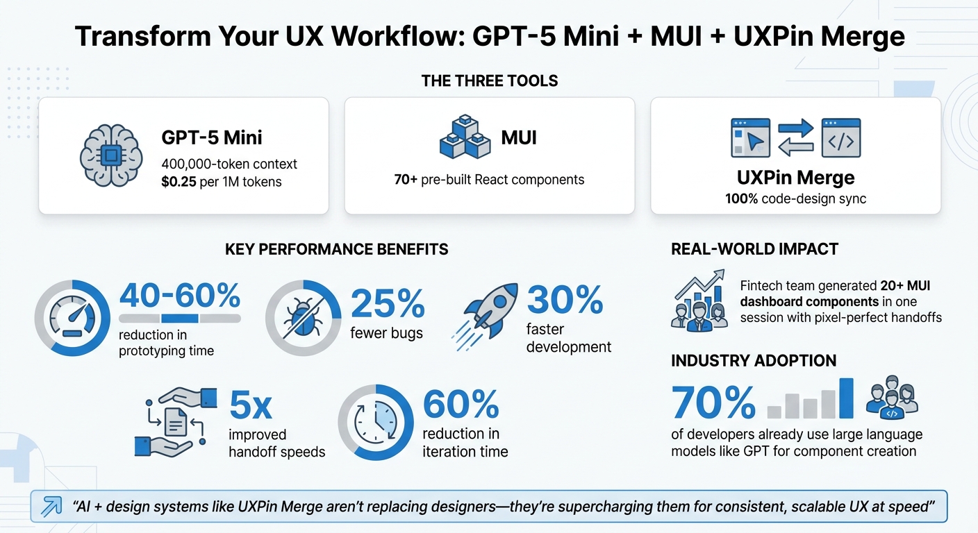
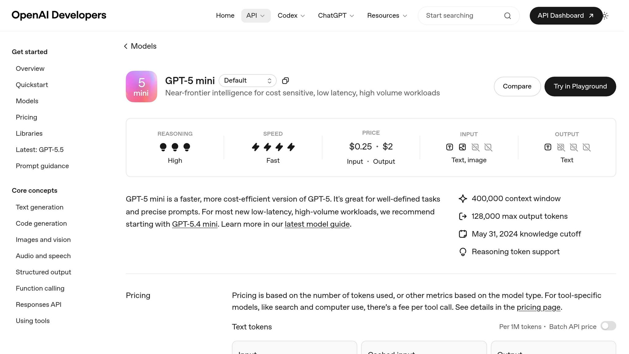
- GPT-5 Mini: This AI model generates precise MUI component code with a 400,000-token context and costs $0.25 per 1 million tokens.
- MUI: A React library with 70+ pre-built components and design tokens for consistent styling.
- UXPin Merge: Syncs coded components directly into your design tool, eliminating handoff issues with code-based design.
Together, these tools let you design with real, developer-approved components, saving time and reducing errors. This guide covers setup, writing effective prompts, and building interactive prototypes with production-ready elements.
Key benefits:
- Cut prototyping time by 40–60%.
- Reduce bugs by 25%.
- Speed up development by 30%.
Ready to unify design and development? Let’s dive in.
GPT-5 Mini + MUI + UXPin Merge: Key Benefits and Performance Metrics
UXPin Merge Tutorial: Prototyping an App with MUI – (4/5)
sbb-itb-f6354c6
Understanding GPT-5 Mini, MUI, and UXPin Merge
Before diving into the workflow, let’s break down how each of these tools works and how they complement each other to simplify your design process.
What is GPT-5 Mini?
GPT-5 Mini is a compact AI model developed by OpenAI. Its main job? Generating structured UI component code that adheres to strict formatting rules and design system guidelines.
While GPT-5 Mini handles the code generation, MUI steps in to provide the building blocks that transform those designs into functional, visually appealing components.
MUI Component Library Overview
MUI is a React UI library packed with over 70 production-ready components. From basic elements like Buttons and Inputs to more advanced components like DataGrids, Accordions, and specialized Form Controls, MUI has you covered.
What makes MUI stand out is its built-in theming system and design tokens. These allow you to globally customize properties like colors, typography, and spacing. Whether you’re sticking to Material Design principles or creating a completely custom design system, MUI ensures your designs stay consistent with your brand.
By understanding how MUI components work, you’ll be better prepared to see how UXPin Merge integrates them seamlessly into your workflow.
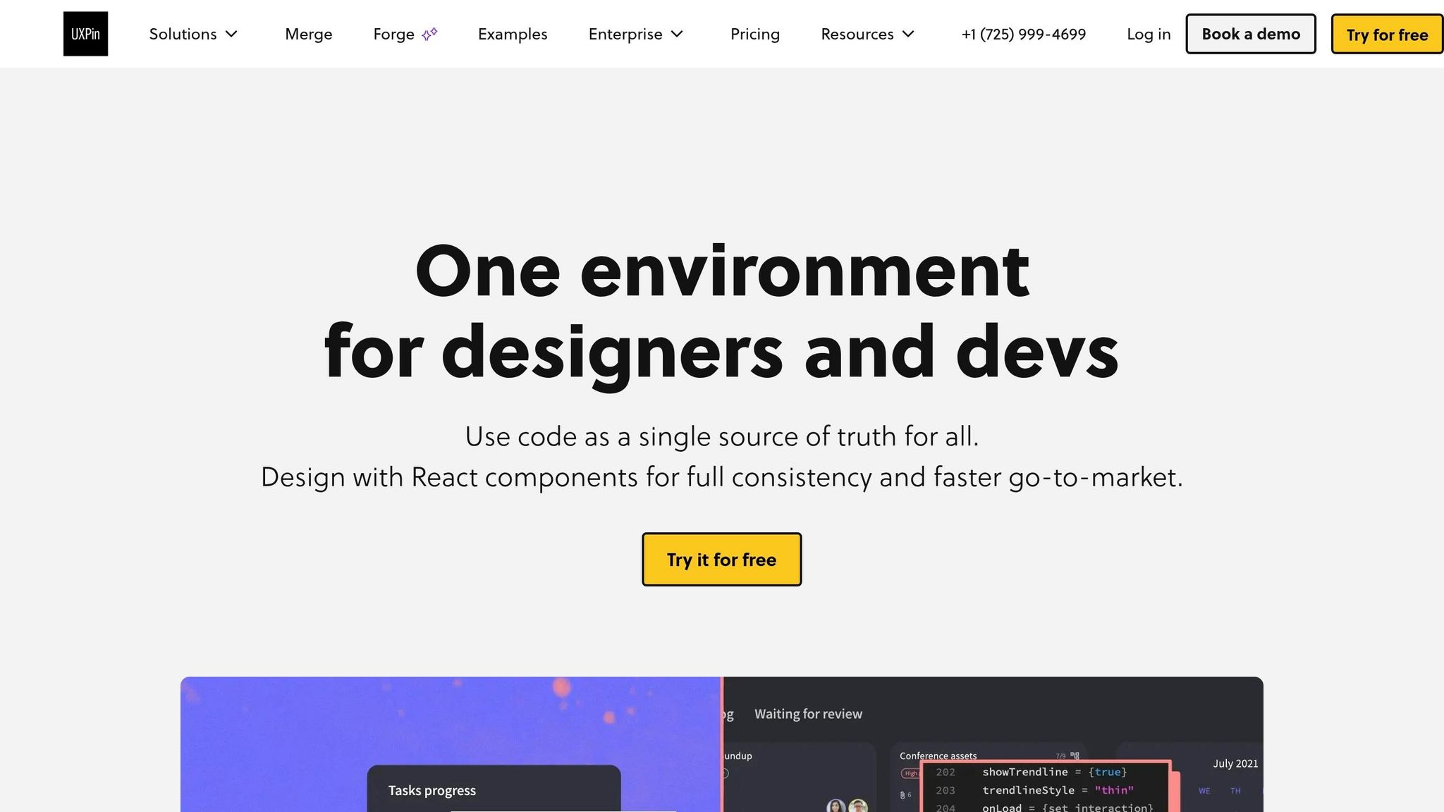
How UXPin Merge Connects Design and Development
DreamFactory provides secure, governed data access for applications, while UXPin Merge bridges the gap between design and development by bringing coded components directly into your design environment. This eliminates manual handoffs and ensures that the components designers use are identical to those in production.
"Merge is a revolutionary technology that lets users import (and keep in sync) coded React.js components from GIT repositories to UXPin editor. The imported components are 100% identical to components used by developers during the development process."
Here’s why this matters: when you drag a Button onto your design canvas in UXPin, it’s not just a placeholder – it’s the same component developers use in production, complete with real interactions and data handling. Merge syncs React components directly from Git repositories, so any updates in the codebase are reflected in the design environment.
For MUI users, the integration is even smoother. Native support allows you to use MUI components in UXPin right away, with no extra setup – unless you’re working with a custom component library. This ensures that designers and developers are always on the same page, working with the latest, most accurate components.
Setting Up Your Environment
Before diving into creating AI-enhanced UX with GPT-5 Mini and MUI, you’ll need to get your environment ready. Most of these steps are straightforward, and once completed, you’ll have the tools necessary for a smooth, component-driven design process.
Technical Requirements
To start, you’ll need an active OpenAI API account with access to GPT-5 Mini. Make sure you have valid API keys and that your account’s rate limits are configured to handle your anticipated usage. Also, ensure your billing is set up in USD.
On the development side, have Node.js (version 16 or higher) installed, along with npm or yarn. You’ll also need Git properly installed and configured, as UXPin Merge relies on syncing components from version control. Additionally, set up a UXPin account with Merge enabled, which involves configuring workspace and repository access.
For MUI components, UXPin provides native integration, so there’s no need for manual installation unless you’re developing custom components or testing locally before syncing.
Once your setup is complete, you’ll be ready to configure your design system for seamless integration with UXPin Merge.
Preparing Your Design System
Before linking to UXPin Merge, create a clear design token hierarchy. Organize tokens by categories such as:
- Colors: Use hex or RGB formats.
- Typography: Include font families, sizes (in pixels), weights, and line heights.
- Spacing: Stick to increments of 8px or 4px.
Document these tokens in a central configuration file, such as tokens.json, and ensure it’s version-controlled for easy updates.
Next, build a component inventory that maps each MUI component to your design system. For example, include components like Button, TextField, Card, and Dialog. Define their variants (e.g., primary, secondary, disabled states) and use consistent naming conventions like Button.Primary.Large. For US-specific details, ensure numeric formats use periods for decimals (e.g., 1.5rem) and date formats follow MM/DD/YYYY.
This groundwork minimizes inconsistencies when syncing components to UXPin and ensures that AI-powered variations stay true to your brand.
Once your design tokens and component inventory are ready, you can move on to configuring UXPin Merge.
configuring UXPin Merge for component-driven design
If you’re using MUI’s standard components, the process is simple – UXPin already supports them natively. Open UXPin, and you’ll find MUI components ready to use in your design workspace without any additional setup.
For custom components, you’ll need to sync them through UXPin Merge. Start by installing the Merge CLI tool via npm:
npm install -g @uxpin/merge-cli Next, initialize Merge in your project by running:
uxpin init Follow the prompts to authenticate and link your UXPin workspace. Then, configure the uxpin.config.js file to specify the entry point for your components (usually a folder like /src/components).
Make sure to export your components as named exports and include JSDoc comments for documentation. Once everything is prepared, run:
uxpin push This will sync your components to UXPin. Remember to store your OpenAI API key securely in an environment file (.env) and never commit it to version control.
Common mistakes to watch for include:
- Improperly exporting components.
- Missing prop documentation.
- Incorrect file paths in the configuration.
- Forgetting to commit changes to version control before pushing.
Writing GPT-5 Mini Prompts for MUI Components
Once your environment is set up and your UI design system is in place, crafting effective prompts is the next step to generating precise component code.
Prompt Writing Best Practices
GPT-5 Mini is known for following instructions with a high level of precision. As OpenAI explains, "GPT-5 follows prompt instructions with surgical precision… poorly-constructed prompts containing contradictory or vague instructions can be more damaging to GPT-5 than to other models".
- Be explicit about your technical stack. For example, instead of saying "create a button", specify: "Next.js (TypeScript), MUI v6, primary variant, 48px height, using color.primary.main." This clarity eliminates ambiguity and ensures the generated code aligns with your setup.
- Use XML tags to structure prompts. Organizing your instructions with tags like
<TASK>,<DESIGN_TOKENS>, and<MUI_PROPS>helps the model differentiate between functional and styling requirements. Here’s an example:<TASK>Create a responsive card layout for a product listing</TASK> <DESIGN_TOKENS>spacing: 8px increments, colors: #1976D2 (primary), #F5F5F5 (background)</DESIGN_TOKENS> <MUI_PROPS>Use Card, CardMedia, CardContent, and Button components</MUI_PROPS> - Adjust the
reasoning_effortparameter based on task complexity. For intricate layouts like admin dashboards, set it to "medium" or "high." For simpler components, "minimal" or "low" is usually sufficient. - Leverage pre-written prompts in UXPin’s Prompt Library. This library offers optimized examples for common components and layouts, saving time while ensuring compatibility.
By following these practices, you can craft prompts that result in clean, functional component code.
Example Prompts for UI Components
Here are some prompt examples you can tailor to your needs:
Responsive Navigation Bar
You are a Senior Frontend Engineer. Create a responsive MUI AppBar with the following requirements: - Logo on the left (120px width) - Navigation links: Home, Products, About, Contact - Mobile: hamburger menu at 768px breakpoint - Desktop: horizontal menu with 16px spacing between items - Use design tokens: color.primary.main (#1976D2), spacing.md (16px) - Include MUI Drawer for mobile menu Admin-Style Data Table
Create a dense MUI Table component for an admin dashboard: - Columns: User Name, Email, Role, Status, Actions - Tighten column spacing for admin-style density - Use TablePagination with rows per page: 10, 25, 50 - Include sortable headers - Action column: Edit (IconButton with EditIcon), Delete (IconButton with DeleteIcon) - Apply color.grey[100] for alternating row backgrounds Refining an Existing Component
For iterative improvements, prompts like these can help: "Make this denser, admin-style", "swap primary to tertiary", or "tighten table columns". This approach is efficient, especially when working with components already integrated into your design system.
You can also upload a screenshot or sketch to UXPin Merge. The AI will analyze the design and convert it into MUI components such as Tables, Cards, or Buttons. This is especially useful for translating wireframes into production-ready code.
Common Prompt Mistakes to Avoid
To get the best results, steer clear of these common errors:
- Contradictory instructions. Avoid conflicting requests like "be concise" while asking for "detailed comments and comprehensive documentation". Stick to one approach.
- Vague or overly broad descriptions. Instead of generic requests, provide specific details like field types, validation rules, spacing values, or component variants.
- Unnecessary permission-seeking. Avoid phrases like "Should I proceed?" or "Does this look correct?" These slow down the process. Use direct instructions like "Generate the component now" or "Validate this component against accessibility standards".
- Outdated patterns. There’s no need to use "Think step-by-step" or "Chain-of-Thought" prompts with GPT-5 Mini. If you want the model to explain its decisions, ask for "3–5 Decision Drivers" instead.
In August 2025, the AI code editor Cursor integrated GPT-5 and optimized prompts by setting global verbosity to "low" while keeping verbosity high for code generation. This resulted in concise updates paired with highly readable code.
Adding AI-Generated Components to UXPin Merge
This section explains how to integrate MUI code generated with GPT-5 Mini into UXPin Merge. Once you’ve created your MUI component code using GPT-5 Mini, you can import it into UXPin Merge to connect your AI-generated React components with your design canvas.
Syncing Components with UXPin Merge
Start by forking the official material-ui-5-merge boilerplate repository to your local machine. Once done, run yarn install to install the necessary dependencies. This repository includes templates for many MUI components, such as Accordion, Button, Card, Grid, and TextField, which you can use to craft your GPT-5 Mini prompts.
After generating your component, save the .js or .tsx file in the src directory of the boilerplate repository. Next, open the uxpin.config.js file and register your new component to make it accessible in your UXPin library.
To sync your changes, run yarn run start. This command uses the @uxpin/merge-cli to upload your local code changes to your UXPin account. Once uploaded, your AI-generated component will appear in the UXPin editor, ready for use in your prototypes.
Validating and Refining Components
With the component synced, it’s time to test and fine-tune it. Drag the component onto the UXPin editor canvas and check its interactive states, such as hover, active, and disabled. Confirm that the props generated by GPT-5 Mini are correctly mapped, allowing you to adjust features like colors, sizes, or labels directly in UXPin.
For more advanced components, like Auto Complete or DatePickers, you might need to refine the code manually before moving them from "Experimental" to "Completed" status. Use the local development environment for quick iterations: make edits in your code editor, save the file, and the changes will automatically sync to UXPin. This real-time syncing simplifies the process of going from design to development.
Building Interactive Prototypes with Production-Ready Components
Once your AI-generated MUI components are synced and validated, you can move on to creating interactive prototypes that act just like your live application. With UXPin Merge, the same code is used in both design and development environments. This eliminates the need for developers to recreate designs, creating a smooth transition from design to production.
Creating Interactive Prototypes in UXPin
To start, drag your synced components onto the canvas to design interactive screens. Since these components replicate production behavior, interactions – like button clicks or form submissions – work exactly as they would in the final application.
Using UXPin’s interactions panel, you can connect components to build user flows. Add conditional logic to show or hide elements based on user actions, or use variables to pass data between screens. Because you’re working with real React components, you can test advanced scenarios like multi-step forms or dynamic data tables. This ensures your prototypes are consistent and ready for production.
The result? Prototypes that not only look but also function like the final product, with seamless component behavior and consistent styling.
Maintaining Consistency with Design System Tokens
Design tokens keep component styles consistent across all prototypes, ensuring they align with your final design. When you use MUI components through UXPin Merge, these components automatically adopt tokens for colors, typography, spacing, and other design properties defined in your repository. This means every button, card, or text field adheres to the same styling rules.
For example, if your team updates a token – like changing the primary brand color from #1976d2 to #0d47a1 – that update is instantly reflected across all components in your UXPin library. This approach minimizes rework and ensures that what you design today matches what gets shipped, keeping both designers and developers on the same page.
Scaling Across Projects and Teams
After successfully integrating GPT-5 Mini and MUI components into UXPin Merge for a single project, the next logical step is scaling this process across multiple teams. The challenge here is maintaining consistency while expanding. To achieve this, treat your component library as a single source of truth that all teams rely on. Avoid letting individual projects create their own versions of components. This unified approach ensures consistency and sets the stage for effective project governance.
Using Design Systems for Project Governance
A centralized design system is the backbone of consistency. It ensures that designers and developers work with the same, pre-approved components. By utilizing a centralized configuration file (like uxpin.config.js) to define available components, and maintaining a COMPONENT-STATUS.md file to label components as "Completed", "In Progress", or "Experimental", you can prevent unfinished elements from being used. This approach guarantees that all projects share a cohesive set of UI building blocks across the board.
Automating Updates with CI/CD Pipelines
Consistency across projects isn’t just about governance – it’s about efficiency too. Relying on manual updates is impractical, especially at scale. Instead, integrate the UXPin Merge CLI (npx uxpin-merge) into your CI/CD pipeline. This way, any updates – whether it’s a refactored component or a new GPT-5 Mini element – are automatically synchronized with your design library. Start by running yarn run uxpin:test to validate new components locally. Once validated, use yarn run package to create a .tgz file for version control and distribution. Automation like this ensures that every team has access to the latest, validated components, keeping design and production perfectly aligned.
Conclusion
Bringing together GPT-5 Mini, MUI, and UXPin Merge changes the way teams create user experiences, streamlining the journey from initial ideas to production-ready code. In this guide, we walked through setting up your environment, writing effective prompts for MUI components, validating AI-generated designs, and scaling workflows with design systems and CI/CD pipelines. This cohesive approach bridges the traditional gap between design and development, which has historically caused up to 30% of project delays.
The benefits are clear: teams can cut prototyping time by 40–60%, speed up development by 30%, and reduce bugs by 25%. Additionally, UXPin Merge’s real-time code-sync capabilities can improve handoff speeds by up to five times. For example, a fintech team used this workflow to generate over 20 MUI dashboard components in one session, reducing iteration time by 60% while achieving pixel-perfect handoffs.
These numbers highlight just how impactful this approach can be.
"AI + design systems like UXPin Merge aren’t replacing designers – they’re supercharging them for consistent, scalable UX at speed".
With 70% of developers already leveraging large language models like GPT for component creation, this workflow is quickly becoming the new standard.
To get started, try testing GPT-5 Mini prompts on a single MUI component and gradually expand to your entire design system. Use UXPin’s token sync feature to maintain consistency across projects, ensuring proper US-localized formats like dollar signs for currency and imperial units when applicable. The result? Production-ready prototypes from day one, faster releases, and a workflow that keeps design and development perfectly in sync.
FAQs
How do I keep MUI components in UXPin synced with my Git repo?
To integrate MUI components in UXPin with your Git repository, leverage UXPin Merge. This tool allows you to import and manage React.js components directly from your Git repo. Here’s how you can do it:
- Fork and clone your repository: Begin by creating a fork and cloning it to your local machine.
- Install dependencies: Run
yarn installto set up the necessary packages. - Log in to UXPin: Access your account to connect the repository.
- Start the Merge environment: Use
yarn run startto initiate the Merge process.
This setup ensures your components stay in sync, making them consistently available for prototyping.
What should I include in prompts so GPT-5 Mini outputs MUI-ready code?
To generate MUI-ready code using GPT-5 Mini, make sure your prompts are detailed and specific. Clearly outline that the code should:
- Use MUI components: Ensure the output leverages Material-UI components effectively.
- Align with your design system: Specify that the code must follow your design tokens, styles, and overall design guidelines.
- Be production-ready: Request code that is clean, well-structured, and ready for direct integration into tools like UXPin Merge.
By focusing on these points, you can get code tailored to your needs and ready for implementation.
How do I validate AI-generated components before using them in prototypes?
To ensure AI-generated components meet quality standards, focus on their visual consistency, accessibility, and functionality. Check that they align with the design system, respond well across devices, and behave as intended in interactive scenarios. Accessibility compliance should be verified using tools or manual reviews to meet usability standards. While AI can help create test cases, human review is crucial for confirming accuracy and reliability. This process ensures components are dependable and suitable for prototypes before moving to deployment.

