Alignment in Design: Types, Techniques & Best Practices for UI Layout (2026)
Alignment is one of the most fundamental — and most underestimated — principles in visual and UI design. It’s the strategic arrangement of elements relative to one another, a shared edge, or a common baseline. Done well, alignment creates order, harmony, and effortless readability. Done poorly, it makes even beautiful content feel disorganized and unprofessional.
This guide covers every type of alignment used in modern interface design, explains how alignment affects user experience and usability, and walks through practical techniques for applying alignment in your design workflow — from grid systems to Auto Layout and AI-assisted generation.
Create visually polished user interfaces with UXPin’s design toolkit — including Auto Layout with real flexbox properties for pixel-perfect alignment. Sign up for a free trial.

What Is Alignment in Design?
Alignment in design refers to the positioning of elements so they line up along a common edge, axis, or center point. It’s one of the four fundamental principles of graphic design (along with contrast, repetition, and proximity) and plays a direct role in how users perceive and process visual information.
Effective alignment achieves three things:
- Creates visual connections — elements that share an alignment are perceived as related
- Establishes order — a well-aligned layout feels intentional and professional
- Guides the eye — alignment creates invisible lines that the reader’s gaze follows naturally
In interface design specifically, alignment is also a key factor in accessibility. Consistent alignment helps users with cognitive disabilities, low vision, and those using screen magnifiers to navigate content predictably.
Why Alignment Matters for User Experience
Alignment directly impacts usability. When interface elements are consistently aligned, users build mental models faster, scan content more efficiently, and complete tasks with less cognitive friction.
Research in visual perception confirms that the human eye naturally seeks patterns and order. Misaligned elements break those patterns, forcing the brain to work harder to interpret the layout. The result: slower comprehension, higher cognitive load, and a less satisfying experience.
Consistent alignment across screens also builds familiarity. Users who know where to expect navigation, headings, and content can move through an interface confidently — which directly improves engagement, task completion rates, and satisfaction scores.
For enterprise design teams managing complex product suites, alignment consistency across dozens of screens is nearly impossible without a systematic approach. This is where design systems and code-backed components become essential — they encode alignment rules directly into the components designers use.
Types of Alignment in UI Design
There are several alignment types, each suited to different design contexts. Understanding when to use each one is key to creating layouts that communicate clearly.
Horizontal Alignment
Horizontal alignment positions elements along the horizontal (left-right) axis. It’s the most common alignment type and has the biggest impact on text readability.

Left alignment is the default for body text in left-to-right languages. It creates a strong, consistent starting edge that the eye returns to with each new line. Left alignment is the most readable option for paragraphs, lists, and form labels.

Center alignment works well for hero sections, headings, and short text blocks that need visual emphasis. Avoid center-aligning long paragraphs — without a consistent left edge, readers lose their place between lines.

Right alignment is used sparingly in LTR interfaces — typically for numerical data in tables, dates, prices, or secondary navigation elements. It creates a clean right edge that works well when paired with left-aligned labels.
Justified alignment stretches text to fill the full width of a container. While it creates clean edges on both sides, it can produce uneven word spacing (called “rivers”) that hurt readability — especially on narrow screens. Use justified text cautiously and only in wide columns with proper hyphenation.
Vertical Alignment
Vertical alignment positions elements along the vertical (top-bottom) axis. It’s essential for aligning content within rows, cards, navigation bars, and flex containers.
- Top alignment — anchors elements to the top of a container. Common in card layouts, table rows, and multi-column content.
- Middle (center) alignment — vertically centers elements within their container. Ideal for navigation bars, icon-and-label pairs, and single-line items.
- Bottom alignment — anchors elements to the bottom. Useful for footers, captions, and aligning elements of different heights to a common baseline.
Edge Alignment
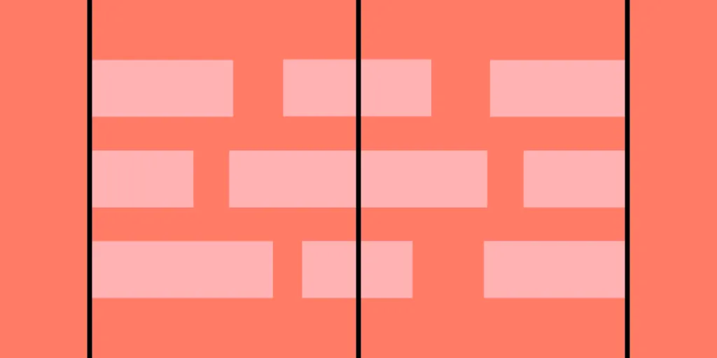
Edge alignment means multiple elements share a common edge — left, right, top, or bottom. This is the most powerful alignment technique for creating clean, structured layouts because it establishes strong invisible lines that organize the entire page.
Design systems enforce edge alignment through grid columns and consistent margins. When every element on a page aligns to the same vertical edges, the layout feels unified — even if individual sections differ in content type or density.
Baseline Alignment
Baseline alignment positions text elements so their baselines (the invisible line text sits on) are aligned. This is critical when placing text of different sizes side by side — for example, a heading next to a subtitle, or a price next to a currency symbol. Baseline alignment creates typographic harmony and prevents text from appearing to “float” at different heights.
Alignment Techniques for Better Layouts
Use Grid Systems
Grid systems provide the structural backbone for consistent alignment. A typical responsive grid uses 12 columns with consistent gutters, giving designers a framework to position content predictably across breakpoints.
Common grid types include:
- Column grids — divide the layout into vertical columns (most common in web design)
- Modular grids — add horizontal rows to create a matrix of modules (useful for dashboards and card layouts)
- Baseline grids — align text to a consistent horizontal rhythm (important for typographic harmony)
- Compound grids — combine two or more grids to handle complex layouts with varying content types
Use Consistent Spacing
Alignment alone isn’t enough — spacing must be consistent too. Use a spacing scale (e.g., 4px, 8px, 16px, 24px, 32px) to ensure margins and padding follow a predictable rhythm. Consistent spacing reinforces alignment and makes layouts feel polished. Many design systems define spacing tokens to enforce this systematically.
Leverage Auto Layout and Flexbox
Modern design tools and CSS frameworks use flexbox and auto layout to handle alignment programmatically. Instead of manually positioning each element, you define alignment rules (e.g., “center vertically, distribute horizontally with 16px gaps”) and the layout engine handles the rest.
This approach is more reliable than manual placement because alignment rules persist as content changes — labels get longer, cards gain content, or screens resize. UXPin’s Auto Layout uses the same flexbox model that developers use in CSS, which means alignment behavior in your prototype matches alignment behavior in production.
Use Alignment in Component Design
Alignment should be built into individual components, not just page layouts. A well-designed button component, for example, should center its label vertically and horizontally within its container. A card component should align its title, description, and CTA to consistent edges.
When working with code-backed components through UXPin Merge, alignment rules are already encoded in the component code. Designers don’t need to manually align internal elements — the component handles it automatically, just as it does in production.
Intentional Misalignment
Sometimes breaking alignment creates visual interest. An image that bleeds outside the grid or a pull-quote offset from the text column can draw attention effectively. The key is intent — misalignment should feel deliberate, not accidental. Always ensure the underlying grid structure supports the overall layout so users can still navigate easily.
Alignment Best Practices for UI Design
- Stick to one primary alignment per section. Mixing left, center, and right alignment within the same section creates visual chaos. Pick one and be consistent.
- Use left alignment for text-heavy content. It’s the most readable option for body copy, lists, and form fields in LTR languages.
- Align related elements to the same edge. Labels and their inputs, headings and their body text, icons and their descriptions — related pairs should share an alignment.
- Maintain alignment across pages and screens. Consistent alignment builds familiarity. Users should find navigation, headings, and content in predictable positions throughout the product.
- Use grids to enforce alignment systematically. A well-defined grid prevents alignment drift as new content and features are added over time.
- Consider alignment across breakpoints. An element that’s left-aligned on desktop might need to be center-aligned on mobile to look correct in a single-column layout. Plan alignment strategies for every screen size.
- Balance alignment with other design principles. Alignment works alongside symmetry, white space, contrast, and proximity. Don’t optimize for alignment at the expense of visual hierarchy or readability.
- Test alignment with real content. Placeholder text like “Lorem ipsum” often has uniform line lengths. Real content varies — test with production copy to ensure alignment holds up.
Common Alignment Mistakes to Avoid
- Center-aligning long text blocks — Without a consistent left edge, readers struggle to track from line to line. Reserve center alignment for short headings and CTAs.
- Mixing alignment types in a single row — A left-aligned label next to a center-aligned input creates visual tension. Keep elements within the same row on the same alignment axis.
- Ignoring optical alignment — Some shapes (circles, triangles, play buttons) need to be positioned slightly outside their mathematical bounds to appear visually aligned. Trust your eyes, not just the alignment grid.
- Relying on manual placement instead of layout rules — Manual nudging breaks down as content changes or new team members join. Use auto layout and grid constraints to enforce alignment programmatically.
Simplify Alignment With UXPin
UXPin’s design interface makes alignment straightforward with built-in tools for precise element positioning:
- Auto Layout uses real flexbox properties to handle alignment and distribution automatically. Elements reflow and realign as content changes — exactly the way they will in production code.
- Align and Distribute tools in the Properties Panel let you snap-align selections with one click.
- Keyboard shortcuts speed up alignment for power users — align left, center, right, top, middle, or bottom without leaving the canvas.
- Merge components have alignment pre-built into their code, so internal element positioning is always consistent.
Because UXPin’s Auto Layout uses the same flexbox model that developers use in CSS, designs translate to code accurately — reducing misalignment bugs and back-and-forth during development.
For teams that want even faster results, UXPin Forge generates properly aligned layouts from text prompts using your team’s real components. Every generated screen respects the spacing, alignment, and layout rules defined in your design system — no manual adjustment needed for the structural foundation.
Simplify your design process and achieve polished layouts fast. Sign up for a free trial to build your first interactive prototype with UXPin.
Frequently Asked Questions About Alignment in Design
What is alignment in design?
Alignment is the deliberate positioning of elements relative to each other, a shared edge, or a baseline. It creates visual order, establishes relationships between elements, and guides the user’s eye through a layout. Good alignment makes interfaces feel professional and easy to navigate.
What are the main types of alignment in UI design?
The main types are horizontal alignment (left, center, right, justified), vertical alignment (top, middle, bottom), edge alignment (aligning to a shared edge or grid line), and baseline alignment (aligning text baselines). Left alignment is best for body text, center alignment works for headings and CTAs, and edge alignment creates structured page layouts.
Why is alignment important for user experience?
Alignment reduces cognitive load by creating predictable visual patterns. Users scan content faster, understand element relationships, and navigate interfaces with less effort when alignment is consistent. Poor alignment creates visual noise that slows comprehension and makes interfaces feel unpolished.
How do grid systems help with alignment?
Grid systems provide an invisible structure that ensures consistent spacing and alignment across a layout. They define columns, gutters, and margins that elements snap to, maintaining consistency across pages and screen sizes. Common types include 12-column grids, modular grids, and baseline grids.
What design tools help maintain alignment?
UXPin provides Auto Layout (using real flexbox properties), snap-to-grid, alignment guides, and smart distribution tools for precise alignment. Because Auto Layout uses the same model as CSS flexbox, designs translate accurately to code. UXPin Forge can also generate aligned layouts from text prompts using your component library.
When should I break alignment intentionally?
Break alignment deliberately to draw attention — such as offsetting a CTA button or pulling an image outside the grid. The misalignment should look intentional, not accidental, and the underlying grid structure should remain intact so the overall layout stays navigable.


