Bad Product Design – 3 Examples of Poorly Designed Products
Bad product design is expensive. Visitors will leave your site if it loads for too long or if it’s too difficult to navigate. App users may stop using it if they’re unhappy with the experience once they’re presented with an alternative. Both scenarios will result in revenue loss. Simply, in the words of Ralph Speth, CEO of Jaguar, if you think that good design is expensive, poor product design will cost a fortune!
In today’s article, we’re going to share a few examples of bad product design. Hopefully, this will help you avoid some of the most common mistakes that designers make.
Design prototypes with UI elements that have interactivity built into them. Explore UXPin Merge, a powerful technology for bringing React, npm, or Storybook components to UXPin for faster prototyping and easier design handoff. Discover UXPin Merge.

What is Bad Product Design?
Bad product design causes user confusion and, generally speaking, complicates their lives. The best way to think of it is to contradict it with the values of good product design.
For example, instead of making it fast and easy to complete a purchase, a user finds themselves entangled in various forms they need to fill in, or can’t see a “buy” button anywhere.
There’s a clear monetary loss to events of bad product design. Not only does it distract users from their main goal by showing unnecessary information, but it might also block them from reaching it entirely.
What Causes Poor Product Design?
Here are some of the most common mistakes leading to poor product design, along with examples of badly designed products on the market.
Choosing form over functionality
Have you ever heard the saying – “the best design is no design?”. It’s a controversial one for a reason. Namely, while it’s absolutely correct when it comes to flawless, almost “invisible” user experience, it doesn’t apply to all products.
Let’s take Apple’s infamous stairs project as a prime design fail example.
In this industrial design example, we can clearly see how you can block users from completing their journeys from point A to point B (in this case, quite literally).
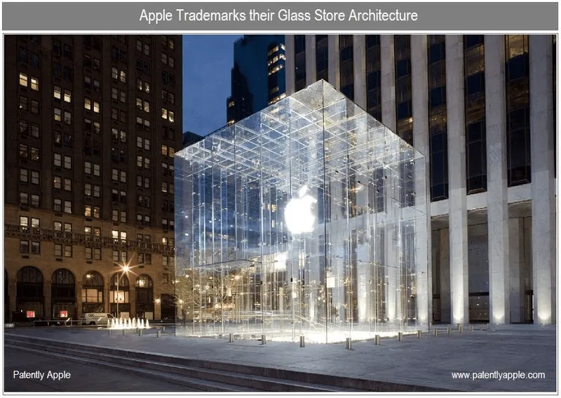
In the late 2000s and early-2010s, the electronics company became fascinated with glass store architecture. They saw it as an ideal extension to their minimal device design and wanted to patent and launch see-through stores all across the globe.
While, admittedly, they do look “light” and are cohesive with Apple branding, it failed to foresee some common user scenarios. A translucent store could fail at least in three ways:
- Discriminating against those who are wearing apparel without a pant section – skirts, dresses, or ethnic garments, among others. Since staircases were also designed in glass, it put some Apple Store customers, particularly those from a conservative background, in an uncomfortable position. Think of it as a physical counterpart of a ‘blocker’ in an app, i.e., something that disrupts a person from continuing on their journey. Say that a potential customer wants to buy a new phone, but finds out that it’s on the first floor. They might abandon the idea of going through with the purchase if there’s no way of getting to the item without feeling discomfort. One might argue that the problem could be easily tackled by using opaque glass. Still, this wouldn’t suffice with the next issue.
- It can be hard to use by the vision-impaired. How so? Two words – lack of color contrast. In the words of Don Norman, the Co-Founder of the NN Group and UX design pioneer, “with age, vision deteriorates. The lens of our eyes harden, making focusing more difficult”. The older the population, the more likely they are to have floaters block the light from passing through the retina. This means that a person entering a translucent store might find it difficult to see object boundaries. This leads to the last argument below:
- Risk of injury. People can mistakenly walk into a glass door or trip on a stair. Not to mention, there’s also the risk of birds flying into invisible walls at full speed.
To sum up, form should never fail user’s needs or, worse yet, make them feel incapacitated.
Takeaways for the design team:
- Before prototyping, run thorough user research
- Always design with functionality in mind
- Maintain a balance between visual appeal and function – remember that UX and UI go hand in hand.
Aggressive popups
Few things annoy users as much as pop-ups, which show immediately after entering a website. They haven’t even had the chance to look at what the brand has to offer, and they’re already asked to sign up for a newsletter or download an ebook. This is hugely discouraging and disruptive.
People come to your website to get answers to their questions – their time as well as attention span is limited. Flooding them with requests to complete a specific action ruins their experience, and can simply be considered bad product design. High chances are they’ll leave (especially, if the pop-up is hard to exit) and search for alternatives.
We’re not saying that you should give up on pop-ups altogether. Just make sure they appear at the right time – and not necessarily during the first visit. Consider waiting until the user absorbs some of the content. Once the user sees value in what you offer, they might consider signing up for a demo or a newsletter.
Takeaways for the design team:
- Make sure that pop-ups don’t appear as soon as a visitor enters your website, give them time to look around;
- Turn to hello bars rather than pop-ups as they’re less obtrusive way of getting user’s attention with web design;
- Ensure that your pop-up is task related, otherwise, it will be considered annoying.
Complex navigation
Another example of poor product design? Amazon Web Services – a comprehensive cloud-computing platform that has over a million users, and really complex navigation. The fact that it offers a wide variety of features shouldn’t stop the brand from creating a good user experience, right?
However, as soon as you click on the products tab, you’re overwhelmed with options – there is so much choice it’s very difficult to find what you’re looking for. And if you’re browsing on a mobile device, then it becomes even harder as you have to scroll endlessly.
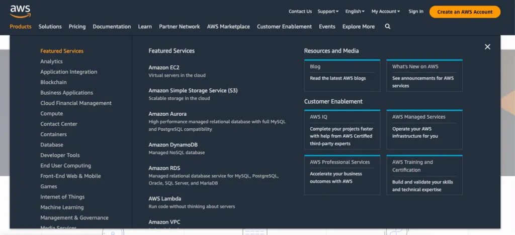
Such complex navigation might cause frustration as users are unable to find the information they need. While overall, the design itself is pleasing to the eye, the information could be displayed better. There’re so many products to choose from that the visitor might simply feel lost. And instead of searching for a suitable product, they’ll exit in panic.
Takeaways for the design team:
- Pay attention to the Information Architecture, especially if there is a lot of content that you’d like to display;
- Use card sorting to test your navigation before committing to it;
- Don’t neglect discoverability, it’s an important UX principle.
Inability to manage expectations
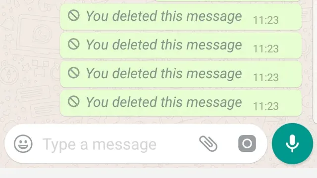
Whenever you introduce a new feature, you’re hoping that it will meet users’ expectations. Unfortunately, this isn’t always the case (which makes prototyping even more important), and WhatsApp is a great example of such a scenario. If you’ve ever used their messaging app, then you’ve probably noticed that WhatsApp informs you when a message gets deleted.
This creates a lot of confusion. Most users expect not to see the message after deleting it, instead of getting a notification that the message was deleted. This creates awkwardness and sometimes leads to follow-up questions like – “what did you write” or “why did you delete your message”.
This is definitely not what human beings want or expect – unless they love drama.
Takeaways for the design team:
- User requirements come first, account for them
- Put yourself in your users’ shoes while designing features
- Make sure that the design team applies user stories in feature planning.
Stigmatizing certain user groups
Let’s once again go back to the elderly user perspective, but this time not in terms of accessibility, but how products make them feel. The older the population, the more prominent the aesthetics problem becomes in digital and physical products for seniors.
Before the industrial revolution, when many items were custom-made, products like canes were often treated as a work of art. On top of serving their core purpose, i.e., keeping the user upright and stable, they often came meticulously designed, with intricate carvings. Fast forward to today, devices – both electronic and analog – tend to be ugly.
According to Norman, they nearly ‘scream’ as a signal of frailty. It’s hardly an emotion anyone, regardless of age, wants to give off to their surroundings. That’s one of the reasons why some people decide not to use walking devices in the first place.
The same can be said of phones designed for users with vision impairment – traditional buttons on phones don’t have to be the only option. If the phone interface and apps offer font or any other user interface element size adjustments, elderly customers might continue using products for the ‘general’ population.
It’s important to bring this forward when you and the design team work on ideation and prototyping your solution. Since the global population of people over 60 years will double between 2020 and 2050 (reaching 2.1 billion), this will likely be the most prominent example of bad product design in the near future.
Takeaways for the design team:
- Dive deep into the world of inclusive design
- Build user personas to better understand different user groups and adjust their experiences
- Focus on the end-user when designing and continuously collect feedback. Tracking your user base’s average age will help you decide when it’s time to do a product re-vamp and include more accessibility features.
Collaborative Prototyping for Preventing Bad Product Design
You can avoid the bad product design examples above by following a well-thought-out product design process. Namely, before putting the first version of your solution out on the market, you need to run extensive user research, ideate, and test out your concepts in the form of prototypes.
Here’s where using the right prototyping tool will be extremely helpful. Using a solution like UXPin lets you, among others:
- Test out your product’s early concepts with potential users, design team, and stakeholders. You can work together to come up with better solutions.
- Collect feedback on your product design – you don’t have to create the designs from scratch. UXPin lets you pull them in from your design system. You can use UI coded components from Git repo, npm, or Storybook. Discover UXPin Merge.
- Collaborate with developers and save time by improving design handoff and communication with developers.
Zero Tolerance for Bad Product Design
Poor design comes in various forms. Commonly, it circles around:
- Ignoring user needs or being unaware of them altogether. This can be avoided by taking on a humble approach to design. A bit of Socratesian “I know that I know nothing” could go miles here. Product design must start with research – ultimately, designers aren’t made to cater to the needs of stakeholders, but the end-user. The design must also go through user testing, as designers can’t predict how users will respond to their user interface design without checking its usability.
- Poor collaboration. When product development team members don’t know how to communicate project requirements or their ideas, problems are bound to happen. This is especially true when working with teams building no-code solutions like Adalo, where designers and developers need to understand how to effectively translate visual designs into functional applications.
- Lack of iteration in the design process. No one gets it right the first time around. So, it’s important to continuously collect feedback, prototype, and implement changes.
Considering the number of options that people get these days, there is simply no room for poor product design. Users will switch to a solution, which not only satisfies their needs but is also pleasant to use. And given the advanced prototyping tools at your disposal, you can easily prevent bad product design with UXPin and its Merge technology. Discover UXPin Merge.