You can go from brief to handoff with fewer design-to-dev mismatches if you use AI for structure and copy, then build with live UI components instead of static layers.
I’d sum the process up like this: write a tight landing page brief, use Claude Haiku 4.5 to draft the page outline and section copy, and assemble the page in UXPin Merge with your approved React components. Then I’d test breakpoints, focus states, form states, and U.S. formatting before handoff.
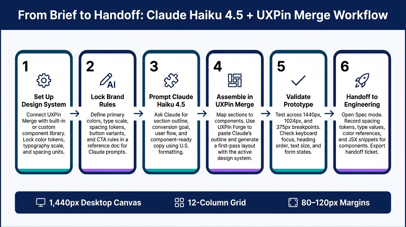
Here’s the full flow in plain English:
- Start with the system first: set up UXPin Merge with either a built-in library or your team’s custom React library
- Lock brand rules early: colors, type scale, spacing tokens, button variants, and CTA rules
- Use Claude for structure, not magic: ask for a section outline, content order, user flow, and short, component-ready copy
- Build with approved components: map each section to cards, grids, buttons, pricing blocks, and form fields already tied to code
- Use Forge for the first pass: paste the outline into UXPin’s AI tool to place sections on the canvas
- check the page before design handoff: test desktop, tablet, and mobile layouts, keyboard focus, heading order, and U.S. copy formats like $49/month, 07/31/2026, and 10,000 users
A few details matter more than they seem. The guide uses a 1,440 px desktop canvas, a 12-column grid, 80–120 px margins, and 24–32 px gutters. It also calls out 16 px minimum body text and 3:1 focus contrast for interactive states. Those small checks cut back on rework later.
What I like about this workflow is simple: Claude helps plan the page, but UXPin Merge keeps the page tied to code. That means the prototype is much closer to what engineering will ship.
If you want the short version, this article shows how to:
- turn a landing page brief into a build-ready outline
- keep AI output inside your design system
- assemble sections with Merge components and Forge
- review layout, access, and localization before dev handoff
That’s the core idea of the whole piece: use AI to draft, use Merge to build, and validate before anyone writes production code.
Claude Haiku 4.5 + UXPin Merge: Landing Page Workflow
UXPin Merge AI: Smarter UI Generation That Follows Your Design System
This integration allows teams to generate UI with AI using production-ready components.
sbb-itb-f6354c6
Set up UXPin Merge with your design system
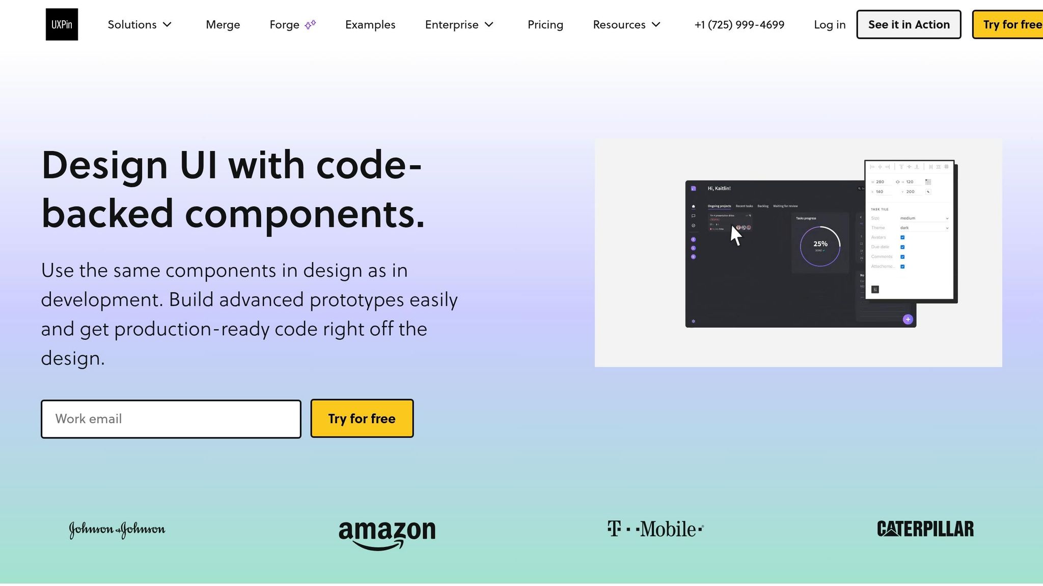
Before you prompt Claude, lock your design system in UXPin Merge. That way, the AI’s output lines up with components your team has already approved instead of drifting into made-up UI.
Choose a built-in library or connect a custom component library
In UXPin, you’ve got two options.
The fastest route is to use a built-in component library like MUI, Ant Design, Bootstrap, or ShadCN right on the canvas. These are already wired in, so you can drag real components onto the page right away.
The other route makes sense for teams that use their own branded parts. With UXPin Merge, your front-end team can connect a custom React library from your codebase. Once that’s done, proprietary components like MarketingHero, PricingCard, or BrandButton appear in the editor just like built-in ones.
A simple rule works here:
- Use built-in libraries when they match your stack
- Use a custom React library when branded components need to stay exact
That gives Claude a system it can follow, so the sections it generates map to real components instead of loose mockups.
Check tokens, component presets, and brand constraints
Once your library is connected, do a quick audit before you touch Claude.
Make sure color tokens like primary, secondary, and neutral are set up correctly. Check your typography scale, from H1 down to body text. Review spacing units too, usually in 4 px, 8 px, and 16 px steps. The goal is simple: these values should come from the design system, not from hard-coded numbers scattered across the page.
Then look at your core components and confirm they include the variants you’ll need for the page.
If you’re using a custom library, check two things in particular: default exports and one component per file. That helps Merge register components cleanly.
It also helps to write your brand rules in a short reference doc. Keep it plain and direct. For example:
Primary color token for main CTAs only. Headings under 60 characters. No red for informational alerts.
You’ll paste rules like these straight into Claude prompts in the next step. It’s a small move, but it gives Claude a tighter lane to work in.
Start with a desktop canvas and U.S. defaults
Once the system is ready, set up the canvas for a landing page that feels realistic to build.
Use a canvas that’s 1,440 px wide with a 12-column grid, margins between 80–120 px, and gutters around 24–32 px. This lines up well with responsive CSS layouts, so a design built at 1,440 px tends to translate cleanly when engineers implement it.
Then fill your placeholders with U.S.-formatted examples. Use prices like $29/month or $99/year, dates like 07/31/2026 in MM/DD/YYYY format, and counts like 10,000 users.
That may sound minor, but it keeps Claude and the prototype speaking the same language from the start.
Use Claude Haiku 4.5 to plan your landing page
With your canvas set and your design system in place, Claude Haiku 4.5 works well as your first draft partner. The aim here isn’t polished copy. It’s a build-ready outline that lines up with actual components, so each section already fits the parts you plan to use.
Prompt for page sections, conversion goals, and UX structure
Start with one prompt that asks Claude for an outline, not finished copy. Include your target audience, your main conversion goal – like starting a free trial or booking a demo – and the sections you want on the page. Keep it tight. Use only the sections that help drive that conversion goal.
Then ask for:
- A numbered section list
- A short note on content priority for each section
- A short note on user flow for each section
That framing makes a big difference. When you ask for a landing page outline, a clear conversion goal, and a section-by-section hierarchy, you tend to get something you can put to work right away. A vague prompt usually leads to a vague answer. This gives you a section map you can move straight into the canvas.
Prompt for U.S.-localized copy and component-ready UI directions
Once the outline looks good, use a second prompt to create copy one section at a time. Ask Claude to follow U.S. conventions. Use U.S. spelling, pricing, and CTA labels such as optimize, $49/month, and Start free trial.
Write the prompt in component-level terms: one headline, one subheadline, three benefit bullets, one primary CTA, and one secondary CTA. That kind of detail makes placement much easier. Each line can drop into a hero, card, button, or pricing block with only light edits.
Then ask for layout directions that map each section to approved layout patterns – for example, a contained primary button for the main CTA, a 3-card grid for benefits, and a two-column layout for supporting copy. Once the copy fits those slots, move into UXPin Merge’s code-based workflow.
Review Claude’s output before moving into UXPin
Treat this as your last build-readiness check before you assemble the page in UXPin Merge. Look at the output and ask a simple question: Can each piece of content fit a specific component – a button, card, column, list, or banner – without rewriting it? If the answer is no, tighten the prompt before you move on.
Also check a few basics:
- Button labels stay within 1–4 words
- Card descriptions are short enough for responsive layouts
- Pricing uses clean U.S. formatting
- Headings follow a clear hierarchy for accessibility
Catching those gaps now saves you from extra work in UXPin Merge. Then build the page in UXPin Merge.
Assemble and refine the page in UXPin Merge
Use the reviewed Claude outline to place approved components in Merge. The goal is simple: turn that outline into a coded prototype built from approved components.
Map each section to real components on the canvas
Go through Claude’s outline one section at a time. Treat each section like a component-mapping job, not a visual mockup exercise.
For the hero, use a layout container like MUI Box or Grid, or Ant Design Row and Col. Add a Typography component set to variant="h1" for the main headline, variant="subtitle1" for supporting copy, and a primary Button with variant="contained" and size="large" for the CTA. If Claude included a supporting image, place it as a media element next to the text. Then set the text, media, and variants in the properties panel.
The feature grid works the same way. In MUI, use Grid items with Card components and CardContent for the title and description. In Ant Design, use Card inside a responsive Row and Col layout. Set the column count, add the icon components, and plug Claude’s benefit copy straight into the text props.
For testimonials, use Card or List.Item with Avatar, Typography, and a rating component – MUI’s Rating or Ant Design’s Rate. Set the rating values as props. For pricing, give each card props for the plan name, price, feature list, and a primary CTA button. Then reuse the hero container and button for the final CTA so the page feels consistent.
Use Forge inside UXPin to generate layouts with approved components
You don’t have to place every component by hand. You can paste Claude’s section outline straight into Forge, UXPin’s built-in AI assistant, and let it generate a first-pass layout using your active design system. That means you can stay on the canvas instead of bouncing between tools.
Open your Merge project, click the Forge icon in the editor, and paste Claude’s structured output. For example:
"Hero: headline, subheading, primary CTA, supporting image. Feature grid: three cards with icons and short benefits. Testimonials: two quotes with star ratings and avatars."
Select your active design system so Forge knows which components and variants it can use. You can also add guardrails like "Use only primary and secondary button variants" or "Follow existing spacing tokens." Forge will then place approved components on the canvas with default props based on your instructions.
After that, clean it up by hand. Swap in Claude’s exact copy through the text props, adjust typography variants so the heading order makes sense, and check that button sizes and grid breakpoints match your brand rules. If Forge adds anything that’s off-system, replace it with the right Merge component before you move on.
With the layout in place, the next step is checking responsiveness, accessibility, and U.S. localization.
Static mockups vs. Merge components
The main difference comes down to code alignment.
Static mockups sit apart from the codebase, so engineers have to rebuild components from layers and fill in missing details around breakpoints and interactions. That adds rework at almost every handoff.
Merge components, on the other hand, connect to the live design system. Props, states, and spacing carry over much more directly into production.
The same idea applies to layout method. Placing components manually gives you tight control over a certain section or interaction. Using Forge with Claude’s structured outline gives you a system-aligned first pass across the whole page faster. Use manual placement when you need precision. Use Forge when you’re building multi-section pages from a reviewed Claude outline.
After layout, check responsiveness, accessibility, and U.S. localization before handoff.
Validate the prototype and prepare for handoff
Test content, responsiveness, and accessibility
Start at 1440×900 and check that the primary CTA sits above the fold. Then test every form state: valid submit, error state, and success message.
Next, resize the page to tablet (1024px) and mobile (375px). The goal is simple: make sure the 3-column feature grid drops to a single column on mobile without clipping, overlap, or awkward gaps. Spacing tokens should stay consistent across each breakpoint.
For accessibility, go through the full page with a keyboard. Every button, link, and form field should show a visible focus state with at least a 3:1 contrast ratio against its background. Body text should be at least 16px on desktop, and heading levels should follow a clear h1 → h2 → h3 structure. Also review semantic HTML and ARIA for any carousel, modal, or tab.
Once the interactions work and the accessibility checks pass, lock the copy and specs.
Check U.S. localization details and development specs
After the interaction pass, review localization and handoff details. Check the final copy for:
- USD currency formatting
- MM/DD/YYYY dates
- comma-separated numbers
- U.S. spelling
If anything looks off, paste the final copy into Claude Haiku 4.5 and prompt it to "audit copy for U.S. English spelling, MM/DD/YYYY dates, and USD currency formatting" before you finalize the text in UXPin.
After the copy is approved, open Spec mode in UXPin. Review each main component, such as the hero button, pricing card, and form field, and record spacing tokens, type values, and color references. If the component includes JSX, copy that snippet, along with screenshots and the key specs, into the handoff ticket. That gives engineers one clear source of truth and helps cut rework.
Conclusion: From prompt to deployable prototype
Claude Haiku 4.5 handles structure and copy. UXPin Merge turns approved components into a code-backed prototype. Then the validation step gets the handoff ready for engineering, so landing pages can move from prompt to production with fewer surprises.
FAQs
Do I need a custom React library to use UXPin Merge?
No. You can start using UXPin Merge right away with built-in, production-ready libraries like MUI, Ant Design, Bootstrap, and shadcn/ui.
If your team uses a proprietary design system, you can connect it through Git, Storybook, or npm packages.
There is one catch: custom components need to be built with React.js or Web Components to work properly.
What should I include in a Claude Haiku 4.5 prompt for a landing page?
Start with four basics: Role, Brief, Sections, and Output Format.
Define Claude as a UX copy assistant or coding assistant for your library. Then spell out the key setup:
- the product
- the audience
- the one conversion goal
- en-US localization
- the allowed components
- the section-to-component mapping
Be specific here. If Claude doesn’t know the job, the audience, or the UI pieces it can use, the output can drift fast.
Add content limits so the copy fits each component. For example, set max lengths for headlines, subheads, body copy, CTA labels, card titles, and form help text. That keeps the draft usable in the actual interface instead of sounding good on paper but breaking the layout.
Also ask for structured JSON output so each field maps cleanly to component props. Think of it like handing off clean parts to a front-end system: less cleanup, fewer guesses, and a much smoother pass from prompt to product.
How do I check that my landing page is ready for developer handoff?
Check three areas: code parity, localization, and functional behavior. Make sure every element exists in your production library. Swap out old variants, use design tokens instead of hard-coded values, and confirm the prototype lines up with your codebase’s component tree and props.
Then review U.S. localization, test responsive behavior, interaction states, and form flows in Preview Mode. Confirm accessibility against WCAG 2.1 AA, ADA, and Section 508, and mark it implementation-ready after joint sign-off.
Related Blog Posts
- How to build a landing page using Claude Opus 4.5 + Custom Design Systems – Use UXPin Merge!
- How to build a landing page using Claude Sonnet 4.5 + Bootstrap – Use UXPin Merge!
- How to build a landing page using Claude Haiku 4.5 + MUI – Use UXPin Merge!
- How to build a landing page using Claude Haiku 4.5 + shadcn/ui – Use UXPin Merge!