Want to create landing pages faster without sacrificing quality? Pair GPT-5.2 for content creation with UXPin Merge for design precision. This combo helps teams streamline workflows by:
- Generating copy in minutes with GPT-5.2.
- Building layouts using real, production-ready components in UXPin Merge.
- Reducing rework and improving alignment between content, design, and development.
Here’s how it works: GPT-5.2 drafts tailored content based on your design system’s structure, while UXPin Merge ensures the design is functional and ready for development. This approach cuts production time significantly, making it ideal for SaaS teams aiming to launch quickly.
Bottom line? You’ll spend less time on back-and-forth revisions and more time delivering high-performing landing pages. Let’s break down how to combine these tools step-by-step.
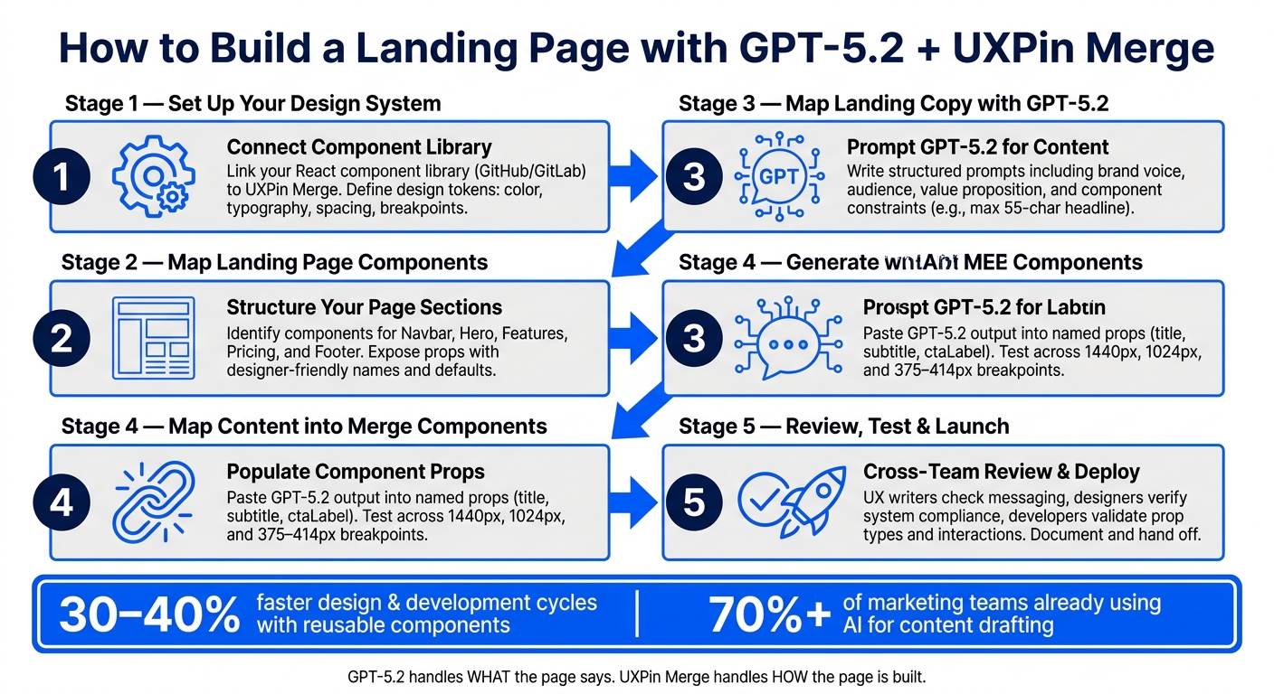
How to Build a Landing Page with GPT-5.2 + UXPin Merge: Step-by-Step Workflow
Understanding the Tools: GPT-5.2 and UXPin Merge
What is GPT-5.2?
GPT-5.2 is a highly advanced language model designed to create structured and purposeful text. When it comes to landing pages, this tool shines in crafting section copy like hero headlines, value propositions, and microcopy (think button labels or error messages). It also helps outline page structures, making it a go-to for content-heavy projects.
Think of GPT-5.2 as your content collaborator, not a search engine. You provide it with a detailed brief – your target audience, key benefits, tone, and section structure – and it generates multiple drafts in seconds. What used to take days of back-and-forth can now be done in minutes. Importantly, your team still controls the strategy, brand voice, and final edits, while GPT-5.2 takes care of the initial drafts and variations.
While GPT-5.2 is all about generating content, UXPin Merge ensures that content comes to life in functional, dynamic layouts.
What is UXPin Merge?
UXPin Merge complements GPT-5.2 by focusing on design precision. It’s a design tool where teams create layouts using real, production-ready UI components. Instead of sketching static shapes that only approximate what a button or form might look like, designers use actual components with built-in behaviors like hover states, responsive layouts, and form validation.
Designers can tweak component properties – like labels, states, or variants – without having to redraw anything. When the design is complete, developers don’t have to guess specs or rebuild layouts from scratch. They simply connect backend logic, data, or analytics to components that already exist in the codebase. UXPin Merge also includes ready-to-use libraries like MUI, Ant Design, Bootstrap, and ShadCN, so teams working with standard frameworks can hit the ground running without importing additional resources.
Why Use GPT-5.2 and UXPin Merge Together
Bringing content and design together is key to speeding up deployment, and combining GPT-5.2 with UXPin Merge makes this possible. Each tool solves a different piece of the puzzle: GPT-5.2 focuses on what the page says, while UXPin Merge focuses on how the page is built. Working together, they bridge the gap between content creation, design, and development.
| Challenge | How GPT-5.2 Helps | How UXPin Merge Helps |
|---|---|---|
| Slow content drafting | Generates copy for every section in minutes | – |
| Misaligned copy and layout | Creates content tailored to fit component constraints | Components define exact content limits |
| Rework at development | – | Uses production-ready components, reducing rebuilds |
| Slow iteration cycles | Produces new messaging variants instantly | Swaps content into existing components effortlessly |
One of the most common headaches in design workflows is writing copy in a separate document, only to struggle later when it doesn’t fit the design. This workflow eliminates that issue. By prompting GPT-5.2 with the exact structure of your component – for example, “Write a hero section with a 60-character headline, two short sentences for the subheadline, and a 5-word CTA” – you ensure that the content aligns with the design from the start. This small adjustment saves a surprising amount of time and effort later in the process.
sbb-itb-f6354c6
Setting Up Your Design System in UXPin Merge
What You Need Before Getting Started with UXPin Merge
To get started with UXPin Merge, you’ll need a React-based component library hosted in a version-controlled repository like GitHub or GitLab. Make sure each component has a stable API with clearly defined props so that what designers see matches what developers build.
Your design tokens should cover essentials like color (color.primary.500, color.neutral.100), typography (font.size.body, font.weight.bold, lineHeight.heading), spacing (space.4, space.8), border radius, shadows, and breakpoints. These tokens need to be in a machine-readable format, such as JSON or TypeScript, to act as your single source of truth. This ensures visual consistency across your landing pages, even as layouts and copy evolve.
On the organizational side, assign a design system owner – often a front-end engineer or design systems designer – who will manage what gets synced to Merge and when. Collaborate with your engineering team on naming conventions and component props to avoid misalignment. If you already have a production page built with these components, use it to validate your setup. If the page renders correctly in UXPin, you’re good to go.
Once these technical and organizational pieces are in place, you can move on to mapping out your landing page components.
Mapping Out Key Landing Page Components
After connecting your library, focus on exposing only the components needed for your landing page. Start by outlining the structure of your landing page and identifying the components required for each section. A typical landing page includes five key sections: Navbar, Hero, Features, Pricing, and Footer. Each section corresponds to one or more components from your library.
For instance, the Navbar might consist of a Logo component, a group of navigation links, and a CTA Button. The Hero section could be a single HeroBanner component with props for headline text, a subheading, a primary CTA label, and an optional media slot. The Pricing section might include a PricingCard component, a toggle for monthly/yearly billing, and a "Most Popular" badge variant. Breaking these sections into smaller components – and documenting which props control which elements – creates a shared understanding for designers and developers before any design work begins.
Within UXPin Merge, organize your components into labeled groups like Layout, Navigation, Content, Forms, Marketing, and Footer. Expose props with designer-friendly names and set sensible defaults. For example, instead of allowing free-form text for a color input, use a variant prop with predefined options like "light" and "dark". This keeps designers within the boundaries of what the codebase supports.
With your components mapped and organized, the next step is creating reusable patterns.
Creating Reusable Landing Page Patterns
Once your components are in place, assemble them into reusable patterns – pre-built layouts that can be easily reused for future campaigns without starting from scratch.
Take a hero pattern as an example: it might include a product image, a headline, a short subheading, a primary CTA, a secondary CTA, and optional trust badges. These elements are all built from Merge components, with placeholder text and token-driven spacing already applied. A pricing pattern could feature two or three PricingCard components, a toggle for monthly/yearly pricing, and a highlighted "Most Popular" plan, with props exposed for pricing details (e.g., $29/month), feature lists, and CTA labels. Save these patterns in UXPin with clear names so your team can quickly duplicate them, adjust variants, and update content without touching the layout.
This method brings immediate benefits. Marketing teams can launch multiple campaigns with consistent navigation, legal footers, and responsive layouts while tailoring the content to specific audiences. The structure remains intact, and only the content changes, making the process both efficient and scalable.
UXPin Merge AI: Smarter UI Generation That Follows Your Design System
Generating Landing Page Content with GPT-5.2
Once your structured design system is ready, GPT-5.2 can help you create content that fits seamlessly into your predefined component framework. With reusable patterns established in UXPin Merge, the focus shifts to filling these components with compelling copy. The key to getting quality output from GPT-5.2 lies in crafting precise prompts. Once the content is generated, it can be integrated into your Merge components to create a polished, cohesive landing page.
How to Write Effective Prompts for Landing Page Copy
Avoid general or unclear prompts; think of your input as a mini content brief. Start by summarizing the page’s purpose, target audience, and desired action in one sentence. For example: "Write copy for a SaaS project-management landing page aimed at mid-market operations teams, designed to increase demo requests." This sentence gives GPT-5.2 a clear direction for its output.
To refine your prompt further, include these five elements: brand voice, audience, value proposition, page sections, and component constraints. Here’s an example of a well-structured prompt:
"Create landing page copy in a confident, concise B2B tone for finance leaders. Include a headline, subheadline, three benefit bullets, a placeholder for social proof, and one CTA under six words."
Component constraints are especially crucial when working with a design system. For instance, if your HeroBanner component allows an 8–12 word headline and a subheadline under 25 words, include those specifics in your prompt. This ensures the generated content fits perfectly within your components without disrupting the layout. After the initial drafts are generated, focus on refining tone and clarity.
Refining AI-Generated Content for Tone and Clarity
Assess the output using a quick brand voice checklist: check for the desired formality, vocabulary, sentence structure, and emotional tone. Edit anything that feels too generic or lacks impact.
A good practice is to generate multiple versions of the same section and compare them. Select the version with the clearest and most actionable message. For example, a vague headline like "Improve your workflow" can be reworked into something more specific, such as "Cut proposal turnaround time by 40%" – provided your product data supports the claim. Research from Nielsen Norman Group shows that concise, scannable copy consistently improves user comprehension and task success rates. If you’re running A/B tests, GPT-5.2 can also help by generating controlled variations. For example, create three headlines focusing on different angles (speed, cost savings, or risk reduction) while keeping the rest of the page consistent to ensure clean test results.
Using GPT-5.2 to Write Microcopy
Microcopy – like button text, form hints, error messages, and tooltips – plays a huge role in guiding users through your page. Research by Baymard Institute highlights that unclear or poorly written microcopy in forms is a top reason for abandonment, with 20–60% of users leaving at least one field blank in complex flows. Improving microcopy can significantly reduce these drop-offs.
GPT-5.2 performs well with microcopy when you provide specific context. For example, when writing button text, include details like the UI location, user intent, and character limits: "Generate three button labels for a pricing card, each under three words, action-oriented, and in second-person." This can produce options like "Start free trial", "Get the demo", or "See it live" – all more actionable than a generic "Submit." For error messages, include the cause and a clear fix in under 18 words, such as: "Your email isn’t valid. Check for typos and try again." This approach results in microcopy that is far more helpful than vague alternatives like "Invalid input." When integrated into your design system, precise microcopy strengthens the overall user experience and aligns with your design-to-development workflow.
Mapping GPT-5.2 Content into UXPin Merge Components
With the GPT-5.2 output in hand, you can seamlessly integrate this content into your design system using Merge’s named props. These are specific fields like title, subtitle, ctaLabel, and featureBody that you can directly populate from the Properties panel in UXPin. This approach streamlines the design-to-development process by directly filling production-ready properties.
Step-by-Step: Adding Content to Components in UXPin Merge
To get started, first format your GPT-5.2 output into a structured format that matches your component props. For instance:
"For a B2B SaaS analytics tool, generate a hero section with:
hero_title(max 55 characters),hero_subtitle(max 120 characters),primary_cta_label,secondary_cta_label, andhero_supporting_bullets(exactly 3 concise bullets). Also generate 3 feature cards, each withfeature_titleandfeature_bodyunder 140 characters."
Once you have the labeled output, open your Merge project in UXPin. Drag the Hero component onto the canvas and open its Properties panel. Then, map the GPT-5.2 output to the corresponding props: for example, paste hero_title into the title field, and hero_subtitle into the subtitle field. Repeat this process for other components. For a FeatureGrid, you’ll map fields like card1Title, card1Body, card2Title, and so on to the respective GPT output. Boolean props, such as showSecondaryCTA, can be toggled based on the generated content.
Once your props are populated, test your layout across key breakpoints: 1440 px desktop, 1024 px tablet, and 375–414 px mobile. Some components – like hero sections, multi-column grids, and pricing tables – may require adjustments if the text overflows or wraps awkwardly. Use UXPin’s layout controls (e.g., Stack direction, gap, padding, alignment) to fine-tune the design. If a headline doesn’t fit well on mobile, consider prompting GPT-5.2 to shorten it by 20% rather than manually altering the layout.
Dividing Responsibilities Between Content and Layout
To maintain consistency, keep content creation and layout decisions separate. GPT-5.2 handles the narrative structure – outlining sections like Hero, Problem, Solution, Social Proof, Pricing, and FAQ – along with the hierarchy and copy variations for different audiences. UXPin Merge, on the other hand, focuses on managing spacing, typography, interaction states, and responsive behavior.
If GPT-5.2 suggests layout ideas, such as "display this in a three-column grid", treat that as a content guide rather than a design directive. The choice of component in Merge – whether a card grid, list, or banner – should always align with your design system. This separation ensures your design system remains consistent and avoids conflicts with AI-generated layout suggestions.
Using UXPin’s Conditional Logic, Variables, and Expressions
Once the static content is mapped, you can elevate your landing page with dynamic features using UXPin’s variables, conditional logic, and expressions. These tools are especially useful for creating prototypes tailored to multiple audience segments.
For example, define variables like userType (e.g., SMB or Enterprise) or billingCycle (e.g., Monthly or Yearly) in the Variables panel. These variables can be bound to component props or text fields, allowing the page to adapt dynamically. You might configure a pricing card to change its variant based on the billingCycle variable, or use conditional logic to display an enterprise-specific benefits section only when userType == "Enterprise".
Expressions can further enhance personalization. For instance, you can combine static text with dynamic values, such as "Save " + discountPercentage + "% with annual billing", while relying on GPT-5.2 to craft the surrounding marketing copy. This combination allows teams to prototype customized landing page experiences without writing any front-end code.
Reviewing, Testing, and Preparing Your Landing Page for Launch
Once you’ve mapped out the content and set up dynamic logic, it’s time to review and finalize your landing page. With the layout and content in place, the next step involves a detailed review process to ensure everything – from messaging to functionality – is ready for launch.
Running a Cross-Team Review of Content and Design
A thorough review process often involves multiple team members focusing on different aspects of the page. Here’s a suggested three-step approach:
- UX Writers and Product Owners: These team members check the messaging hierarchy, from the hero section to the call-to-action (CTA). They ensure all claims are accurate, remove speculative language unless supported by real data, and verify localization details. This includes formatting USD currency, using proper comma placement for numbers, and ensuring dates follow the MM-DD-YYYY format.
- UX Designers and Design System Owners: They confirm that every design element adheres to the design system. This includes checking spacing, heading hierarchy (H1 to H3), brand colors, and responsive behavior. If a new design element is introduced, it should either become a reusable pattern or align with an existing one.
- Developers and QA: This group ensures that all code elements work as intended. For example, they verify that prop types (like
variant="primary"orsize="lg") match the codebase, form submissions function correctly, and error states display as expected. They also check that conditional sections render properly. All findings should be logged in a shared checklist for resolution before sign-off.
This collaborative review ensures your page is ready for usability and accessibility testing.
Testing for Usability and Accessibility
Testing your landing page involves both usability and accessibility checks to ensure a smooth experience for all users.
- Usability Testing: Test the layout across key screen sizes, such as desktop (1440 px), tablet (1024 px), and mobile (375–414 px). Make sure CTAs are always visible, text remains legible, and no horizontal scrolling occurs.
- Accessibility Testing: Confirm that the page meets WCAG 2.1 AA standards. For example, check that color contrast ratios are at least 4.5:1 for body text, heading levels follow a logical order without skipping, and all interactive elements (like icon-only buttons) include appropriate
aria-labelattributes. While design system components often handle accessibility basics, it’s essential to verify these elements in the context of the full page.
Final Steps Before Deployment
Before handing off the page for deployment, use the final UXPin Merge file as the definitive design reference. Developers can then add production-specific logic, such as analytics, form integrations, or A/B testing hooks, without altering the established component structure or content hierarchy.
If any code updates lead to visual changes, update the Merge library first to maintain consistency between design and development. Finally, document the final version of the page, noting what was reviewed, any changes made, and who approved it. This documentation serves as a reference for the deployment team and helps trace any post-launch issues back to their source.
Conclusion: Key Takeaways for Building Better Landing Pages
Here’s the big takeaway: content and design should grow together from the start. By using GPT-5.2 to draft copy and immediately placing it into UXPin Merge components, you can avoid the endless back-and-forth that often bogs teams down. This approach ensures the copy fits the layout from day one, letting the design reflect the actual message instead of placeholder text.
Streamlined workflows lead to faster results. Teams with well-developed design systems have reported design and development cycles that are 30–40% faster by reusing components rather than starting from scratch. When you layer AI-assisted copy generation onto that, the time savings become even greater.
Here’s a snapshot of how this workflow changes the game:
| What Changes | Why It Matters |
|---|---|
| Early draft integration | Reduces revision cycles between writers and designers |
| Code-backed components in UXPin Merge | Keeps design files aligned with what developers deliver |
| GPT-5.2 as a first-draft tool | Speeds up ideation while keeping human oversight essential |
| Cross-team review of live prototypes | Identifies mismatches early, before development begins |
The table highlights how these adjustments can make your process smoother. To build on this, use GPT-5.2 as a partner for creating first drafts, and document your best layouts and copy to improve future projects. With over 70% of marketing teams already using AI to draft and refine content, human judgment still plays a crucial role in ensuring quality before anything goes live.
FAQs
What do I need before using UXPin Merge with my design system?
To get started with UXPin Merge, you’ll need a UXPin account that includes a Merge AI plan. It’s also important to have a solid understanding of UXPin’s interface, prompt engineering, and your component library.
If you’re working with pre-integrated libraries like MUI, Bootstrap, or Ant Design, you’re in luck – these components are already available in the editor, ready to use.
For custom libraries, the process involves connecting your Git repository or npm package. You’ll also need to set up the right tools, such as Node.js, npm or yarn, and configure your build environment accordingly. This setup ensures your custom components integrate smoothly into UXPin.
How do I prompt GPT-5.2 so the copy fits my components?
To make sure GPT-5.2 creates content that aligns with your components, use structured prompts with clear boundaries. For example, you can use structured JSON to map text directly to specific component properties like heroHeadline or primaryCtaLabel. Be sure to set precise character limits to prevent text from overflowing in your design.
Additionally, include a scope constraint to ensure the output sticks to your design tokens. For fine-tuning, implement a "Perfection Loop" by asking GPT-5.2 to review its output and compare it to your design standards, refining the results until they meet your expectations.
How can I personalize a landing page in UXPin using variables and conditions?
You can tailor your landing page by incorporating variables, conditions, and expressions directly within the UXPin canvas. These features allow you to simulate how a real application behaves. By using the Properties Panel, you can link content to variables or tweak component properties to showcase dynamic states. This approach lets you build interactive prototypes that closely replicate real-world functionality, ensuring your landing page reacts appropriately to user interactions.

