What is Design System Theming? [+ 4 Use Cases]
Building a design system is expensive. Whether an organization develops from scratch or adopts an open-source design system, theming is crucial for customization. This customization could be as simple as creating a dark mode or a multi-brand design system to accommodate a product suite.
Design tokens and variables are crucial to design system theming, allowing teams to make significant, global changes by editing a few lines of code–sometimes a single digit or letter.
Sync your multi-theme design system to UXPin using our Git Integration for React component libraries. Visit our Merge for Git page for more details and how to request access.

What is Design System Theming?
Design system theming is a process of making a design system flexible to stylistic changes. These changes are made possible through design tokens or stylesheet variables, where engineers make a single change to impact the entire cross-platform ecosystem.
Some examples where organizations use design system theming include:
- Dark mode: essential for accessibility in modern product development to accommodate users with visual impairments.
- White labeling: open-source design systems use theming to allow users to customize the component library.
- Multi-brand design systems: organizations with a suite of products use theming to change a single design system rather than develop multiple component libraries.
- Marketing campaigns: theming allows product teams to make stylistic changes for marketing campaigns, like green, red, and white for Christmas, red for Valentine’s Day, or red, white, and blue for July 4th.
What are the benefits of design system theming?
A themeable design system enables organizations to reuse a single design system for multiple products or purposes. For example, MUI is one of the world’s most widely used open-source component libraries. MUI’s theming enables brands to customize the library to meet their specific requirements. So, two or more products using MUI can look completely different.
Theming saves product teams considerable time and resources because it allows them to make many changes with minimal effort. The benefit for organizations is that designers and engineers spend more time on product development than messing with styles or designing and programming from scratch.
How Does a Design System Theme Work?
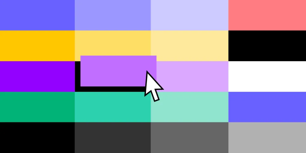
Products use design tokens or variables to represent a specific property–we’ll use color to explain how design system theming works.

A design system’s color palette typically has several essential colors:
- Primary
- Secondary
- Error
- Warning
- Info
- Success
For websites and web applications, engineers use a six-digit HEX code to define each color. These HEX codes appear many times across multiple components in the design system. If engineers need to make a change, they must find every instance where the HEX code appears and revise it–which could be hundreds, even thousands of changes.
Using variables
Theming provides a global solution for applying these changes. Engineers assign properties to a variable they use in place of fixed values. So, a primary blue value of #1976d2 becomes “primary” or something to that effect, depending on the design system’s naming convention. A button component may look something like this:
<Button color=”primary”>Submit</Button>
If engineers want to make a global change, they change the primary variable, updating every instance where that variable appears in the product’s stylesheets. Instead of hundreds of changes, they make one.
Creating theme stylesheets
To create multiple themes, engineers only have to update the stylesheet with the variables and give it an appropriate name. For example, a multi-brand design system may have three brands, each with dark and light modes, resulting in six different variable stylesheets:
- Brand A Light (brand.a.light)
- Brand A Dark (brand.a.dark)
- Brand B Light (brand.b.light)
- Brand B Dark (brand.b.dark)
- Brand C Light (brand.c.light)
- Brand C Dark (brand.c.dark)
This button component’s code would look the same for every theme, but the primary variable would reference a different color code.
<Button color=”primary”>Submit</Button>
To apply Brand B Light, engineers import brand.b.light into the component’s file and apply it using a theme property.
What Can You Change With Theming?
Theming happens within a product’s stylesheet, meaning you can create design tokens or variables for any CSS properties. Common theming properties include:
- Color palettes
- Typography and font styles
- Spacing and sizing
- Responsive breakpoints
- CSS transitions and animations
- Radii
When to Use Design System Theming?
Should you use design system theming? And how much theming will you allow? You also need to consider factors specific to your product and business, including:
- Framework constraints
- Platform-specific requirements
- Supported tech stack
- Technical requirements and limitations
- Budget and human resources
Dark mode
Most organizations will only use design system theming to switch between dark and light modes. This type of theming should only impact your design system’s color palette.
Designers will need to test how these colors appear across many styles, including:
- Font colors
- Background colors
- Borders
- Shadows
- Gradients
- Icon colors
Color contrast is the most important thing designers must focus on for light and dark modes. Contrast significantly impacts users with visual impairments.
With UXPin’s built-in contrast checker and color blindness simulator, designers can test colors for light and dark modes without leaving the design canvas.
Multi-brand design systems
Multi-brand design systems are another reason organizations use theming. Product teams and engineers need more flexibility than color to meet each brand’s requirements. But greater flexibility impacts more properties, meaning more customization.
For example, one theme might use square corners while another uses rounded ones. They may also use different typefaces and font styles. Changing fonts will impact other properties like padding, spacing, margins, line heights, etc.
Cross-platform design systems
Many devices and operating systems have specific styling, or components products must use. For example, you might want to use the system typography for iOS (San Francisco) and Android (Roboto). Each of these would need a different theme to accommodate the fonts and any additional styling, like padding, sizing, line heights, etc.
White-labeling
Software developers often use white-label design systems to deliver products to multiple customers more efficiently. This design system theming requires a lot of customization to meet many scenarios, platforms, brands, and use cases. Adalo and other no-code platforms exemplify how theming enables developers to build flexible, customizable applications that can be white-labeled for different clients without requiring extensive custom development.
If you’re building a white-label design system, you might want to use variables in place of every value to offer complete customizability and flexibility–i.e., everything has a variable.
Design System Theming Resources
Here are some resources to help with your design system theme:
- The many faces of themeable design systems – Brad Frost
- How to add a theme switcher to Storybook – Storybook Blog
- Creating themeable design systems – Kolby Sisk
- Evolution of theming in NewsKit design system – James Spencer
- Theming in Design Systems – Knapsack
Multi-Theme Design System Prototyping With UXPin Merge
Multi-theme design systems are challenging to develop for engineers but require even more effort for designers. Every theme requires a separate UI kit to use in image-based design tools.
With UXPin Merge, you can sync your multi-theme design system to UXPin’s design canvas, so designers and engineers use the same component library. Any changes to the library, including adding a new theme, automatically sync to UXPin and notify designers of the update–a true single source of truth saving your DesignOps and DevOps teams countless hours of work and collaboration.
Higher-quality prototypes and testing
Theming is currently only available for React with Merge’s Git Integration, which syncs directly to your component library’s repository. Merge components are fully interactive and include properties (via React props) defined by the design system.
Component props appear in UXPin’s Properties Panel so designers can make changes and switch themes with a few clicks. They can also combine components or save multiple versions as Patterns to streamline prototyping and testing by simply swapping Patterns instead of adjusting properties.
These Merge components function as they do in the final product, allowing designers to create exact prototype replicas resulting in accurate, meaningful results during user testing.
Erica Rider, UX Lead EPX at PayPal, describes how UXPin allows her team to iterate faster during testing, “It’s been so helpful for us to have these high-fidelity prototypes built with UXPin Merge. We build high-fidelity prototypes much quicker, and we get immediate feedback after the session. If there’s something we can fix immediately, we make that change before the next participant and get feedback much faster than before.”
Streamlined handoffs
Design handoffs are smoother, almost non-existent with UXPin Merge. Engineers already have copies of every component, so it’s a matter of importing them from the repository, copying JSX changes from UXPin, and replicating the design team’s layouts.
Since switching to UXPin Merge, German-based software developer dotSource enjoys “seamless collaboration between design and development,” including some other key benefits:
- No inconsistencies or design drift
- One change automatically syncs design and code
- Documentation is always up to date
Switch to the only design tool that automatically syncs multi-theme design systems between design and development for a powerful single source of truth to reduce DesignOps burdens while optimizing product development workflows. Visit our Merge for Git page for more details and how to request access.

