Heuristic Evaluation – The Most Informal Usability Inspection Method

Design teams commonly use Jakob Nielsen’s heuristics to evaluate human-computer interaction because they provide a comprehensive user experience audit.
A heuristic evaluation explores ten critical facets of a product’s user experience, allowing design teams to focus on specific usability problems within user interfaces and interactions.
Get accurate insights about your product’s usability performance using advanced prototypes that look and feel like the final product. Sign up for a free trial to discover interactive prototyping with UXPin.

What is a Heuristic Evaluation (Heuristic Analysis)?
Heuristic refers to problem-solving and self-education, usually through trial and error. In UX design, heuristics describes the cognitive load or mental capacity required to make decisions and complete tasks. Designers use usability testing to evaluate heuristics and identify issues for fixing.
There are ten usability heuristics, and a heuristic evaluation assesses these to identify a product’s usability performance. These usability heuristics come from Jakob Nielsen’s (co-founder of the Nielsen Norman Group) ten general principles for interaction design which he devised in the early 1990s.
10 Usability Heuristics
Jakob Nielsen created the ten usability heuristics based on research from two other UX and engineering experts, including:
- Gerhardt-Powals Cognitive Engineering Principles
- Ben Shneiderman’s Eight Golden Rules of Interface Design
Visibility of system status
Designers use system status indicators for a range of interactions and user tasks. For example, the battery icon on your mobile phone displays the battery life status. This battery life indicator is crucial because it informs users whether they have enough power and when to charge the device. Without it, the device would die intermittently without warning, causing frustration for end-users.
Visibility of system status is crucial for visual feedback–what happens when a user interacts with a component (click/tap, hover, swipe, etc.) or completes an action, like submitting a form? The system must provide feedback to inform the user that something is happening or that it has executed a task.
The following user interface design elements are great examples of visibility of system status:
- Progress trackers on forms
- Loading icons
- System messages (success, warning, error, etc.)
- Badges on shopping carts, text apps, etc.
- App notifications
Designers must be careful not to overwhelm users with system status updates and only provide feedback when it’s relevant and necessary.
Match between the system and the real world
There are two rules within match between the system and the real world:
- Speak the user’s language
- Follow real-world conventions
Firstly content designers must always use obvious words and language. Facebook’s “News Feed” and “Photo Tagging” are excellent examples of speaking the user’s language. In a podcast with Lex Friedman, early Facebook exec. Chamath Palihapitiya describes how the company chose the most obvious names for Facebook’s features to ensure people knew what they did.
Connected to language are real-world conventions–mimicking real-world experiences and interactions in a digital product. For example, an eBook experience is similar to a physical book, where users can turn pages, highlight text, and add bookmarks.
Matching the system to the real world makes user experiences obvious, reducing the cognitive load required to navigate products and complete tasks. This obviousness is especially important for people learning technology, the elderly, and users with cognitive disabilities.
User control and freedom
Designers must provide exits and offramps for users through edit, undo, redo, back, cancel, etc. The freedom for users to rectify a mistake or change their minds is crucial for a good user experience.
This freedom is especially important regarding financial decisions like purchases or changing a paid service. Giving users this freedom and control builds trust while minimizing fears of exploring a product and its features.
Consistency and standards
There are two facets of consistency and standards:
- Internal
- External
Internal consistency and standards apply to your UIs and components, usually defined by your product’s design system or design language. Designers must follow these internal standards consistently to ensure tasks and actions are always obvious to users.

External consistency and standards refer to globally recognized UX patterns. For example, the hamburger icon to open a navigational drawer or the cart/trolly icon for eCommerce websites. Breaking these conventions forces users to learn something new, thus increasing their cognitive load.
Following consistency and standards reduces the need to think about actions so that users can locate content and complete tasks with minimal mental effort.
Error prevention
Error prevention is one of the most critical heuristics. Errors can cause significant distress, especially for irreversible actions–for example, transferring money to the wrong bank account or accidentally deleting something.

Designers use a strategy called cognitive friction, which creates roadblocks to force users to stop and think before completing an action. For example, a dialog popup after a user clicks transfer confirming the amount, recipient’s name, bank account number, and branch code with the option to confirm or cancel the transaction.
Good user experience design creates these friction points to prevent errors and, in some cases, reverse them. For example, saving recently deleted items for 30 days.
Recognition rather than recall
Humans have limited short-term memory, which means we battle to retain information. Designers must make content visible or retrievable, so users don’t have to remember. For example, eCommerce platforms allow shoppers to save their delivery and billing details, so they don’t have to recall these at checkout.
This concept includes simplifying designs, so users don’t have to refer to the documentation or watch a tutorial to use a product. Designers use form labels, menu items, tooltips, placeholder text, and other reminders to help users complete tasks.
Flexibility and efficiency of use
Flexibility and efficiency of use allow users to complete tasks and actions fast while providing more than one way to execute them. The best example of this principle is copying and pasting. Users typically have three options, depending on the application:
- Using the app’s primary navigation, Edit>Copy and Edit>Paste
- Using the mouse’s right-click, right-click Copy, right-click Paste
- Using the keyboard shortcut, CMD/CTRL+C, CMD/CRTL+V
Another example for you Instagrammers is the double tap to like an image instead of tapping the heart/like icon.
When users first start using a product, they generally use the most obvious default option, i.e., the app’s navigation or icon in Instagram’s case. But as they become more confident, they use shortcuts to maximize efficiency.
Aesthetic and simple design
User interfaces must be aesthetically pleasing and simple so users can focus on the most critical content and actions without distraction. For example, an eCommerce store wouldn’t run ads on its website because A) it would create a busy UI, and B) competitors’ ads would likely appear, taking the user to another offer.
In a bid to convert users by any means necessary, companies often have too many CTAs on their website or landing page–join our mailing list, purchase this product, follow us on Twitter, Like us on Facebook, book a sales call! Too many options overwhelm users resulting in the opposite effect–they leave!
Designers must prioritize content to support the user’s primary goal or task while eliminating irrelevant and distracting UI elements.
Help users recognize, diagnose, and recover from errors
Error messages must do more than alert users to a problem; they must offer an easy solution to fix the problem. This snackbar example from Google’s Material Design adds an “Undo” action in case the user archived an email accidentally.
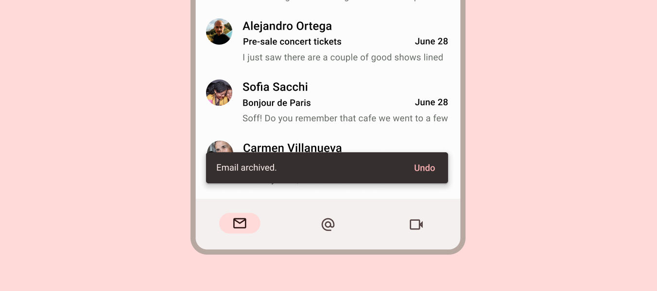
Google’s Gmail does a similar recovery action after you send an email with a snackbar allowing users to “Undo” sending–”Oh no! I forgot to add the attachment–*Undo–Thank you, Gmail!”

Other examples where designers help user recover include:
- 404 errors with helpful links
- Error messages with a link to activate the solution
- Input field error messages with explicit instructions to fix the problem
Help and documentation
No one likes to leave what they’re doing to read documentation, but often it’s necessary to diagnose the problem and find a solution. Designers can help users by using walkthroughs, tooltips, popovers, and chat to find answers without leaving the page they’re working on.
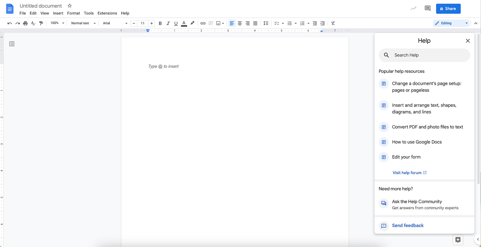
Google Docs provides users with a help popup where they can search the product’s documentation to find a solution. Additionally, there is a link to the Google Docs community and an option to report a problem directly to Google.
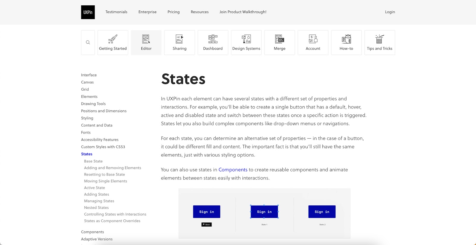
The documentation must be easy to search and navigate while providing users with helpful, actionable answers. UXPin’s documentation provides users with the most searched help categories and an option to search (with autocomplete). Each section offers images, GIFs, and written instructions to help users find what they need.
How to Conduct a Heuristic Evaluation
With a clear understanding of each usability principle, it’s time to conduct your heuristic evaluation.
The process of carrying out a heuristic evaluation is the same regardless of the industry or nature of the design project.
- Phase one–Planning: the design team uses user research to map the heuristic evaluation. They also delegate tasks and define goals.
- Phase two–Execution: conducting the heuristic evaluation.
- Phase three–Review: synthesize and review the evaluation and design a plan of action.
Planning
First, teams define which heuristics they’ll use and the evaluation methods. These heuristics should be chosen carefully based on market research, previous user testing, and the principles of careful design.
Next, the team must select the evaluators–the usability experts responsible for the evaluation. Evaluators generally work in pairs to reduce bias and spot more usability issues. These small units must assess one heuristic at a time. Simultaneously evaluating multiple heuristics can result in errors.
Executing
- The first step is briefing the evaluators so that they understand the heuristics they’ll use and how the system functions.
- The evaluators interact with the system to understand how it works.
- The evaluators evaluate the system based on pre-determined heuristics, noting any usability issues they encounter.
Reviewing
Evaluators present their findings with recommended actions to fix the problems. The team collates these into one master document where they create and prioritize tasks to fix the usability issues.
Identify more usability problems and fix errors before they make it to end-users with advanced interactive prototyping from UXPin. Sign up for a free trial to explore UXPin’s sophisticated design tool.


