Since the Middle Ages, scientists have documented the emotional effects of colors. It should be no surprise that different colors evoke different emotions, seeing how it has seeped into our everyday language (“feeling blue,” “seeing red,” etc.).
To master a naturally visual medium like experience design, you must also master colors. Unfortunately, not everyone has the time to dive into the technicalities of color theory or art.
To get you started, we’ve compiled a quick reference guide that covers the basics of each color’s unique effects, and how they relate to UX design.
Red
Aggression, Importance, Passion
One of the most powerful colors, attributed simultaneously with love and war, red offers the proven physiological effects of increasing blood circulation, quickening breathing, and raising metabolism. Red elements are more noticeable, adding a sense of importance, whether good or bad.
Just think of the red carpet.
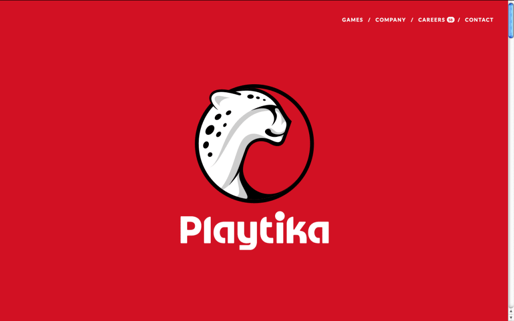
Source: Playtika
Use red carefully, as a little goes a long way. It’s a great highlight for individual elements that need attention, but in excess it will inhibit relaxation. Light red draws out its energy, good for themes like youth and love (see the entry for Pink below), while dark red emphasizes power and durability, like blood or bricks.
Orange
Energy, Playfulness, Affordability
As you might have guessed, colors vary in degrees by the placement on the spectrum, so colors like red, orange, and yellow (“warm” colors) have similar effects but different levels. Orange shares red’s stimulating aspects, but to a lesser degree. This gives it an energetic aura without red’s aggression.
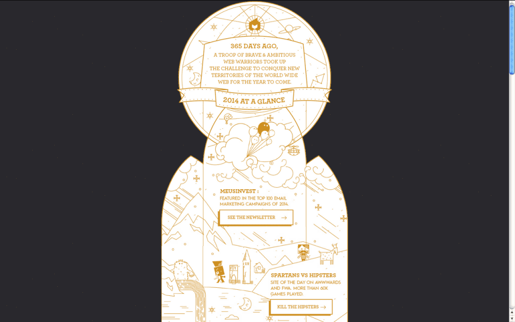
Source: Epic Creative Agency
Orange is a playful, upbeat color, great for casual sites but not always the top choice for enterprise sites. You’ll find many different interpretations of orange: some say it encourages impulsivity, others say it increases appetite (for culinary sites), while still others say it denotes cheapness, for better or worse.
Yellow
Friendliness, Happiness, Attention
Oddly, yellow represents both happiness and anxiety, activating both in the brain.
Like other warm colors it’s generally energetic and upbeat, but brighter shades dial up this effect, making it a color often used for warning signs.
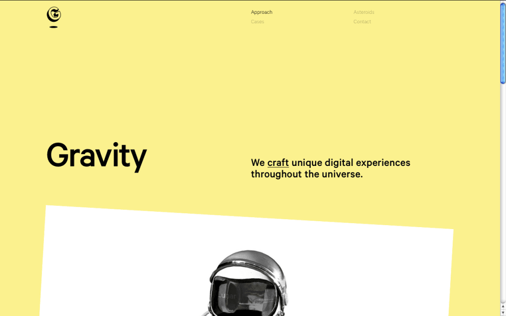
Source: Lunar Gravity
If you use yellow, you can try softening its brightness for a more mellow experience. Light yellow reminds users of sun and happiness, and dark shades (like gold) are more serious and also give the impression of antiquity.
Green
Growth, Nature, Success
The most obvious associations with green are plants (and by extension, nature).
But more than that, green bridges the gap between warm colors and cool colors (blue and purple), making it the most balanced color.
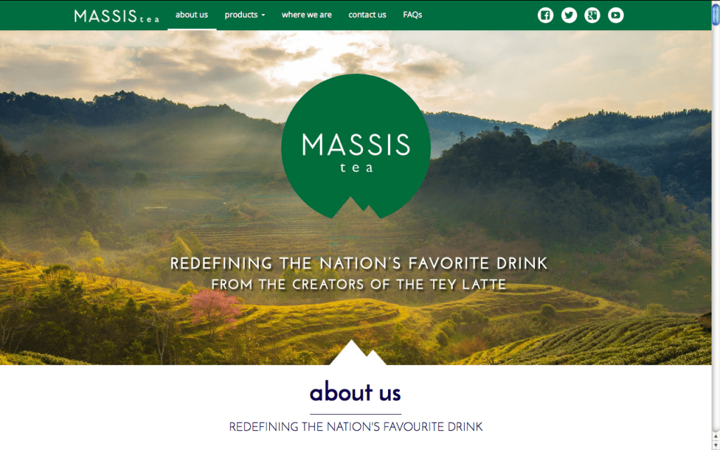
Source: Massis Tea
Green’s balance lends itself to calls-to-action, using the visibility of warm colors by the relaxing qualities of cool colors. Its nature connotations give it a sense of growth and prosperity, moreso in the Western world for its association with money.
Blue
Trust, Comfort, Relaxation
Without a doubt, blue is one of the most important colors in UI design, and one of the most frequent. This is partially thanks to its range, where light blue and dark blue offering different characteristics.
Its associations with water gives it a calming effect, which leads to friendliness that “invites” users into a site.
It’s no coincidence that the two biggest social media outlets Facebook and Twitter both use blue as their core color. This relaxing friendliness also translates into inherent trust, which is why it’s often used by banks — think of the branding for CitiBank, Chase, and Capital One.
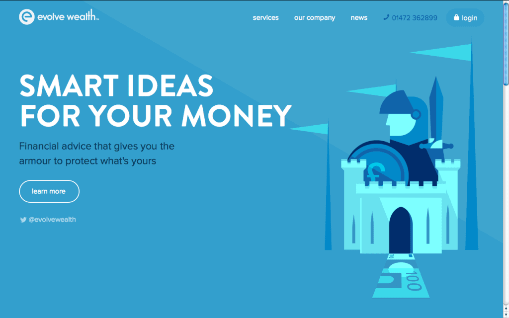
Source: Evolve Wealth
Light blue accents the friendly qualities and can even be energizing if bright enough, while dark blue is more somber, emphasizing the security and trust aspects (which is why dark blue suits are popular in the business world).
While blue offers a wealth of benefits, it comes with one distinct limitation: it’s a proven appetite suppressant.
Purple
Luxury, Romance, Mystery
Historically linked to royalty, purple retains this air of luxury today. Purple insinuates that a product or site is high-end, even if it’s not — the opposite effect of orange.
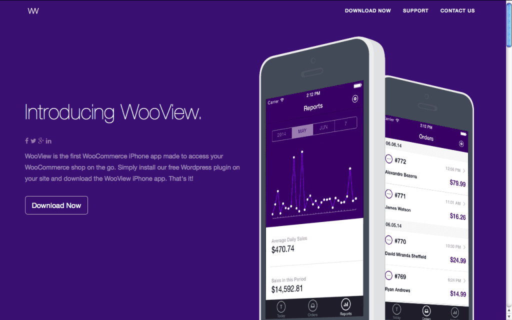
Source: WooView App
Because purple cycles back to red on the spectrum, it shares some of red’s romantic features, especially lighter shades like lavender. Deep purple, on the other hand, brings to mind mystery, and more sensual undertones.
Pink
Femininity, Innocence, Youth
Extending outside of the primary colors, pink is both unique and common enough to make it worth mentioning.
Pink is most known for its associations with femininity, although it has strong ties to youth and the innocence that goes with it. However, lately it’s being used independently of gender-targeting.
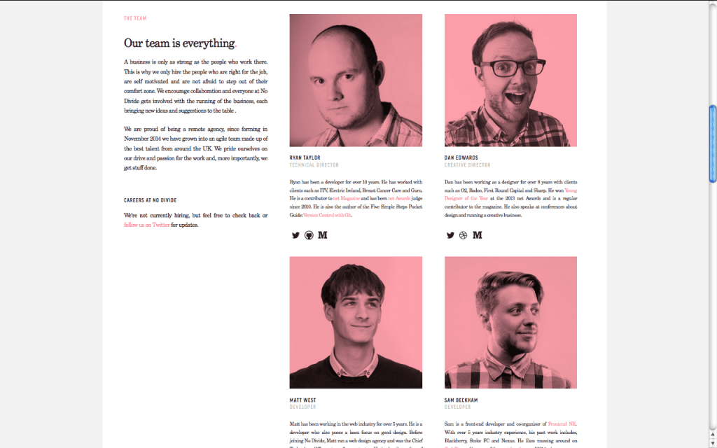
Source: No Divide Studio LTD
Pink is often the color of sugary sweets, so the color gives an air of playfulness, almost childishness. As a shade of red, it also can be used for romantic themes, leaning towards “young love” rather than more classic romance. Pink doesn’t always mean feminine.
In fact, overusing pink for its “feminine qualities” can easily irritates users by pandering to traditional gender roles.
Brown
Stability, Rustic, Earth
Brown doesn’t work for most sites, but for the ones it does work with, it works perfectly.
With its strong links to dirt and trees, it generates a rustic, old-fashioned feel, perfect for rugged, outdoorsy sites, or even organic products. The connotations with wood also suggest stability and reliability.

Source: Well Storied
With its themes of nature, mud, dirtiness, and earth, brown is similar to green, although more masculine and less aesthetic.
Black
Power, Sophistication, Edgy
Black is the strongest of all colors, and requires some care — that’s why it’s most commonly used only for text and accents. Black attracts attention faster than other colors, even red, so it can make or break your intended visual hierarchy.
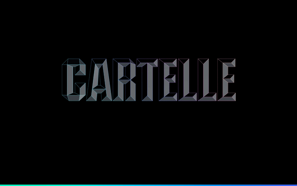
Source: Cartelle
When used as a main component in a color scheme, such as a background, black creates its own emotional ties like any color.
It can take a mysterious, even scary tone, but this can be harnessed into edginess. Often, black comes across as mature and sophisticated. Interestingly, black accents the colors used with it, so a colorful flare is more potent against a black background.
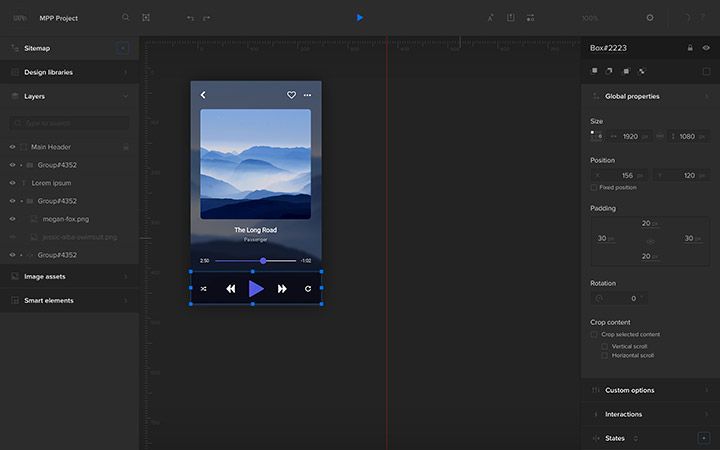
On a related note, we’re currently testing a darker version of our collaborative design platform at UXPin. Currently known as “UXPin Dark”, the all-black background is designed to contrast strongly with interface labels and menus.
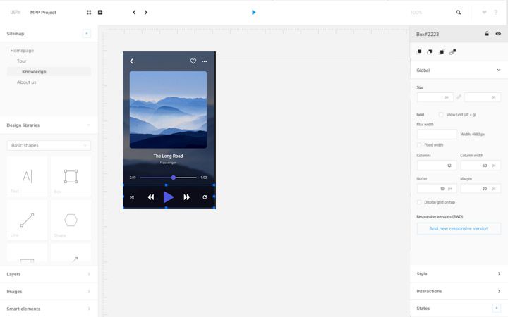
The original “UXPin Light” is also available, and we’ll be allowing users to toggle between the two according to their preferences.
White
Virtue, Sterility, Health
Like its opposite black, white accents other colors around it, making it a popular choice for a secondary color.
When used in abundance, white gives a “clean” feeling, which can be pushed further to sterility. This makes it a popular choice for hospitals and the medical industry, both online and off. In some cultures, especially Western, white represents virtue and even “holiness.”
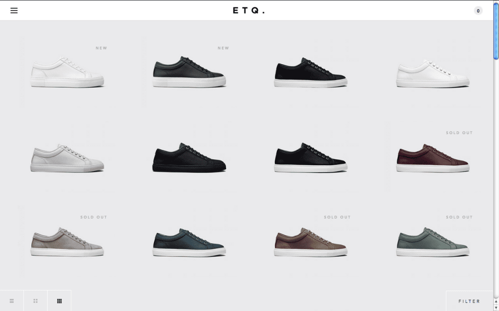
Source: ETQ Studios Amsterdam
When white is the dominant color, its sterility can be overwhelming. If your white site seems too stark, try an offshoot of white. Ivory and cream work well in these cases: they are softer, but still give the same advantages.
Gray
Formality, Neutrality, Professionalism
As you can guess, gray represents neutrality.
While it risks coming across as boring, skilled designers recognize it as a powerful tool: by altering its shade, gray can take on the characteristics of either black or white, to whatever degree is most helpful.
For example, if black is too strong, try dark gray.
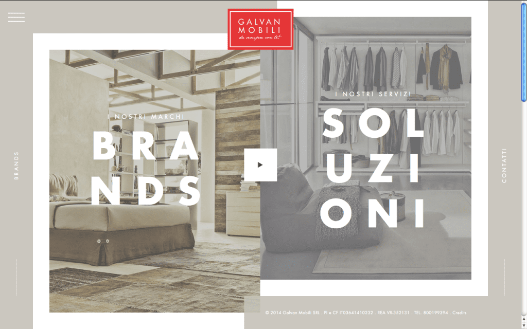
Source: Galvan Mobili
When used as a primary color, gray gives the impression of formality, which can easily become professionalism or tradition. This can backfire, though: use content and accompanying images to stave off the “gloomy” feel.
Beige
Accentuation of other colors
We’ll close with a special color, beige. It doesn’t have many properties of its own, but it makes the perfect sidekick to accent other dominant colors.
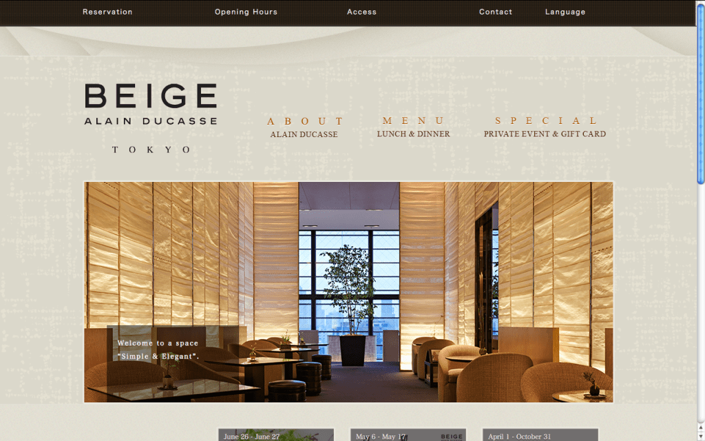
Source: Beige Alain Ducasse
While bland on its own, beige with enhance the characteristics of any color it’s paired with. It’s the perfect supporting color to keep attention on the primary color.
Conclusion
If you’ve found this post helpful, check out the free guide Web UI Design for the Human Eye.
Across 100 pages, we explain techniques for color, visual design, and interface design based on analyzing 33 case studies.


