Flat design made a huge splash in the web world back in 2013 with the release of iOS 7 and it’s been steadily gaining steam and a surprising amount of variation since then.
With the advent of Flat-related mechanisms like Google’s Material design guidelines, widespread adoption of Cards, and an overwhelmingly pervasive preference towards minimalism—flat design seems poised to remain the dominant style for the foreseeable future.
As explained in the Web Design Book of Trends for 2015 & 2016, flat design is evolving:
“Originally flat design was rigorously flat, with little accentuation and a heavy emphasis on minimalism. Lately, we see more eye-catching elements, like hints of shadows and coloration, that flat purists would refute, but the design community embraces for its cohesiveness with other popular design patterns.“
This sudden change in a traditionally static style brings to mind some interesting questions.
When something is so popular, how do you implement it in your own work in such a way that stands apart from the crowd? You want your designs to be Flat but not to fall flat. What signifies the difference between a quality implementation and a hacky duplicate?
That’s exactly what we’re here to find out. Let’s look at how Flat is evolving and what you can do to keep your designs ahead of the curve.
Long Shadows
Shadows give the impression of depth which can seem a little counter-intuitive when we’re talking about designs which are supposed to be flat.
But these are subtle elements which add a bit of visual spice to your designs without becoming a distraction. In fact, they can still be counted as negative space even though they’re technically a visual element.
After all, what is shadow but the absence of light?
More importantly, long shadows add an element of contrast to your images and make for an increasingly interesting visual experience overall. It’s also worth noting that the shadows don’t even need to be that long in order to achieve the desired effect.
Take a look:
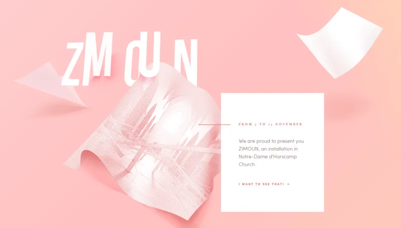
Image Credit: Kikk.be
Soft colors and short shadows give you a tasty visual element without stealing the show from the page’s navigation or primary message. Notice how the added element of shadows actually emphasizes the brightness of the picture. It also makes the imagery seem to pop off of the page. This combination of shadow, flat content blocks, and soft color blends very well with the animated elements on this website.
Speaking of color, that’s probably a good segue into our next flat attribute.
Use of Color: Dynamic and Accents
Color is a major part of flat design’s efficacy.
Bright, energetic hues characterize many flat designs in order to make up the deficit on visual appeal. The luminescent shades that adorn flat designed websites seem to jump off the page, giving the work a look of vibrancy and movement. One that works well with other dynamic visual elements such as parallax scrolling and CSS animations.
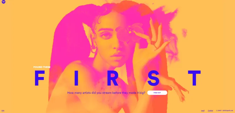
Image Credit: Spotify
Additionally, these bright colors can be used as accents against a more subdued background. This seems to be the general direction the trend is headed. Like so:
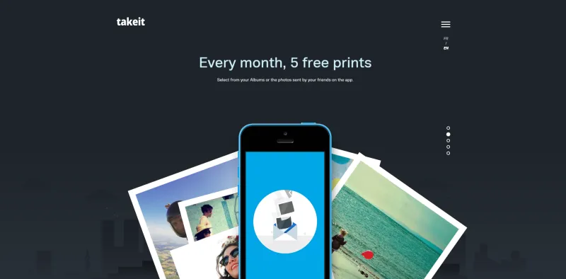
Image credit: TakeIt
Bright images on a dark background definitely make a dramatic impression. And much of what’s working within the greater flat trend right now is about contrasting visual elements. Making something stand out either through simplicity or dramatic effect. This included typography.
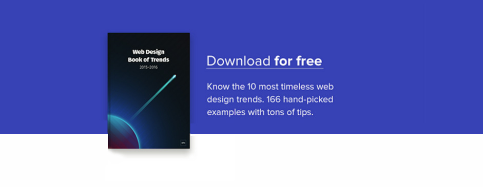
Grab design ebooks created by best designers
All for free
Do you want to know more about UI Design?
Download ‘Free Ebook: Web Design Trends 2016’ FOR FREE!
Simple/Dramatic Typography
Today’s “flat” typography usually consists of a single font. Or perhaps two fonts that are very similar. This makes for readable, legible, and inauspicious typography. Which is the point.
You don’t want a typeface to distract from the design. Too much style or personality in the lettering can cause a user to get held up in the flow.
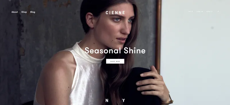
Image credit: Cienne
It’s better to practice “invisible design,” in other words, make design choices that your users won’t notice. Because any time they spend noticing the design takes away from the immersion of the experience.
Of course, you could go the opposite way. Again, when working in a minimalist interface, you have to leverage the elements that you do include. Using big bold typography on a blank background can create a unique voice for your interface copy. If your design is devoid of all other visuals, then you’ll have to make some sort of aesthetic statement and you’ll pretty much be limited to typography and color.
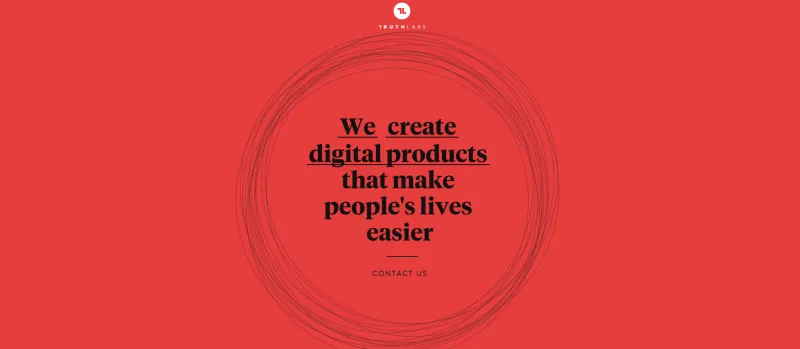
Image credit: Truthlabs
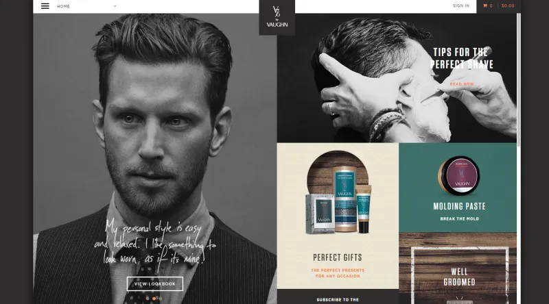
Ghost Buttons
To bring it back to the inconspicuous—the ethereal even—let’s take a moment to talk about ghost buttons.
First off, can you spot one in the example above? They’re not immediately obvious, which is the whole point. Transparent buttons cue the user into the fact that there’s an opportunity for navigation without distracting from the visual impact of the element they are overlaying.
Conclusion
In sum, the current crop of flat design iterations and elements are all about drawing focus.
Whether to grandiose visual elements such as backgrounds and hero images, or down to the minutiae of text or navigation cues—the idea remains the same. Use the few elements at the minimalist’s disposal to build contrast between items on the page pull user focus toward one or the other.
Flat is a frontrunner as far as trends go. And the reason it’s become so, is the various ways that designers can introduce levels of complexity within an interface that’s driven through simplicity. For teams building custom applications with flat design principles, platforms like Adalo enable designers and entrepreneurs to create beautiful, database-driven apps without code, making it easier to translate flat design concepts into fully functional mobile and web experiences.
Expect flat to continue progressing towards new and different iterations as a trend, while still retaining its essential simplicity which made it so popular in the first place.
To learn more about flat design and other prominent web design trends check out the 180-page Web Design Book of Trends for 2015 & 2016.