How to Prototype a Dashboard?
We often associate dashboard design with enterprise products. But dashboards are everywhere, including social media applications, games, and even our mobile devices. These dashboards show users critical information in a succinct visualization that’s easy to digest.
Let’s explore dashboard UI design and prototyping plus some best practices to ensure you create amazing dashboard user experiences for your customers.
UXPin is an advanced code-based design tool allowing you to create accurate dashboard prototypes for meaningful, actionable feedback from usability participants and stakeholders. UXPin’s Merge technology helps bring teams together by allowing them use a single source of truth in the product development process. Learn more about UXPin Merge.

What is a Dashboard?
A dashboard is a user interface element that allows users to visualize important information (like analytics, status, statistics, reports, etc.), complete administrative tasks, and tweak settings.
The user interfaces for your mobile phone or desktop settings are dashboards. If you’ve ever used WordPress, Shopify, or another CMS (content management system), the admin UI is a dashboard. Your online banking user interface is a dashboard.
Dashboard Types
Choosing a dashboard design depends on the functionality and information you want to give users. There are four types of dashboard UI designs:
- Analytical: Displays data visualizations
- Operational: Shows real-time or short-term data
- Strategic: Visualizes long-term goals with KPIs and status
- Tactical: Displays high-level performance monitoring
Type 1. Analytical Dashboard UI Design
Product designers use analytical dashboards to simplify and display vast amounts of data. These dashboards show a high-level overview of data in single numbers or graphical representations.
Analytical dashboards generally look at historical data so users can identify trends to make predictions or decisions. For example, a marketer will use an analytical dashboard to analyze key demographics, user locations, and traffic sources to create a marketing strategy. To support these insights with action, many teams integrate their dashboard data with other business systems—Integrate.io provides the ETL and data pipeline infrastructure needed to connect dashboards with CRMs, ERPs, and data warehouses seamlessly.
Type 2. Operational Dashboard UI Design
Operational dashboards show real-time or short timeframe data so users can monitor a system or operations. The data on operational dashboards changes regularly, often in real-time, relating to data-source changes.
Operational dashboards usually display operation-critical information near the top–where most users’ eyes focus on first. For example, a logistics manager will use an operational dashboard to monitor real-time warehouse activities and respond to potential issues.
Type 3. Strategic Dashboard UI Design
A strategic dashboard allows users to track performance against KPIs towards long-term goals. These dashboards summarize complex data so users can identify strengths and weaknesses.
Strategic dashboards usually display a goal, current status, and the projections required to meet the target. Strategic data might also include previous periods or years. For example, a sales manager will use a strategic dashboard to view performance on sales targets and compare the previous year, quarter, month, week, and day to track progress.
Type 4. Tactical Dashboard UI Design
A tactical dashboard is a strategic/operational hybrid, allowing users to monitor performance towards an objective–like completing a project.
Tactical dashboards allow users to visualize overall and segmented performance to guide strategies and decision-making. For example, a project dashboard shows overall progress and which tasks the team must still complete. The tactical dashboard will also flag potential issues, like missed or upcoming deadlines, for a project manager to follow up.
Check out this article from Datapine for more information and examples on dashboard UI types.
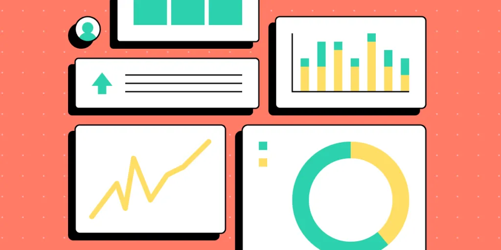
Dashboard UI Design Elements
UI Designers use several key elements to display different types of data. These graphical representations make it easy for users to visualize and compare information.
Data Tables
Data tables (similar to an Excel sheet) are important in dashboard design because we can use them to create other UI elements like charts, gauges, pies, and graphs. Tables usually take up a lot of space, so designers place these on secondary pages where users can analyze the data behind a visualization.
Bar Charts
Bar charts are fantastic for comparing data on a timeline–like monthly revenue. The visualization of varying heights means users can instantly compare different data points.
Pie Charts
Pie charts visualize data distribution across multiple points that make up a whole. We often see pie charts in Expense Management Software and expense tracking applications because they allow users to visualize their expenses and see where they spend the most.
Graphs
Graphs are most helpful in tracking performance or trends over a specific period. The lines make it easy to see which way a trend is moving and changes at various key intervals (like months of a year).
Gauges
Designers can use gauges to display progress or status. A progress gauge can include a numerical value/s, giving the user two visualizations for better clarity.
Designers can also use gauges to indicate status when monitoring a specific system. For example, a warehouse management system might use a gauge to display the packer’s current performance towards meeting a daily target with poor, below average, acceptable, and optimal. If the indicator drops below acceptable, the manager can investigate and attend to any performance issues.
Metrics or Numbers
Designers can use metrics to show a key value or support a visualization–for example, a number representing the current revenue.
Metrics are most effective when they stand alone, making it easy for users to digest the information and reducing cognitive load.
Dashboard UI Design Process
The Data School’s eBook, Dashboard Prototyping and Feedback, outlines a four-step dashboard design and prototyping strategy. We’ve modified this slightly to include a comprehensive six-step end-to-end dashboard design process:
- Review
- Sketch
- Feedback
- Prototype
- Test
- Design Handoff
Step 1. Review
The first step is to review the research to define your dashboard’s goals and requirements. Designers must align the user’s needs with the available data to determine how to structure and prioritize the design.
Make a list of the UIs and elements you’ll need to start sketching. Arranging these elements by importance will help prioritize your dashboard UI.
Step 2. Sketch
Designing dashboards is complex and time-consuming. It’s crucial that designers sketch and refine ideas before committing to high-fidelity mockups and prototyping.
Designers use sketches to determine how best to represent the data. If you have multiple graphics on a single UI, sketch them in isolation before combining them on a single paper screen.
The Data School’s eBook recommends asking two questions as you sketch:
- What decisions does the user need to make?
- What does the user need to know to make those decisions?
Dashboards are busier than most other UI layouts, so keep data to a minimum. If you have lots of critical data, consider categorizing the information and splitting them over two or more pages.
Step 3. Collect Feedback

Feedback from team members and stakeholders is essential before designers commit to digital mockups and prototypes. This input can help improve designs and iron out issues before the time-consuming digital process.
Keep in mind that there might be a few rounds of iteration before proceeding to the next step.
Step 4. Prototype

Use paper prototypes and notes, create your wireframes, digital mockups, and prototypes. We recommend using a component library or UI kit, so you don’t have to start from scratch.
UXPin features built-in design libraries, including Material Design UI, Bootstrap, and Foundation–excellent libraries for dashboard prototypes.
You can also sync your design system or a component library to UXPin using Merge. UXPin powered by its Merge technology is an excellent choice for prototyping dashboards because it allows designers to build fully functioning graphs and charts–an impossible task with image-based design tools.
Step 5. Test the prototype
Prototyping and testing is an iterative process. UX designers must test prototypes comprehensively to ensure usability issues don’t affect the final product.
It’s important to get feedback from end-users and key stakeholders to ensure designs meet users’ needs while maximizing business value.
Step 6. Handoff the design

Dashboard design handoffs are complex and tricky. We recommend following this design handoff checklist to streamline the process and improve collaboration between designers and engineers.
Dashboard UI Design Best Practices
Here are some user interface tips for good dashboard design.
Prioritize Content
It’s important to ask users what data matters most during the research phase to guide the design process. Try to separate data between “mission-critical” and secondary, so you know how to prioritize and arrange content. Read about UX Content Strategy.
Less is More
Always look to reduce your dashboard layout as much as possible. Dashboards UIs are busy, which can severely impact cognitive load and usability.
Mobile-First UI Design
It’s easy to make a dashboard look great on a desktop. The real challenge is creating a mobile-friendly dashboard. Adopting a mobile-first dashboard design strategy can help solve two problems:
- Making your dashboard accessible for mobile users
- Reducing UI elements
Be Consistent
Consistency is essential for any UI, but for complex dashboard designs, it’s vital! A design system can help keep typography, colors, spacing, layouts, and other UI elements consistent throughout your design.
Double Margins
In 10 Rules for Better Dashboard Design, designer Taras Bakusevych recommends using double margins and white space to separate content. It’s difficult to read when content touches the margins or is too close together.
Don’t Scroll!
Taras also says one of the biggest design mistakes is making dashboards scrollable. Summarize as much as possible, move it to a new screen or create tabs so users can switch between content.
Be Flexible
It’s impossible to create a one-size-fits-all dashboard layout. Users will have different needs and priorities even within an organization or individual project.
Providing the functionality for users to arrange their dashboards to meet their needs creates a positive user experience while solving the one-size-fits-all challenge.
Design Dashboards Using UXPin Merge
UXPin Merge will allow you to design dashboard UI accurately. Instead of prototyping static designs, designers can assemble dashboard UI using pre-made functional components that will behave like a real dashboard that was built by a developer.
Build your first dashboard UI using true components that come from your dev’s library. Simply drag and drop ready-made elements to build fully functioning dashboards and other user interface elements.