What is a Component Library, and Why Should You Use One for UI Development?
When optimizing development across many platforms, it’s wise to consider using a component library. By offering an accessible, open-source repository of production-ready, customizable, and reusable code components—like buttons and accordions—component libraries let UI and UX designers leverage faster development and growth.
Key takeaways:
- A component library is a set of pre-made, tested, and well-documented UI components that can be easily reused across the user interface of a product.
- It ensures that the product has a consistent look and feel and promotes efficiency and scalability.
- With component libraries, designers and developers can quickly add new features and pages while preserving the overall design consistency.
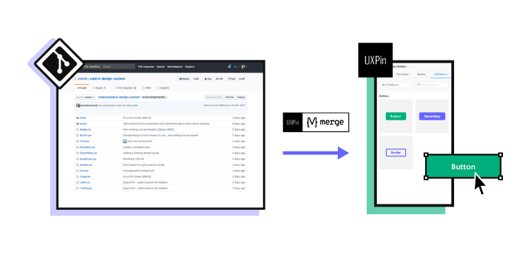
Share a single source of truth between designers and engineers. Use UXPin Merge to bring one of the component libraries to our design tool and use its elements to create interactive prototypes that can be easily passed to developers for production. Learn more about UXPin Merge.

What is a Component Library?
UI component library is a collection of pre-designed and pre-built user interface elements used to create user interfaces for digital products, such as websites and applications that have a unified look.
These libraries include a range of pre-made UI elements, such as buttons, forms, navigation menus, icons, and more, each designed with a consistent look and feel.
UI component libraries are particularly useful in collaborative design and development environments, as they help ensure that all team members are using the same source of truth and that the end product maintains a professional and polished appearance.
Component Library Can Offer a Single Source of Truth
Component library can reduce the risk of any variation between products, or ending up with different components in different places. They handle the source code for UI elements and usually leverage CSS and JavaScript.
React is a prime example of a popular open-source framework, developed by Facebook as a component library but since grown into a large ecosystem for creating apps, static sites, and desktop applications.

There are many more advantages of using a component library that are worth highlighting:
- Accessibility: As a single repository for housing ready-made, reusable components, a component library offers quick access to developers and designers everywhere. This improves collaboration and communication between developers and designers working across teams.
- Reduced code duplication: Often, code gets duplicated across varying designs and projects. But with a component library, there’s no need to convert every pixel to code. Instead, you can use already coded components with no further development.
- Consistency: Promoting a single source of truth is more likely with a component library. By enabling consistent UI and UX across entire projects, it’s easier to achieve uniformity. And this is a key advantage that makes you work faster and more efficiently.
- Speed: By avoiding building from the bottom up, teams save time. Instead of recreating or designing a calendar, it’s already there to use. Plus, thanks to a set of ready-made, pre-set components, teams can avoid any drawn-out, time-draining decision-making processes they may have once faced.
- Compatibility: Frontend developers can struggle with ensuring cross-browser and cross-device compatibility. But a component library will go a long way to avoiding incompatibility through standardization.
When Is It Best to Use a Component Library?
There are some particular situations where a component library can add measurable value to a project. So let’s look at what they are:
Code-first prototyping
Projects that focus on functionality over visual design are more likely to benefit from a component library. Plus, prototyping with code is more efficient than starting with images and then converting them into code. So rather than expecting developers to interpret image-based designs and then create the codes, they simply take the code component from the ready-made design.
This also opens up the chance for developers to design with pre-built components without worrying about any lack of design skills.
When you lack the skills or experience to build your own
Creating your own component library or developing one as part of your own enterprise design system may be your dream. But this may not be a reality when your team lacks experience in building reusable UI components or you’re working to tight project deadlines.
Instead, integrated component libraries provide all the code components designers and developers need to test functionality, usability, and design before conversion to digital products.
If you’re a smaller company or team
Startups and small or medium-sized businesses may need to be more careful with financial resources. And with a wide range of effective, versatile, open-source component libraries around, smaller companies can set themselves up to scale, step by step. After all, no industry giant got there overnight. And many of them continue to stick with their original component library throughout their evolution.
There Are Some Exceptional Tools Available to Help You Scale
If it’s not yet clear how you’ll benefit from a component library, then here are some questions that could prompt your thinking:
- Do you see developers building the same components for each project but with slight variations?
- Are any developers confused about which UI or UX convention they should use in interfaces?
- Do you need to release updates and changes fast?
- Do you need a lot of customization?
- Are you looking for a combined design system and component library?
If the answer to any of these questions is yes, then consider one of the tools below.
1. Merge Component Manager
Merge Component Manager is a design operations tool for managing React UI components in UXPin. You can bring your own component library and use Component Manager to manage component’s properties. It’s perfect for those of you who lack active development support.
Once you upload UI components, you can use them to design UI in UXPin. The components have their full interactivity in UXPin since they’re coded in React.
2. Merge npm integration
One of the ways to bring UI components from your component library to UXPin is through NPM package integration. All you need to import the components is a library name. Then, you would use Merge Component Manager to set up props and write desicriptions, etc. Read more about npm integration.
3. Merge Storybook integration
Storybook is an open-source tool for developing UI components in 15 different frameworks, among others the most popular ones: React, Vue, and Angular. It’s a combined coded design system and component library that acts as a sandbox for effective components and page development, testing, and documentation. Your developers can take a more effective component-driven approach over a visual one.
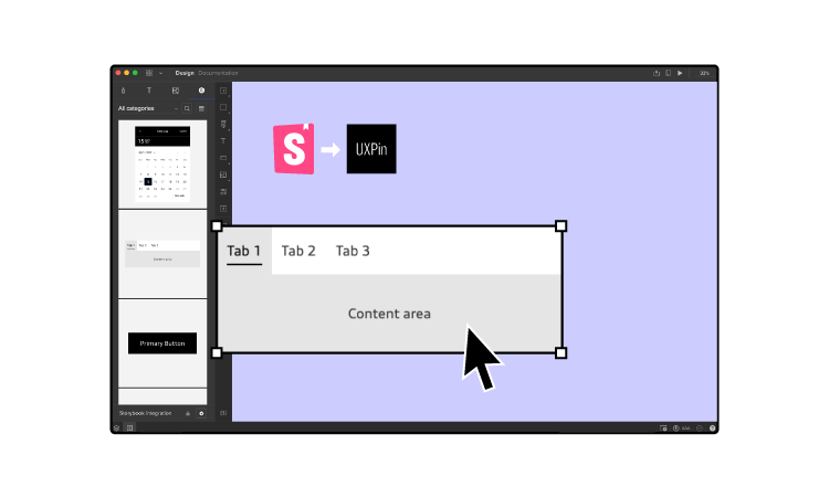
As Storybook is used by developers, there’s an integration with UXPin that can help you with designing as well. With UXPin Merge technology, you can sync any Storybook with UXPin editor to design with code components. The fully functional UI elements will show up in one of the UXPin libraries so that you have access to them right away.
Be the First to Design with Code Using Innovative Merge technology
Component libraries offer the chance to standardize development, reduce code duplications, improve collaboration between teams, and drive scalability. And with so much influence over your project deliverable and team motivation, it’s important to choose the right solution for your needs.
But if you’re looking to improve design consistency and development productivity, UXPin’s Merge technology offers a unique point of integration with Storybook, as well as its own tool, Merge Component Manager for managing components in design. Discover more about UXPin Merge.


