
Overview
A UI design system keeps your product design organized and consistent. Here’s how to create one for your next project.
- UI design systems help you establish consistent design across your product. This consistent design is crucial for user experience and SEO. You won’t have an effective product without a good component design.
- Effective component design starts with gathering market research and inspiration. Start with a mood board and let everything else branch off from there. Establish consistent elements including a color palette, type scale, icons, and forms.
The world of web design allows for more creativity than ever. Long gone are the days of static pages with neon fonts and background music. Evolving technology means web design can include so much more than previously imagined. It also means that design can be more complex than ever. Keeping your component design consistent can be a challenge. That’s where UI systems come in. Read on to learn how to design components to be uniform across the whole of your product.
Guide to building a UI design system
- Overview
- What is a component design system?
- Why do you need a component design system?
- Creating a component design system
- Mood Board
- Color palette
- Shadows
- Type scale
- Icons
- Buttons, sliders, forms, and other components
What is a component design system?
A component design system is a reference point for certain design standards that you’ve decided on prior to or while putting your product together. Think of it as a visual style guide, or an inventory for design components. This will include your color palette, type scale, icons, buttons, and any other design elements the product uses (more on each of these components and more below).
What’s the point? Having these elements in one place will make it easier for you to keep your design consistent. You’ll know exactly what color your buttons are supposed to have, the general style of your icons, your font sizes and style, and so on. UI systems eliminate the guesswork when adding future pages and features to your product.
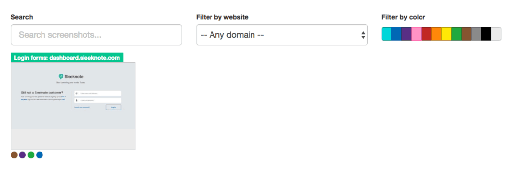
To get a better idea of what this looks like, take a look at some UI design systems from recognizable brands and our free repository of available design systems and pattern libraries – Adele.
Why do you need a component design system?
There are a number of reasons why a component design system is necessary, and a number of ways poor design can hurt you.
A well-designed website doesn’t just look good. It reads well and gets your message across with intuitive navigation. Your product, whether a website or an application, becomes the user’s first impression of your brand. Consistent design is the key to an intuitive design, as the user can get a good grasp of where to navigate, how buttons look, what an error looks like, and so on.
Ux-optimized design can also make or break your product’s visibility. SEO best practices may seem like a moving target, but today’s tactics are much more involved than the keyword stuffing of yesterday. Design and accessibility play big roles in SERP rankings, so if your product delivers a poor user experience, search engines will not look favorably upon it.
Creating a component design system
Building your own UI system isn’t something to be taken lightly. It’s a process that takes a lot of time and dedication. But it’ll be worth it when you have a consistent, high-quality design for your product. So don’t rush! You’re taking crucial planning steps for your product’s brand.
Mood board
Your first step to planning your component design should be constructing a mood board. Here’s where you gather images of anything that inspires your intended design. That can include current design trends, inspirational images, thematic graphics, and so on.

You’re essentially putting together a private Pinterest board. Once you have enough “pins,” you’ll be able to step back and see some common threads between them. And with these common threads, you can decide on components like colors, lines, and icons.
Color palette
Your product’s color palette should be based on your mood board and research into your product or service. For example, if your industry has anything to do with water (boats, sailing, fishing, conservation, etc), it may not make sense for you to have a palette with primarily warm colors. And the images you’ve gathered on your mood board would likely steer you in the direction of greens, blues, and purples.

But color palettes in UI design systems are more complex than that. You’ll want to decide on primary, secondary, and tertiary colors, as well as colors that indicate success or failure for relevant fields. (These will relate to your buttons and forms, described below.)
You’ll want a basic understanding of color theory to make an eye-catching color palette. This means understanding value, saturation, and color schemes. You’ll also need to decide how often to use each color, using primary colors and accents often enough to convey their importance. There’s a 60-30-10 rule that’s generally recommended for this purpose: your primary color gets used 60% of the time, secondary color 30%, and accents 10%.
Read more about choosing a color palette.
Shadows
With all our technological advancements, computer screens are still two-dimensional. But that doesn’t mean you can’t add some depth and perspective to your design, and it’s definitely something to consider. The use of shadow is a trending design element lately, and with good reason. Strategic use of shadows with your design components is an effective yet subtle way to add emphasis and draw the eye. Just make sure to keep these shadows consistent with direction, depth, and strength.
Type scale
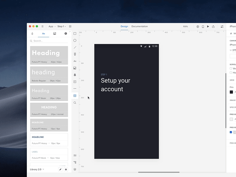
When it comes to your text, you want to make sure the font stays consistent and legible. But you also want to pay attention to the scaling of your text and headers so that everything looks uniform. If your H2 on the homepage looks different from an H2 on your contact page, that’s not a good look. You also want to avoid your H2s looking too close in size to H1s or H3s. A standardized type scale helps with this by establishing uniform sizes and formats for your body text, headings, links, and so on.
If you need help establishing a type scale, there’s a free-to-use type scale online.
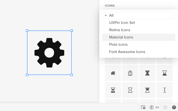
Icons
Keep your icons simple and uniform. Since they’re small by nature, too much detail can get lost. Inconsistent design with your icons will only look sloppy. There are free icon set packs available online if you have trouble nailing down a design but to make things much easier for you, we have ready-to-use icon library in UXPin.
Buttons, sliders, forms, and other components
These are vital parts of your UI design, as these are the elements that your users will interact with the most. They must stand out and be identifiable, and their purpose should be obvious.
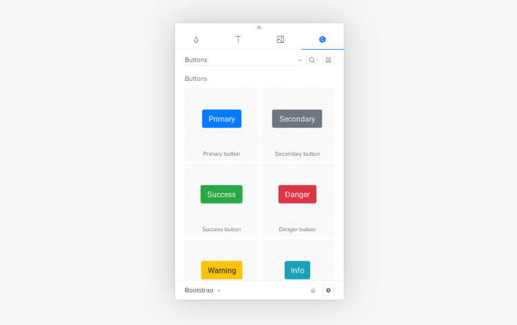
Buttons are like icons in the sense that simple design is best, and consistency across buttons is a must. This doesn’t mean button design has to be boring – there’s plenty of room to play around with the look of your standard buttons and radio buttons! If you need inspiration or want to add ready-to-use components to your design, you can find a ready library in UXPin with Material Design patterns.
Keep your other components like navigation drop-downs and text fields visible without crowding the rest of your design. This is where your color palette and shadows can come into play.
Still working on that perfect design? Join the platform used by the best designers on the planet. UXPin helps you design and manage your whole UI project with one tool. Join for free now and get started without a credit card.