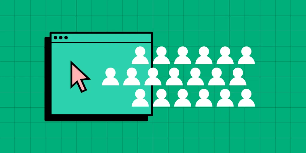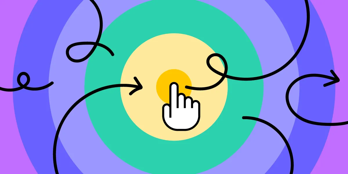
Interaction design (IxD) is one of the most critical disciplines within user experience design — and one of the most misunderstood. It determines how a digital product responds to every user action — a tap, a scroll, a swipe, a voice command — making the interface feel alive, intuitive, and human. In an era of AI-generated UIs, understanding interaction design principles matters more than ever: someone still needs to refine how the product behaves.
Key takeaways:
- Interaction design (IxD) focuses on behavior and response — what happens when a user interacts with a product.
- Core principles include visibility, feedback, constraints, mapping, consistency, and affordance.
- IxD is a specialized discipline within UX design, distinct from (but closely related to) visual UI design.
- Tools that support states, conditional logic, and real interactivity — like UXPin — let interaction designers prototype without writing code.
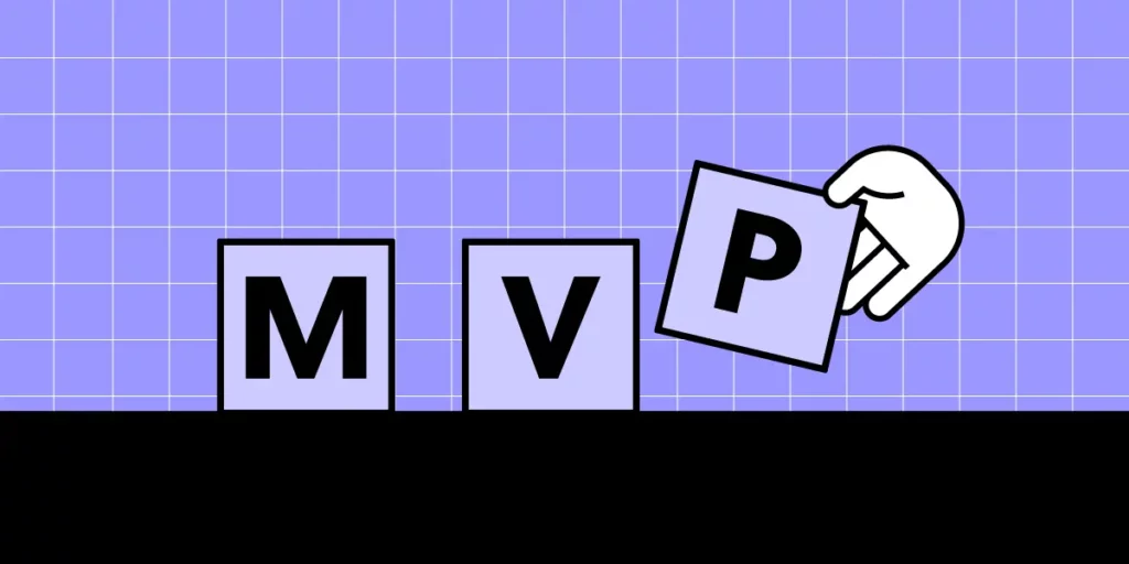
- AI tools handle the first 80 % of layout work; interaction designers refine the critical last 20 %.

What Is Interaction Design?
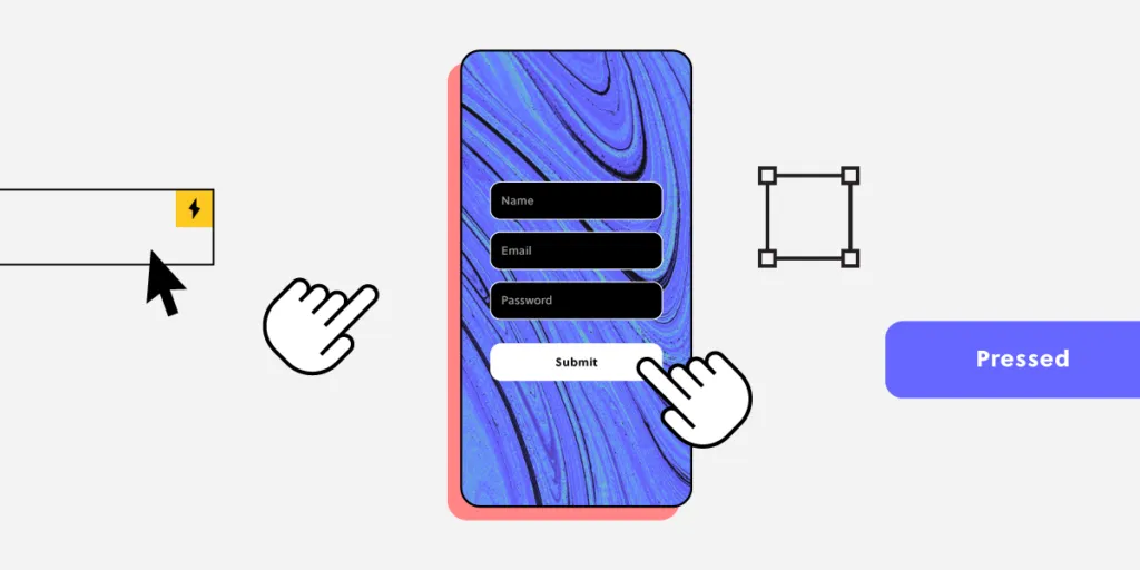
Interaction design (IxD) is the practice of designing how digital products respond to user actions. Every time a user taps a button and sees a loading spinner, hovers over a card and watches it lift, or swipes a list item to reveal a delete action, an interaction designer has shaped that moment.
The discipline uses interactive elements — transitions, micro-interactions, animations, haptic feedback, sound, and copy — to create a dialogue between the user and the system. The goal is to make that dialogue feel natural, predictable, and satisfying.
Good interaction design leads to:
- Greater product satisfaction and trust
- Faster learnability — users understand the product quickly
- Fewer errors and support requests
- Stronger emotional connection with the brand
- Higher retention and repeated use
Interaction Design in Human-Computer Interaction (HCI)
In the context of Human-Computer Interaction (HCI), interaction design is the bridge between human cognition and system behavior. It applies research from psychology, ergonomics, and cognitive science to ensure that digital interfaces are intuitive, responsive, and accessible.
HCI researchers study how people perceive, learn, and remember — interaction designers translate those findings into buttons that feel right, error messages that help, and flows that guide without frustrating.
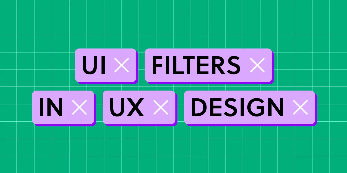
Interaction Design vs. UI Design
These two disciplines are closely related but distinct:
- Interaction design = behavior and motion. What happens when a user taps, scrolls, or hovers?
- UI design = visual aesthetics. What does the interface look like — colors, fonts, icons, layout?
In smaller teams, one designer often handles both. In larger organizations, the roles are separate, with interaction designers focusing on motion, states, and transitions while UI designers own the visual language.
Interaction Design vs. UX Design
Interaction design is a specialized discipline within UX design. UX designers look at the entire user journey — research, information architecture, content strategy, and overall satisfaction. Interaction designers zoom in on one crucial layer: how the product physically responds to each user action.
Think of it this way — UX design decides what the user should be able to do; interaction design decides how it feels when they do it.
Core Interaction Design Principles
The following principles draw heavily from Don Norman’s landmark book, The Design of Everyday Things. They remain the foundation of great IxD in 2026.
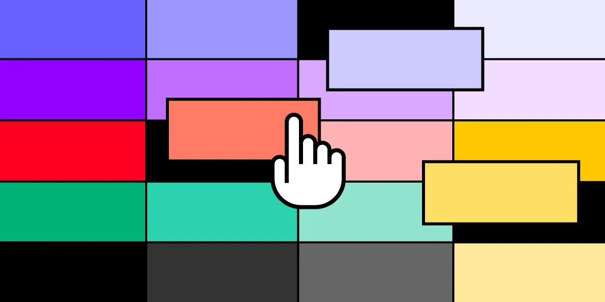
Visibility
The more visible an element is, the more likely a user is to discover and use it. Interaction designers must prioritize visibility based on user needs and business goals, especially on mobile where screen space is limited. Which links go in the bottom tab bar? Which get tucked behind a hamburger menu?
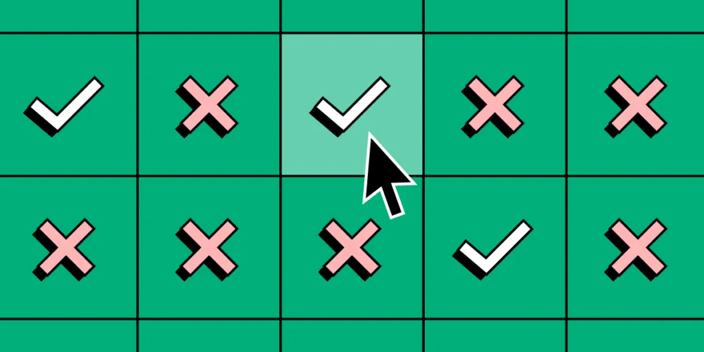
Feedback
Every user action should produce a perceivable response. Feedback can be visual (a button changes color), motion-based (a spinner appears), auditory (a click sound), or haptic (a vibration). Designers must also consider accessibility — how does the feedback reach users who rely on assistive technology?
Constraints
Good interaction design limits choices to prevent errors and guide users toward their goal. Landing pages are a classic example: by stripping away navigation and leaving only a single CTA button or form, designers constrain users toward conversion.
Mapping
Controls should have a clear, intuitive relationship with their effects. A volume slider that moves right for louder, up for higher — these mappings leverage real-world expectations. The more natural the mapping, the less users have to think.
Consistency
Consistency reduces the learning curve. The same action should produce the same result everywhere in the product, across all screen sizes and platforms. Many organizations build a design system or adopt an open-source component library to enforce consistency at scale. With UXPin Merge, teams can bring production React components directly into the design canvas, ensuring that the interactions designers prototype are identical to what developers ship.
Affordance
Affordance signals how an element should be used. A raised button affords tapping. An underlined, colored word affords clicking. A disabled button state tells users they need to complete a prerequisite before proceeding.
Cognition
Interaction designers need a working understanding of cognitive psychology to avoid overloading users’ mental resources. Key concepts include:
- Gestalt principles: how the brain groups visual elements into recognizable patterns.
- Hick’s Law: more choices = longer decision time. Keep options manageable.
- Fitts’s Law: larger, closer targets are faster to reach — critical for touch interfaces.
- The Principle of Least Effort: users gravitate toward the path requiring the least energy.
- Serial Position Effect: people remember the first and last items in a list best.
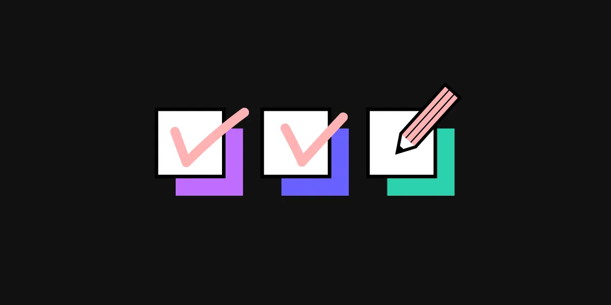
Interaction Design Checklist
Use this checklist (inspired by usability.gov and the IxD Checklist by Aaron Legaspi) when reviewing your designs:
- Define input methods: tap, swipe, long-press, keyboard, voice — what does each do?
- Provide pre-action clues: proper labels, distinct link colors, consistent clickable styles.
- Anticipate errors: prevent invalid states and provide clear, actionable error messages.
- Design feedback timing: how quickly does the system respond, and what does the user see while waiting?
- Scrutinize every element: is this the right pattern? Is there enough spacing between interactive targets?
- Simplify for learnability: use familiar patterns, minimize cognitive load, and reduce steps to completion.
What Do Interaction Designers Do?
An interaction designer’s day-to-day work spans several activities:
- Research user needs — conducting interviews, analyzing behavior data, and identifying pain points in existing interactions.
- Map user flows — designing step-by-step paths users take to complete tasks, ensuring each step is as efficient as possible.
- Design interactive elements — specifying how every button, form field, menu, and gesture behaves.
- Prototype and test — building interactive prototypes, running usability tests, and iterating based on feedback.
- Collaborate with developers — ensuring engineers understand exactly how each interaction should work, including edge cases and error states.
- Enforce consistency — maintaining coherent interaction patterns across the product via design systems and documentation.
- Balance user and business goals — designing interactions that serve both the user’s task and the organization’s conversion objectives.
UXPin — The Ultimate Interaction Design Tool
Traditional image-based design tools force interaction designers to create dozens of static frames to approximate basic behavior. UXPin takes a fundamentally different approach: it is powered by code, so prototypes can behave like the real product.
States
Create multiple states for a single component — default, hover, active, disabled, error — each with its own properties and triggers. Build complex patterns like carousels, accordions, and dropdown menus within a single component.
Interactions
UXPin Interactions provide triggers, actions, and animations far beyond what image-based tools offer. Conditional Interactions add “if-then” and “if-else” logic — no code required.
Variables
Variables capture user inputs and reuse them across the prototype — like displaying a personalized welcome message after an onboarding form.
Expressions
Expressions bring code-like functionality — form validation, shopping-cart calculations, and dynamic content — into the design canvas.
AI-Assisted Interaction Design with Forge
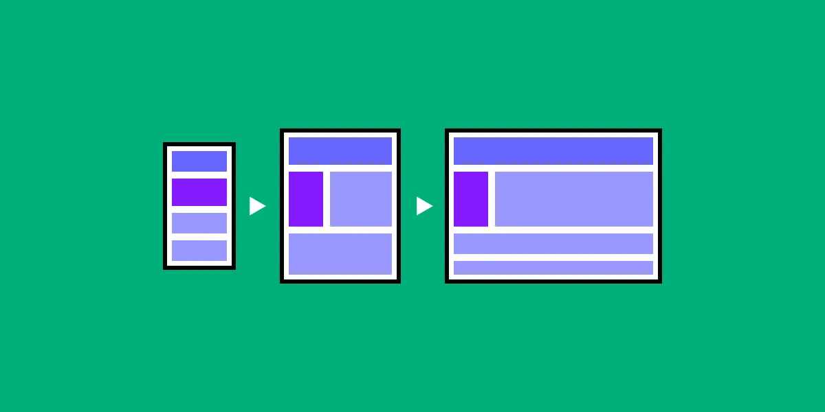
For teams looking to move even faster, UXPin Forge generates interactive layouts from a text description using your production component library. Forge handles the initial layout — roughly 80 % of the work — and interaction designers refine the remaining 20 %: fine-tuning micro-interactions, edge cases, and transitions with UXPin’s professional tooling.
Because Forge generates from real components rather than generic pixels, the output is already consistent with your design system and exports as production-ready JSX. Teams using Forge with Merge report 8.6× faster design-to-prototype cycles.
Ready to prototype interactions that feel real? Start a free UXPin trial today.
Interaction Design in the AI Era
AI design tools are changing how interaction designers work — but they are not replacing the discipline. Tools like UXPin Forge can generate interactive layouts from a text prompt, handling layout, component selection, and basic structure in seconds. But the nuanced work of interaction design — defining micro-interaction timing, crafting error recovery flows, designing for edge cases, and ensuring accessibility — still requires human expertise.
The practical workflow in 2026 looks like this:
- AI generates the first 80 % — Forge creates a working layout using your production React components, complete with proper structure and component logic.
- Interaction designers refine the last 20 % — Using UXPin’s States, Variables, Conditional Interactions, and Expressions, designers fine-tune every behavior: hover states, transition timing, validation logic, loading sequences, and gestural interactions.
- The output ships as code — Because both Forge and Merge work with real components, the result exports as production-ready JSX. The interactions designed on the canvas are the interactions users experience.
This workflow doesn’t diminish the role of interaction design — it elevates it. Designers spend less time on layout grunt work and more time on the behavioral details that separate good products from great ones.
Frequently Asked Questions About Interaction Design
What is interaction design?
Interaction design (IxD) is the discipline of designing how users interact with digital products. It focuses on creating meaningful responses — animations, transitions, micro-interactions, and state changes — that make human-to-computer interaction feel intuitive and satisfying.
What is the difference between interaction design and UI design?
Interaction design focuses on behavior — what happens when a user taps, swipes, or hovers. UI design focuses on aesthetics — colors, typography, icons, and layout. In practice the two disciplines overlap significantly, and in smaller teams one person often handles both.
What is the difference between interaction design and UX design?
Interaction design is a specialized sub-discipline within UX design. UX design covers the entire user experience — research, information architecture, content strategy, and overall satisfaction — while interaction design focuses specifically on how the product responds to user actions.
What are the core principles of interaction design?
The core principles, largely derived from Don Norman’s work, include: visibility (important elements are easy to find), feedback (the system responds to every action), constraints (limiting choices to prevent errors), mapping (controls match their effects intuitively), consistency (similar actions work the same way), and affordance (elements suggest how they should be used).
What tools do interaction designers use in 2026?
Interaction designers use prototyping tools that support states, animations, conditional logic, and real interactivity. UXPin is particularly well-suited because its code-based engine supports States, Variables, Expressions, and Conditional Interactions — allowing designers to build prototypes that behave like the final product without writing code.
How does AI change interaction design workflows?
AI tools like UXPin Forge generate interactive layouts from a text description, handling the initial structure quickly. Interaction designers then refine micro-interactions, transitions, and edge-case behaviors using professional design tools. The result ships as production-ready JSX, closing the handoff gap entirely.