Using a color contrast checker can make your designs more attractive and accessible to people with vision problems. Worldwide, about 300 million people have colorblindness. About 2.2 billion people have vision issues that could make it difficult for them to use your digital products.
Understanding the positive and negative effects of some color combinations will put you on the path to reaching more people with your web and app designs.

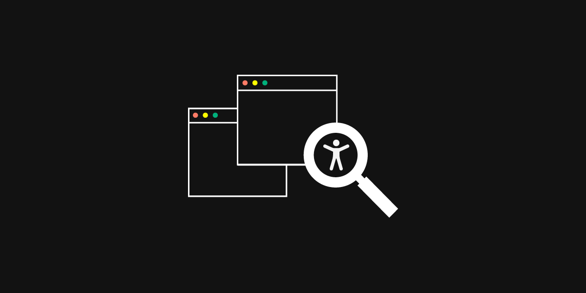
Why use color contrast in product UI?
A color contrast checker can make your digital products better in at least two important ways.
Follow WCAG 2 guidelines to make products more accessible
WCAG 2.1 (web content accessibility guidelines) and Success Criterion set rules you can follow to make your products more accessible to people with a broad range of vision impairments.
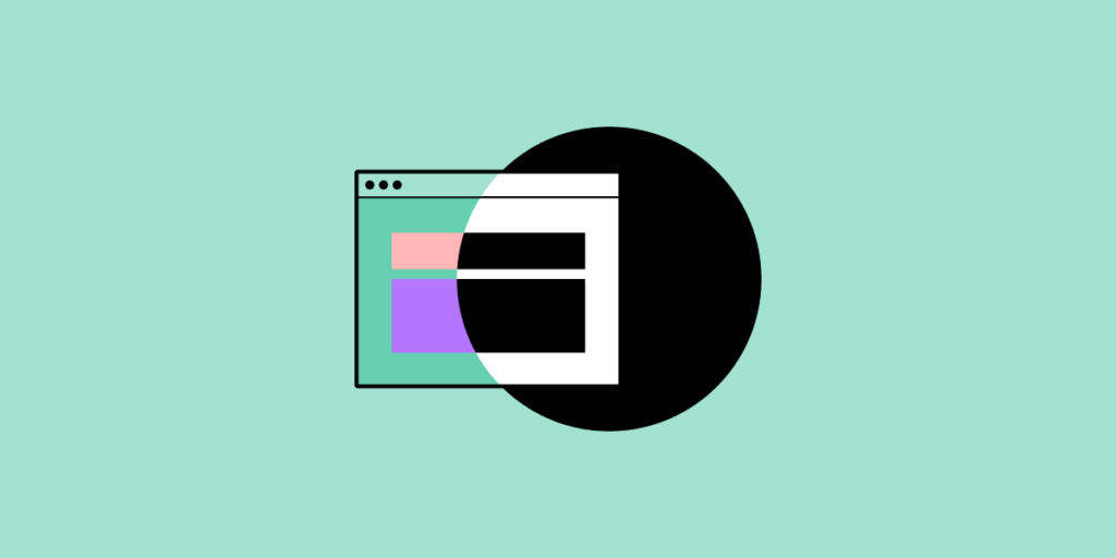
Using a background color that blends in with text color can make it impossible for some people to use your products. Colorblind people might also have difficulty seeing text and images when you select a color that they do not perceive as the larger population does.
Something as simple as picking a different color can help people recognize:
- User interface components
- Web page content
- Navigational menus
- Logos
A color picker that considers accessibility makes it much easier for you to create designs that more people can use. You can check your designs in our built-in color blindness simulator and contrast checker that comply with all the WCAG 2 guidelines.
You can learn more about the topic by reading Things every designer needs to know about accessibility. It explains some of the ways you can help users by using large text and other features.
Reach a broader audience with color contrast
When you make your designs more accessible, more people can use your products. Ethically, you want to include as many people as possible because everyone deserves to enjoy using the same products. Financially, you want to include more people because it helps grow your business’s revenue.
Using color contrast attracts more users, which can lead to higher advertising revenues and more sales. It makes sense from ethical and business perspectives.
Recommended reading: New e-book: Web UI Design for the Human Eye (Colors, Space, Contrast)
Know the three WCAG levels
WCAG has three levels. Aim to reach the highest level so you can make your designs as accessible as possible.
The following explanations only cover vision-based accessibility. You will need to think about other features before you can reach people with other accessibility restrictions.
Level A (Beginner)
The presentation doesn’t rely exclusively on color.
Level AA (Intermediate)
The color contrast ratio between the text and background color is at least 4.5 to 1.
The color contrast ratio between user interface components, graphics, and nearby colors is at least 3 to 1.
Text can double in size without losing function or context.
Level AAA (Advanced)
The color contrast ratio between your text and background is at least 7 to 1.
Color contrast checker tools to explore
If you don’t have any visual impairments that prevent you from distinguishing colors, you probably can’t identify whether you reach the minimum contrast unless you use a color contrast checker. The following tools can help you choose colors that improve accessibility for more people.
Colour Contrast Analyser (CCA)
Colour Contrast Analyser is a free tool that you can download to your computer. Enter the hex code, CSS color format, or use the color picker tool to get your contrast ratio and determine whether you pass AA or AAA standards.
Built-In Contrast Checker
See if your design tool has a built-in contrast checker to make it easier for you to evaluate the colors you used. At UXPin, you don’t need to search for plugins that will help you with that as it’s already there, in the editor.
Colour Contrast Check
Colour Contrast Check makes it easy for you to know whether your design is WCAG 2 AA or WCAG AAA compliant. Enter the hex value of your background and foreground colors. The results will give your contrast ratio and a simple “yes” or “no” regarding compliance.
Accessible Color Generator
Accessible Color Generator lets you enter a color by hex code or a color palette. It will analyze your color and give you a contrasting color that meets AA or AAA guidelines for small, large, or normal text sizes.
Color Laboratory
The Color Laboratory tool lets you choose colors to see how they look next to each other. It will also augment the colors you select so you can see them the way someone with colorblindness would. It can give you quite a bit of insight into how colorblind people experience your products.
Color Safe
Color Safe generates color palettes based on WCAG guidelines. Choose a color, your text size, and font family to get a color palette that complies with WCAG standards.
APCA Contrast Calculator
The APCA Contrast Calculator is a tool that stands out for giving you a simple and full font matrix version of its tool. If you just want to know whether your text size and color contrasts meet APCA standards, you can use the simple version. If you want to include more variables, try the full font matrix version.
Ensure proper color contrast with UXPin
UXPin lets you make prototypes that look and perform just like your final product. That way, you don’t have to worry about your color contrast changing between the prototyping and product release stages.
Try our 14-day trial to use the editor with a built-in contract checker and so much more! Sign up here. No credit card required!