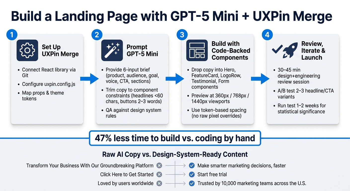
You can go from brief to a code-backed landing page in one workflow: use GPT-5 Mini for page structure and copy, then build the page in UXPin Merge with your team’s React components. That cuts rework, keeps design and engineering in the same system, and helps the final page match what ships.
Here’s the core idea in plain English:
- I use GPT-5 Mini to draft the page sections, headlines, CTA text, feature copy, and form labels.
- I use UXPin Merge to place that copy into production React components from a custom design system.
- I keep the page inside token, prop, and layout rules, so the prototype stays close to the shipped version.
- I review the page with design and engineering in one place, then test copy options without changing the layout.
- One cited study says a simple form page built with a design system took 47% less time than coding it by hand.
What matters most: this is not about making a static mockup faster. It’s about using AI for the draft, then using your design system as the limit for what goes live.
In short, I’d describe the process like this:
- Set up Merge with your React library.
- Prompt GPT-5 Mini with your product brief and page goals.
- Trim the copy to fit component limits like character count, states, and labels.
- Assemble the page with code-backed hero, cards, logos, testimonials, and form components.
- Review and test headline and CTA variants in the same structure.
If you want a landing page that is faster to approve, easier to build, and closer to production from the start, this workflow is the point of the article.
How to Build a Landing Page with GPT-5 Mini & UXPin Merge: 4-Step Workflow
UXPin Merge AI: Smarter UI Generation That Follows Your Design System
sbb-itb-f6354c6
Step 1: Prepare your design system for UXPin Merge
Before you open UXPin and start dropping components onto the canvas, your React library needs to be clean and ready. That’s what lets designers use production components directly instead of rebuilding them from scratch.
Connect a custom React library and configure Merge
Keep your library in Git, use a supported Node.js LTS version, and manage packages with npm or Yarn. It also helps to group components by section type so the library stays easy to browse.
The uxpin.config.js file tells Merge which components to load. Use glob patterns to bring in the pieces you want while leaving out tests and internal utilities:
module.exports = { components: { path: './src/components/**/*.tsx', ignore: ['**/*.test.tsx', '**/internal/**'] } }; Keep this config in the same repo and review it the same way you review product code. Run the UXPin CLI in CI on every merge to main. Each merge to main updates the library in UXPin automatically.
Once Merge can read the library, you can prompt GPT-5 Mini against actual component limits instead of starting from a blank page.
Map props, themes, and wrappers for design system control
Only expose the props designers need. That usually means things like text, variant, size, state, and link behavior.
For example:
- Expose button text as editable copy
- Expose
variantas a dropdown (primary,secondary,ghost) - Expose
sizeas a radio group - Expose state as a dropdown for normal, hover, disabled, and loading
- For links, expose
hrefand a booleanisExternalto control whether the link opens in a new tab
Use wrappers for shared providers, theme tokens, and global styles. Keep them lean and include only what the component needs to render.
When to use built-in libraries vs a custom system
Built-in libraries work well for quick prototyping. A custom Merge setup makes more sense when your production system already defines the brand, tokens, and components your team uses.
With the library connected, GPT-5 Mini can generate page sections that match the components and props you’ve exposed. Next, use GPT-5 Mini to draft the landing page structure and copy around those available components.
Step 2: Use GPT-5 Mini to generate landing page structure and copy
With your design system connected and components mapped in UXPin Merge, you’re ready to draft the page copy itself.
Write prompts that produce usable sections
GPT-5 Mini works best when you give it a short brief with six inputs: product description, target audience, primary page goal, brand voice, main CTA, and the sections you want on the page. The more specific the prompt, the less cleanup you’ll need later.
For example:
"B2B analytics platform for marketing teams in the U.S. Goal: drive demo requests. Brand voice: confident and clear. Primary CTA: ‘Schedule a demo.’ Sections needed: hero, 3-card feature grid, customer logos, pricing teaser starting at $29 per month, and a simple contact form."
Ask GPT-5 Mini to return discrete fields instead of full paragraphs. That way, each string can map cleanly to a Merge component prop like heroHeadline, heroSubheadline, primaryCTALabel, three feature card titles and descriptions, a trust signal metric, a pricing snippet, and form field labels such as First name, Work email, Company, Team size, and Role.
Then tighten the output so each field fits the limits of your design system.
Refine AI output to fit component constraints
Start with a constraint checklist based on your design system docs. Pull in limits from tokens, character counts, and component states, then add those limits to the first prompt or run a second pass to trim the copy.
A few examples make this easy:
- For hero headlines, add "under 60 characters"
- For feature cards, specify "1–2 sentences, fewer than 30 words"
- For button labels, keep them to 2–3 words and start with a verb, like "Start free trial", "Book a demo," or "View pricing"
- For form helper text, stay under 140 characters
For accessibility, be direct in the prompt:
Ensure all copy is at a 6th–8th grade reading level, follows U.S. English spelling, and makes button labels and form instructions screen-reader friendly.
For instance, error messages should be specific:
"Please enter a valid email address, such as name@company.com."
Once the copy fits your component rules, you can move it into Merge without manual cleanup.
Raw AI copy vs design-system-ready content
The goal isn’t just better wording. It’s copy that lines up with how your components and product language already work. Use the table below as a quick QA check before dropping content into Merge.
| Element | Raw GPT-5 Mini Output | Design-System-Ready Content |
|---|---|---|
| Hero headline | "Transform Your Business With Our Groundbreaking Platform" | "Make smarter marketing decisions, faster" |
| CTA button | "Click Here to Get Started" | "Start free trial" |
| Feature card title | "Unparalleled Real-Time Insights" | "Real-time campaign analytics" |
| Trust signal | "Loved by users worldwide" | "Trusted by 10,000 marketing teams across the U.S." |
| Form field labels | "Name", "Email", "Company Name", "Message" | "First name", "Work email", "Company", "Team size", "Role" |
Once refined, each string can drop into the matching Merge prop without rework.
Step 3: Assemble the page in UXPin Merge with code-backed components
Once the copy is mapped, drop each piece into the right component prop. Build the page with existing production components, not static mockups.
Build the hero and CTA section
Open your UXPin project that’s connected to your custom React library through Merge. Start with a predefined layout container like PageLayout, Grid, or Stack as the hero wrapper. That gives you spacing, width, and background styles from tokens right out of the gate.
Inside that container, add a Heading component and set its variant prop to h1 or Display, based on your system. Paste the refined GPT-5 Mini headline into the children or text prop. If the hero needs a visual, add an Image, Illustration, or Media component and bind it to either a placeholder or the final asset. Then place the subheadline in a Text or Subtitle component with a body or subtitle variant.
For the main CTA, use your Button or PrimaryButton component. Set variant="primary", connect the label prop to the approved copy, and set the click action in UXPin to move to a demo request screen or open a layer. Then test the built-in states to make sure it behaves the way you expect.
Add a feature grid, trust content, and lead form
Map each feature into a FeatureCard or IconTile prop. Place those inside a Grid container with breakpoint-aware column props like columns={{ sm: 1, md: 2, lg: 3 }} and a token-based gap="md". Stick to three to six cards so the section stays easy to scan.
Use the same setup for trust content. Add your system’s LogoRow or BrandStrip component for customer logos, then use a Testimonial component for quotes. Bind the quote, name, title, and company props to approved customer data. For the lead form, build it with TextField, Select, and Button components. Connect field labels, placeholder text, and helper copy to your GPT-refined strings. Use validationState="error" to check how error styling looks.
Keep the page aligned with tokens, responsiveness, and flows
Don’t override a token by hand. If a layout feels cramped, move the gap or padding prop to the next token step, like sm to md, instead of typing in a raw pixel value. For color, stick with semantic roles such as colorRole="primary" or surface, not hex codes.
For responsive checks, preview the prototype at common U.S. viewport sizes:
- 360×640 for mobile
- 768×1024 for tablet
- 1440×900 for desktop
Because these components are code-backed, the stacking and reflow you see in UXPin should closely match what ships to production. Then wire up a few simple interactions. Connect the hero CTA to a demo form screen, set the form’s submit button to show a thank-you state, and link any secondary CTAs to the right overlays. That gives stakeholders a chance to review the full experience before a single line of new code is written.
Once the layout is in place, review it with design and engineering before launch.
Step 4: Review, iterate, and prepare for production
Once the page is assembled, review it with design and engineering before launch.
Review with design and engineering using one source of truth
Have design and engineering review the same Merge prototype together. A focused 30–45 minute session tends to work well. The designer walks through the hero, feature grid, social proof, and lead form, while calling out standard components like Hero, CardGrid, Testimonial, and Form. The engineer checks that each component instance maps straight to an existing React component and prop set in the Git repo.
Use that review to confirm the page is ready for copy testing.
Because UXPin Merge connects straight to your codebase, designers can edit props and layout in the prototype, while engineers refine the underlying component definitions. Then, when engineers merge those changes in the repo, UXPin pulls in the updates automatically. Every page instance reflects the change.
Run fast content experiments without breaking the system
If the base layout gets approved, test copy variations next. Use GPT-5 Mini to generate two or three headline or CTA options. Keep the prompt tight. For example:
"Write 3 hero headlines under 60 characters for a B2B SaaS audience, with matching subheadlines under 140 characters."
Then swap the copy into the same component props – headline, primaryCtaLabel, and subheadline – and duplicate the UXPin page for each version. Name them clearly, like Landing – Hero Variant A and Landing – Hero Variant B.
Only the copy changes. The layout, tokens, and components stay fixed. That lets developers implement each version by injecting new copy into the same React structure. No rework. No rogue styling.
Run the test for at least 1–2 weeks to reach statistical significance. Then move the winning version back to the main page and archive the rest.
Conclusion: From AI-generated ideas to a deployable landing page
This workflow gives product teams a repeatable way to go from an AI draft to a production-ready landing page.
FAQs
Do I need coding skills to use UXPin Merge with GPT-5 Mini?
Not always. If your team uses a pre-integrated library like MUI or Ant Design, you can drag and drop ready-made components onto the canvas with no code.
If your team uses a custom design system, developers need to set up and maintain the integration. That includes connecting the library and mapping tokens and properties. Once that’s in place, you can build interfaces in UXPin by adjusting component properties instead of writing code.
How do I keep AI-generated copy within my design system rules?
Map the prompt to your component props as directly as you can. If a card has a title, description, and ctaLabel, ask for those fields by name. That keeps the model focused and cuts down on copy that looks fine in a doc but breaks once it hits the UI.
Set hard character limits for every text field. This matters a lot when you’re working with fixed-width cards, buttons, badges, or mobile layouts. A short limit helps prevent overflow, ugly wraps, and last-minute edits in design review.
Use a dedicated constraints block in the prompt. Spell out that the model must not invent new UI elements, colors, design tokens, or extra states that don’t exist in the system. If your interface only supports certain props, say so plainly.
Ask for structured output like JSON so the response can plug into production-ready component props with less cleanup. For example:
{ "title": "Up to 40 characters", "description": "Up to 120 characters", "ctaLabel": "Up to 20 characters" } That kind of structure makes handoff much smoother. Engineers know where each string goes, and content teams can review copy in the same shape the product uses.
What components should I prepare before building the landing page?
Start with a React-based component library that lives in a Git-backed repo. That gives you one source of truth, clear change history, and a setup your team can work on without stepping on each other.
Define your design tokens first. Put colors, type styles, spacing, border radius, shadows, and breakpoints in a machine-readable format like JSON or TypeScript. That way, your styles aren’t scattered across files. They’re stored in one place and easy to reuse.
Then connect your components to the main parts of the landing page:
- Navbar
- Hero
- Features
- Pricing
- Footer
Each component should do one job well. Keep the API tight. Expose only the props people will need, use clear prop names, and set sane defaults so the component works out of the box.
Think of it like this: the less guesswork a developer has, the easier the system is to use.

