You can go from prompt to a code-backed landing page without doing the same work twice. I’d use Claude Sonnet 4.5 to draft section copy and MUI component mapping, then place those parts in UXPin Merge so design and React stay aligned from day one.
Here’s the short version:
- I’d keep the page to 4 sections: hero, feature grid, CTA, and lead form
- I’d give Claude a strict MUI component whitelist
- I’d ask for JSON output tied to props like
variant,color, andxs={12} md={6} - I’d build the page in UXPin Merge using actual MUI components
- I’d test breakpoints at 375 px, 768 px, and 1,440 px
- I’d check copy, design tokens, spacing, form states, and handoff specs before review
In other words: instead of writing copy in one place, mocking up in another, and rebuilding in React later, I’d use one flow that keeps structure, props, and layout in sync.
A few details stand out:
- Claude is used for copy + layout guidance
- MUI provides parts like
Container,Grid,Card,Typography,Button, andTextField - UXPin Merge lets me assemble the page with those same React-backed parts
- US rules matter, so I’d keep formats like $29/month, 07/12/2026, and 1,250 users
That matters because landing pages often fail in handoff, not in concept. Teams lose time when spacing, variants, and section logic drift between design and code.
I also like that the article stays practical. It doesn’t ask Claude for vague “marketing copy.” It tells the model exactly what to return, such as:
- a hero headline under 60 characters
- 4 feature cards
- form field labels, types, helper text, and required states
- a
used_componentsarray to catch off-list parts before build
One useful point: the page’s responsive behavior is set with MUI breakpoints, so the same layout logic can carry into production.
If I were summarizing the article in one sentence, it would be this: use Claude to plan the page, use MUI to define the parts, and use UXPin Merge to build a prototype that maps straight to React.
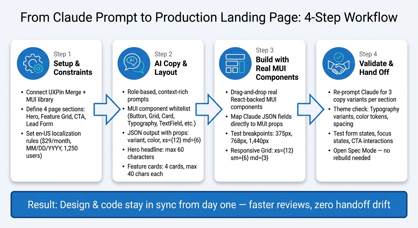
From Claude Prompt to Production Landing Page: 4-Step Workflow
Design To React Code Components
sbb-itb-f6354c6
Step 1: Set up UXPin Merge, MUI, and your landing page constraints
Before you prompt Claude or drop a single component onto the canvas, make sure two things are in place: access to a Merge-enabled UXPin account and a clear plan for how the page will be built.
Use MUI inside UXPin Merge
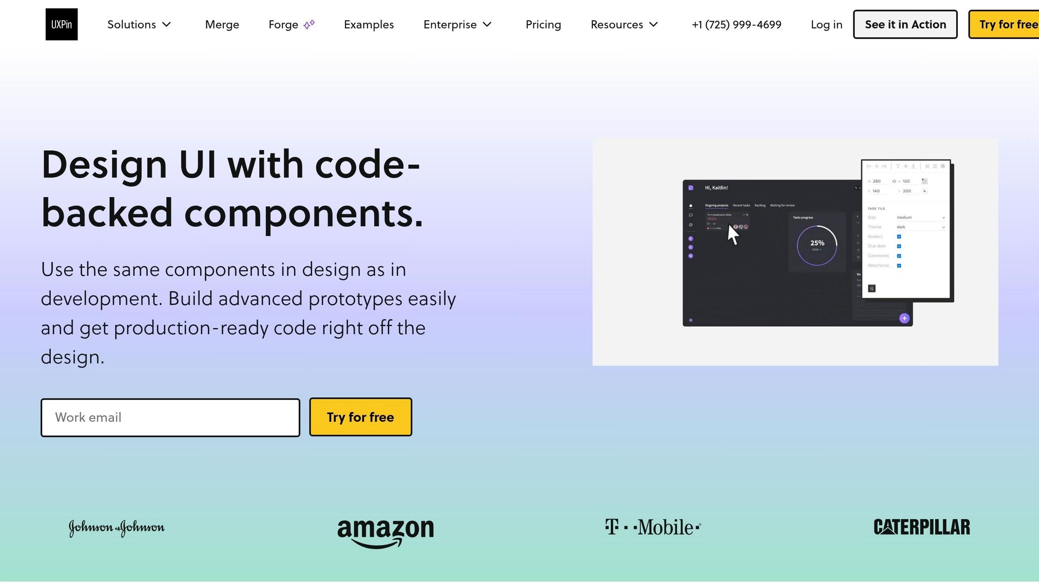
Merge’s Libraries panel includes MUI components backed by React code. That means you can place components on the canvas and edit props like variant, color, and size right there or personalize MUI components to fit your brand.
If your team uses a custom MUI system, sync your repo through Merge so the prototype uses the same components your team ships in production.
For early layout work, start with the built-in library. Once the page structure is in place, switch over to your synced library.
After the component source is locked, set the content rules Claude needs to follow.
Define the page structure and US localization rules
Decide on your page sections and content rules before you open Claude. Keep the scope tight: four sections only.
- Hero
- Feature grid
- CTA
- Lead form
Pass those in as clear constraints so the model doesn’t generate UI you won’t use.
Do the same for your en-US localization rules. Be explicit:
- Format pricing with the dollar sign first:
$29/month - Write dates as
MM/DD/YYYY, like07/12/2026 - Use commas for thousand separators:
1,250 users - Stick to American spelling: color, customize, optimize
- Use US-friendly CTA labels: "Book a demo", "Start free trial," or "Contact sales."
Feed these rules into Claude now, not later. That way, its copy and layout will fit your MUI components without extra cleanup.
These constraints become the prompt input for Step 2.
Step 2: Prompt Claude Sonnet 4.5 for copy, layout, and MUI component guidance
With the constraints from Step 1 set, open Claude. The aim here is NOT generic marketing copy. You want output that fits straight into your MUI component structure in UXPin Merge with little cleanup. Use the section map and locale rules from Step 1 as the base for your prompt.
Write prompts that map content to MUI sections
Prompt Claude like a UX writer working inside your MUI component set. Don’t ask for “a hero section” in loose terms. Tell Claude which MUI components to use and how the output should be shaped.
Start with a role-based, context-rich prompt that covers four things: what the product does, who it’s for, the page goal, and the MUI components allowed. Here’s a working example for a B2B SaaS data observability platform:
"Act as a UX writer and front-end designer helping build a B2B SaaS landing page in UXPin Merge using MUI. Our product is a data observability platform for US-based engineering teams. The primary goal is to drive demo requests. Using only the following MUI components: Container, Grid, Card, Typography, Button, TextField, Box, Stack, define the content and layout for: hero, feature_grid, primary_cta, lead_form. For each section, provide copy and recommended MUI components and props. Follow the en-US rules from Step 1. Return your answer as JSON."
For the hero, tie each piece of copy to a component and prop. Ask Claude to return hero_title for Typography variant="h2" align="left", hero_subtitle for Typography variant="subtitle1" color="text.secondary", and two CTA labels: one for Button variant="contained" color="primary" and one for Button variant="outlined" color="primary". Return the hero copy and component props in JSON. Keep the headline under 60 characters so it displays cleanly at all breakpoints.
For the feature grid, ask for four cards, each with:
- a
title(max 40 characters,Typography variant="h6") - a
description(1–2 sentences,Typography variant="body2") - a
benefit_tag(Typography variant="caption")
Also ask Claude to suggest a responsive Grid layout: Grid container spacing={3} with Grid item xs={12} md={6}.
For the lead form, use U.S.-formatted examples for phone, price, and date fields. Ask each TextField to include name, label, type, required, and helperText, plus suggested props: fullWidth, size="small", margin="normal", variant="outlined".
Limit Claude output to your approved component set
A component whitelist keeps Claude inside the MUI set you’ve shipped. Without it, Claude may suggest components like Accordion or Alert that aren’t in your synced Merge library. That means extra work for both design and dev.
Paste your approved component list at the top of every session: Button, Typography, Card, Grid, Container, Box, Stack, TextField, Chip.
Then add a token dictionary: colors like color.primary.main and color.text.secondary, spacing values like spacing.2 and spacing.4, and typography variants from h2 through body1.
Tell Claude plainly: "Do not invent new components or tokens. If you would normally use something outside this list, map it to the closest approved component instead."
To check compliance, ask Claude to include a used_components array at the end of each section. That makes it easy to spot anything that slipped through before you start building in UXPin Merge.
Once Claude returns structured JSON, build the page in Merge with real MUI components.
Step 3: Build the landing page in UXPin Merge with real MUI components
Take Claude’s output and build the page straight in Merge. The key idea is simple: use the JSON fields from Claude to fill each MUI prop.
Assemble the hero, feature grid, and CTA
Start by dragging a Container onto the canvas. Set maxWidth="lg" and sx={{ py: 8 }}. Inside that, add a Box with display="flex" and flexDirection="column" to act as your layout frame.
For the hero section, create a two-column Grid container with spacing={4} and alignItems="center". In the left Grid item xs={12} md={6}, paste Claude’s headline into Typography variant="h2", the subheading into variant="subtitle1", and add a short trust note in Typography variant="body2".
Place your main Button with variant="contained" color="primary" and a second Button with variant="outlined" right below it. Use a Stack with direction="row" and spacing={2} so the buttons sit neatly side by side. In the right Grid item xs={12} md={6}, add a product screenshot or illustration with a Box or Card.
After the hero is done, use the same component mapping for the feature cards. Create another Grid container with spacing={4} and justifyContent="center". Add four Grid items set to xs={12} md={3}, each with a Card inside.
Map Claude’s output straight into the props:
Typography variant="h6"for the feature titlevariant="body2"for the descriptionvariant="subtitle2"for short benefit tags
Update the copy right in the component props. If you need more features, duplicate a Card. That keeps the setup clean, and developers still get the same MUI Card with matching props.
For the CTA band, wrap the section in a Box with bgcolor: 'primary.main' and py: 6. Use Typography variant="h4" in white for the headline and variant="body1" for the supporting copy. Then place the main Button with variant="contained" color="secondary" and a second Button with variant="text" inside a Stack set to direction={{ xs: 'column', sm: 'row' }} and spacing={2}.
Add a lead form and responsive layout behavior
After the CTA, finish with the form users will use. Build the lead capture area inside a dedicated Card or Container. Add a Grid container with spacing={2} to arrange the TextField components: Work email with type="email" and placeholder jane.doe@example.com, Full name, Company, and Team size.
Set fullWidth={true} on each field so they stack cleanly on mobile. Add required and helperText props right in the props panel. For example: We'll never share your email. For consent, add a Typography variant="body2" line with your compliance copy. End the section with a main Button using variant="contained" color="primary" and the label Get demo access.
Responsive behavior comes from MUI breakpoint props, which you set right in UXPin’s inspector. Set hero image columns to xs={12} md={6}, feature cards to xs={12} sm={6} md={3}, and use sx={{ px: { xs: 2, md: 4 }, py: { xs: 4, md: 8 } }} on section wrappers.
Test the page at 375 px for small phones, 768 px for tablets, and 1,440 px for desktop in UXPin’s preview. Those breakpoint props carry straight into production.
Where UXPin Forge fits in
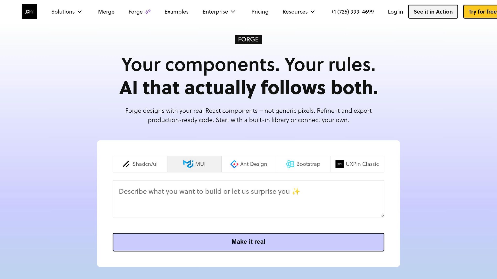
Use Forge only when you need alternate layouts, not for the core build. It’s best for trying quick layout variations inside the same approved MUI library.
Step 4: Refine, validate, and hand off without rebuilds
Before engineering review, tighten the copy, clean up props, check spacing, and make sure the page lines up with your theme.
Refine copy, props, and system consistency
Take your current hero headline, subheading, CTA labels, and form helper text and paste them back into Claude Sonnet 4.5. Use a tight prompt like this: "Rewrite this SaaS landing page copy for a US B2B audience. Keep the hero headline under 60 characters and return 3 variants for each section."
Then choose the strongest option and drop it into the matching MUI component prop in UXPin Merge.
While you’re in the properties panel, do a quick theme check. Make sure:
- Headings use approved
Typographyvariants - Colors come from theme design tokens
- Spacing uses theme values instead of custom pixel settings
That last part matters more than it seems. A page can look fine at a glance, then start to drift once one-off values pile up.
Next, test the prototype like an actual visitor.
Validate handoff quality with code-backed prototypes
Open UXPin preview and move through the page from top to bottom. Click into the form. Check focus states. Make sure TextField components show the right helperText and error states. Then confirm the CTA button triggers the intended interaction.
Because Merge uses real MUI components, the preview stays in line with production props, states, and interactions.
Once preview checks look good, open Spec Mode. Review each component’s variant, color token, and spacing prop before handoff. That gives engineering a component-accurate prototype with no rebuild step.
Conclusion: Turn AI-generated ideas into landing pages your team can ship
Once the build steps are done, the big win is speed without drift. This setup closes the gap between design and development by turning Claude output into real MUI components in Merge.
Building component libraries cut translation mistakes and trim rework during handoff. When your prototype uses the same MUI components your engineers will ship, review cycles get shorter, and the prototype starts to act as the source of truth for handoff.
That same component-based setup works across the sections teams build again and again. Claude Sonnet 4.5 can help draft the copy and map out section logic, but it still needs a human pass. Tighten the copy, check breakpoints, and keep props aligned with the approved theme. You can use this same flow for product launches, campaign sign-ups, and lead forms.
From prompt to production, Merge keeps both teams working in the same component language and makes handoff faster.
FAQs
How do I write a good Claude prompt for this workflow?
Be specific and structured.
Define the user type, goals, platform, and constraints up front. For example, mention mid-sized U.S. companies, the product context, and the MUI components you plan to use, such as Grid, Card, Stack, or Button.
Use U.S. formatting in your prompt and examples:
- Currency:
$1,234.56 - Date:
MM/DD/YYYY - Numbers:
1,234.56
Ask for structured output, like JSON, so the content maps cleanly to component props and is easier to plug into your UI.
For layout-heavy prompts, call out the exact MUI components and responsive breakpoints you need, such as xs={12} and md={6}. That keeps the response implementation-ready for UXPin Merge instead of sounding like loose mockup copy.
Can I use my team’s custom MUI components in UXPin Merge?
Yes. You can connect your team’s MUI-based component repository to UXPin Merge through Git, Storybook, or npm.
Once it’s connected, your custom components sync as live, code-backed elements. That means you can use your team’s props and variants directly on the canvas instead of rebuilding them by hand.
You can also manage component behavior with uxpin.config.js and track changes through your Git audit trail.
What should I validate before handing the page to engineering?
Validate both structure and function before handoff. Check key states like loading, empty, and error. Review role-based logic, accessibility, and page hierarchy too.
Make sure the hero sits above the fold, headlines scale in a clear way, and navigation stays tied to the main conversion goal. If the top of the page feels crowded or the menu pulls people in five directions at once, that’s usually a sign something needs to be trimmed.
Also confirm U.S. formatting, such as $9,999.99 and MM/DD/YYYY, and keep CTA labels consistent. A button that says Start Free Trial in one spot and Get Started in another can create friction fast.
In UXPin, test component behavior in Preview Mode, then use Spec Mode so developers can review JSX and CSS details.
Related Blog Posts
- How to build UI using Claude Sonnet 4.5 + shadcn/ui – Use UXPin Merge!
- How to build a landing page using GPT-4.1 + MUI – Use UXPin Merge!
- How to build a landing page using Claude Opus 4.5 + MUI – Use UXPin Merge!
- How to build a landing page using Claude Opus 4.5 + Custom Design Systems – Use UXPin Merge!