
How to build a landing page using Claude Opus 4.5 + Ant Design – Use UXPin Merge!
Use AI to write copy, map sections to Ant Design, and build a responsive, code-backed landing page in UXPin Merge.
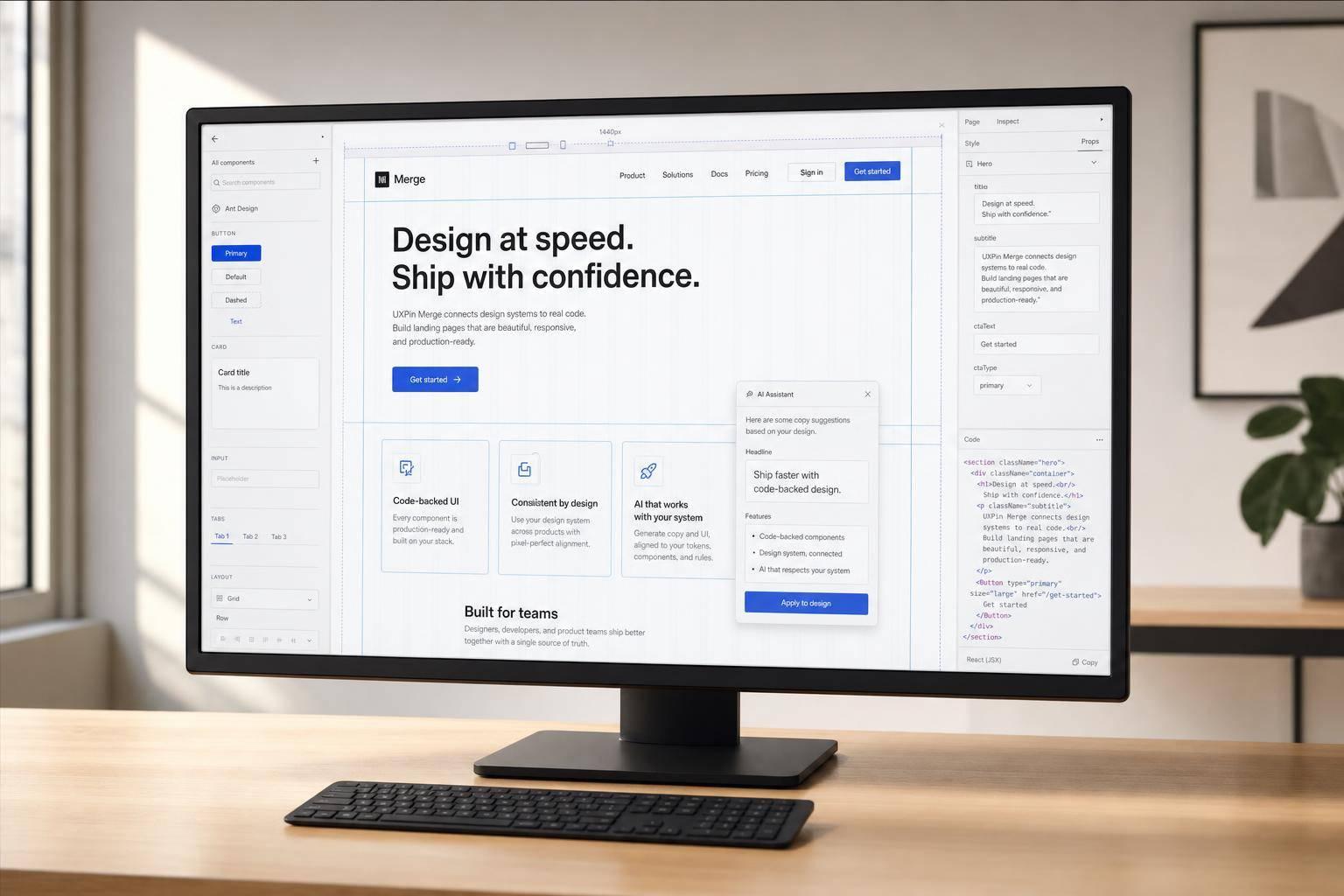
You can go from idea to a code-backed landing page in one flow: use Claude Opus 4.5 for page copy and structure, then build with Ant Design components in UXPin Merge so the prototype stays close to what developers will ship.
I’d sum up the article like this: plan first, map each section to components, build with the same React-based UI library, then test before handoff. The page in this guide includes 5 parts: navigation, hero, feature grid, CTA block, and a sign-up form. It also keeps copy in en-US format, with examples like July 9, 2026, 10,000, and $29/month.
Here’s the core process:
- Use Claude Opus 4.5 to draft headlines, body copy, CTA labels, and section order
- Turn that output into a component list for Ant Design
- Build in UXPin Merge with
Layout,Row,Col,Card,Button,Form,Input, andMenu - Test at 375px, 768px, 1,024px, and 1,440px
- Document props and component mapping for engineering handoff
A few points stood out to me:
- Ant Design is open-source and uses the MIT license
- The form example includes fields like First name, Last name, and Work email
- The feature grid uses 3 cards
- The review step checks states like hover, active, error, and success
Bottom line: I see this article as a simple workflow for teams that want fewer rebuilds, less mismatch between design and code, and a cleaner handoff.
| Step | What I’d do | Output |
|---|---|---|
| 1 | Set up Ant Design in UXPin Merge | Component library ready |
| 2 | Prompt Claude with section and copy rules | Landing page outline |
| 3 | Map sections to Ant Design parts | Build checklist |
| 4 | Assemble the page in UXPin | Working prototype |
| 5 | Review layout, states, and form rules | Handoff-ready file |
If I were starting today, I’d begin with one landing page, keep the structure tight, and use the prototype review to catch layout or form issues before sharing it with developers.
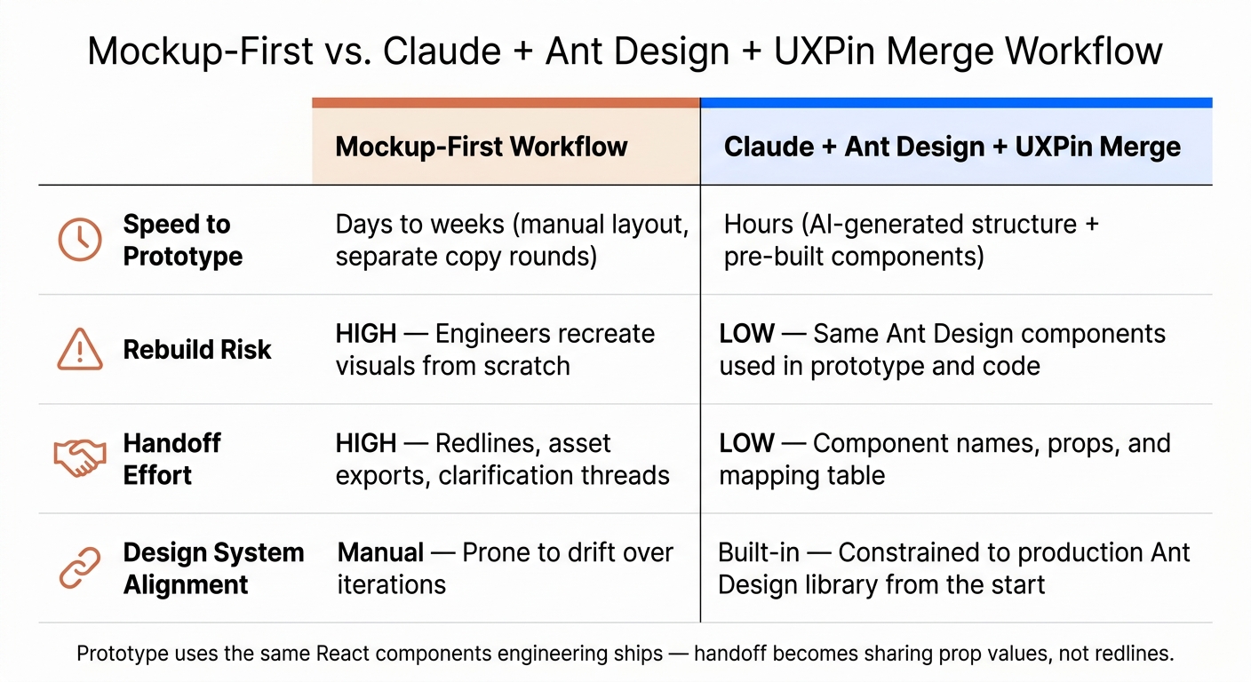
Mockup-First vs. Claude + Ant Design + UXPin Merge Workflow
Design Using Your Favorite React UI Libraries
1. Set up your stack in UXPin
Before you prompt Claude or place a single component, make sure your setup is ready. Doing this up front helps you avoid broken layouts and missing components later.
Enable Ant Design components in UXPin Merge
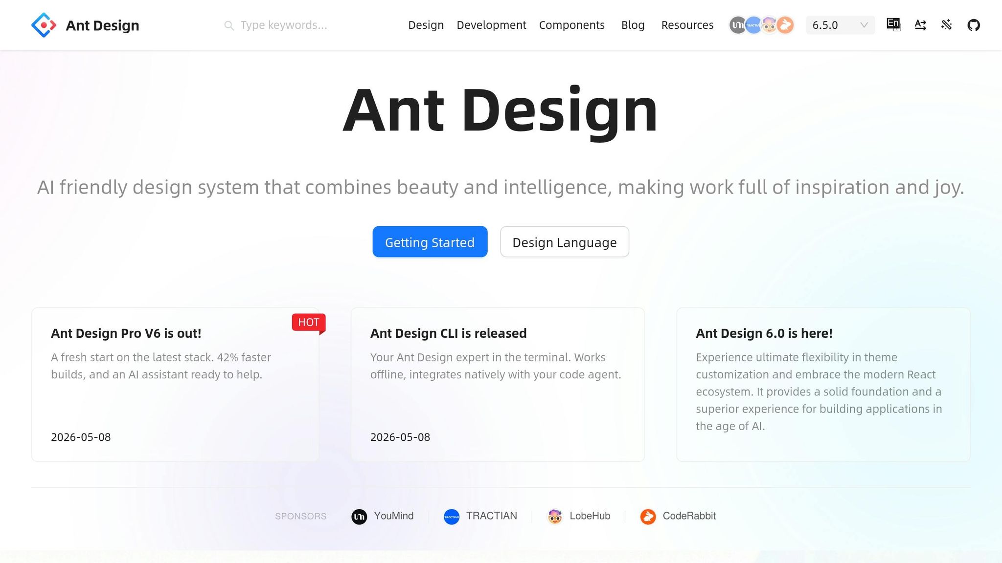
Create a UXPin project, open Design System Libraries, and enable Ant Design.
Think of this component set as your checklist for the hero, feature grid, CTA block, and sign-up form:
| Component | Landing Page Use |
|---|---|
| Layout, Row, Col | Page structure and responsive grid |
| Typography | Headlines, subheads, body copy |
| Button | CTAs and form submission |
| Card | Feature grid items |
| Menu | Navigation header |
| Form, Input | Sign-up and lead capture |
Use the Merge version so each component maps to real code.
Choose between Claude Opus 4.5 and Forge inside UXPin
Use Claude Opus 4.5 to plan the page. Use Forge to build the layout inside UXPin.
A simple way to think about it: Claude handles the content, while Forge helps you put the layout together faster.
Plan and account notes
Check that the project owner or admin can enable Design System Libraries. Editors also need a seat to place and edit components.
Once the stack is ready, you can use Claude to generate the landing page structure and copy.
2. Use Claude Opus 4.5 to generate landing page structure and copy
With your Ant Design library turned on in UXPin Merge, use Claude Opus 4.5 to turn a rough page idea into a clear brief you can build from in UXPin Merge. Then take that brief and turn it into a component checklist.
Write a prompt that maps content to Ant Design sections
Claude gives you a usable structure when the prompt is specific. If you ask it to "write copy for a SaaS landing page", you’ll usually get generic marketing copy. If you give it structure, you’ll get something you can build.
Here’s a prompt template that fits this workflow well:
"You are helping me design a SaaS landing page for a US audience, built with Ant Design in UXPin Merge. Propose a structured outline with these sections in order: 1) Top navigation, 2) Hero, 3) Feature grid, 4) Primary CTA block, 5) Email sign-up form. For each section, list: a) the purpose in one sentence, b) suggested Ant Design primitives such as Layout.Header, Row, Col, Typography.Title, Typography.Text, Button, Card, Form, Input, and Checkbox, c) 2–3 headline options, d) supporting body copy of 2–3 sentences, e) CTA label text, f) layout notes such as 2-column or left copy/right image. Use US English spelling and price examples in USD such as $29/month. Use clear bullets so each line maps to a component in Merge."
That level of detail gives you a component-ready outline for your Merge library. More importantly, it keeps Claude’s output tied to the parts you’ll place next.
Format copy for a US English audience
Add formatting rules right into the prompt so the output is closer to production-ready and needs less cleanup. Set locale rules up front: USD prices like $29/month, US dates like July 9, 2026, comma-separated numbers like 10,000, and US spelling like color and optimize.
For forms, be specific. Ask Claude to use separate First name and Last name fields, one Work email field, and a primary button labeled "Get started" or "Start free trial." That maps neatly to Ant Design’s Form and Input components.
Convert the outline into a component checklist
Once Claude gives you the outline, resist the urge to jump into design. First, turn each section into a plain list of Ant Design components. That’s the link between AI output and Merge build work.
| AI-Generated Section | Ant Design Components | Key Props to Note |
|---|---|---|
| Navigation | Layout.Header, Menu, Button |
Button type="primary" for the header CTA |
| Hero | Row, Col, Typography.Title, Typography.Paragraph, Button |
Row align="middle", two Col spans for split layout |
| Feature grid | Row, Col, Card, Typography.Title, Typography.Text |
Col span={8} for a 3-column grid |
| CTA block | Layout.Content, Typography.Title, Button |
Button type="primary" size="large" |
| Sign-up form | Form, Form.Item, Input, Checkbox, Button |
Separate Form.Item for First name, Last name, Work email |
A quick review against four checks helps keep things on course: clarity (does each section have a clear job?), mappability (can each line of copy attach to a specific component?), localization (are prices in USD, dates in Month Day, Year format, and spelling in US English?), and feasibility (can you build the interaction with basic Ant Design components in a first pass?).
If something doesn’t map cleanly, ask Claude to revise it. For example:
"Rewrite the feature section so it uses exactly 3 cards, each with a title under 5 words and one sentence of description."
With the outline set, build it section by section in UXPin Merge.
sbb-itb-f6354c6
3. Build the landing page in UXPin Merge with Ant Design components
Build each section right in UXPin Merge with Ant Design components and props. Start with the header and hero, then move down the page section by section.
Build the global layout, header, and hero section
Start by dragging the Layout component onto the canvas. Then add Layout.Header, Layout.Content, and Layout.Footer as subcomponents. That gives you a page shell that matches the kind of structure teams often use in production.
In Layout.Header, place the brand on the left, a horizontal Menu on the right, and a primary CTA at the far right. A common U.S. SaaS nav includes Product, Pricing, Resources, and Log in. Keep Pricing visible since this is a high-intent page. Use type="link" for Log in so the visual hierarchy stays clear.
For the hero, add a Row inside Layout.Content and split it into two Col components with xs={24} and md={12}. That way, the layout stacks on mobile and sits side by side on desktop. In the left column, use Typography.Title level={1} for the headline, Typography.Paragraph for a short value statement, and a Button set to size="large" and type="primary". Handle spacing with the gutter prop on Row and with column spans instead of drawing static mockups.
Add a feature grid, CTA block, and sign-up form
For the feature grid, use a Row with gutter={[24, 24]} and three Col components set to span={8}. Inside each column, place a Card with hoverable={true}. Build the first card with an icon or small image at the top, Typography.Title level={4} for the feature name, and Typography.Paragraph for a one-sentence description. Then duplicate it twice. Reusing the first card helps keep spacing and hierarchy aligned.
The CTA block goes below the feature grid. Use a Row with justify="center" and a single Col to center the content. Add Typography.Title level={2} for the headline, a short Typography.Paragraph under it, and one Button set to type="primary" and size="large". Stick to one primary CTA so the block stays focused.
For the sign-up form, wrap the section in a Form component set to layout="vertical". Use Form.Item for each field with clear U.S.-friendly labels:
- First name
- Last name
- Work email
- Company
- Role (
Select) - Team size (
Select)
Add a Checkbox for marketing consent: I agree to receive product updates and marketing emails, with a link to your Privacy Policy. Finish with a Button set to htmlType="submit" and type="primary". Add rules for required fields and email validation on Work email.
Use Forge to speed up layout without leaving the design system
If you want a faster first pass, paste the same outline into Forge. Be specific about the components you want. For example:
Use Ant Design Layout, Header, Row, Col, Card, Form, Input, and Button components already available in this UXPin project. Create a responsive landing page with a hero, feature grid, CTA block, and sign-up form based on this outline.
Forge generates the first layout from the same Ant Design library, so each element stays aligned with your design system and production codebase. After that, review spacing, responsiveness, and prop behavior in the next step.
4. Review the prototype and prepare for handoff
Once the layout is built, switch to review mode and check the prototype before handing it off. This is the point where you make sure the page works the way it looks like it should.
Check behavior, props, and responsiveness
In Preview Mode, test the full flow. Click navigation links and CTAs. Run through form validation. Tab through the page to check keyboard flow. Also review hover, active, error, and success states to make sure each one behaves the way you expect.
For responsive checks, resize the canvas to 375px, 768px, 1,024px, and 1,440px. At each width, confirm a few core things:
- The hero headline stays above the fold
- The feature cards stack cleanly
- The form fields don’t force horizontal scrolling
If a CTA slips below the fold, adjust the Col spans or the padding.
Then review the main props across each section. Check Button type="primary" size="large", Typography.Title level={1}, responsive Row gutters and Col spans, and the form validation rules. These should line up with how the engineering team will set up the same components in React.
Once those checks are done, capture the component mapping for handoff.
Document section-to-component mapping for your team
Use the table below as the handoff record for engineering.
| Landing Page Section | Ant Design Components | Key Props | UXPin Notes |
|---|---|---|---|
| Hero | Layout, Row, Col |
Title level={1}, Button type="primary" size="large", Col xs={24} md={14} |
Use shared Hero component; bind headline and subcopy to text tokens |
| Feature Grid | Row, Col, Card |
gutter on Row, Col xs={24} sm={12} md={8} |
Duplicate FeatureCard component; use content overrides for icon, title, description |
| CTA Block | Row, Col |
Row justify="center", Col xs={22} sm={16} md={12}, single type="primary" button |
One primary CTA only; reuse as GlobalCTA component |
| Sign-up Form | Form, Form.Item, Input, Select, Checkbox, Button |
rules for required fields and email, htmlType="submit" |
Mirror production validation rules; connect submit to success state |
Keep this table under version control alongside the prototype. That way, the design system stays tied to the product as it grows, instead of drifting over time.
With the handoff map set, the workflow difference becomes easy to spot.
Compare this workflow with a mockup-based process
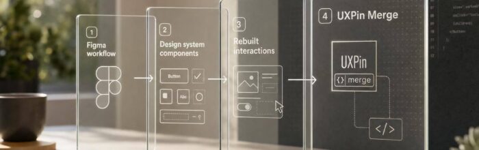
In a mockup-first process, engineers look at visual specs and rebuild the layout from scratch. That often leads to small gaps between the design and the shipped product. With Claude Opus 4.5 + Ant Design + UXPin Merge, the prototype uses the same React components engineering will use later. So handoff becomes much simpler: share prop values instead of a pile of redlines.
| Dimension | Mockup-First Workflow | Claude + Ant Design + UXPin Merge |
|---|---|---|
| Speed to prototype | Days to weeks (manual layout, separate copy rounds) | Hours (AI-generated structure + pre-built components) |
| Rebuild risk | High – engineers recreate visuals from scratch | Low – same Ant Design components used in both prototype and code |
| Handoff effort | High – redlines, asset exports, clarification threads | Low – component names, props, and the mapping table |
| Design system alignment | Manual – prone to drift over iterations | Built-in – constrained to production Ant Design library from the start |
At this stage, you have a tested prototype, checked props, and a clear section-to-component map. That gives engineering what they need without extra guesswork.
Conclusion: A repeatable path from AI ideas to code-backed landing pages
This workflow works because everything stays in one system. Claude Opus 4.5 handles the copy, Ant Design supplies the UI components, and UXPin Merge turns the result into a code-backed prototype.
And this isn’t limited to one kind of page. The same pattern fits pricing pages, onboarding flows, and feature pages too. The flow stays the same: prompt, map, build, validate, hand off.
A few mistakes can throw things off fast. Vague prompts lead to messy output. Styling outside Ant Design can create drift. Skipping Preview Mode checks makes handoff riskier than it needs to be.
The best way to start is simple: use one live project. Track the time you save, ask developers what worked and what didn’t, and tighten the workflow from there. That first project gives you a clear baseline for speed, quality, and handoff clarity.
FAQs
Do I need to know React to use this workflow?
No. You don’t need to know React to use this workflow.
Ant Design components are already built into the UXPin Merge library. That means you can drag and drop them onto the canvas, then set up props, states, and layouts in the Properties Panel – all without writing code.
How detailed should my Claude prompt be?
Be specific and structured. Don’t stay broad.
Include these six factors in your prompt or brief:
- Product name
- Target audience
- User goals
- Required Ant Design components
- Desired data density
- Branding or accessibility constraints
Give step-by-step directions so the output doesn’t drift. Spell out the campaign objective, the tone of voice, and U.S. localization rules. For example, use $29/month, not another currency format, and mm/dd/yyyy for dates.
It also helps to ask for a section-by-section outline before the full draft. That way, you can check the structure early instead of fixing a long response later.
Set limits for each section so the copy fits the UI component it’s meant for. For example:
- Hero headline: 40 to 60 characters
- Subheading: 90 to 140 characters
- Card description: 120 to 180 characters
- Table cell text: keep it short and scannable
- CTA button: 2 to 5 words
If you’re using Ant Design, be direct about where the copy will live. A banner, modal, card, table, tooltip, and form all need different copy lengths and levels of detail. Short version: tell the model what it’s writing, who it’s for, and how much space it gets.
What should I hand off to developers?
With UXPin Merge and Ant Design, you often don’t need a standard handoff. That’s because your prototype is already built with the same production-ready React components your developers use.
For development, switch to Spec Mode. Engineers can inspect the exact JSX, dependencies, and logic, along with token-based values like spacing, colors, and CSS properties. So instead of translating designs or rebuilding mockups, they can work from what’s already there.