Adaptive Design and Ecommerce UX: How They Work Together to Boost Conversions

It used to be that if consumers wanted a product you sell online, that would be enough to warrant a sale. But as the ecommerce industry has evolved along with consumer preferences and psychological triggers, the standards have been heightened. According to Adobe, 38% of online shoppers will leave a website if they find the design to be unattractive. People not only appreciate a good user experience (UX), they’ve come to expect it.
This article touches on what ecommerce UX is, and how adaptive design goes a long way to improving it and boosting your conversion rates.
Mobile Ecommerce Stats
But before diving into ecommerce UX and adaptive design, take a gander at these ecommerce stats:
- By 2021, 53.9% of all US retail ecommerce is expected to be generated through mobile. And that number is even more significant in emerging markets, as the share of mobile ecommerce is expected to reach 72.9% by 2021, up from 58.9% in 2017.
- According to Shopify, the greatest factor hindering the total domination of mobile ecommerce is the absence of mobile optimization of many ecommerce stores. For mobile optimized stores on the Shopify platform, 77% of traffic came from mobile devices, while driving 67% of orders.
-
After averaging rates from 40 studies, the Baymard Institute found that the global cart abandonment rate is close to 70%. Meanwhile, another study found that 60% of shoppers report leaving a transaction due to extra costs like shipping fees. Additionally, a slow website can increase abandonment by 75%, while dropping loyalty by 50%.
Defining Adaptive Design and Why It’s Important to Ecommerce UX
First Off, What Is Ecommerce User Experience?

In its most basic sense, the foundation of a good ecommerce UX design is one that provides a simple, easy to understand, and enjoyable shopping experience. This entails, among other things, having a web design that’s clean and easy to navigate – and one that provides a purchasing process that’s as intuitive as possible.
It’s not far removed from physical stores. What would you do if you found yourself entering a shop, find the display cluttered, couldn’t find what you’re looking for, while finding the sales associates to be inattentive to your needs? Chances are, you’d just leave – feeling annoyed and swearing never to do business with that shop again. It’s the same for online shoppers. If they can’t find what they’re looking for, aren’t presented with the payment options they prefer, or find any part of the process of the shopping experience confusing – they’re likely to bounce from your site just as easily as they came in.
But even when you’ve presented all the most pertinent information to consumers—things like price, discounts, customer reviews, product availability, and shipping options, sometimes that’s still not enough. Especially, when the web design isn’t suited to the device they’re using. Enter, adaptive design.
Adaptive Design 101

Adaptive design is essentially a user interface (UI) that adapts to different screen sizes. In this approach, when the system detects your device’s browser size, it automatically selects the layout that’s most appropriate for your screen – whether it be a smartphone, tablet, or laptop.
It’s easy to confuse adaptive design with responsive design because both ultimately want to present the optimal layout for different devices. The difference is that in adaptive design, the content follows a fixed layout size, compared to responsive design, where it moves dynamically. This means that in adaptive design, there are a few fixed layouts created for the most common screen sizes (320, 480, 760, 960, 1200, and 1600) from which the best one suited for device is selected.
Tips on How to Improve Ecommerce UX with Adaptive Design
Choose Elements That Function Well
That is, as opposed to choosing those that look nice. This has been the case for design trends that, while attractive and fancy, have merely come and gone. These include things like parallax scrolling, video backgrounds, autoplay, and image carousels.
Keep in mind that what online shoppers want are very basic: an easy access to products, detailed information, and easy selection and checkout process. There’s a time and place for creative design, but functionality should always be the priority.
Maintain An Updated Website With Accurate Details
Nurturing user experience is largely founded on building trust and consistency. How would you feel if after searching for a company’s website, you find that their phone number is no longer working? Of what would happen if you find an address on a website, drive there, and find they’ve moved? That’s incredibly frustrating.
And to a certain extent, it’s even more frustrating when it comes to ecommerce. Everything needs to be on point—prices, product images, shipping fees—everything. If it concerns your products and how customers can get their hands on them, it should be updated with accurate details. Beyond your website’s front-end, maintaining accurate product data and backend information is equally critical; platforms like DreamFactory provide governed API access to your data sources, ensuring that your ecommerce systems, inventory databases, and customer information stay synchronized and current across all touchpoints.
Use Microinteractions To Improve Ecommerce UX
Essentially, microinteractions are design elements meant to accomplish a single task, while also improving the natural interface flow. These can be used to:
- Guide the user through the website more intuitively.
- Reduce user anxiety, boost comfort, and provide a more natural interplay.
- Reduce errors, and provide immediate feedback.
-
Improve user interaction.
Optimize Adaptive Images
One of the biggest culprits for slow loading pages is imagery. To address this, you can use tools such as Adaptive Images, which is a small PHP script that detects the screen size and automatically resizes, caches, and serves a scaled-down version of the image. The tool also has customization features that allow you to set the image quality and browser caching.
Optimizing images is an aspect that’s easy to overlook, especially with everything that’s going on in an ecommerce store. But even when promoting on mainstream platforms like Instagram, you need to be aware of optimal image sizes.
Analyze User Behavior
If you’re just starting with your ecommerce store, you can kick this practice off with the simpler things. For example, you can analyze users’ search patterns, so you can get a better idea of their interests and preferences. This will allow you to make more intelligent recommendations, which can boost your conversions. You can also track their locations and location history so you can provide information in context with where there actually are. This information could be useful not only for shipping purposes, but also for presenting offers relevant to where they are.
Then, as you build a system that’s capable of performing more intricate analysis, you can use that data to provide an even more seamless ecommerce UX to your customers and use other psychology principles in your design.
Exclude Unnecessary Elements
This has already been touched on in the examples above, but it still bears emphasizing. And to truly understand which elements are necessary, you should have a good understanding of your users. You can do this by testing different elements on your website. By using a properly set up analytics, you can find out which features users are using, and you can start taking away those that aren’t being favored.
Examples of Adaptive Design in Ecommerce
Staples
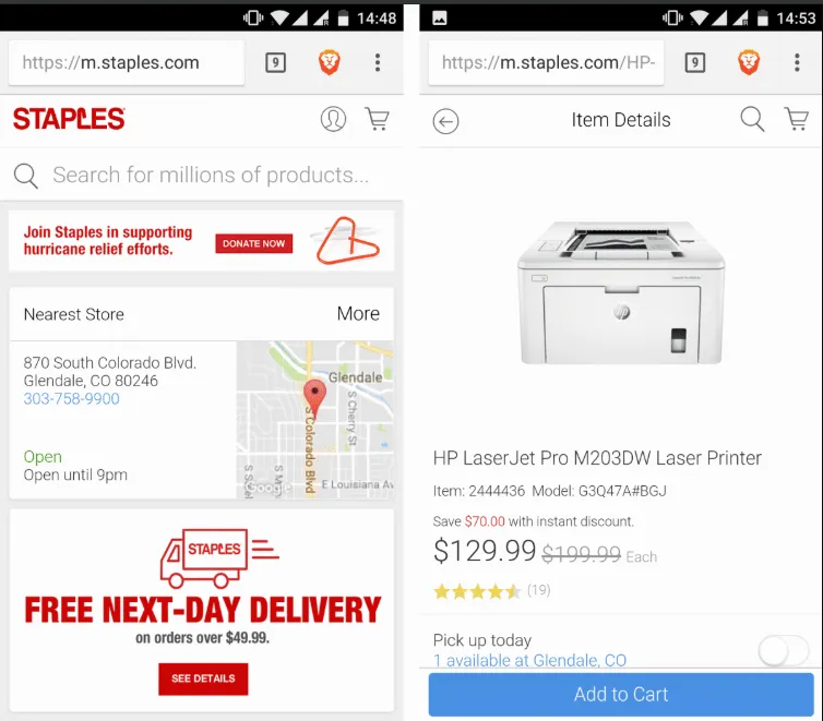
There are a few things to note from office equipment retail giant Staples’s mobile website. While you would expect to have fewer elements on the mobile site compared to its desktop counterpart, Staples committed to focusing on what users on smaller screens are more commonly looking for. These include things like the location, contact details, and store hours of the store closes to them; basic shipping details; product info and ratings. Color psychology is also leveraged – red for CTAs, and a blue “Add to Cart” button to elicit trust.
The number of featured products is also less on the mobile site, making it load fast even when connectivity is sub-optimal. As you can see, the Add to Cart button is also placed within reach of a mobile user’s thumb. That’s, quite literally, a great touch.
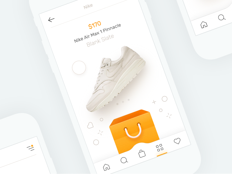
Nike
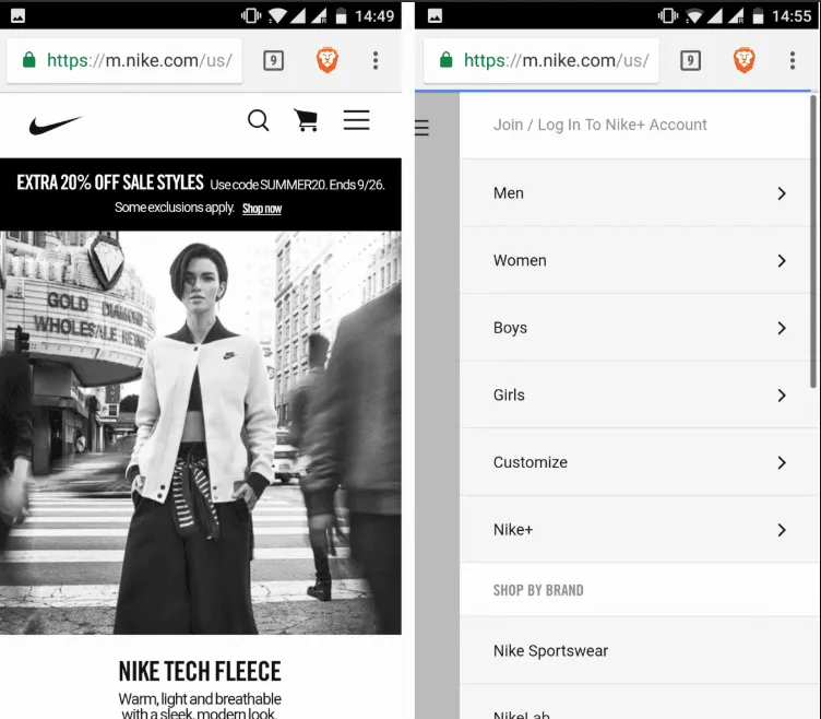
Nike does a great job of presenting users only with what they need, while still having all the necessary options just a few taps away. Case in point: while the desktop design has a looped video on the homepage, the mobile version only has a static frame – done so to save on bandwidth and hardware resources.
They’ve also cut down on the menu on top of the mobile page, but puts all the other elements inside the hamburger menu, allowing you to access all options from one place. As well, while an individual item shows a men/women menu, on the mobile site, users can just tap the “Refine” link to access search customization options.
Air France
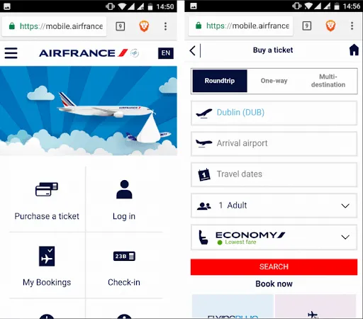
Speaking of just presenting the essentials, Air France does just that with its mobile website. As you can see, the most important options: Purchase a ticket, Log in, My Bookings, Check in, Flight Status, and Information, are all presented with their own icons. This allows mobile users to do just what they need to do, with zero distractions.
Takeaway
As you’ve learned, implementing adaptive design has a host of benefits for your ecommerce business. And while a lot of it has to do with providing an overall better UX for your customers, it inevitably also trickles down to improving your conversion rates. More importantly, it’s more than just a design trend.
With the mobile-first approach becoming a necessity in today’s digital world, embracing adaptive design is at the core of designing not only for different devices, but also for different users. And with a plethora of online tools (like an extremely useful UI kit) that can help you provide better experiences for your customers, there’s no reason not to go all in on implementing adaptive design for your ecommerce store.
Off the bat, what design improvements do you think your ecommerce store can benefit from? Let us know in the comments.

