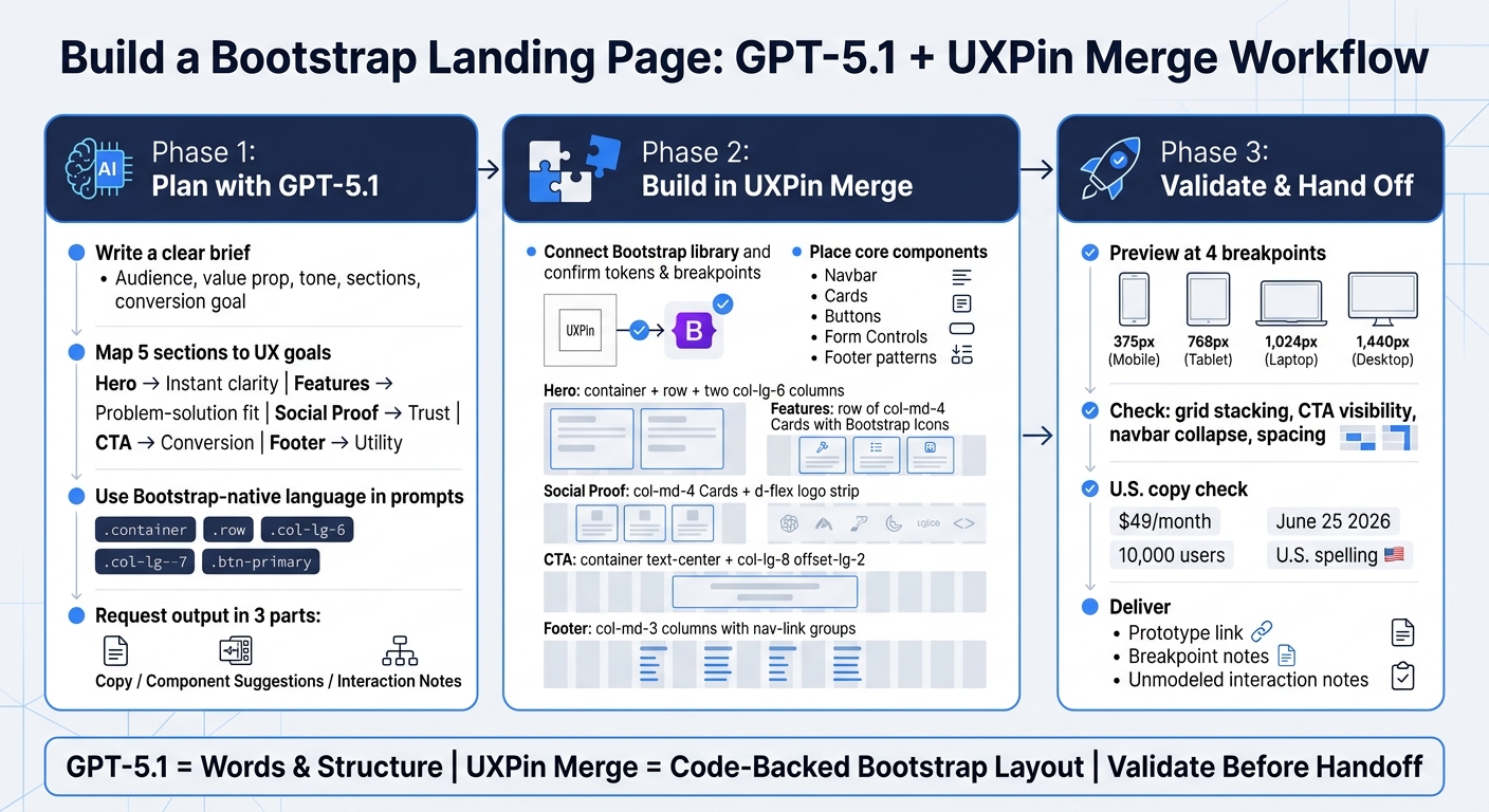
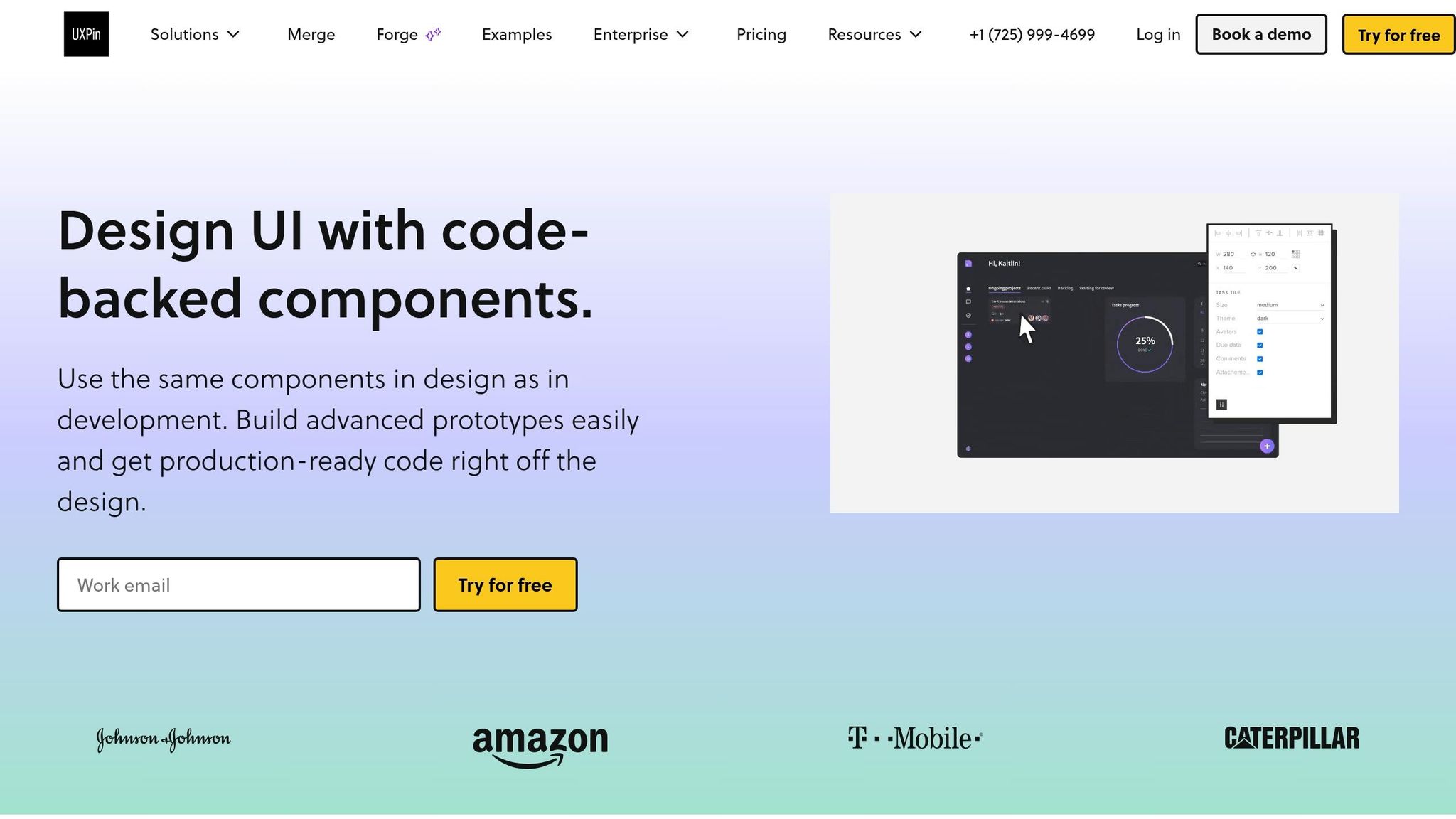
You can build a Bootstrap landing page faster if you split the job into three parts: use GPT-5.1 for copy and page structure, use UXPin Merge for code-backed Bootstrap components, and then check the page at 375 px, 768 px, 1,024 px, and 1,440 px before handoff. That cuts guesswork, keeps the layout tied to the same Bootstrap parts developers use, and helps you move from draft to prototype with fewer edits.
Here’s the short version:
- I use GPT-5.1 to draft:
- headlines
- subheads
- CTA text
- feature card copy
- testimonial ideas
- I use Bootstrap terms in prompts like
.container,.row,.col-lg-6, and.btn-primaryso the output is easier to place into the design. - I use UXPin Merge to build with:
- Navbar
- Cards
- Buttons
- Form controls
- Footer patterns
- I structure the page with five sections:
- Hero
- Features
- Social proof
- CTA
- Footer
- I finish by checking:
- mobile stacking
- spacing
- CTA visibility
- U.S. English spelling
- pricing like $49/month
- dates like June 25, 2026
The main idea is simple: GPT-5.1 gives you the draft, and UXPin Merge turns that draft into a responsive Bootstrap prototype built from the same component system your dev team already knows.
A few points stand out from the workflow:
- A clear brief matters. If the prompt is vague, the copy gets generic.
- Each section needs one job: the hero explains, features support the pitch, social proof adds trust, the CTA asks for action, and the footer handles utility.
- The page should be reviewed at 4 screen widths, not just desktop.
- The handoff should include:
- a prototype link
- breakpoint notes
- notes for items not modeled in the prototype, like form validation
If I had to sum up the article in one sentence, it would be this: use GPT-5.1 for words and structure, use UXPin Merge for Bootstrap-based layout, and check responsiveness before handing anything to development.
How to Build a Bootstrap Landing Page with GPT-5.1 & UXPin Merge
Build A Landing Page using Bootstrap 5 | Full Step by Step Tutorial
sbb-itb-f6354c6
Plan the page structure and write effective GPT-5.1 prompts
Before you open UXPin Merge or start writing, put together a clear landing page brief for GPT-5.1. That brief should spell out five things: target audience (for example, U.S.-based product managers at mid-market SaaS companies with 50–500 employees), value proposition (for example, reduce design–dev handoff time by 40% by prototyping with real Bootstrap components), tone (for example, confident, practical, B2B enterprise-friendly, no hype), required sections and the Bootstrap components the page will use, and one primary conversion goal (for example, schedule a 30-minute demo or start a 14-day free trial, no credit card required).
This step matters more than it seems. If the brief is vague, GPT-5.1 tends to drift into generic copy. If the brief is sharp, the output gets much easier to use.
Map each landing page section to a clear UX goal
Each section on the page should do one thing well. When you define that job upfront, GPT-5.1 is more likely to give you focused copy instead of padding.
| Section | UX Goal | GPT-5.1 Output |
|---|---|---|
| Hero | Instant clarity | Headline, subheadline, primary CTA button text |
| Features | Problem–solution fit | 3–4 benefit-driven cards tied to specific pain points |
| Social proof | Increase trust | Testimonials, logo strip, or usage stats near the CTA |
| CTA | Drive conversion | Button copy, form fields, reassurance microcopy |
| Footer | Utility | Nav links, legal pages, U.S. contact info, compliance badges |
Tie each feature to an outcome, not just a capability. That’s the difference between “Here’s what the product has” and “Here’s why a buyer should care.”
The social proof section should feel relevant to U.S. enterprise decision-makers. That usually means short testimonials with a name, title, and recognizable company, or a logo strip with brands people know. Putting that proof close to your primary CTA, instead of hiding it at the bottom, is a common recommendation for improving sign-ups and demo requests.
Start with a master prompt, then refine section by section
Don’t ask GPT-5.1 to do the whole page in one shot. Start with a master prompt that asks for the full page outline, then tighten things up with follow-up prompts for each section.
Ask GPT-5.1 to act as an expert UX writer and front-end strategist for a U.S. SaaS landing page built with Bootstrap. Then request a full outline for the hero, features, social proof, CTA, and footer. Split the response into Copy, Component Suggestions, and Interaction Notes.
That three-part structure helps keep content, design, and development in sync. It also cuts down on the back-and-forth that happens when copy notes and layout notes get mashed together.
Once you have that outline, move to section-level prompts. For the hero, ask for three headline options under 12 words and three subheadline options under 20 words. For features, ask for card-ready content: a 3–5 word title, one benefit sentence, and an optional supporting metric. Keep each prompt narrow, structured, and easy to scan.
Write prompts in Bootstrap-friendly terms
If you want output you can drop into UXPin Merge with less cleanup, use Bootstrap-native language in your prompts. Be specific about layout and component choices.
- Ask for a
.containerwith a.rowand two.col-md-6columns, with copy on the left and a screenshot on the right. - For features, ask for a
.rowof.col-md-3cards that stack to.col-12on screens smaller than 768px. - For CTAs, specify
.btn-primaryfor the main action and.btn-outline-secondaryfor the secondary link. - For forms, ask for a
.form-groupwith fields for work email and company size, plus inline validation messaging.
It also helps to build U.S. localization into the prompt from the start. Tell GPT-5.1 to use U.S. English spelling, show pricing in U.S. dollars, and format dates month-first, such as 09/30/2026. For enterprise-facing pages, ask for language that signals trust to U.S. buyers: SOC 2 Type II audited, U.S.-based support, 24/7, and trusted by Fortune 500 teams. Small details like these cut down on edits and make the output much closer to publish-ready.
Once the prompt structure is in place, you can turn it into actual Bootstrap components in UXPin Merge.
Set up UXPin Merge with Bootstrap components
Open UXPin Merge, add the Bootstrap library, and start placing real components on the canvas. UXPin comes with a built-in Bootstrap library, so you can use real components right away instead of drawing lookalikes. After you add the library, check your tokens and breakpoints before you start laying out the page.
Connect the Bootstrap library and confirm design system rules
Once the library is connected, review tokens, variants, and breakpoints before you build. Line up Bootstrap’s sm, md, lg, xl, and xxl breakpoints with your SCSS settings. If your team uses brand variants, set those rules early so the library matches production. Designers handle layout and visual review. Engineers handle component props and the library setup.
Choose the core Bootstrap components for the page
Use only the components this landing page needs. That keeps the page clean and cuts extra setup.
The main set includes:
- Container and grid for section structure
- Navbar for top navigation with responsive collapse behavior
- Cards for feature highlights and testimonials
- Buttons for primary and secondary CTAs
- Form controls for lead capture
- Footer patterns for nav links and trust signals
These components cover every section in this guide: hero, features, social proof, CTA, and footer. And because the same components are shared across design and build, teams skip a lot of the back-and-forth that usually slows design handoff down.
Code-backed Bootstrap components vs. static mockups: a comparison
The difference between Merge and a static mockup tool shows up most at handoff. With code-backed components, a lot of the usual rework is already out of the way before the build section starts.
| Feature | Code-Backed Bootstrap (UXPin Merge) | Static Mockups |
|---|---|---|
| Responsiveness | Automatic via Bootstrap’s 12-column grid | Must be approximated manually for each screen size |
| Handoff quality | Production-ready component props, no guesswork | High translation effort; developers recreate CSS from visuals |
| Component reuse | Real React components from the production library | Visual symbols only, no code relationship |
| Accessibility | Built-in ARIA attributes and keyboard support | Must be manually checked and documented separately |
| Front-end cleanup | Minimal; design is already built with code | Large effort to reconcile design with implementation |
Next, use these components to build the hero, features, CTA, and footer.
Build each landing page section in UXPin Merge
Once the Bootstrap library is connected, build each landing page section in Merge. The loop stays simple: prompt GPT-5.1, tighten the copy, assemble the layout in Merge, then check breakpoints.
Build the hero and features sections
For the hero, write a focused GPT-5.1 prompt that spells out your audience, product type, and layout goal. For example:
Generate a hero for a US-based B2B SaaS analytics platform. Include a headline under 12 words, a subheading under 30 words, a primary CTA button label, and a secondary CTA link. Use a Bootstrap 5 layout with a
container,row, and twocol-lg-6columns: left for text and buttons, right for a product screenshot placeholder. Use American English spelling and refer to pricing as Starts at $49/month.
When GPT-5.1 gives you the copy, trim anything that drags and check that the tone fits your brand. Then move into UXPin Merge and build the layout: a container, a row, and two col-lg-6 columns. Place the headline in an h1 with fw-bold, put the subhead in a p with the lead class, and set the primary CTA as btn btn-primary btn-lg. The secondary CTA can be btn btn-outline-secondary or simple linked text underneath.
For features, GPT-5.1 will usually return three or four feature-benefit pairs. Bring those straight into Merge and build a row with three col-md-4 columns, using one Bootstrap Card component for each feature. Match the feature name to the card title and the benefit to the body copy. Add a Bootstrap Icon at the top of each card with the icon prop from your Bootstrap component, use mb-3 for spacing, and style titles as h5 fw-semibold with body copy in text-muted. Then preview at 375 px to make sure the cards stack into a single column on mobile.
Add social proof, CTA, and footer
For social proof, prompt GPT-5.1 to write three short testimonials, each under 25 words, with a customer name, role, company, and a one-sentence outcome. In Merge, map each testimonial to a Bootstrap Card component with props for avatar, name, role, and quote. Arrange them in a row with col-md-4 columns on desktop and col-12 for mobile stacking. Below the testimonials, add a logo strip using d-flex justify-content-between align-items-center.
The CTA section should speak to risk and support head-on. Prompt GPT-5.1 for a reassurance headline under 10 words, a support line that handles objections about risk and support, a primary button label like Start your 14-day free trial, and microcopy such as No credit card required. Cancel anytime. In Merge, center the section with container text-center and use a col-lg-8 offset-lg-2 column so the content stays narrow. Set the primary button to btn btn-primary btn-lg and place the microcopy under it in small text-muted.
For the footer, GPT-5.1 can produce tidy link groups like Product, Company, Resources, and Legal, along with contact details and a copyright line. Map those into a multi-column Bootstrap footer with col-md-3 columns, nav and nav-link styles for each group, and a full-width bottom row using border-top pt-3 mt-4 text-muted small for the © notice.
GPT-5.1 raw output vs. final UXPin Merge implementation: a section-by-section comparison
GPT-5.1 gives you the draft. Merge turns that draft into UI that lines up with production. Here’s how the output usually changes once you shape it for Merge.
| Landing Page Section | Initial GPT-5.1 Copy | Suggested Layout | Selected Bootstrap Components | Final Adjustments |
|---|---|---|---|---|
| Hero | Headline, subhead, CTA text that often runs long | Two-column layout with image on the right | Container, Row, Col-lg-6, Button |
Trimmed the headline to under 12 words; confirmed the CTA stays visible above the fold at 375 px |
| Features | 3–4 feature-benefit pairs with icon suggestions | Simple grid of feature blocks | Card, Row, Col-md-4, Bootstrap Icons |
Mapped feature names to card titles and benefits to body copy; added mb-3 icon spacing; verified single-column stacking on mobile |
| Social Proof | Short testimonials with name, role, and outcome | Testimonial cards or a carousel | Card, Row, Col-md-4, d-flex logo strip |
Applied shadow-sm; confirmed line height with lh-base; added a logo strip with d-flex justify-content-between align-items-center |
| CTA | Reassurance headline, objection-handling line, button label, microcopy | Centered section with button below headline | Container, Col-lg-8 offset-lg-2, Button |
Set btn-primary btn-lg; kept the CTA button and microcopy stacked cleanly on mobile |
| Footer | Link groups, contact details, legal text, © line | Multi-column footer with nav links | Nav, Nav-link, Col-md-3, Container |
Applied border-top pt-3 mt-4 text-muted small to the © row; confirmed single-column collapse on mobile |
Next, check responsiveness and prepare the handoff.
Check responsiveness, iterate, and hand off to development
Check consistency and responsive behavior before sign-off
After you build the sections in Merge, do one last validation pass before handoff. Preview the page at 375 px, 768 px, 1,024 px, and 1,440 px. Those four widths cover the main screen sizes the page needs to handle. At each one, check the grid, content hierarchy, and spacing.
At 375 px, make sure hero columns stack neatly, feature cards collapse into a single column, and the main CTA stays easy to tap. At 768 px, confirm the navbar switches to a hamburger menu and that two-column layouts don’t crush text into hard-to-read line lengths. At 1,024 px and 1,440 px, look for too much empty space around narrow content blocks. Also check that centered CTA sections don’t feel stranded on large screens.
Run a quick consistency pass at the same time. Stick to one heading style, one spacing scale, and one main CTA style across the page. If a card uses the wrong variant, replace it with the approved Bootstrap component before handoff.
Then do a final U.S. copy check. Prices should appear as $49/month, dates should use formats like June 25, 2026, and stats should follow U.S. number formatting: $49/month, $1,200/year, 10,000 users, 3.5x faster. Watch spelling too. Use U.S. forms like customization, color, and organization, since GPT-5.1 can sometimes drift into British spelling. Fix the text in Merge, then adjust your GPT-5.1 prompt if the same issue keeps showing up.
Once the page clears both checks, put together the handoff bundle:
- Prototype link
- Breakpoint notes
- Any unmodeled interactions, such as form validation logic or dropdown behavior
Workflow comparison and next steps: GPT-5.1 + Bootstrap + UXPin Merge vs. mockup-first
This last check makes the Merge workflow’s upside pretty clear: it cuts revision work after prototype approval. Here’s how the two paths differ on the points product and engineering teams care about most.
| Aspect | Static mockup workflow | GPT-5.1 + Bootstrap + UXPin Merge |
|---|---|---|
| Time to first prototype | Slow – manual copywriting and layout work happen before any code-backed prototype exists | Fast – GPT-5.1 generates structure and copy; Merge assembles a working Bootstrap prototype early |
| Handoff revisions | High – developers reinterpret static designs, which often leads to extra feedback cycles | Low – devs get a prototype built with real Bootstrap components, which cuts misreads |
| Production alignment | Weak – visual mockups may not match actual Bootstrap spacing, grid behavior, or components | Strong – the design uses the same Bootstrap components and tokens as production code |
| Rework risk | High – gaps between mockups and live Bootstrap output show up late in development | Low – early checks with production-like components catch problems before build stage |
Once the prototype passes review, share the link and breakpoint notes with development.
Use GPT-5.1 for structure and copy, UXPin Merge for a code-backed Bootstrap layout, and validate everything before handoff.
FAQs
How detailed should my GPT-5.1 prompt be?
Your prompt should be detailed and well organized so GPT-5.1 matches your brand and technical needs.
Start with a consistent brand brief. Include your product name, target persona, tone, preferred copy examples, and restricted language. This gives the model a clear lane to stay in from the start.
Then get specific about the job. Spell out the goals, formatting rules, and component limits. Add word or character caps, requested output formats like JSON, official Bootstrap component names, and U.S. localization details. The less guesswork, the better.
It also helps to guide the workflow in order. Lay out the full page first, then move into each section one by one. That step-by-step flow gives you tighter control over structure, copy, and implementation.
Do I need Bootstrap knowledge to use UXPin Merge?
No. You can use UXPin Merge for prototyping without any Bootstrap knowledge.
It comes with a visual drag-and-drop editor, so you can build with real, code-backed Bootstrap components without writing HTML or CSS.
That said, a basic grasp of Bootstrap’s grid system and components can still help. It can make your AI prompts better and give you a bit more control over the layout, but it’s not required for design or prototyping.
What should I include in the developer handoff?
Share the fully functional prototype because it already includes the production-ready React components, JSX, and dependencies used in the design.
For a smooth handoff, use Spec Mode to show the needed JSX, functions, and Bootstrap imports. Also add notes for any custom Bootstrap classes or component tweaks. That gives developers the same code-backed elements without manual redlines or rebuilding.

