Streamline your UX design process with GPT-5.2, shadcn/ui, and UXPin Merge. These tools enable designers to work with real React components, refine designs using AI, and create production-ready prototypes without starting from scratch. Here’s how they work together:
- GPT-5.2: Generates layouts from wireframes or prompts, reducing design errors by 50% and handling complex design logic with its 400,000-token context window.
- shadcn/ui: A React component system built on Radix UI, offering accessible, customizable components that live in your codebase.
- UXPin Merge: Integrates directly with your Git repository, allowing designers to use production-ready components for seamless handoffs to developers.
This approach eliminates inefficiencies in the design-to-development workflow, ensuring that prototypes are not just visually accurate but fully functional and ready for deployment. By combining AI-driven design with a component-driven system, teams achieve faster, more accurate results while maintaining alignment across design and development.
Key Benefits:
- Reduce design-to-code inconsistencies
- Leverage AI to refine designs with natural language commands
- Use production-ready components for scalable, modular design systems
Ready to evolve your UX workflow? Dive into the details below.
UXPin Merge AI: Smarter UI Generation That Follows Your Design System
sbb-itb-f6354c6
Setting Up Your Environment
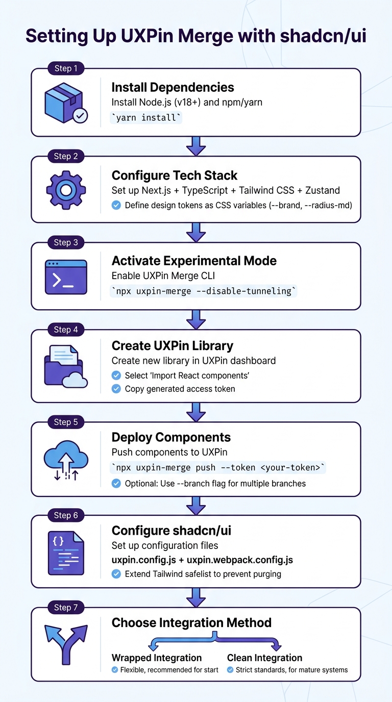
Setting Up UXPin Merge with shadcn/ui: Complete Integration Workflow
To get started with GPT-5.2, shadcn/ui, and UXPin Merge, you’ll need a specific tech stack and configuration. The setup requires Next.js with TypeScript, Tailwind CSS, and Zustand for state management. The shadcn/ui components are built on Radix UI primitives, which are designed to provide accessibility right out of the box.
What sets shadcn/ui apart from traditional component libraries is that it resides directly in your repository. As Vaibhav Gupta puts it:
"If you approach shadcn UI as a system instead of a library, it will outperform most traditional UI frameworks – both in developer experience and production stability."
This structure ensures a seamless integration with UXPin Merge as you proceed.
Tech Stack Requirements
Here’s what you’ll need for your setup:
- Node.js (version 8 or higher)
- Either npm or yarn
- Tailwind CSS configured with CSS variables
To support multi-theme designs, define design tokens in your Tailwind configuration (e.g., --brand, --radius-md). This method makes it easier to create white-label products without the need for a full rebuild.
For better scalability, organize your components into folders based on their purpose: raw components, modified versions, and compositional elements. Use abstractions like a custom AppButton component to handle global behaviors, analytics, or loading states.
Connecting Your Codebase to UXPin Merge
The connection between your codebase and UXPin Merge is managed through the uxpin-merge CLI tool. This tool syncs your local React components with UXPin’s design editor. Start by running:
yarn install to ensure all dependencies are ready. Then, activate Experimental Mode with:
npx uxpin-merge --disable-tunneling To push your components into UXPin, follow these steps:
- Create a new library in the UXPin dashboard by selecting "Import React components".
- Copy the generated access token.
- Deploy your components using:
npx uxpin-merge push --token <your-token> If your team works across multiple branches, you can use the --branch <branch_name> flag to sync specific versions of your development work. For real-time updates, integrate your UXPin authentication token into your CI/CD pipeline. Tools like GitHub Actions or CircleCI can automatically push changes whenever code is committed.
Finally, configure shadcn/ui to ensure your components render correctly within UXPin Merge.
Configuring shadcn/ui in Merge
Once your environment is ready, you’ll need to adapt shadcn/ui for UXPin Merge. This involves setting up two configuration files: uxpin.config.js and uxpin.webpack.config.js. These files determine which components are available in UXPin and how they’re organized.
To prevent Tailwind from purging necessary styles during the build, extend the safelist in your tailwind.config.js to include shadcn/ui’s dynamic classes.
The shadcn-merge repository provides a boilerplate for integration and reflects ongoing updates to maintain compatibility. Each component directory should include a single component with an export default statement to ensure proper compilation.
When syncing components, UXPin offers two methods:
- Clean Integration: A direct Git connection that enforces strict code standards.
- Wrapped Integration: Uses Higher-Order Components for more flexibility.
Most teams prefer starting with Wrapped Integration for its adaptability and transition to Clean Integration as their design systems evolve.
Using GPT-5.2 in UXPin Merge
Once you’ve set up your environment and configured components, GPT-5.2 takes center stage in refining your design with AI-driven precision. When given clear, detailed prompts, GPT-5.2 excels at generating components that meet your specifications. However, it’s important to note that vague prompts won’t yield the desired results – this model thrives on clarity. When using Forge AI within UXPin Merge, the quality of the generated components is directly tied to how well you structure your requests.
Writing Prompts for Production-Ready Outputs
The best prompts follow this structure: Context → Task → Constraints → Output. Start by explaining the user scenario and the purpose of the component you need. Then, detail the task – whether it’s a login form, navigation menu, or dashboard card. After that, define your constraints, such as which shadcn/ui components are allowed, specific Tailwind tokens to use, or elements that should be excluded.
Without clear restrictions, GPT-5.2 might introduce unintended styles or elements. To avoid this, use labeled containers like <DESIGN_SYSTEM> and <CONSTRAINTS> to organize complex requirements. For example, you can specify “tokens-only colors” and prohibit creating new UI elements outside your existing library.
A key strategy is the "Perfection Loop". In this approach, you instruct GPT-5.2 to create an internal rubric for an ideal response, evaluate its own output, and refine it until it meets your standards. This self-review process helps catch inconsistencies early, ensuring higher-quality results before transitioning to Forge AI.
Using Forge AI in UXPin Merge
Forge AI, seamlessly integrated into UXPin, generates components that align perfectly with your design system. Unlike other AI tools that might produce generic wireframes, Forge ensures that only approved production components – like those from shadcn/ui, MUI, Ant Design, or your custom library – are used.
No separate ChatGPT or Claude account is required. You can simply prompt directly within the UXPin canvas. Forge will then map your request to the right components, handle any missing dependencies, and download the necessary assets automatically.
As shadcn, the creator of shadcn/ui, stated:
"This is the ultimate Figma kit for shadcn/ui. If I were to build a Figma kit, this is what I would’ve built."
Ryan Almoneda, a UX Designer at BlackDuck, shared:
"Our company selected shadcn as our primary design library… Its comprehensive variable system has significantly improved our efforts around branding and accessibility."
This integration ensures that AI-generated components align with your design tokens and Tailwind CSS settings, eliminating the typical design-to-code inconsistencies that often require extra developer time. These tools help you strike a balance between speed and accuracy in your design workflow.
Balancing Speed and Accuracy
With precise prompts and effective component mapping, GPT-5.2’s reasoning_effort parameter allows you to control the balance between speed and detail. This parameter ranges from none (fast, minimal deliberation) to xhigh (thorough, highly detailed reasoning). For quick layout iterations, use none or minimal. For more complex components, like those requiring accessibility features, opt for medium or high.
If your request is straightforward, GPT-5.2 may automatically switch to a faster, less resource-intensive model, which can sometimes result in lower-quality outputs. To encourage deeper reasoning, include phrases like "Think carefully about this" or "Think deeply" in your prompt.
OpenAI reported that incorporating prior reasoning steps into follow-up requests improved the Tau-Bench Retail score from 73.9% to 78.2%. For ongoing UX workflows in UXPin Merge, this means you can maintain context across tasks while reducing token usage, keeping your sessions efficient and accurate at the same time.
Building Component-Driven Workflows
By combining GPT-5.2 and shadcn/ui with UXPin Merge, you can streamline workflows through a component-driven approach. Instead of designing isolated screens, this method focuses on creating modular, reusable systems. The components are treated as source code, integrated directly into your codebase, ensuring scalability and efficiency.
Designing with Unified Tokens and Patterns
At the heart of any component-driven system are design tokens. These tokens, which define elements like color, typography, and spacing, should be set up as CSS variables in the :root layer – for example, --radius-md or --brand. These tokens can then map directly to your Tailwind configuration. This setup not only supports multi-theme functionality but also ensures that global style updates ripple across your design system instantly.
To keep your system structured, organize components into three layers:
- UI: The raw shadcn components.
- Primitives: Slightly customized components aligned with your brand.
- Blocks: Fully composed sections such as pricing tables or dashboard cards.
This layered approach avoids unnecessary styling and keeps component APIs clean and predictable. As Vaibhav Gupta puts it:
"Shadcn UI isn’t ‘just another component library.’ It’s a component system built on Radix UI + Tailwind CSS, designed for teams that care about ownership, performance, and long-term scalability."
Instead of directly using raw components like Button in your layouts, create product-aware abstractions such as AppButton. These abstractions allow you to centralize global behaviors like analytics tracking, role-based permissions, or loading states. This structure not only simplifies maintenance but also aligns with accessibility best practices.
Using shadcn/ui for Accessibility
Shadcn/ui, built on Radix UI primitives, ensures accessibility right out of the box. Features like keyboard navigation, screen reader compatibility, and focus management are standard. To maintain these features in UXPin Merge, stick to the asChild pattern and avoid overriding default focus styles.
When prototyping, prioritize CSS-based interactions (like Tailwind’s group-hover) over React state. This reduces JavaScript usage, keeping designs lightweight and ensuring accessibility features remain intact. This balance between performance and accessibility is key in a component-driven workflow.
Iterating Quickly with AI-Powered Prototyping
With a modular system in place, GPT-5.2 can speed up prototyping by fine-tuning components, interactions, and responsive designs – all while staying within the boundaries of your design system. Instead of designing screens from scratch, focus on assembling "Blocks" – pre-built sections that enhance consistency and accelerate delivery.
The shadcn/ui ecosystem in 2026 offers tools that further boost AI-powered workflows in UXPin Merge. Tools like Novel (AI-powered autocompletion for WYSIWYG editors), Plate (rich-text frameworks with AI capabilities), and Assistant UI (chat interfaces with multiple LLM integrations) integrate seamlessly with UXPin Merge. These tools enable rapid iteration on complex components directly within your design environment.
To ensure clarity and save time for future teams, document your component decisions in a README.md file within the components folder. Include details on why a component exists, when to use it, and when to avoid it. Additionally, limit component variants and handle layout logic through parent containers instead of embedding it within components. This keeps your system clean and predictable.
Scaling Design Systems with UXPin Merge
When scaling a design system to support multiple teams and products, centralization becomes essential. UXPin Merge simplifies this by connecting directly to your Git repository or Storybook, ensuring all designers work with the same production-ready components. This approach eliminates the risk of fragmentation caused by outdated or inconsistent design files.
The results speak for themselves. At Microsoft, just three designers managed 60 internal products and over 1,000 developers by integrating the Fluent design system with UXPin Merge. Erica Rider, a UX Architect, demonstrated that with the right tools and governance, it’s possible to scale operations without increasing headcount. Similarly, PayPal achieved seamless consistency between prototypes and final products using UXPin Merge, streamlining their development process. Centralized systems like these ensure consistency and effective management across large-scale design operations.
Governance and Role-Based Permissions
Scaling a design system also requires clear ownership and access control. A RACI matrix – outlining who is Responsible, Accountable, Consulted, and Informed – clarifies roles and streamlines decision-making. Assigning a Product Owner for the design system can further simplify approvals and reduce delays.
UXPin Merge supports role-based access control (RBAC), enabling tiered permissions. For example, junior designers might have view-only access, while senior team members handle edits and approvals. Contribution tiers can also guide teams on how to propose new components or patterns without disrupting the core system.
Automated validation gates are another key feature, rejecting non-compliant files before they reach production. Without such measures, design systems can experience "entropy", where up to 40% of UI components deviate from established standards. Automated governance tools can cut design review times by 60% and free up 20% to 30% of team capacity for more innovative work.
Maintaining Design System Consistency
Consistency across a design system relies on strong governance and enforceable design tokens. UXPin Merge takes this further by syncing with your Git repository and applying design tokens as binding rules. For instance, updating a token like --brand ensures that changes propagate instantly across all designs, eliminating manual updates and ensuring alignment between design and engineering.
To reduce friction during handoffs, align naming conventions across design tools and codebases. For example, ensure component names in Figma match those in your code. This minimizes errors and streamlines collaboration. Documenting the reasoning behind design decisions – such as why a specific color is used for destructive actions – helps maintain clarity and justifies exceptions.
"When I used UXPin Merge, our engineering time was reduced by around 50%. Imagine how much money that saves across an enterprise-level organization with dozens of designers and hundreds of engineers." – Larry Sawyer, Lead UX Designer
Using versioned registries with semantic versioning and deprecation schedules helps manage component updates effectively. With UXPin Merge’s Git integration, updates flow directly into the design environment, eliminating the need for manual imports.
Preventing Design Drift at Scale
Design drift occurs when small, unintended changes – like hardcoding values or duplicating components – add up, causing inconsistencies between the design system and production. UXPin Merge addresses this with Forge AI, which ensures AI-generated layouts use only approved components from your design system. This guarantees that every layout is pre-approved, tested, and ready for development.
For example, when designers request tables, forms, or dashboards, Forge AI automatically pulls from the connected design system, avoiding the generic wireframes often produced by other AI tools. This keeps designs aligned with your codebase.
Automated audits further enhance consistency by flagging WCAG violations or brand drift within your CI/CD pipeline. This proactive approach catches issues early, reducing costly rework. One telecom company, for instance, reduced compliance violations by 75% using governance dashboards. Automated workflows also save teams an average of two hours per week on accessibility and compliance checks.
"As a full stack design team, UXPin Merge is our primary tool when designing user experiences. We have fully integrated our custom-built React Design System and can design with our coded components. It has increased our productivity, quality, and consistency." – Brian Demchak, Sr. UX Designer, AAA Digital & Creative Services
Conclusion
Key Benefits of Using These Tools Together
By integrating GPT-5.2, shadcn/ui, and UXPin Merge, teams can skip the tedious process of converting static designs into production-ready code. Designers work directly with React components that are ready for deployment, eliminating manual translation efforts. This streamlined process has shown real impact – Larry Sawyer, Lead UX Designer, shared that his team cut engineering time by nearly 50% with UXPin Merge.
But it’s not just about speed. Automatic synchronization through CI/CD tools like GitHub Actions ensures design files are always aligned with the latest production code, avoiding the common issue of design drift. Additionally, GPT-5.2 has reduced error rates in software interface understanding by 50%, leading to AI-generated layouts that are more precise and require fewer revisions. Mark Figueiredo, Senior UX Team Lead at T. Rowe Price, highlighted a major time-saving benefit: feedback cycles that once took days now take just hours, significantly shortening project timelines.
Final Thoughts on Design-Driven Development
These tools aren’t just for small teams – they shine at the enterprise level too. Component-driven design is becoming a standard for scalable and efficient workflows, and with 69% of companies already adopting or developing design systems, the focus on bridging design and development has never been more critical.
UXPin Merge takes this to another level by ensuring components used in design are fully interactive and identical to those in production. This consistency allows teams managing multiple products or large-scale development projects to work more efficiently and cohesively.
"As a full stack design team, UXPin Merge is our primary tool when designing user experiences. We have fully integrated our custom-built React Design System and can design with our coded components. It has increased our productivity, quality, and consistency." – Brian Demchak, Sr. UX Designer, AAA Digital & Creative Services
Ready to eliminate workflow bottlenecks? Explore UXPin Merge and see how it can redefine your design-to-development process.
FAQs
What’s the fastest way to connect my Git repo to UXPin Merge?
The quickest method is to use the built-in Git integration available in your UXPin account. This tool lets you sync your custom component libraries directly with UXPin Merge, ensuring updates are smooth and everything stays consistent.
Here’s how to set it up:
- Enable Git integration: Plans start at $29/month.
- Connect your Git repository: Link it directly through UXPin.
- Sync your components: Enjoy live updates and real-time collaboration with your team.
How do I keep shadcn/ui + Tailwind styles from breaking in Merge?
When working with shadcn/ui components and Tailwind styles in UXPin Merge, it’s important to handle customizations thoughtfully to avoid potential issues. Here are some practical tips:
- Use Tailwind Utility Classes: Instead of modifying the core code of components, rely on Tailwind’s utility classes for styling. This approach keeps your changes clean and manageable.
- Leverage shadcn/ui Theming Options: Take advantage of the theming features provided by shadcn/ui, such as CSS variables, to align components with your project’s design system.
- Stay Updated with Tailwind v4: Keep an eye on updates to Tailwind CSS (version 4) to ensure your styles remain compatible and avoid conflicts.
- Keep Customizations Modular: Organize your custom styles and changes in a modular way. This ensures your project remains stable and easier to maintain when updates are needed.
By following these practices, you can ensure your components are styled in a way that’s both scalable and reliable for your projects.
How can I make GPT-5.2 use only my approved components and tokens?
To make sure GPT-5.2 sticks to your approved components and tokens, it’s important to use clear and structured prompts. Start with a system-first approach, which prioritizes setting up the model’s framework before diving into tasks. By focusing on effective prompt engineering and providing detailed instructions, you can guide the model’s responses more precisely.
Additionally, implementing system design strategies specifically tailored for GPT-5.2 ensures that it stays aligned with your desired components and tokens throughout interactions. This approach helps maintain control and consistency in the model’s behavior.

