Components in Figma vs UXPin (+ Other Design Tools)
Components are a fundamental aspect of modern UI design tools, enabling designers to create reusable elements that maintain consistency across projects.
While both UXPin and Figma offer robust component systems, they have distinct differences in functionality, flexibility, and integration with other tools. This post will explore these differences, helping you decide which platform might be better suited for your design needs.
Optimize design-to-development handoff, create prototypes that are full of interactive UI components, such as input fields, clickable menus, and sortable data tables. Simplify design with UXPin Merge. Discover UXPin Merge.

What are Components in Figma?
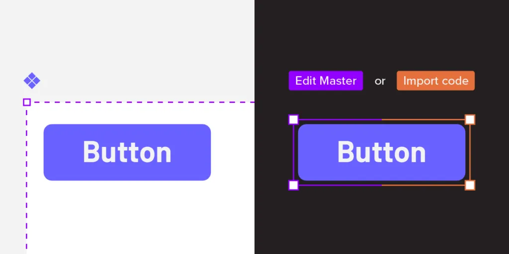
Figma’s documentation states, “Components are elements you can reuse across your designs. They help to create and manage consistent designs across projects.” Designers create Figma components using shapes, icons, images, text, and even other components. These components are vector-based, visual representations of the coded UI components engineers use to develop the final product.
Understanding vector-based design elements
While Figma’s vector-based are aesthetically accurate, their static nature means they’re graphical representations rather than functional UI elements or design patterns.
Most image-based or vector-based design tools have this limitation. Designers can make things look beautiful, but they can’t accurately replicate the experience. The platform renders vector graphics that cannot handle live data.
Improved workflow, not output
Figma’s Config 2023 releases make it easier for designers to build semi-interactive prototypes and components, but little has changed on the user testing end. Figma’s components still render the same; the company has just simplified the workflow.
Instead of using multiple frames to create interactivity, designers can apply the interactions, like state changes, directly to the components. While this is a massive step forward for simplifying designer workflows, it doesn’t change the tool’s vector-based limitations.
How Can You Use Components in Figma?
Here’s how Figma handles components:
- Flexible and Easy-to-Use Components:
- Component Variants: Figma introduced a feature called Component Variants, which allows designers to group similar components (like different button styles) into a single parent component. This simplifies the component library and makes it easier to manage and switch between different variations.
- Nested Components: Figma supports nested components, where a component can be used within another component. This feature is particularly useful for creating complex UI elements that are built from smaller, reusable components.
- Instance Overrides and Detachment:
- Overrides: Figma allows for overrides in component instances. Designers can change text, colors, and other properties without affecting the master component. This flexibility is crucial for customizing components to fit different use cases without breaking the overall design consistency.
- Detaching Instances: Figma allows you to detach an instance from its master component, effectively converting it into a standalone element. This feature provides greater flexibility but comes at the cost of losing automatic updates from the master component.
- Collaboration and Real-Time Editing:
- Real-Time Collaboration: Figma’s biggest strength is its collaboration capabilities. Multiple team members can work on the same file simultaneously, seeing each other’s changes in real-time. This feature is ideal for teams working in fast-paced environments or needing to collaborate closely on design projects.
- Comments and Feedback: Figma includes built-in tools for commenting and feedback, making it easy for teams to discuss changes directly within the design file. This helps streamline the design review process and keeps all feedback centralized.
What are Components in UXPin–and how are they different?
The principle of UXPin components is the same as Figma, but instead of working with static images, UXPin renders HTML, CSS, and Javascript behind the scenes, giving designers greater fidelity and functionality to play with. When combined, UXPin components enable design teams to create fully interactive prototypes.
For example, designers can program any form field to mimic code-like functionality. Using text components, they can capture a username and password at registration and ask the user to use those same credentials to sign in, accurately replicating a sign-up flow.
Understanding interactive prototypes
Interactive prototypes closely mimic the final product by responding to user engagement like clicks/taps, swipes, scrolls, inputs, etc. These prototypes enhance testing because designers can present stakeholders and test participants with an authentic user experience.
There are two ways to create fully interactive prototypes:
- Using code–requires engineering input
- Using a code-based design tool–no engineering input
This code-based approach allows designers to create components like dropdown menus, accordions, image carousels, and other complex UI patterns.
How Can You Use Components in UXPin?
Here’s how UXPin handles components:
- Dynamic, High-Fidelity Components:
- Interactivity and States: UXPin allows you to create interactive components with multiple states, which can simulate real user interactions. For example, a button component can have hover, active, and disabled states, which are easily switchable within the prototype.
- Conditional Logic: UXPin supports conditional interactions, meaning components can change based on user input or specific conditions. This feature is particularly useful for creating dynamic and interactive prototypes that mimic real-world applications.
- Live Data Integration: UXPin components can integrate live data, making them highly functional for testing and development. This capability allows designers to connect components to real data sources, enhancing the fidelity of the prototype. For teams managing complex data flows, integrating with DreamFactory — a self-hosted platform providing governed API access to any data source — can seamlessly extend your prototyping capabilities with enterprise-grade data connectivity.
- Code-Based Components with UXPin Merge:
- Merge Technology: One of the standout features of UXPin is its Merge technology, which allows designers to import coded components from a repository (such as a GitHub repository). This means the components in UXPin can be the actual production-ready code, ensuring consistency between design and development.
- Single Source of Truth: With Merge, there’s a single source of truth between designers and developers. Components behave exactly as they would in the final product, allowing for seamless handoffs and reducing the risk of design inconsistencies.
- Component Instances and Overrides:
- Editing Flexibility: In UXPin, component instances (copies of the original component) can have overridden properties, such as text or color, without affecting the master component. However, updates to the master component will propagate to all instances unless specific properties have been overridden.
- Design System Integration: UXPin supports comprehensive design systems, which can include components, patterns, and documentation. This makes it easy to maintain a cohesive and consistent design language across projects.
Key Differences Between UXPin and Figma Components
Both UXPin and Figma offer powerful component systems, but they cater to different needs and workflows. UXPin is ideal for teams that require high-fidelity prototypes and a seamless transition from design to development, while Figma is perfect for collaborative design work with a focus on quick iterations and feedback. Understanding these differences can help you choose the right tool for your specific project needs.
- Interactivity and Prototyping: UXPin excels in creating high-fidelity, interactive prototypes with conditional logic and live data integration, making it ideal for projects that require detailed user testing and development-ready components. Figma, on the other hand, is better suited for quick iterations and real-time collaboration, with less focus on prototyping complex interactions.
- Code Integration: UXPin’s Merge technology provides a direct link between design and development, allowing for production-ready components to be used in design. This is a unique feature not present in Figma, which focuses more on design collaboration rather than integrating with code.
- Design System Management: Both tools support design systems, but UXPin offers more robust features for integrating and maintaining a single source of truth across design and development. Figma’s design system tools are excellent for managing visual assets and components but lack the depth of integration with development workflows that UXPin provides.
- Collaboration: Figma is unparalleled in its collaboration features, allowing multiple designers to work simultaneously in a shared environment. UXPin offers collaboration features but is more focused on the transition from design to development, making it a stronger choice for teams looking to integrate their design system closely with their codebase.
Merging Design and Development
UXPin’s proprietary Merge technology allows organizations to sync a design system from a repository to UXPin so that designers can use interactive components in the design process. Merge gives designers all the powers of code without writing or seeing a single line.
While the setup requires some engineering input and technical expertise, once this initial process is complete, Merge automatically syncs updates to UXPin, and notifies design teams of the new release.
You can import any kind of component, pattern, or page template using Merge, including graphs, data tables, date pickers, video/audio players, dashboards, and more.
UXPin Merge vs. Figma Dev Mode
Figma’s Dev Mode allows engineers to inspect elements from a technical perspective, including CSS and front-end code. Figma automatically generates this generic code in a design-to-code workflow. While this code is helpful, it’s not production-ready and, in most cases, redundant because it won’t align with every product’s syntax and programming practices.
UXPin Merge works the opposite way in a code-to-design workflow: sending visual components from a repository rather than generating generic code from the design tool. The Merge components designers use in UXPin are exactly the same as those devs use for front-end development. Component properties, including interactivity, sync to UXPin, so designers never have to set these up or make adjustments.
This Merge workflow eliminates design drift and reduces technical debt because designers and engineers work with the same UI library within the same constraints, creating a single source of truth across the organization.
Comparing UXPin Merge & Figma Components
We’ll use two identical Material Design button components to illustrate the differences between Figma and Merge. We’re using Material Design 2’s UI kit in Figma and imported MUI’s React components into UXPin using Merge–MUI uses Material Design as a foundation for its React component library.
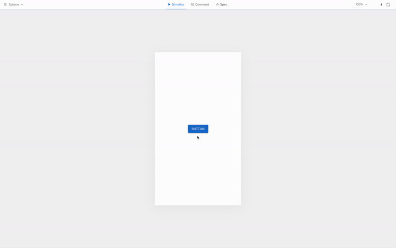
We’ve dragged a component from each UI library onto the canvas without applying any changes.
Figma:
UXPin:
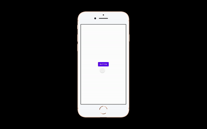
You’ll notice the UXPin component is interactive by default, with hover and click interactions defined in the repository. The Merge component is fully interactive because it’s an actual code component rather than a graphical representation.
The Figma component is not interactive by default because it’s essentially an image. Designers must set these interactions up in the design tool before prototyping. They must also share lots of supporting documentation and component variations at design handoff so engineers understand what to build.
Spec Mode vs. Dev Mode
Merge’s Spec Mode is also very different from Figma’s Dev Mode. Dev Mode allows designers to inspect elements with suggested CSS and other code–which we’ve already established is not production ready. Designers must also share each Figma component’s variants, interactions, animations, triggers, etc.
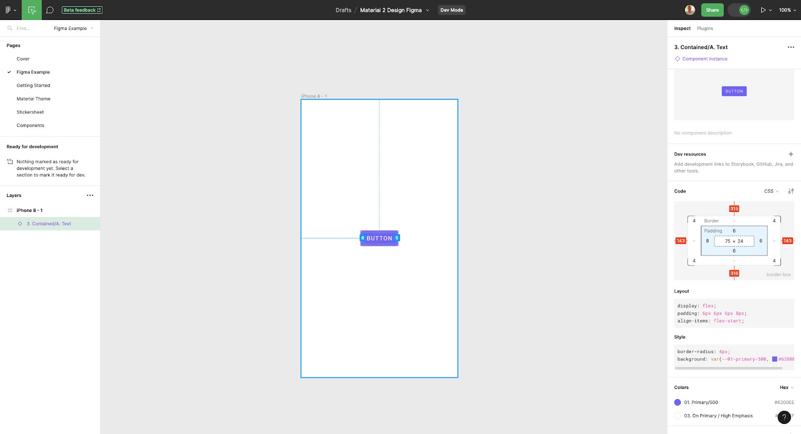
UXPin only displays the Merge component’s JSX properties (spacing, typography, size, etc.) for the prototype’s default or initial state. Developers already have the same UI library, which they import into their project from the same repository to start development. They simply copy/paste the JSX code from UXPin and apply it to the relevant component in their IDE.

Developers don’t need additional documentation detailing each component’s interactions, triggers, etc., because the design system team has already defined these properties in the repository. These baked-in constraints mean designers can’t change a component’s interactivity, whereas, in Figma, they can detach a component instance from its master component and change its properties.
Prototyping in Figma vs. Prototyping in UXPin
For the most part, the design environment, tools, and workflow is similar in Figma and UXPin. The differences are following.
Frames vs. pages
One of the biggest differences is Figma follows a frame and artboard workflow, while UXPin uses pages with a separate canvas for each screen. Designers can visualize the pages on a single screen as they would in Figma using UXPin’s Overview.
Adding interactivity
Figma’s Prototype feature allows designers to add basic interactivity with limited user actions. Config 2023 releases make it easier to change component states using Variables, but these are still far from the code-like experience necessary for accurate testing.
UXPin’s Interactions include many user triggers and actions for desktop and mobile prototyping. As Merge components are interactive by default, designers focus primarily on navigational interactions like page transitions and popups, allowing for faster designing and iterating.
Testing scope
Due to Figma’s lack of fidelity and functionality, designers are limited by what they can test using the platform. Design teams often use plugins, integrations, or other tools to increase prototyping scope, which increases costs, time, and other resources.
With UXPin Merge, designers can build fully interactive prototypes indistinguishable from the final product without plugins or integrations. They can also use APIs to connect to external services, significantly increasing testing scope. These advanced prototypes allow designers to collect meaningful insights during testing to make accurate design decisions for better product outcomes.
Ready to experience the benefits and ease of working with a code-to-design workflow? Visit our Merge page for more details and how to request access to this revolutionary technology.


