Good UX equals good conversions. In this piece, we’ll provide some UX tips for higher conversions and happier users.
Understand It’s Not Just About Clicks
For many years designers were told that a good website should only take the user three clicks for them to get to the desired destination. But the three-click rule has since been debunked. Former Hubspot UX Director actually found that it didn’t really make much difference how many times somebody clicked in order for them to engage with the content or buy a product.
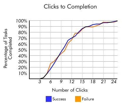
Photo credit: User Interface Engineering
Porter’s study analyzed more than 8,000 clicks, – determining if the user succeeded or failed in finding what they were looking for and how many clicks it took for them to give up. He found that some users visited as many as 25 and as few as two or three before stopping.
“If the Three-Click Rule came from data, we would certainly see it with this wide variation in the number of pages they visited,” says Porter. “If there is a scientific basis to the Three-Click Rule, we couldn’t find it in our data. Our analysis left us without any correlation between the number of times users clicked and their success in finding the content they sought.”
So there was no correlation between the number of clicks to user behavior in this case, nor was there to user clicks and customer satisfaction. As Porter points out, the three-click rule does have its place in forcing the design community to think more about users, but essentially it’s a flawed concept that has no real basis.
Don’t Let Users Give Up
Users leave a website when they can’t find what they want or at least see signals — an information scent, if you will — to guide them to it. Information scent describes “the extent to which users can predict what they will find if they pursue a certain path through a website,” according to Jakob Nielsen, who points out that it’s also a larger part of information foraging theory [PDF].

Photo Credit: Sybren Stüvel, Creative Commons
This theory is concerned with how users interact through an analogy of animals searching for food. In the animal kingdom, predators that follow a strong scent believe that they will be rewarded with their prey at the end of the trail. Similarly, users who are looking for specific answers or products on a website will keep on searching as long as they keep finding links that appear to make the goal seem within reach.
So long as the user is following what they believe to be a strong trail, they will remain on a site until they do.
” In our study of the usability of e-commerce sites, for example, users were looking for a baby seat for their car, and quite logically looked in the automotive section of one of the sites we were testing. No baby seats there, so no sale,” writes Nielsen in his article. “Users assumed that the site didn’t sell the product they needed because it wasn’t in the category where they assumed they’d find it. (In fact, the product was in a different section of the site, without a cross-reference from the car area).”
Leave a Logical Trail
As we described in Web UI Best Practices, a site with a strong navigation (and other guiding elements) will successfully convert more sales. A site that doesn’t craft its navigation, content, links and overall hierarchy to logically point the user to where they want to go is one that will suffer from ‘pogo sticking’.
Photo Credit: Gary H., Creative Commons
Further to this, a site that provides all of the right things and creates a strong ‘scent’ but doesn’t logically order the content or product will lose sales. While the number of clicks don’t mean a huge amount when it comes to user behavior, you should minimize whenever possible.
As designer David Hamill suggests in his excellent piece for UXBooth, it’s much more important that each click feels effortless.
Include The Right UI Design Elements
Websites vary wildly when it comes to what they offer to their visitors. This means that there’s no one-size-fits-all solution as to what constitutes the perfect page or site that converts. However, if the site is constructed bearing the above in mind, then that’s a good start, and there are certain elements that make up a great landing page.
These include:
- Great headline – Hooks the user by promising to deliver something that they want (and preferably under 7 lines).
- Sub-header –Describes how the product/service is going to achieve this.
- Value proposition – Attracts potential customers or users (for example: 99.99% uptime for a cloud hosting company).
- Relevant image – Conveys meaning with regards to the product and to the problem it will solve in the customer.
- Smooth form – Captures that all-important customer contact information. As recommended in Web UI Patterns, minimize your form fields as much as possible and consider mad-libs style forms as a creative alternative. If your form runs long, consider chunking it out into smaller forms with a progress bar at top
- Social media icons – The exception, of course, is for minimalist sites, in which case these icons can be removed for greater content emphasis.
- Idiotproof navigation elements and structure – Assume the user just wandered onto your site. Your navigation must show the user where to go at each stage and where the user should click or touch. Navigation must be touch friendly and not encroach on surrounding areas. Design your navigation to tell the user their current location, as well as the easiest path to completing their goal.
Photo credit: Squarespace
The language that’s used is also an important and integral part of the overall design.
Unfortunately, the copy on a site is often something of an afterthought for designers and it’s often not given enough weight. It can’t be stressed enough though that copy is an essential part of the mix – language is equally as powerful as images. As described in the free e-bookInteraction Design Best Practices, words are the foundation of all user interactions – they’re just as much a design element as a sidebar or icon since they complement the visuals and are all a part of the same interface.
It’s preferable to complete the copy before the design work even begins, as you can then use the language to inform your design and create something where every element works in harmony with the others. Furthermore, as content-first design dictates, you don’t run the risk of revamping a design in case the final copy doesn’t fit the existing visual constraints.
Think Mobile
When it comes to mobile, good landing pages that encourage user action are even more difficult to get right due to the limited space that you have to work with. For teams building mobile apps, considering how users will interact with your product across devices is equally critical—whether you’re developing a native app or exploring no-code app builders that let you design and publish custom apps to iOS, Android, and web simultaneously.
According to Unbounce: “Mobile users are more likely to be in a top-of-the-funnel research phase, so you need to make the information you provide digestible or they’ll give up and look elsewhere.“
So while you need to provide information that’s useful and relevant , you also have to ensure that it’s easy to read and presented in short, digestible, chunks.
Consider then, not just how the user reads online (e.g. the F & Z patterns we showed in Web Design for the Human Eye) but also the logistics of reading on a mobile device. Content should be large enough so that the user doesn’t have to do a lot of pinching and zooming (although some is inevitable on very small screens). Text and images should remain legible.
How many pages should content span on mobile? If you consider that users were prepared to make 25 clicks, then it stands to reason that you can get away with content that spans a few – although we wouldn’t necessarily recommend going with as many as 25.
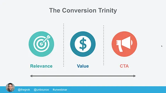
Image source: Unbounce
According to Amanda Durepos, writing for Unbounce, your landing page should:
- Be relevant to your audience and address its unique needs/pain points
- Clearly demonstrate the value that your product offers contextually
- Include and clear and compelling CTA which prompts user action
This, she says will allow you “do some serious damage control” to your pages in case anything slips with regards to mobile accessibility.
Let’s take a look at that in a little more detail.
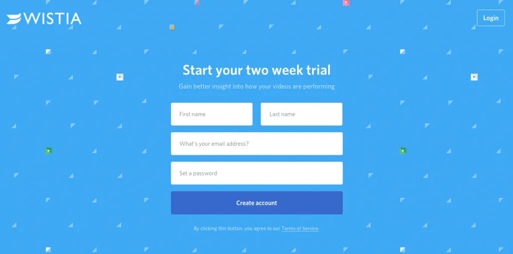
Image source: Wistia
While Wistia isn’t quite responsive, the signup page is great example of a page designed for conversions in every way.
The form asks to create a free account and the contrast provided between the blue and white ensures that the eye is immediately drawn to the form. The contrast between the white and the blue when it comes to above the fold content leaves the user in no doubt which is the most important area of the page.
Below that is a short FAQ for the really cautious user who wants to be armed with plenty of information before signing up, which also helps to increase trust.
This page ticks all of the boxes in the three main principles Durepos described for us. Even though the site isn’t responsive, the simple copy and use of color still make it somewhat usable for mobile devices.
Consider the Bigger Picture
So when considering your design elements, think about the page as a whole.
Consider what colors might be more effective and relevant to your niche too by using color psychology in design. Different colors make us feel various emotions. For example, dark blue is often associated with professions such as law and finance, as it inspires a sense of trust and luxury, whilst green is often used in sites that are connected to nature.
For a quick guide, check out the image below.
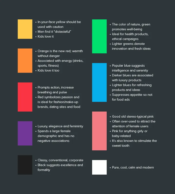
Photo credit: UXPin
You should also consider Hick’s Law, which states that the more choice you give to a user, the less inclined they will be to make one, as illustrated by the famous Jam Test.
Less is More
Designing a landing page that converts well is not a particularly easy task because you can’t second-guess the user.
This means that you have to be fully aware of what the audience likes if you’re to be 100% successful. Applying psychology to design can help inform your choices when it comes to color and the number of design elements to include on the page. Add to this the power of A/B testing and it’s possible to craft a page that tells your users exactly where they need to go, what they need to do, and why.
Simple pages generally work best, but this does depend on the audience and your specific industry. For example, travel websites are usually a little ‘busier’ than other industries as they must feature imagery and forms that are designed to allow you to quickly book a vacation.
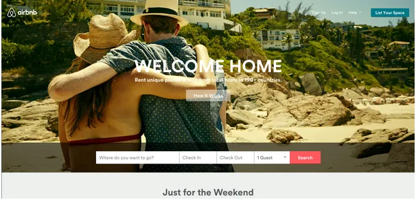
Source: Airbnb
Get it right and you’ll easily see site conversions shoot up. Get it wrong and it’s likely that you’ll be left wondering what you’ve done wrong.
With this in mind, you should ensure that you always test the page on as many real-world devices as you can before going live. If your budget allows it, you should also carry out usability testing before it’s ready to be tested on your audience.
For more advice on designing websites that leave the best first impression on users, check out the free e-book Web UI Design for the Human Eye.