Material-UI and React simplify prototyping by combining pre-built UI components with React‘s component-based architecture, enabling faster development and better design-to-code consistency. Here’s how they work together:
- Material-UI provides ready-to-use, customizable components based on Google’s Material Design, ensuring visual consistency.
- React allows for reusable, modular components, making it easy to build and iterate on prototypes.
- Benefits include:
- Faster prototyping with pre-built components.
- Consistent designs across prototypes and final products.
- Code-backed prototypes with real interactions and logic.
- Easy transition to production-ready code using tools like UXPin.
Key Steps to Get Started:
- Setup: Install Material-UI and React dependencies (
@mui/material,@emotion/react). - Organize: Create a clean project structure with reusable components.
- Customize: Use Material-UI’s theming system for consistent branding.
- Build: Combine Material-UI components like Buttons, Grids, and Cards for responsive, interactive layouts.
- Enhance: Add interactivity with React state management and Material-UI features like Dialogs and Snackbars.
For teams, tools like UXPin integrate Material-UI components directly into design workflows, bridging the gap between design and development while reducing errors and saving time. This approach ensures prototypes look and behave like the final product, streamlining feedback and development processes.
React + Material UI #2: Actually coding a UX design
Setting Up Your Material-UI and React Environment
To get started with Material-UI and React, you’ll need to follow three key steps: installing the necessary packages, organizing your project structure, and configuring theming.
Installing Material-UI and Dependencies
First, create a new React application. You can use Create React App to quickly set up your project:
npx create-react-app my-mui-prototype cd my-mui-prototype Once your React app is ready, install Material-UI along with its required dependencies. Material-UI uses Emotion for styling, so you’ll need to include both the core library and Emotion packages:
npm install @mui/material @emotion/react @emotion/styled Alternatively, if you’re using Yarn:
yarn add @mui/material @emotion/react @emotion/styled After installation, check your package.json file to confirm the dependencies are listed. Then, run the app with npm start to ensure it launches without issues. The app should be accessible at http://localhost:3000.
Next, focus on organizing your project for better scalability.
Organizing Your React Project
A clean project structure is essential for efficient development. Start by creating a src/components folder to house all reusable components. This approach keeps your project organized and makes it easier to locate and update components as your application grows.
To avoid potential conflicts with Material-UI, delete the default CSS files (App.css and index.css) included in the Create React App setup.
For larger projects, consider grouping related components (e.g., navigation, forms, and layouts) into subfolders within the components directory. This structure will save time and effort, especially when collaborating with a team or working on more complex prototypes.
With your project organized, you can now configure Material-UI’s theming system.
Setting Up Material-UI Configuration
Material-UI offers a powerful theming system to maintain consistent styling across your application. Begin by importing createTheme and ThemeProvider from @mui/material/styles in your main App component:
import { createTheme, ThemeProvider } from '@mui/material/styles'; Next, define a custom theme to reflect your project’s visual style. For example:
const theme = createTheme({ palette: { primary: { main: '#1976d2', // Customize the primary color }, }, }); Wrap your application with the ThemeProvider component and pass the theme object as a prop. This ensures all Material-UI components use your custom theme:
function App() { return ( <ThemeProvider theme={theme}> <YourAppComponents /> </ThemeProvider> ); } Here’s an example of how you can use a Material-UI component with the custom theme:
import Button from '@mui/material/Button'; <Button variant="contained" color="primary"> Click Me </Button> The ThemeProvider acts as a centralized hub for global styling, allowing you to update your app’s look and feel from a single location.
| Setup Step | Command/Action | Purpose |
|---|---|---|
| Create React App | npx create-react-app my-mui-prototype |
Bootstrap a new React project |
| Install Material-UI | npm install @mui/material @emotion/react @emotion/styled |
Add Material-UI and its dependencies |
| Organize Components | Create src/components/ folder structure |
Maintain clean and scalable organization |
| Configure Theme | Use createTheme and ThemeProvider |
Apply consistent styles across the app |
| Test Setup | npm start |
Verify the app runs without issues |
Creating and Customizing Material-UI Components
Material-UI makes it easy to build prototypes by combining its pre-built components with customization options tailored to your design needs.
Using Pre-Built Material-UI Components
Material-UI comes with a wide range of ready-to-use components based on Google’s Material Design principles. Popular choices for prototyping include Buttons, Cards, Grids, and TextFields. These components not only look polished but also provide functionality right out of the box.
Here’s an example of how you can use these components to create a simple registration form:
import { Button, Card, CardContent, Grid, TextField, Typography } from '@mui/material'; function PrototypeExample() { return ( <Grid container spacing={2}> <Grid item xs={12} sm={6}> <Card> <CardContent> <Typography variant="h5" component="h2"> User Registration </Typography> <TextField label="Email Address" variant="outlined" fullWidth margin="normal" /> <Button variant="contained" color="primary" fullWidth> Sign Up </Button> </CardContent> </Card> </Grid> </Grid> ); } This code demonstrates how to quickly assemble a functional layout. The Grid system ensures responsiveness, automatically adapting to different screen sizes – taking the full width on mobile (xs={12}) and half the width on larger screens (sm={6}). The Card groups related content, while TextField and Button handle user input and actions.
Material-UI components like Buttons come with multiple variants (contained, outlined, text) and color options (primary, secondary, error), making it easy to create a clear visual hierarchy. With these tools, you can quickly get a polished prototype up and running.
Customizing Components with Styling
Material-UI offers three main ways to customize components: the sx prop, the styled API, and custom themes. Each method serves a specific purpose, depending on the scope of your prototype.
- The
sxprop is ideal for quick, inline adjustments. It lets you define styles directly in your component with a theme-aware JavaScript object:
<Button sx={{ backgroundColor: '#ff4081', color: 'white', padding: 2, borderRadius: 3, '&:hover': { backgroundColor: '#e91e63' } }} > Custom Pink Button </Button> - The
styledAPI is great for creating reusable, styled components. Here’s an example:
import { styled } from '@mui/material/styles'; const BrandButton = styled(Button)({ backgroundColor: '#1976d2', color: '#fff', borderRadius: 8, padding: '12px 24px', textTransform: 'none', boxShadow: '0 4px 8px rgba(0,0,0,0.1)', '&:hover': { backgroundColor: '#1565c0', boxShadow: '0 6px 12px rgba(0,0,0,0.15)', }, }); <BrandButton>Styled Brand Button</BrandButton> This method allows you to define consistent styles for custom components like a BrandButton, which can be reused throughout your project.
When customizing, keep accessibility in mind. For example, ensure sufficient color contrast and use semantic HTML elements. Material-UI components come with built-in accessibility features, so any customizations should align with these standards.
Creating Custom Themes for Branding
Custom themes are the most effective way to ensure your design reflects your brand identity. By setting up a theme, you can centralize the visual language of your application, making it easier to maintain consistency across components.
Here’s how you can create a theme tailored to your brand:
import { createTheme } from '@mui/material/styles'; const brandTheme = createTheme({ palette: { primary: { main: '#1976d2', light: '#42a5f5', dark: '#1565c0', }, secondary: { main: '#dc004e', light: '#ff5983', dark: '#9a0036', }, background: { default: '#f5f5f5', paper: '#ffffff', }, }, typography: { fontFamily: '"Roboto", "Helvetica", "Arial", sans-serif', h1: { fontSize: '2.5rem', fontWeight: 600, }, button: { textTransform: 'none', fontWeight: 500, }, }, spacing: 8, shape: { borderRadius: 12, }, }); This theme defines your colors, typography, spacing, and shapes. For example, the palette object specifies primary and secondary colors, while the typography section ensures consistent font styles. The spacing property standardizes margins and padding, and shape applies rounded corners to components like buttons and cards.
To go a step further, you can override component-specific styles directly within the theme:
const brandTheme = createTheme({ // ... previous theme settings components: { MuiButton: { styleOverrides: { root: { borderRadius: 8, padding: '8px 24px', }, contained: { boxShadow: '0 2px 4px rgba(0,0,0,0.1)', }, }, }, MuiCard: { styleOverrides: { root: { boxShadow: '0 4px 12px rgba(0,0,0,0.05)', borderRadius: 12, }, }, }, }, }); These overrides ensure that every Button and Card adheres to your design standards without requiring manual adjustments.
"We have fully integrated our custom-built React Design System and can design with our coded components. It has increased our productivity, quality, and consistency, streamlining our testing of layouts and the developer handoff process." – Brian Demchak, Sr. UX Designer at AAA Digital & Creative Services
sbb-itb-f6354c6
Building Prototypes: Layouts, Responsiveness, and Interactivity
Using customized Material-UI components, you can elevate your prototype by incorporating responsive layouts, interactive features, and dynamic state management.
Creating Responsive Layouts
Responsive layouts are the backbone of effective prototypes, and Material-UI’s Grid system makes this process seamless. Built on CSS Flexbox, the Grid system employs a 12-column layout that adapts automatically to various screen sizes. It uses predefined breakpoints (xs, sm, md, lg, xl) to ensure your design works across devices.
The Grid system relies on two key components: Grid container and Grid item. Here’s an example of a responsive product grid:
import { Grid, Card, CardContent, Typography, CardMedia } from '@mui/material'; function ResponsiveProductGrid() { return ( <Grid container spacing={3}> <Grid item xs={12} sm={6} md={4} lg={3}> <Card> <CardMedia component="img" height="200" image="/product1.jpg" alt="Product 1" /> <CardContent> <Typography variant="h6">Premium Headphones</Typography> <Typography variant="body2" color="text.secondary"> High-quality audio experience with noise cancellation </Typography> </CardContent> </Card> </Grid> {/* Repeat for more products */} </Grid> ); } In this layout, the grid adjusts to show one column on mobile devices (xs={12}), two on tablets (sm={6}), three on small laptops (md={4}), and four on large desktops (lg={3}). This mobile-first approach ensures a smooth experience across all screen sizes.
Adding Interactivity to Prototypes
Static designs are a good start, but interactivity breathes life into prototypes. Material-UI offers tools like Dialogs and Snackbars to create engaging user experiences by delivering focused content and immediate feedback.
Here’s an example of an interactive user profile update flow:
import { useState } from 'react'; import { Dialog, DialogTitle, DialogContent, DialogActions, Button, TextField, Snackbar, Alert } from '@mui/material'; function InteractiveProfile() { const [dialogOpen, setDialogOpen] = useState(false); const [snackbarOpen, setSnackbarOpen] = useState(false); const [profileData, setProfileData] = useState({ name: '', email: '' }); const handleSave = () => { setDialogOpen(false); setSnackbarOpen(true); // Simulate API call }; return ( <> <Button variant="contained" onClick={() => setDialogOpen(true)}> Edit Profile </Button> <Dialog open={dialogOpen} onClose={() => setDialogOpen(false)}> <DialogTitle>Update Profile</DialogTitle> <DialogContent> <TextField label="Full Name" fullWidth margin="normal" value={profileData.name} onChange={(e) => setProfileData({ ...profileData, name: e.target.value })} /> <TextField label="Email Address" type="email" fullWidth margin="normal" value={profileData.email} onChange={(e) => setProfileData({ ...profileData, email: e.target.value })} /> </DialogContent> <DialogActions> <Button onClick={() => setDialogOpen(false)}>Cancel</Button> <Button onClick={handleSave} variant="contained">Save</Button> </DialogActions> </Dialog> <Snackbar open={snackbarOpen} autoHideDuration={4000} onClose={() => setSnackbarOpen(false)} > <Alert severity="success">Profile updated successfully!</Alert> </Snackbar> </> ); } In this case, the Dialog component allows users to edit their profile in a focused interface, while the Snackbar provides a quick confirmation after saving. These elements make your prototype feel more like a real application.
Managing State in React for Prototypes
React’s hooks simplify the process of managing dynamic interactions. The useState hook is perfect for handling straightforward state changes, such as toggling between tabs.
Here’s an example of a tabbed interface:
import { useState } from 'react'; import { Tabs, Tab, Box, Typography } from '@mui/material'; function TabPrototype() { const [activeTab, setActiveTab] = useState(0); const handleTabChange = (event, newValue) => { setActiveTab(newValue); }; return ( <Box> <Tabs value={activeTab} onChange={handleTabChange}> <Tab label="Dashboard" /> <Tab label="Analytics" /> <Tab label="Settings" /> </Tabs> {activeTab === 0 && <Typography variant="h4">Dashboard Content</Typography>} {activeTab === 1 && <Typography variant="h4">Analytics Content</Typography>} {activeTab === 2 && <Typography variant="h4">Settings Content</Typography>} </Box> ); } For more complex scenarios, such as multi-field forms, React’s useReducer hook can help manage state transitions more effectively. This allows for better organization and control over intricate logic, taking your prototype’s interactivity to the next level.
Using UXPin for Code-Backed Prototyping
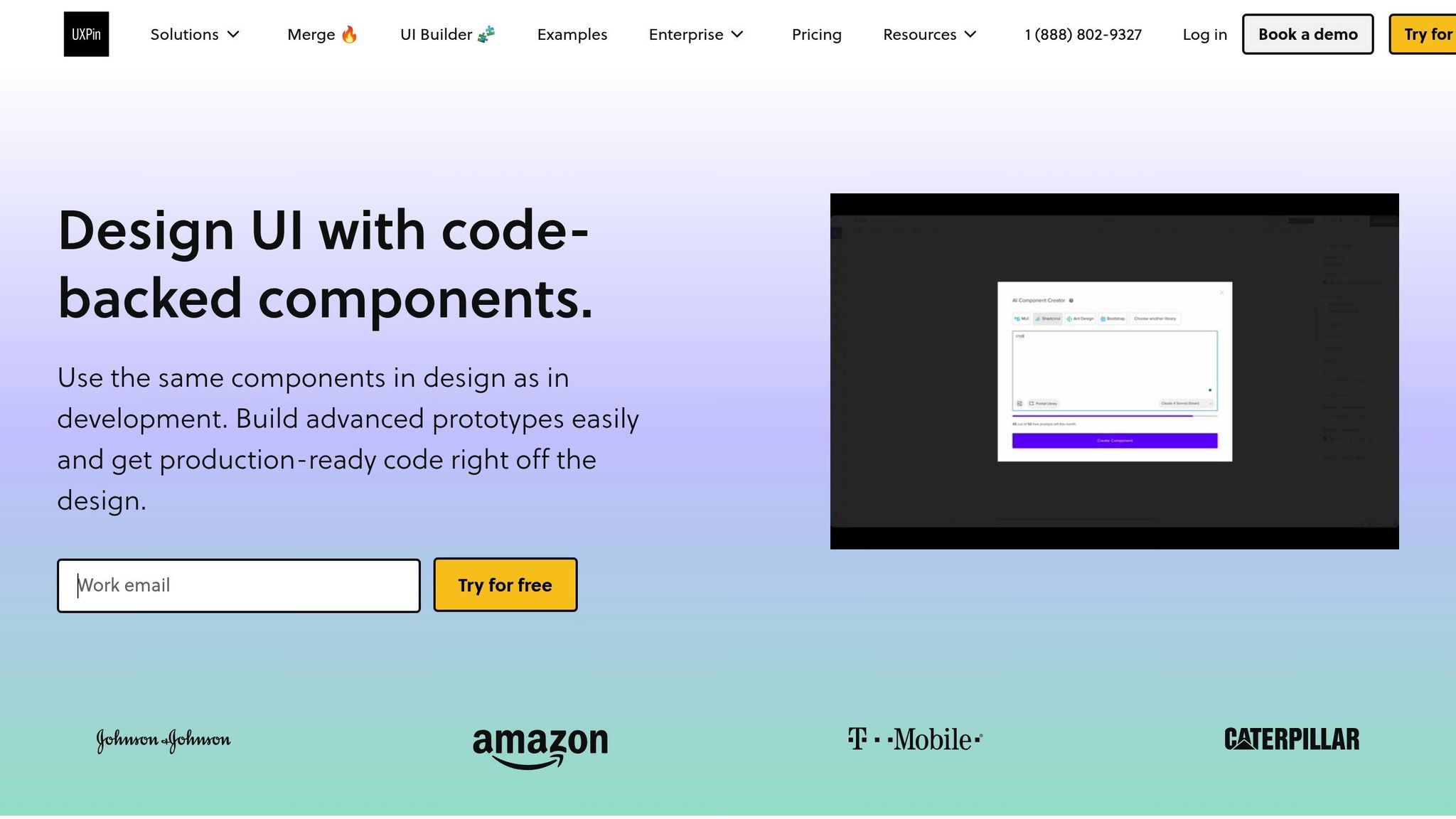
UXPin takes the already robust Material-UI and React setup to the next level, making the prototyping process even more seamless. By incorporating actual code into interactive design, UXPin ensures your prototypes closely mirror the final product.
Working with UXPin’s Material-UI Libraries
One of UXPin’s standout features is its ability to bridge the gap between design tools and development frameworks. It allows you to work directly with Material-UI components, offering a drag-and-drop interface for elements like Buttons, Cards, and Grid layouts.
There are two ways to integrate Material-UI components in UXPin. You can use the platform’s built-in Material-UI library, which provides instant access to popular React components, or you can sync your own custom Git component repository to work with your team’s unique design system. This flexibility ensures your prototypes align perfectly with your development environment.
When you add a Material-UI Button in UXPin, you’re not just placing a static visual element; you’re working with a fully functional React component. You can tweak properties like variant, color, and size just as you would in actual code. This means what you design is exactly what developers will implement – no surprises, no inconsistencies.
Even better, updates to your component library automatically sync with your prototypes. If your development team updates a Material-UI theme or introduces a custom component, those changes flow into UXPin without manual updates. This ensures your designs stay consistent and up-to-date, creating a smoother workflow from start to finish.
Key UXPin Features for Prototyping
UXPin offers a range of features that make prototyping faster and smarter. One standout is the AI Component Creator, which uses AI models like OpenAI or Claude to generate code-backed layouts from simple text prompts. For example, you could describe "a product dashboard with filtering options and data visualization", and UXPin will produce a functional prototype using Material-UI components.
The platform also supports advanced interactions with features like conditional logic, variables, and state management. This allows you to create prototypes that respond dynamically to user actions – like validating form fields or changing content based on user roles – without needing to write any code.
Reusable UI components act as a living style guide, while real-time collaboration tools let teams work together effortlessly. Changes are instantly visible to all team members, and built-in commenting tools make it easy to provide feedback on specific components or interactions. These features, combined with code-backed prototypes, help teams reduce iteration cycles and improve efficiency.
Benefits of Code-Backed Prototyping with UXPin
Using actual Material-UI components in your prototypes eliminates the guesswork during handoffs. Developers receive specifications that match the production environment exactly, ensuring consistency in spacing, colors, and component behavior.
UXPin’s production-ready React code export feature speeds up the transition from prototype to development. It generates clean React code with all necessary dependencies, which developers can integrate directly into their projects. This code can also be tested immediately in online environments like StackBlitz or exported as a complete project structure.
Conclusion: Improving Your Prototyping Workflow
Key Takeaways
Material-UI and React provide a powerful combination for creating high-fidelity prototypes that effectively connect design and development. By using pre-built, production-ready components, teams can speed up development while adhering to Material Design principles. This approach fosters smoother collaboration between designers and developers, reduces friction during handoffs, and ensures that designs are implemented with precision.
Prototyping with production-ready Material-UI components eliminates guesswork and reduces inconsistencies. Tools like the createTheme function and ThemeProvider help maintain brand consistency across prototypes, while the sx prop and styled API allow for detailed, component-level customizations. These features ensure that prototypes not only look accurate but also behave as intended.
A streamlined workflow benefits from clear component structures, shared themes, and regular code refactoring. Interactive prototypes also allow teams to gather feedback early, helping stakeholders visualize the final product before full development begins. This process lays the groundwork for a more efficient prototyping approach.
Next Steps for Better Prototyping
To refine your prototyping workflow, start by leveraging code-backed design components from UXPin’s Material-UI libraries or your synced Git repository. This gives you a strong foundation to build high-fidelity prototypes that mirror the final product, complete with advanced interactions, variables, and logic.
Make code your single source of truth by unifying your Material-UI and React environment within UXPin. This ensures both designers and developers work with the same code-backed components, improving team alignment and efficiency. UXPin’s AI Component Creator can further simplify the process by generating layouts from simple text prompts, and its ability to export production-ready React code eliminates the need for manual coding.
The benefits to your development timeline can be substantial. Many teams report cutting engineering time by as much as 50% when adopting code-backed prototyping workflows. This efficiency comes from reducing manual redlining, minimizing back-and-forth communication, and providing developers with clean, ready-to-use React code.
To keep improving, explore advanced Material-UI features like responsive utilities and accessibility tools. Build and maintain a shared component library that evolves with your team’s needs, and use UXPin as your central hub for prototyping. This will enable real-time collaboration and make feedback cycles more efficient, ensuring your team stays on track and aligned.
FAQs
How do Material-UI and React streamline the prototyping process for development teams?
Material-UI and React make prototyping much easier by providing code-backed components. These components ensure that what’s designed matches what’s developed, eliminating inconsistencies and cutting down on rework. Essentially, the same components flow seamlessly through both design and development stages.
Using these tools, teams can craft interactive, high-fidelity prototypes that look and feel like the final product. Plus, this approach produces production-ready React code, speeding up the development process and saving valuable time.
How can I customize Material-UI components to align with my brand in high-fidelity prototypes?
To make your Material-UI components align with your brand in prototypes, focus on tweaking theme settings and component styles. Begin by creating a custom theme with Material-UI’s createTheme function. This is where you can define your brand’s colors, typography, and spacing preferences. Once your theme is ready, use the ThemeProvider to apply it globally, ensuring a consistent look throughout your project.
For more detailed customizations, you can adjust individual component styles using the sx prop or the styled utility. This lets you tailor specific elements, such as buttons, inputs, or cards, to better reflect your brand’s identity. By following these steps, your prototypes will not only look professional but also stay true to your design goals.
How does UXPin improve the prototyping workflow with Material-UI and React, and what are its key benefits?
UXPin streamlines the prototyping process by letting designers and developers craft interactive prototypes using Material-UI and React, all powered by real code. With UXPin, you’re not just designing – you’re working directly with actual React components, ensuring your prototypes match the final development output.
By incorporating Material-UI’s pre-coded libraries, UXPin allows you to create detailed, high-fidelity prototypes that stay consistent across both design and development. This smooth transition from design to code boosts collaboration, minimizes mistakes, and helps teams deliver production-ready React code faster and with greater accuracy.

