Profile Page UI Design: Best Practices, Examples & How to Build One (2026)
Profile pages are one of the most universally recognized UI patterns in digital product design. Whether you’re building a social platform, a SaaS dashboard, a healthcare app, or an internal team directory, the profile page is where users see and manage their identity. Getting this design right affects engagement, trust, and retention.
This guide covers the essential components of profile page UI design, real-world examples from different industries, practical design tips, accessibility considerations, and how to prototype profile pages quickly with production-ready components — updated for 2026.
Key takeaways:
- A profile page displays user information and provides a personalized space for managing identity, preferences, and activity.
- Core elements include a profile card (avatar + name), About Me section, interests/achievements, and a follow or connect button.
- Design for your specific audience — a fitness app profile differs fundamentally from a healthcare professional profile.
- Use progressive profiling to collect information gradually and reduce onboarding friction.
- Maintain consistency with the rest of your app through a shared design system.
Prototype your profile page UI with real, interactive components — no handoff required. UXPin Forge lets you describe a profile layout in plain language and generates a working screen from production React components. Try UXPin for free.
Essential Profile Page UI Elements
Profile pages can contain a wide range of information depending on your application’s purpose. Regardless of the specifics, the following elements form a strong foundation that users instantly recognize.
Profile Card
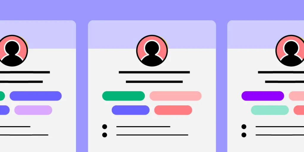
The profile card is the visual anchor of any profile page. It typically includes a profile photo (or avatar) and the user’s display name — the two most recognizable identity elements.
Profile pictures help users identify each other quickly. Research shows people remember visual information better than text, which makes images essential for social and collaborative platforms.
Keep profile picture management simple — adding, changing, and cropping should be intuitive. Depending on your platform, consider supporting avatars, multiple images, or placeholder initials for users who don’t upload a photo.
The display name should be easy to edit. Names change for many reasons (marriage, legal updates, personal preference), so don’t treat them as immutable fields. Consider also supporting nicknames or preferred names.
About Me Section
While photos and names make users identifiable, an About Me section lets them express who they are in their own words. Depending on the platform, this might include a short bio, work experience, location, cultural identity, or personal interests.
In professional networking apps, the About Me section is often the deciding factor for hiring managers or potential collaborators. If this section is cluttered or irrelevant, visitors may skip the profile entirely. Set users up for success with clear formatting suggestions and relevant placeholder content.
Interests and Achievements
An interests section helps users find common ground, while achievements provide professional or personal credibility. Both can use engaging visual treatments — tags, icons, badges, and progress indicators.
Keep these sections optional. Use progressive profiling — require only essential information at sign-up (name, email, photo) and prompt users to fill in additional details over time. This reduces onboarding friction and increases overall profile completion rates.
Follow / Connect Button
For apps with social or networking features, the follow/connect button is critical. Design considerations:
- Placement: On mobile, position the button within thumb reach — the lower third of the screen or near the profile card.
- Feedback: The button should visually respond to interaction (pressed state, confirmation).
- Visibility: It should be easy to identify at a glance — don’t bury it below the fold.
For best practices on button design and button states, see our dedicated guides.
Profile Page UI Examples
Let’s look at how different applications approach profile page design for their specific audiences.
Example 1: Personal Page Template by Monty Hayton

This personal page template highlights the individual. The organized layout supports multiple photos that hint at interests, but the profile photo stands out through its positioning and shape. A short bio and connection list round out the page — plenty of information with no clutter.
Example 2: Sports App by Rifayet Uday

This sports app demonstrates how profile UI can be themed to suit a specific purpose. Instead of a traditional bio and interests section, the profile emphasizes activity type, distance, calories, and routes — directly supporting the app’s goal of encouraging exercise.
Example 3: Fashion Profile by Vijay Verma

This fashion profile uses bold colors with an ombré theme, proving that colorful designs can be visually rich without becoming cluttered. The colors are strategically placed to draw attention to interactive elements. For guidance on choosing a color palette that works for your profile pages, see our dedicated guide.
Example 4: Healthcare Professional Profile by Mehedi Hasan Roni

This healthcare profile serves two audiences with one design: the doctor can display their name, availability, and qualifications, while patients can read reviews and book appointments. It’s an excellent example of how profile pages can serve dual purposes while maintaining a clean, easy-to-navigate interface.
How to Design a Profile Page: Practical Tips
Tip 1: Start With User Research
Before designing anything, understand who will use the profile page and why. User research should guide every design decision — from what fields to include to how information is prioritized.
Identify your target demographics and their goals. For a dentistry app, research might reveal that patients care most about credentials, availability, and reviews — so those elements should be most prominent. Discover and eliminate pain points like cumbersome appointment booking or hard-to-find contact information.
Tip 2: Ensure Design Consistency Across the Product
Your profile page should feel like a natural part of the overall product — not a standalone screen. This means consistent color palettes, typography, spacing, and interaction patterns.
A design system is the most reliable way to enforce this consistency at scale. With UXPin Merge, your profile page prototype uses the same coded components as every other screen in your product — so visual consistency is guaranteed, not just aspirational.
Tip 3: Prototype With Production Components
Static mockups can’t capture how a profile page actually feels to use — editing a bio, uploading a photo, switching between tabs. Use a prototyping tool that supports real interactivity.
UXPin Forge lets you describe a profile page layout in plain language — “a profile card with avatar, name, bio, and a tabbed section for Posts, Following, and Settings” — and generates a working prototype from production React components like MUI or shadcn/ui. You can iterate conversationally: “add an edit button to the bio section” or “make the avatar 80px with a circular crop.”
Because the output uses real components, the prototype you test with users is structurally identical to what developers will build — eliminating surprises during handoff.
Tip 4: Collect Feedback From Team Members and Users
Platforms are built for users, but they depend on a well-connected team. Share prototypes for design critique sessions, then test with real users from your target demographic.
After launch, use in-app feedback to guide future iterations. Profile pages often need multiple rounds of refinement as you learn how people actually use them.
Tip 5: Avoid Clutter — Prioritize Information
The right balance of personality and clarity depends on your app’s purpose. An exercise app can function with a name, image, and recent workout stats. A social media profile may include hobbies, interests, and media galleries.
Use interactive components — tabs, accordions, collapsible sections — to break information into digestible chunks without overwhelming the page. This keeps the profile clean while allowing depth for users who want it.
Tip 6: Design for Accessibility
Profile pages contain many interactive elements — buttons, links, tabs, image uploaders — that must all be keyboard accessible. Key considerations:
- Add descriptive alt text to profile images
- Ensure all buttons and links are keyboard-navigable
- Use proper heading hierarchy (H1 for the user name, H2 for sections)
- Maintain sufficient color contrast for all text
- Label form fields for screen reader compatibility
Build Better Profile Pages
Profile pages are fundamentally about users — giving them a space to be seen, express themselves, and connect with others. The best profile designs balance visual appeal with clarity, personality with usability, and richness with restraint.
Start by understanding your audience. Prototype with real components so you can test interactions before committing to code. Iterate based on real feedback. And enforce consistency through a shared design system.
UXPin Forge makes it easy to go from idea to interactive prototype in minutes — describe the layout you need, and Forge generates it from production React components. Refine with UXPin’s professional design tools, then hand off clean, code-backed specs to your development team.
Sign up for a free UXPin trial and start building your profile page prototype today.
Frequently Asked Questions About Profile Page UI Design
What are the essential elements of a profile page UI?
The core elements are: a profile card (avatar/photo and display name), an About Me or bio section, interests and achievements, a follow or connect button, and navigation to the user’s content or activity. Depending on the app, you may also include settings, privacy controls, and activity feeds.
How do I make a profile page accessible?
Ensure all interactive elements are keyboard-navigable. Add descriptive alt text to profile images. Use sufficient color contrast. Implement proper heading hierarchy. Label all form fields for screen readers. Test with keyboard-only navigation and a screen reader.
What is progressive profiling?
Progressive profiling collects user information gradually rather than all at once. During sign-up, ask only for essential fields (name, email, photo). Over time, prompt users to add more details. This reduces onboarding friction and improves completion rates.
How do I prototype a profile page quickly?
Use UXPin Forge to describe your profile page layout in plain language. Forge generates a working prototype from production React components (avatars, cards, buttons, tabs) in minutes. Iterate conversationally and test with real users before writing any code.
Should profile pages look the same on mobile and desktop?
The content should be consistent, but the layout must adapt. On mobile, stack elements vertically, keep the follow/connect button within thumb reach, and prioritize the most critical information above the fold. A component library like MUI or shadcn/ui handles responsive behavior automatically.
How do I maintain design consistency across profile pages and the rest of the app?
Use a shared design system with defined tokens for color, typography, spacing, and component behavior. With UXPin Merge, your profile page prototype uses the same coded components as every other screen — so consistency is enforced automatically, not manually.