Reusable React components streamline prototyping by offering pre-built, interactive UI elements that save time and ensure consistency. These components combine functionality, styling, and behavior, allowing designers and developers to create high-fidelity prototypes that closely mimic the final product. Platforms like UXPin Merge simplify this process by integrating React libraries directly into design workflows, enabling seamless collaboration between teams.
Key Takeaways:
- What They Are: Modular, self-contained UI elements that can be reused across projects.
- Why They Matter: Reduce repetitive work, maintain design consistency, and simplify updates.
- Best Practices: Follow the single responsibility principle, use composition over inheritance, and prioritize accessibility.
- Tools: UXPin Merge integrates React components for drag-and-drop prototyping with real functionality.
Reusable components aren’t just about efficiency – they also improve collaboration and help maintain uniformity across designs and prototypes.
Design To React Code Components
Key Principles for Designing Reusable React Components
Building reusable React components requires careful planning and adherence to certain principles. These guidelines ensure components are easy to understand, adaptable, and durable – qualities that are especially important in fast-moving workflows like prototyping.
Single Responsibility Principle
A component should focus on doing one thing well. For instance, a button component should handle click events, manage its visual states (like hover or disabled), and display text or icons. It shouldn’t also be responsible for form validation or managing complex business logic – that’s the job of other components.
Keeping components focused makes them easier to debug, test, and reuse. When a teammate picks up your code, they should immediately grasp what a component does without wading through unnecessary complexity.
This principle also streamlines testing. A component with a limited scope requires fewer test cases and is less prone to breaking when other parts of the system evolve. In a prototyping environment, where requirements often shift, this simplicity becomes even more valuable.
Composition Over Inheritance
Instead of relying on inheritance to create complex hierarchies, design components to work together through composition. This approach uses props and children to combine simple components into more sophisticated ones.
For example, a card component can be built by combining smaller components like a header, a content area, and a button. This is far more manageable than cramming all that functionality into a single, bloated component.
Composition makes components more flexible. You can reuse the same button component in a card, a modal, or anywhere else in your app, ensuring consistent behavior and appearance across your prototype.
React’s children prop is especially useful here. It allows you to create wrapper components that can hold any type of content. For instance, a modal component using children can display anything from forms to images, making it incredibly versatile.
Customizability and Maintainability
Reusable components should be easy to customize without requiring direct changes to the code. This means exposing the right props for likely variations – like color, size, or text – while providing sensible defaults for everything else. A properly designed component works out of the box but also offers flexibility when needed.
To keep components simple and maintainable, only expose props that are necessary. For example, instead of a generic type prop, use more descriptive ones like variant for styling or size for dimensions. Clear naming conventions and concise documentation further enhance maintainability, making it easier for others to use your components effectively.
Think ahead when designing your components. Use CSS custom properties for styling that might need adjustments, and structure your logic to allow for future features without major rewrites. This is especially critical in prototyping, where requirements tend to change frequently.
Sometimes, it’s better to create multiple specialized components rather than overloading a single one. For instance, a basic button and an icon button can be separate components instead of merging them into one overly complex solution. This approach keeps your codebase cleaner and easier to manage.
Checklist for Creating Reusable React Components
Building reusable React components takes a thoughtful and structured approach. Here’s a step-by-step guide to ensure your components are reliable, maintainable, and easy to use across different scenarios.
Define the Component’s Purpose
Start by clearly identifying what the component is supposed to do. Ask yourself: What specific UI problem does this component address? A well-defined purpose keeps your design focused and avoids unnecessary complexity.
Follow the "three-times rule": if a UI element appears at least three times or is inherently complex, it’s a good candidate for reusability. This helps you prioritize creating reusable components without overcomplicating simple elements.
Separate business logic from UI logic – this keeps the component focused and easier to test. For example, a card component should focus on layout and presentation, while any data-fetching logic should live elsewhere.
Think modular. Instead of creating one massive component, break it down into smaller, focused pieces. For instance, a card component might consist of subcomponents like a header, content area, and footer. This approach makes your components easier to mix, match, and maintain.
Finally, document the component’s purpose in one clear sentence. For example: "This component displays user profile information, including an avatar, name, and status indicator." This clarity not only guides your design but also helps your team quickly understand the component’s role.
Use Props to Enable Flexibility
Props are the key to making components adaptable without needing frequent code changes. They allow you to customize behavior and appearance while keeping the core structure intact.
- Start with required props for the component’s essential functionality. For instance, a button component might require
childrenfor the label andonClickfor the action. - Add optional props for variations. For example, a button could offer props like
variant,size, anddisabledfor styling and behavior tweaks.
Use clear and descriptive prop names. For instance, use variant instead of something vague like type. This ensures your components are self-explanatory and easy to use.
Set default values for optional props to provide a functional baseline. For example, a button component should have default settings for its size and style, so users don’t need to specify everything for basic usage.
Leverage prop validation with PropTypes or TypeScript. This helps catch errors early, especially in fast-paced prototyping environments. Clear error messages can save developers time by making issues easier to diagnose.
Design props to work consistently across your components. For instance, if one component uses a color prop, ensure it behaves the same way in other components. This consistency simplifies learning and makes your library more intuitive.
Ensure Accessibility and Usability
Accessibility should never be an afterthought – it’s essential for creating inclusive, user-friendly components that work for everyone.
- Add ARIA attributes where needed. For example, a custom dropdown should include attributes like
role="combobox",aria-expandedfor its state, andaria-labelledbyto associate it with a label. These attributes help screen readers and other assistive tools understand your component. - Implement keyboard navigation for all interactive elements. Users should be able to navigate and interact using just a keyboard. Test components to ensure buttons can be activated with Enter or Space, and lists can be navigated with arrow keys.
- Use semantic HTML elements as your foundation. Native elements like
<button>,<input>, and<select>come with built-in accessibility features and expected behaviors. Avoid reinventing the wheel with<div>elements. - Ensure color contrast meets accessibility standards. Don’t rely solely on color to convey meaning – use text or icons alongside color cues for error states or other key information.
- Test with assistive technologies. Tools like screen readers and voice control software can reveal usability issues you might miss during visual testing. Even basic tests with your device’s built-in screen reader can provide valuable insights.
- Handle focus management carefully. For example, when a modal opens, focus should shift to the modal, and when it closes, focus should return to the element that triggered it. These details enhance the user experience and make your components feel polished.
sbb-itb-f6354c6
Managing Reusable Components in Prototyping Projects
After creating solid reusable React components, the next challenge is keeping them organized, up-to-date, and accessible across your prototyping projects. Poor management can lead to maintenance headaches, but a well-thought-out strategy can streamline workflows and minimize errors.
Organize Components into Libraries
To make the most of your components, structure them in a way that encourages reuse. A centralized component library is key to maintaining consistency and improving team collaboration. With a single source of truth, everyone can find what they need without wasting time.
Start by grouping components by their function rather than by project. For example, create categories like "Form Elements", "Navigation", "Data Display", and "Feedback." This functional categorization makes it easier for developers to locate the right component for specific tasks.
Establish a clear folder structure. Within your library, separate directories for components, utilities, and documentation can keep things tidy. Each component should live in its own folder, containing the main component file, styles, tests, and a story file for documentation purposes.
Speaking of documentation, ensure every component includes usage examples and guidelines. This might include details about when to use the component, its available props, and common implementation patterns. Comprehensive documentation is a lifesaver for team members working with components they didn’t create.
For common use cases, consider adding pre-configured component variants. For instance, instead of expecting developers to remember prop combinations for buttons, provide options like "PrimaryButton", "SecondaryButton", and "DangerButton." These variants reduce guesswork and help maintain consistency across projects.
Finally, apply clear naming and versioning standards to make updates more manageable.
Version Control and Naming Conventions
Consistency in naming and versioning is crucial for avoiding confusion and ensuring smooth updates.
Use semantic versioning (semver) for your component library. This system breaks versions into major, minor, and patch updates. Major updates signal breaking changes, minor updates introduce new features, and patch updates fix bugs. This approach helps teams understand the scope of changes and plan accordingly.
Adopt clear naming conventions for components, props, and files. Component names should follow PascalCase (e.g., "UserProfileCard") for clarity, while props should use camelCase (e.g., "isDisabled") to describe their function. Avoid using abbreviations that might confuse others – clarity is key.
For version control, use branch prefixes like "feature/" or "bugfix/" to describe the purpose of a branch. This small step keeps your repository organized and easy to navigate.
Maintain a changelog to document all updates, including new components, fixes, or breaking changes. A well-kept changelog provides a clear history of the library’s evolution and makes troubleshooting easier when issues arise.
To catch potential issues early, incorporate automated testing into your CI/CD pipeline. Visual regression testing is particularly useful for component libraries, as it can detect unintended styling changes that might not be caught by standard code-based tests.
With these systems in place, you’re ready to integrate your components into UXPin for a seamless design-to-development workflow.
Integration with UXPin
UXPin simplifies prototyping by allowing direct integration with your React component library via npm or Storybook. This integration ensures that designers and developers work with the same components, closing the gap between design and production.
To get started, import your component library into UXPin using npm or Storybook sync. This setup ensures that updates to your codebase are reflected in your UXPin prototypes, keeping everything in sync.
Leverage UXPin’s Merge technology to bring your React components into the design environment. With Merge, designers can work with fully functional components that include real interactions, state management, and data handling. This creates prototypes that closely mimic the final product, making user testing and stakeholder feedback more accurate.
UXPin’s collaboration tools, such as comments, version history, and real-time updates, help keep everyone aligned. These features reduce miscommunication and ensure that design and development stay on the same page.
Finally, configure UXPin component properties to mirror React props. This alignment makes prototypes behave like the final product and simplifies the handoff to developers, as the prop structure is already defined.
Pros and Cons of Reusable React Components
Reusable React components can be game-changers in prototyping, offering a mix of benefits and challenges. Understanding both sides of the equation is crucial to determine when and how to implement them effectively.
Weighing the Benefits and Drawbacks
Deciding whether to invest in reusable components depends on factors like project scope, deadlines, and team dynamics. While they bring notable advantages, they also introduce complexities that require careful planning.
| Benefit | Impact on Development | Drawback | Challenge Description |
|---|---|---|---|
| Reduced Development Time | Speeds up feature delivery by eliminating repetitive coding | Initial Setup Overhead | Requires significant upfront planning and well-thought-out architecture |
| Code Consistency | Ensures a uniform UI and user experience across the prototype | Over-generalization | Components may become overly complex when trying to handle too many scenarios |
| Easier Maintenance | Updates in one place automatically reflect across the prototype | Tight Coupling | Components might rely too heavily on specific data structures or business logic |
| Improved Scalability | Facilitates growth without a massive increase in code | Excessive Abstraction | Over-engineered components can be harder to debug and maintain |
| Enhanced Readability | Simplifies complex code, promoting collaboration | Prop Overload | Too many configuration options can make components confusing to use |
| Easier Testing & Debugging | Modular units are simpler to test and troubleshoot | Accessibility Oversight | Generic implementations may neglect specific accessibility requirements |
Breaking Down the Key Points
"Reusable components are essential for building efficient, scalable, and maintainable React applications. They reduce development time, improve consistency, and make your codebase cleaner and easier to work with." – React Masters
Reusable components shine in large projects. By reusing existing elements, developers save time and speed up development cycles. These time savings grow as the component library expands, creating a ripple effect of efficiency.
Consistency is another major advantage. Beyond just visual uniformity, reusable components standardize behavior and interactions, making the application more intuitive for users and reducing the cognitive load on developers.
A mature component library also supports scalability and simplifies maintenance. Updates made to a single component can automatically propagate across the project. Testing becomes more efficient, as modular components are easier to isolate and validate.
"6 times would be more than enough for me to think about making it a common component. You’d probably also have an easier time testing it if it’s a reusable component." – TheBrightman
However, challenges like over-abstraction can’t be ignored. Creating overly generic components can lead to complexity, making them harder to use and maintain. Striking the right balance – keeping components flexible without overcomplicating them – is crucial.
Lastly, accessibility must be prioritized from the start. Generic designs often risk overlooking specific accessibility needs, which can lead to additional rework later. By addressing these considerations early, teams can maximize the benefits of reusable components while minimizing the drawbacks.
Conclusion: Building Consistent and Scalable Prototypes
Reusable React components transform prototyping into a strategic process, focusing on efficiency rather than repetitive tasks. By following core practices like maintaining a single responsibility for each component and leveraging version control, teams can create workflows that are both effective and easy to maintain.
Beyond saving time, reusable components foster better collaboration between designers and developers by creating a shared framework. This alignment becomes especially important when prototypes need to adapt quickly or when multiple contributors are involved in the same project.
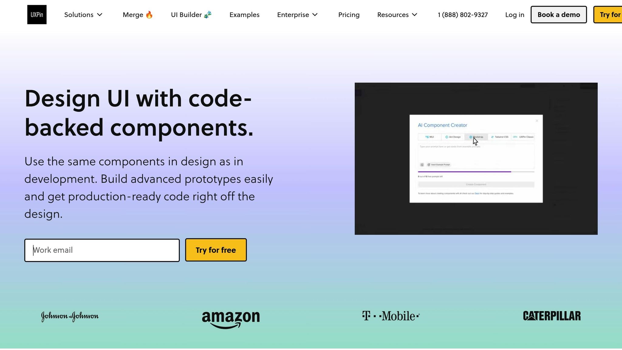
UXPin Merge simplifies this collaboration by bridging the gap between design and development. Its integration with popular open-source libraries such as MUI, Ant Design, and Bootstrap allows for immediate prototyping. Plus, with the ability to work directly with real code components, UXPin ensures that "what you design is what you build".
The platform also introduces AI-powered component generation, enabling teams to create functional Tailwind CSS components from simple text prompts. These quick iterations pave the way for smoother transitions to development.
Another standout feature of UXPin is how it eliminates handoff delays. Designers can share preview links that include ready-to-use JSX code, dependencies, and functions. As UXPin puts it, "You’re essentially skipping the translation phase between design and development, which is a huge win, especially for smaller teams".
FAQs
How do reusable React components improve collaboration between designers and developers during prototyping?
Reusable React components serve as modular building blocks that bridge the gap between designers and developers. Designers can leverage these components to craft interactive, realistic prototypes, while developers can seamlessly implement and reuse them across multiple projects. This shared library not only ensures uniformity but also minimizes miscommunication and accelerates the development process.
By incorporating reusable components, teams can stay aligned on design standards and functionality. This alignment simplifies iteration, maintains consistency across the project, and enhances collaboration between design and development teams, ultimately saving time and streamlining workflows.
What challenges might arise when building reusable React components, and how can they be solved?
Creating reusable React components can be tricky. You might run into problems like over-engineering or struggling to predict how the component will be used in the future. If a component is too generic, it can become a headache to maintain. On the flip side, if it’s too specific, it might not adapt well to different needs.
The best way to tackle this is by focusing on modularity. Design each component with one clear job in mind. This keeps things simple, avoids unnecessary complexity, and makes the component easier to reuse. Also, steer clear of adding side effects within components – this helps keep them predictable and reliable.
Another key step? Write clear documentation. When your team knows exactly how a component works and how to use it, it saves everyone time and ensures consistency. Tools like design systems or component libraries can also help. They make scaling easier and keep your workflow running smoothly.
How does UXPin Merge simplify using React components in prototypes, and what are the key benefits?
UXPin Merge simplifies the process of bringing React components into prototypes by letting designers import production-ready components straight into the design workspace. This approach helps maintain alignment between design and development while preserving the actual functionality of the components.
With Merge, teams can work more efficiently, minimize mistakes, and enhance collaboration between designers and developers. The real-time sync with code repositories ensures prototypes stay current, making the handoff from design to development smoother and quicker.

