HubSpot’s home page is visited by more than 4 million users per month, serving 18,000+ companies across 90+ countries.
Their home page is the lynchpin for the company’s entire online ecosystem. So when the company grew massively from a private company to a multi-product, public global organization, a homepage redesign was in order.
And it needed to happen quickly, in time for a grand release of a whole new product line at HubSpot’s annual industry event, INBOUND, just 1.5 months from the project kickoff.
UX Designer Austin Knight led the project, supported by a team of three (visual designer, developer and marketing manager). Outside the immediate team, Knight also worked with six others for product positioning, copywriting, and technical development.
This is the story of how a designer applied the focused research, collaboration and unwavering customer focus of Lean UX to deliver bottom-line results on a tight schedule.
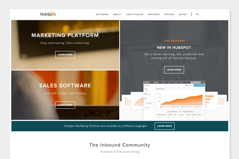
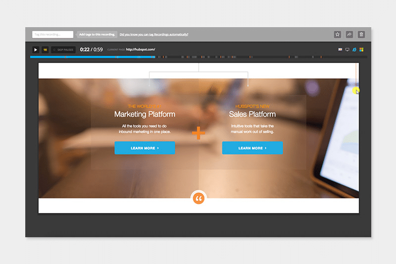
Photo credit: HubSpot’s redesigned homepage
The following is an excerpt from The Project Guide to Enterprise Product Design. The free guide explains best practices based on real projects.
Step One: Deep Research and Constant Testing
The HubSpot project began right when Knight was introducing the more iterative, Lean UX approach to his team. Created by Jeff Gothelf, Lean UX aligns business strategy with lightweight design process through constant “learning loops” (build – measure – learn).
In this case, the first step of this work was to dive into analytics and user research to quickly validate assumptions.
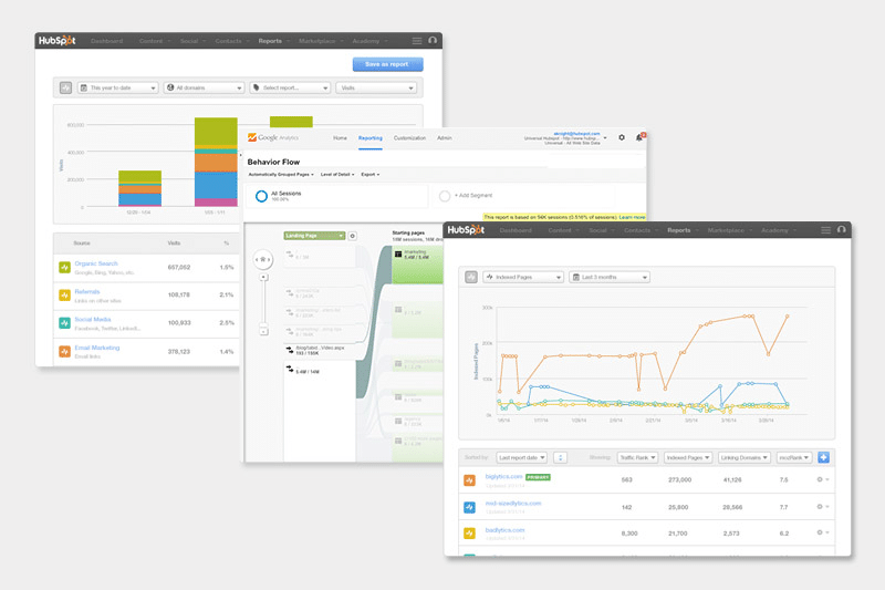
Analytics & Heat Mapping
Unlike some processes where a marketing analyst might provide the design team with web data insights, Knight dove right into the data himself. Massive amounts of data were available in HubSpot, Google Analytics and Mixpanel. The main challenge was sorting through the data to reveal meaningful patterns.
Knight discovered a significant number of users exhibited the following behaviors:
- Moving straight from the homepage to pricing (pre-disqualifying themselves from the product benefits)
- Moving straight from the homepage to an FAQ (signalling they weren’t finding the answers to their questions)
- Moving straight from the homepage to site search (usually searching for product queries, meaning they weren’t quickly getting the information they needed).
It was clear that, despite being in-depth, the home page lacked critical information that decreased conversion.
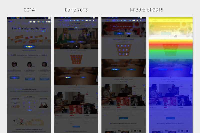
Knight also examined heat maps and scroll maps conducted with 25,000 users each, supplying 467,308 unique data points. Ranging from several years back to the present time, the maps helped Knight further understand where disengagement was happening, including discovering that only 25 percent of users would scroll on the homepage.
Session Recording
Finally, user session recordings acted as hybrid quantitative/qualitative research.
Since the recordings were live, anonymous, and undetected, the results were fairly reliable since they represented user behavior in a natural environment.
Session recordings ran continuously throughout the whole design project, providing a stream of data to validate user interviews and usability tests.
Qualitative Research
While quantitative research helps you see the “what”, it doesn’t always reveal the “why”. To dive into motivations behind behavior and UX requirements, designers need to interview users and stakeholders.
1. Customer Interviews
Because 10% of the HubSpot homepage traffic consisted of HubSpot customers logging in or searching for resources, the redesign could not neglect such a valuable user group.
Knight interviewed customers not just to validate the other sources of data, but also as a basis for determining how the new homepage could deliver dynamic content to specific segments.
By developing a rigorous user interview process and tying questions to outcomes, he gathered highly focused feedback.
2. Stakeholder Interviews
Since this project would literally change the digital face of HubSpot, Knight also interviewed executive leadership and product, marketing, sales, and customer support teams.
He then cross-referenced the results with feedback from user interviews, support call transcripts, unsolicited HubSpot redesigns, tweets, emails, and even conversations that Knight had with attendees at his own speaking events.
“Data-inspired, human-centered design – that’s what we do,” Knight said. “Designers need to interpret data on their own and objectively justify their design decisions whenever possible. We work in an industry where designers are becoming increasingly empowered by quantitative and qualitative data. As such, we generally don’t make decisions based on opinion or what someone ‘likes’. There has to be more to it. The true magic of today’s designer is in how they can interpret implicit and explicit data, and thoughtfully transform that information into design solutions.”
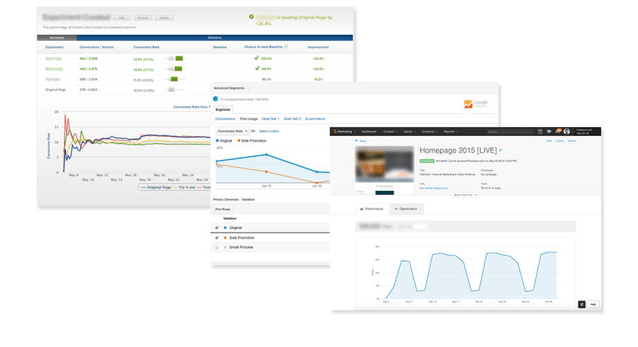
Multivariate Testing of Small Tweaks
Finally, based on all the initial research, Knight was soon able to quickly design a few incremental changes for validation with multivariate tests.
The tests helped qualify or disqualify specific design elements, which would then influence the entire team’s strategic decisions as they moved to the full homepage redesign.
Step Two: Building a Living Design
As explained in The Project Guide to Enterprise Product Design, Knight followed a structured process of “starting broad, testing, learning, iterating, and narrowing in on the optimal solution with each round”.
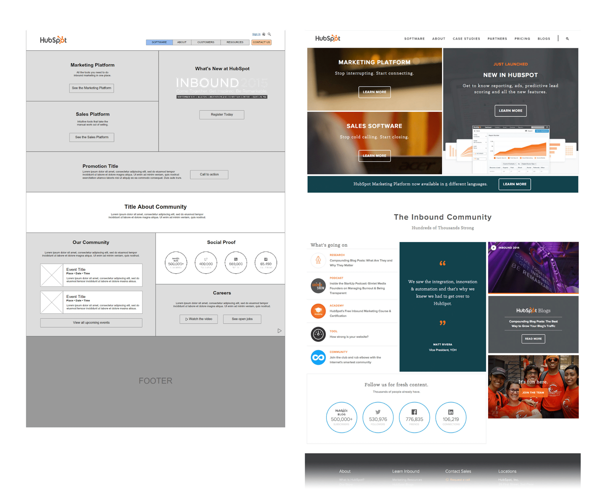
Lo-Fi Prototyping
Once the team decided on three major variations, they created lo-fi prototypes and added fidelity as needed to present to stakeholders for feedback. Once a major direction was selected, Knight remained in the lo-fi stage for multiple iterations before moving on to visual design.
In fact, the lo-fi prototypes bear a striking resemblance to the final product, given all the time spent gathering feedback and direction from users at this critical juncture.
“We tested with users throughout, from testing paper prototypes to working with our wireframes and on to visual design,” Knight said. “The voice of the customer was present throughout the process. As a designer, this extra voice in your ear is critical. It doesn’t make all the decisions for you, but it helps you find your direction.”
Mockups
During the visual design stage, Knight worked closely with his visual designer.
It’s also important to note that Knight was already discussing the design with his developer at each step of the process. While they wouldn’t begin coding extensively until the hi-fi prototyping, they all worked on interactions throughout, ensuring the entire team was on the same page.
The team created a modern aesthetic with bold colors, HD imagery, and an atypical grid structure. This grid structure was inspired by the need for the new homepage to represent a “living design”. The grid-based, modular structure scales well across devices, content could be easily changed or moved and key sections could be updated with content inspired by stakeholder and user suggestions.
Another interesting element of the atypical grid structure was the photo framing.
The team took a very unique set of photos intended to fit perfectly into the structure, allowing the off-hover state to show an out-of-focus section of a photo that would expand out into the right grid element on-hover, revealing the full photo and additional information.
The photo treatment became a distinctive design element and interaction that greatly increased user engagement. The team also developed dynamic content personalized to the user, which was revealed as a major opportunity in early customer interviews.
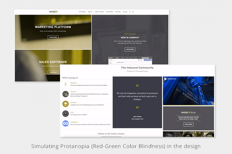
Finally, since 16% of HubSpot users access the site via mobile and more than 19% of the U.S. population has specific accessibility needs, compatibility and accessibility elements were critical to the design and accounted for in every step of the process, including the code.
As with all other aspects of the project, the mobile and desktop versions were iterated on together on a parallel path.
Step Three: Coding and Testing
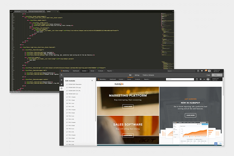
The next step was building a clean code, using the company’s own CMS.
Knight, his visual designer, and his developer worked hand-in-hand to ensure the code was compatible across all devices, QA testing their prototypes on a regular basis.
The team tested the site across devices and resolutions in multiple versions of Chrome, Safari, Firefox, Internet Explorer, Edge, Opera, and Yandex. The team used BrowserStack to emulate the site on real devices and since they knew they percentage of their users on each platform, they were able to prioritize fixes according to audience size and criticality.
Step Four: Constant Testing and Iteration
The new site went live, as planned, on stage at INBOUND, premiering as the new products and features it was built to support were announced by the company’s co-founders. The launch was a huge success.
As Lean UX practitioners, however, the core team couldn’t just rest on their laurels.
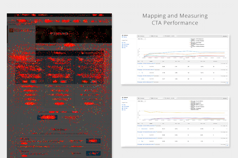
The team cross-referenced live site data in Google Analytics and HubSpot, paying close attention to the following metrics:
- Conversion rate
- Submission rate
- Drop-off rate
- Goal completion
- Navigation summary (origin page and destination page)
- Specific search Queries.
The team only examined vanity metrics like bounce rate and time on page to create context for the core KPIs mentioned above.
To continue optimizing the design, the team ran more heat mapping tests (25,000 users in multiple sessions) and more usability tests.
Result: Data-Informed UX Success
This was the first project that Knight and team completed using the full Lean UX process, combining data and form together to deliver quick business outcomes. And because the resulting site is as collaborative and flexible as the process itself, iterations can be made easily and often, keeping the design fresh and responsive to whatever the user needs and business goals might arise.
While we can’t dive into all the numbers due to NDA, we can reveal the following post-launch business results:
- Increased engagement in critical CTAs
- Increased engagement with navigational elements
- Increased trial signups
- Less reported stress among the product team
HubSpot is now a firm believer in the Lean UX approach: “Our team was efficient and collaborated well,” Knight said. “Users were involved throughout the entire process. And as a result, we produced something impactful that we all could really be proud of.”
For more advice based on case studies, download the free Project Guide to Enterprise Product Design.