Animations & Interactions in Design: Creating a Fading Navigation Menu

Arguably the most popular type of mobile navigation is the type that appears on demand: Tap an icon and site-wide links appear. But just making them suddenly appear is boring. It lacks panache. Great navigation has a hint of animation that gives the links context — they’re not just things that appear out of nowhere. They’re hidden just out of sight, ready to help users get around when the need arises.
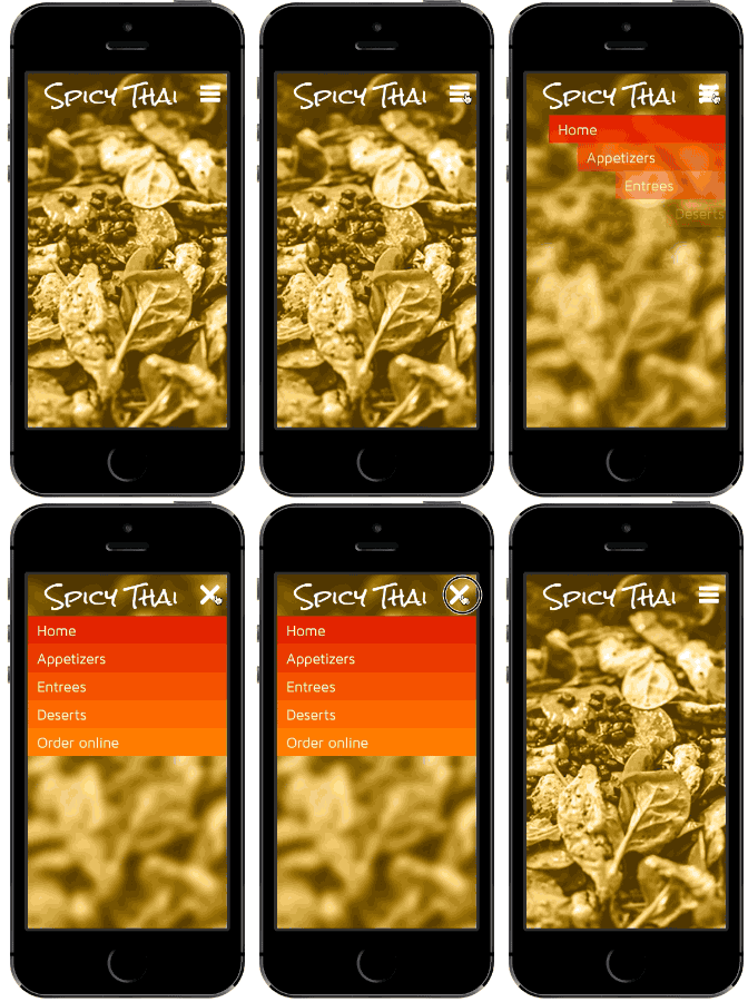
Fly-in navigation demo

Today we’re going to show you how to build a fading navigation that flies in and out on mobile without writing a single line of code that’s sure to wow stakeholders.

1. Build the framework

Log in to your UXPin account (or start a free trial) and let’s get started. Then find and drag out the following elements:

  • iPhone bezel, black
  • FontAwesome “reorder” icon
  • FontAwesome “remove” icon
  • Page title (36pt Rock Salt)
  • Background image (in focus)
  • Background image (blurred)

We suggest you name each element as you create it — you’ll thank yourself later. To do so, tap the “i” icon at the top of the options menu whenever you tap an icon.

2. Create the background

This prototype uses the background images in smart elements so we can reuse them later. Whether you choose to follow suit or not, drag in two versions of the background image: one in focus, and one blurred. Arrange them in the canvas so the in-focus image is on top of the blurred one. Finally, select the phone bezel and move it to the front.
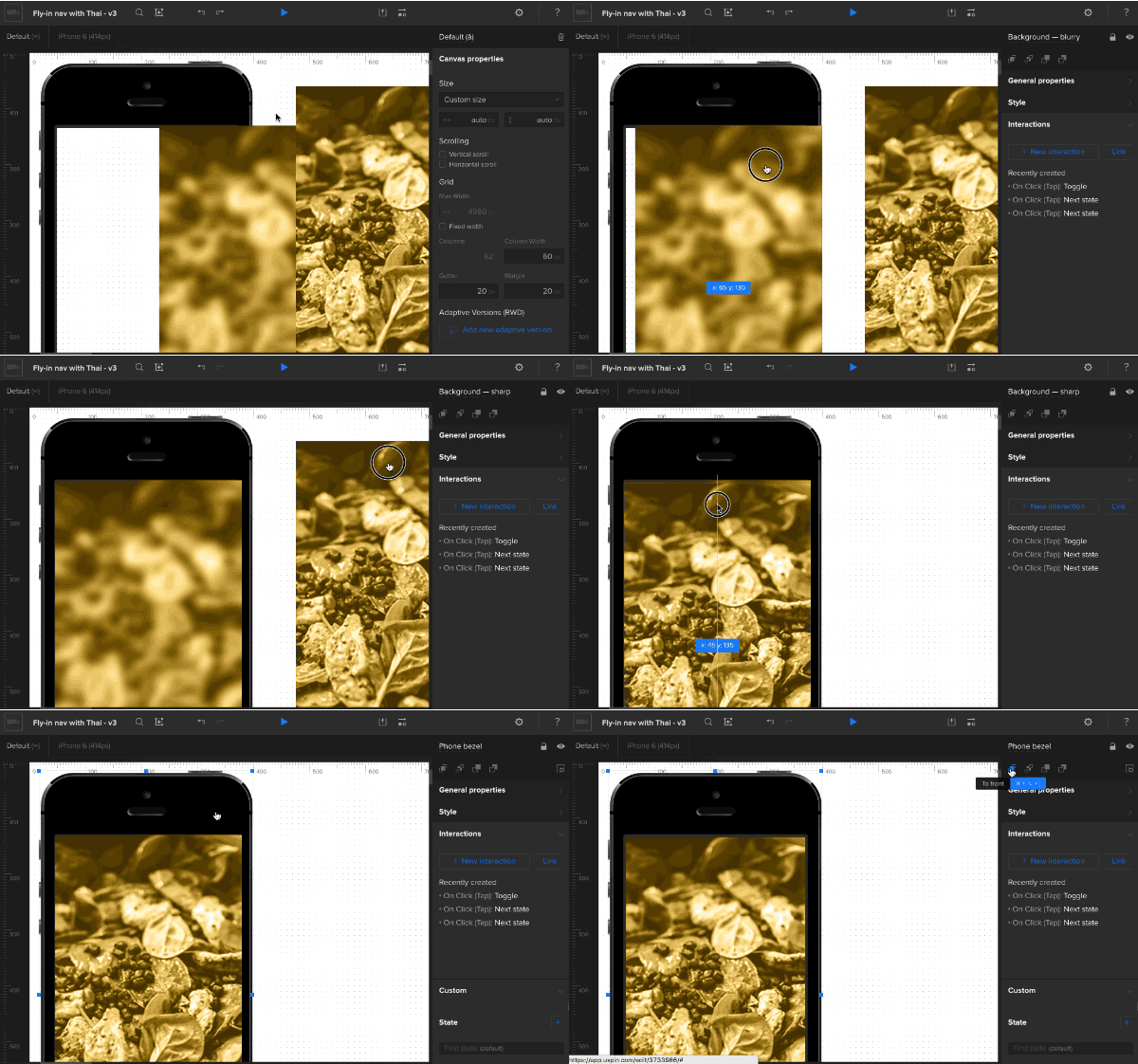
Set up background

3. Create the navigation links

Add navigation links (home, appetizers, entrees, etc). To add text to a box, double-click on its center and start typing.
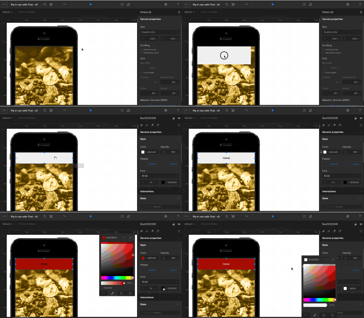
Create nav item

Color each box and add a little padding. Change the typeface and size as you see fit — in this demo we used 24px Maven Pro. You can make each link the same color, but in this demo we used:

  • #cf1000
  • #d82300
  • #e43b00
  • #f05301
  • #fa6801

4. Finish the interface

Add the title (36pt Rock Salt, in this case) and the open-navigation “hamburger” icon.
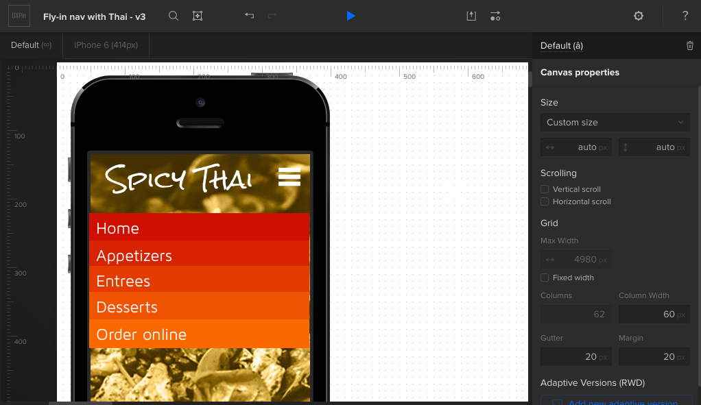
Set up the rest

Place the close-nav icon on top of the open-nav icon, then hide it with the layers palette.

Add and hide the close icon

Shrink the navigation links to fit under the phone bezel’s right edge, and use the “eye” icons in the layers palette to hide them.
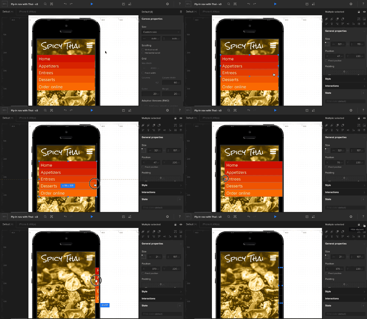
Shrink the nav items

5. Create an advanced animation

The fun begins with the custom animations editor. Add an action to the navigation trigger: advanced animation. “Step 1” represents the state that the animation will reach upon completion. This is the point at which the navigation should be fully revealed, the background blurry, and the “hamburger” icon changed to a “X”. To start all that, reveal and expand the navigation.
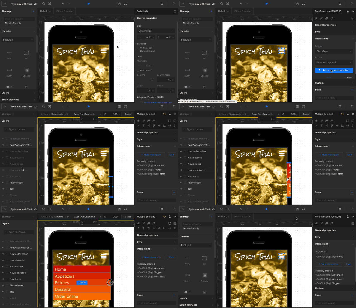
Animate the open-nav action

Set each navigation link to appear 50ms after the last. For example, “Appetizers” begins at 50ms and “Entrees” begins at 100ms.
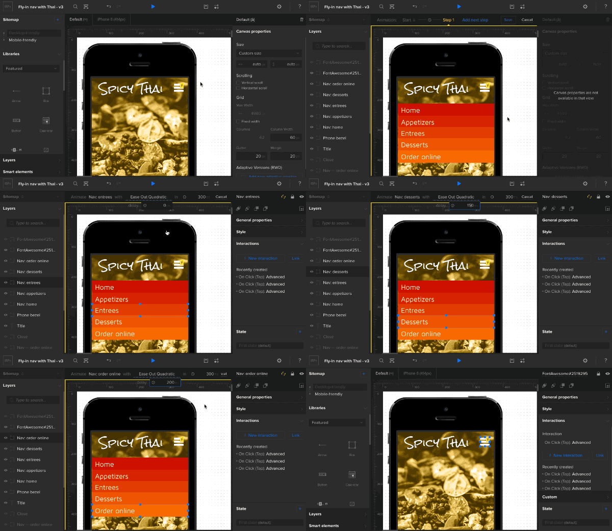
Set nav item timing

Now for a little switcheroo. Hide the open-nav icon and show the close-nav icon. Then hide the focused background and show the blurred background.

Change background and icons

6. Fix the order

Finally, make sure the phone bezel is the above the navigation links, but below the open/close icons. This ensures that the navigation links only appear in the app’s working area, not over the phone itself.
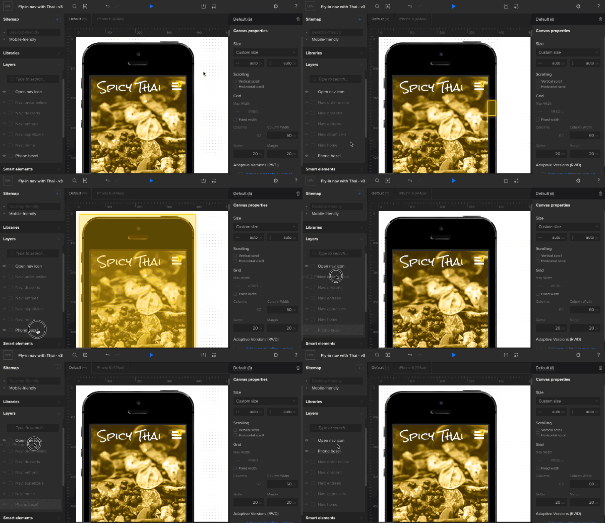
Move the bezel up

Then try it out! Advanced animations are a powerful way to give interactions a little pizzazz. To set yourself up for success, though, we suggest that you name elements as you go, pay attention to their layer orders, and don’t be afraid to experiment. Hope you enjoyed this tutorial. Now play with UXPin on your own!

When You’re Holding A Hammer Everything Seems Like A Nail

This post is inspired by a conversation with one of the winners of the UXBite competition, Tomek. We were talking about various wireframing tools and one of the things Tomek said caught my attention: I was trying to work with ***, but I felt like they gave me a hammer and now I’m obliged to only see nails around me. That made me thinking.

We are being limited by the names we give to specific objects and tools. We are being limited by our habits. We are being limited by habits of other people. And we are being limited by our own usual ways of using certain tools.

For example: what you can do with a hammer? First thing that comes to mind: hit the nails with it of course! What a stupid question?! But as you keep thinking you can find different ways of using a hammer. You can hit nails with it but you can take them out of wooden boards as well. Or you can kill someone with this tool. Everything depends on current needs.

I know that you may be thinking  prototyping / wireframing tool  is only for wireframing or prototyping. Period. Today I want to show you a little alternative way of using JustProto. How? See below.

Product Retrospect.

Product Retrospect is a simple yet effective way of summary after the project’s closed. You gather the whole team and discuss every pro and con that’s project related. You don’t point fingers saying “You screwed this up by not talking to me earlier” but say “This was badly executed due to lack of communication”. Sometimes when your team is spread all over the world it’s extremely difficult to do this kind of project retrospective – time difference and gathering everyone on the same page is hard. JustProto’s collaborative features come in handy in this time of need:

  • Multiple Collaborators,
  • Real-Time Collaboration,
  • Chat,
  • Project Preview with just One Link,
  • Live Preview.

How it works?

Each JustProto account have an Administrator/Owner, who can grant access to others – The Collaborators. Each Collaborator gets his unique login and password to login to the project at a certain time. Using nothing else but computer with Internet access everyone edit the same project at the same time and everyone see all changes in the real time (that’s the Real-Time Collaboration).Kinda like on Google Docs while editing the same spreadsheet or word document.

Each person choses note, tag or pin color they like and that’s that – by editing its text Collaborators – The Team add their point of view on a closed project. What is important – everyone can talk on a project Chat. Smart history will save all the conversations. This way everyone’s up to date even if the Internet connection dies: Chat history and current version of the retrospective is saved and always available online.

Any person who is not on the project team but gets the Preview Link will see the retrospective project. Let’s say your boss is not one of your project team but you’d like him to know the results of the retrospective – send him a Preview Link and that’s that!

What’s even more fun and handy and cool – if a person who get the Preview Link will open it while you and your team edit the notes, they will see everything in the real time too thanks to Realtime Preview! How the project retrospective can all look like? See here.

This example shows that you don’t ALWAYS need to stick to the tool’s purpose. Don’t be limited, try thinking of other ways you can use the tools you like : ) What it also shows is the fact that wireframing tool can be helpful not only while design happen – it can also become pretty useful after the project is done. Remember that the tool is just a hammer. You don’t need to see nails everywhere.

Wireframe Madness! App Tourney — Round 4

JustProto wins 4th round of the Wireframe Madness App Tourney!

Why to use JustProto? (according to the tournament results)

  • Customize interface with company logo
  • Auto save
  • Nice set of social icons, iab standard ads, and iphone/ipad/android tools
  • Collaboration and co-edit ability
  • Allows Components page templates
  • Simple prototyping ability
  • Rulers and grid with pixel increments
  • Easy edit of size, shape, color, border, etc of any item through properties tab

Wish us luck in next rounds! ;)

See the Tourney.