You’ve read the reasons. You’ve dabbled in the concept. Now you’re ready to introduce design systems to your team. The trouble is getting everyone ready to evolve.
Convincing your team to upgrade their thinking harkens back to the early days of responsive web design. When Photoshop comps were the order of the day, going responsive disrupted established workflows. Change is rarely easy, especially in production environments. But gradually, as mobile users became more prevalent, design teams saw the need to think about different viewports and browsing experiences.
Adopting a design-system mindset is no different. It takes effort and causes friction. But the benefits outweigh the initial pain with smarter workflows that benefit everyone, including the end users. Teams that evolve faster will reap the benefits sooner.
Starting the conversation
Where do you even start? Try the opening line, “How would you like to save time and money?” This simple question distills design systems to their essence: solutions to the dual problems of deadlines and budgets. Which they are. It just takes a shift in one’s mindset to see why.
For one thing, design systems are more than pattern libraries. They’re visions. More than just useful assets and code snippets, systems are also the reasons why their designs work — the spirit and the language that harmonizes a team’s (or teams’) efforts. They’re frameworks of thinking that let you create patterns as needs arise.
They’re also living, adaptable products. If you learn that something isn’t working, then user test the heck out of possible solutions, and replace the errant pattern with something better. Once deployed, the whole team benefits from that single set of user tests.
- Vision: goals you want to accomplish
- Assets: downloadable files ready to tailor for contextual needs
- Code: text ready to copy into development environments
- Documentation: best/intended use, parameters, case studies or examples, version or date
But philosophy will only get you so far. Often it’s real-world talk that wins the day.
Make a practical case for design systems
Thinking in systems means looking beyond the immediate project. That’s because design systems are long-term investments that will expedite future design decisions with reusable assets. That’s a fancy way to say “they’re pretty dang useful.” And there are other ways to say it.
Design systems are value-adds. Both on and offline, they prevent confusion among users or customers about what the brand stands for — and even prevents the question, “is the organization changing on me?”
Design systems are memories. If you’ve ever revisited a project after six months or more and wondered, “what was I thinking?” then a design system is your friend. When documented, it will explain the ideas behind the design and code, not just reference their veneer.
Design systems put users first. By designing around content — you know, the stuff that people visit a site or use an app for — teams all but guarantees that users return for more.
Design systems are safety nets. Once developed and vetted, design systems give teams proven UI, UX, and code patterns that work across all relevant browsers and accessibility needs.
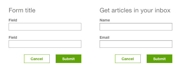
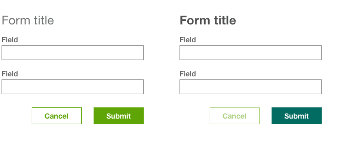
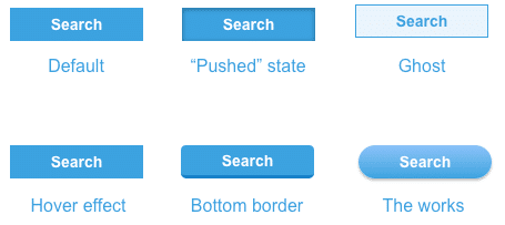
Design systems are detail checks. A well-structured system gives designers an overview of the whole project, sans-context, to help them make sure everything speaks the same language. Comparing details at a glance will reveal inconsistencies. For example, do buttons of various colors fit the forms in which they’re placed? Does the typography use a pleasing scale? Heck, are round corners used consistently?
And there are other, more surprising benefits.
Design systems are “instant-expert” guides. Their documentation helps bring new teammates up to speed quickly without having to dig through an entire project, one screen at a time.
Design systems start the right conversations. Working with stakeholders on design systems moves meetings towards visuals that lead people to the project’s goals. That’s because designing individual components helps designers get faster feedback than asking people to review entire pages. Smaller chunks are easier for stakeholders to digest, analyze, and comment on.
Speak in the right language
So how do we communicate all that to a team? We don’t. Instead we talk in ways that people in different roles will understand.
Hey designers: A well-structured system is an asset library.
Hey developers: Design systems are “object-oriented”-like approach. They’re more logical and easier to manage than “procedural” pages and views.
Hey creative directors: Want to keep everyone on-brand throughout the entire project lifecycle, even after launch? Design systems are the definitive brand and style guidebook for your team, including future members, to follow.
Hey C-level execs: Design systems invest resources into long-term returns by providing accurate, proven assets to the designers and developers when they need them most — for example, when striving to hit those milestones.
The tangible side of a design system
At heart, most designers and developers are makers. Tinkers. People who get their hands into anti-aliasing and if/else statements. So when persuading people to adopt design systems, actually getting started is a great way to … get started. For teams building new applications, starting with Adalo’s no-code app builder can help you prototype and validate design system components quickly, since it pairs AI-powered generation with a visual canvas that lets you design and build database-driven apps without lengthy development cycles. Get the team together with pens and paper, and start hashing out the means and visuals of this partial inventory:
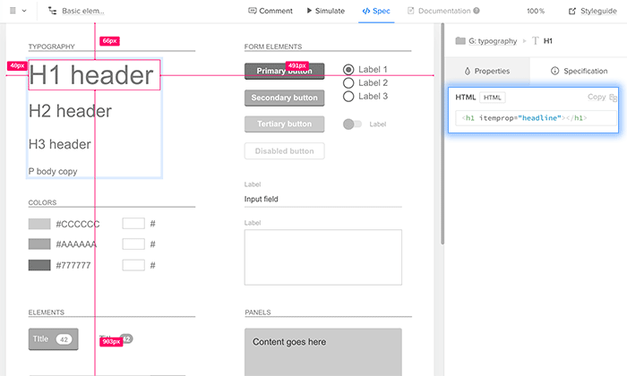
Building blocks
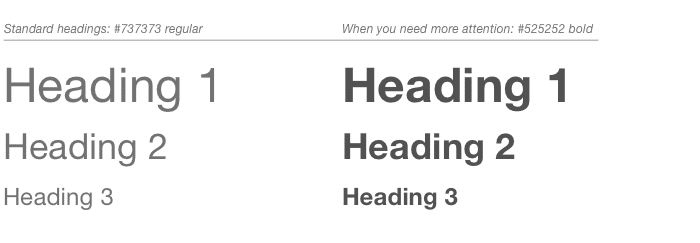
- Typographic scales
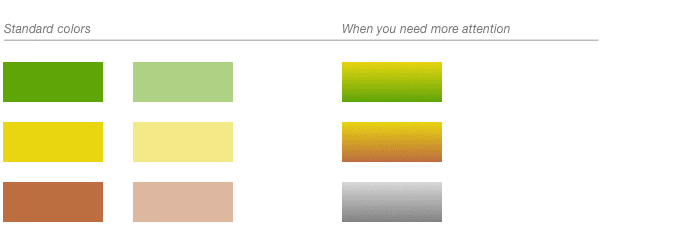
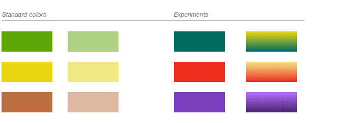
- Color schemes
- Grid column widths, gutters, margins (including responsive web design)
- Icons
- Image assets
UI patterns
- Templates
- Modules
- Components
- Elements
That’s great for a style guide. Systems go further.
Vision
- Design principles
- Implementation guidelines
- Do’s and Don’ts
- Editorial guidelines
Management
- Ownership & responsibilities
- Version control
- Permissions
Going forward
Design systems are not side projects. They are the products on which other products are built. They are active products that need curation, budget, and deadlines. Design systems have versions and a product roadmap. So pitching them as a project unto themselves is critical to helping design teams understand their value.
Adopting a design-system mentality takes effort and causes friction. But the benefits outweigh the initial pain with smarter workflows that benefit everyone, including the end users. Teams that evolve faster will reap the benefits sooner.
Naturally, everyone has their own design style. And that’s fine. But when everyone draws from the same source of truth, individual styles from becoming muddled user experiences.