
In our previous posts, we described the qualitative insights and quantitative insights from our user testing on Yelp’s website. Now that the results and analysis were done, it was time to put pen to paper and our cursors to the screen to get designing.
We’ll show side by side comparisons of the current Yelp design and our new look. We’ll also explain our process of sketching and low fidelity wireframing. In Part 2, we’ll look at low fidelity prototyping and high fidelity prototyping.
Sketching
As discussed in the Guide to Wireframing, sketching is a universal language for capturing thoughts, exploring ideas, and sharing those ideas. For the Yelp redesign exercise, sketching was our first step for reimagining the homepage and search results page. We like our sketches quick and dirty since it lets us think as freely as possible, and gives us room to fail on paper (rather than later in the design process). Each of the drawings below took Treder no more than 20 minutes and helped broaden his perspective for the next step of wireframes.
1. Homepage
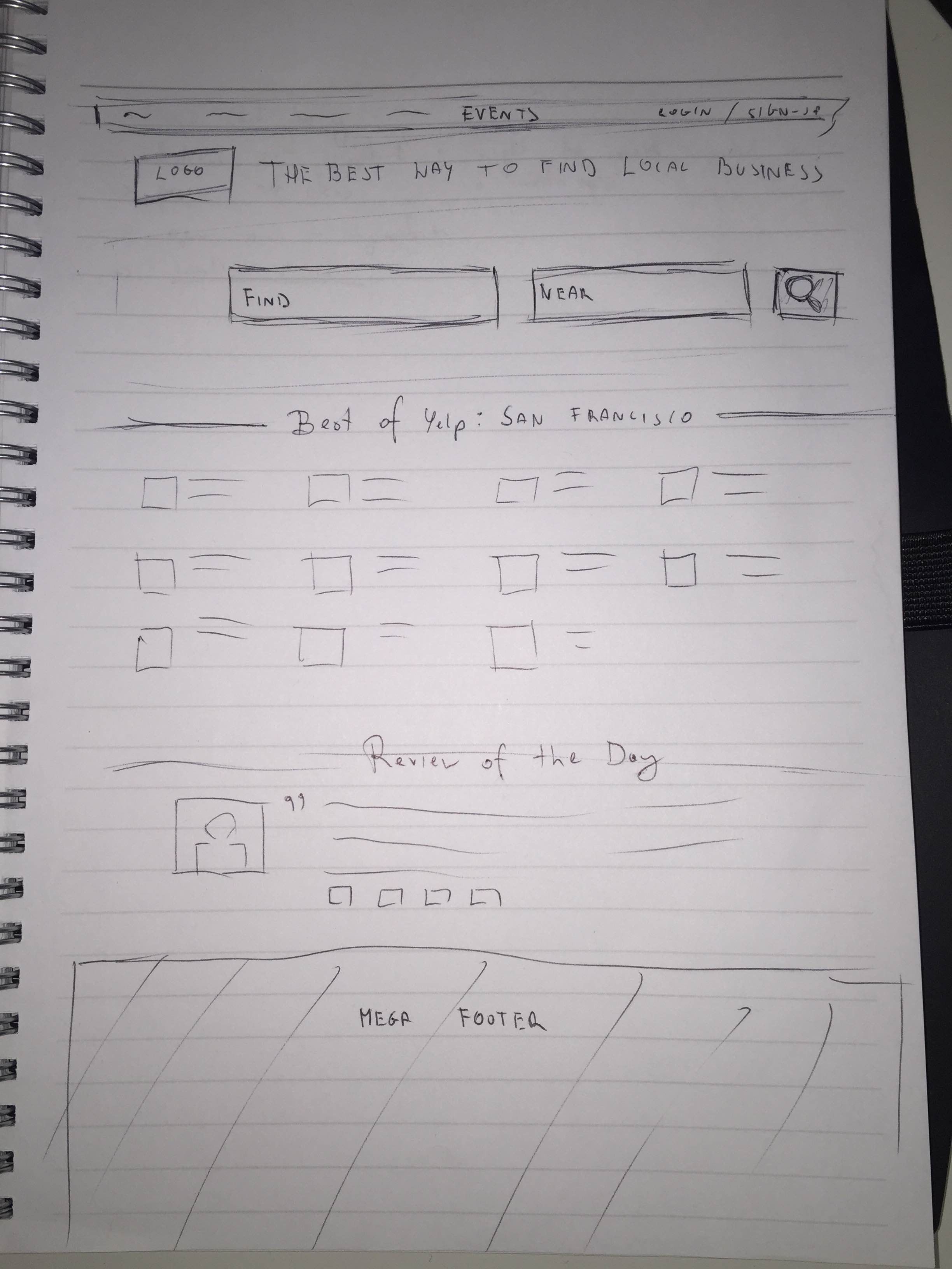
Our homepage sketch took a first pass at addressing the following issues identified in our usability testing:
- Increasing prominence of Search bar — Tests showed this was one of Yelp’s most popular functionalities)
- Make it easier to find an event — Usability tests showed that almost nobody used the Events tab. When they rarely did, they found it confusing.
- Simplify and streamline the categories — Our sketch presents these in a Card format rather than a List format (you can learn about when and why to use each of these UI design patterns in Web UI Patterns 2014).
2. Search Results Page

In the sketch, we focused the following usability concerns for the results page:
- Make photos more prominent — When tasked with finding a restaurant with a certain ambiance, 3/5 users in our recorded remote study depended on photos. The photos on the results page are currently quite small, so we enlarged them.
- Clearly explain the price categories — When asked to search for a restaurant of a certain price range, two of the five users weren’t sure what the dollar symbols represented. Above, you can see that we initially thought about just listing the price.
We addressed the rest of the usability concerns about the feature filters and “Sort By” options with wireframing, the next step of our design process.
Low Fidelity Wireframing
The purpose of wireframing is to creating the skeleton of the design. More fidelity is layered on top of our sketch as we move into UXPin for digital wireframing.
As discussed in the Guide to Wireframing, there’s debate between low versus high fidelity wireframing. We prefer low-fidelity wireframing since we want to focus on structure and add fidelity later in the prototyping stage. Low fidelity wireframing helps us focus on concepts like the naming of labels and visual hierarchy. While we addressed some usability concerns in the sketches, our wireframes would be more comprehensive.
You can check out the live wireframe and follow along below.
Homepage
In addition to fixing usability issues, we also wanted to preserve the SEO aspects (such as listing other cities) because that is valuable to Yelp as a business. Even though we don’t have access to Yelp analytics, it’s safe to assume that search traffic makes up a sizable portion of their traffic (based on how their site is currently set up).
i. Improving the Search Bar
Current Design

Source: Yelp
The search bar currently sits at the top of the page.
New Wireframe

Source: UXPin Yelp Redesign
gave the search bar more “breathing room” to stand out (a very effective tactic described in Web UI Best Practices). Compared to the previous cluttered layout, the new treatment is much more effective. Because writing a review is a core interaction for Yelp, we also added a quick-access “Write a Review” button in the top left corner.
ii. Make the categories easier to use
As we touched on earlier, the biggest design change was revising the categories from a List layout to a Cards layouts
Current Design

Source: Yelp
The search bar currently sits at the top of the page.
New Wireframe
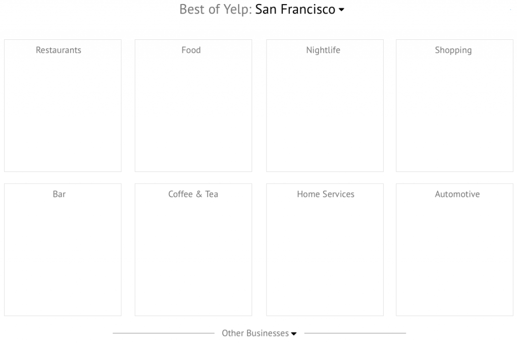
Source: UXPin Yelp Redesign
As described in Web UI Patterns 2014, the Cards UI design pattern is perfect for visually displaying a wide range of content options. Our wireframe is more visual and only presents 8 categories at once. To reveal more, users just click on “Other Businesses”. We also moved this near the top part of the page for more emphasis.
iii. Make it easier to find events
If you reference back to the earlier screenshot of the new Search bar, you’ll see that the top navigation also includes “Events” in the left corner. Now we’ll show you rest of the redesign work for Events.
Current Design
Source: Yelp
Events are either hidden on the far right in the top navigation (not shown here) or pushed away to a sidebar in the middle of the scroll.
New Wireframe

Source: UXPin Yelp Redesign
The revised wireframe places Events in the center of the scroll. This allows for a feature photo to the left of the text, and/or a video playing in the background.
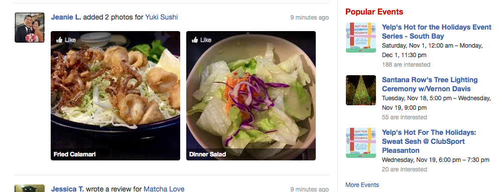
iv. Reduce overall clutter
In our first click testing, we found that 30% of users said the current design was cluttering and confusing. While this wasn’t a dealbreaker, cleaning up the overall interface would only make the important elements stand out better.
Current Design

Source: Yelp
Events are either hidden on the far right in the top navigation (not shown here) or pushed away to a sidebar in the middle of the scroll.
New Wireframe

Source: UXPin Yelp Redesign
Any secondary parts of the interface such as Popular Events or Lists (which the usability testing indicated was never even used) were moved to a newly-created footer. This footer also held items that were more for SEO (like listing different neighborhoods).
Results Page
The results page required less iterations than the homepage (since the layout is simpler). Let’s take a look at the key areas of redesign. You can follow along by checking out the live wireframe.
i. Improving Sorting & Filtering
Current Design

Source: Yelp
The sorts and filters lack hierarchy, which was counterintuitive to the behavior we saw in usability testing. Even though our testing revealed “Serves Dinner” as an important filter option, you can’t even filter by meal unless you click “More Features” and then select from a long menu.
New Wireframe

Source: UXPin Yelp Redesign
The revised wireframe isolates the most important filters and restructures the entire section. Because 90% of users felt “Open Now” was the important filter, we actually separated it from all options for added emphasis.
Pricing is clarified with dollar ranges and the 7 unimportant filters (identified by usability testing) are hidden.
ii. Improving Layout of Results Page
We also needed to reshape how the results appear. For this part of the redesign, we leaned more on qualitative feedback from Optimal Workshop.
Current Design

Source: Yelp
Most users relied on photos to determine ambiance, yet the thumbnails in the search results page are too small. You also can’t save businesses for later reference (33% accomplished the task but complained about difficulty, while 67% failed or gave up).
New Wireframe

Source: UXPin Yelp Redesign
We enlarged the thumbnail and added a “Save for Later” button on top to make it a one-click action. We also redesigned the layout to better closely resemble an F Pattern for easier scanning and isolated the address and phone number (since those are important pieces of information).
More visual details in the e-book
To learn about the wireframing process for the Search results page, sign up for a copy of the e-book releasing next week. Tons of visuals and more details are included. You can also use the dozens of elements libraries and interactions/animations in UXPin to take your design from lo fidelity sketch to high fidelity prototype.

In part 2, we’ll take a deeper look at the prototyping process (with plenty of high fidelity screenshots).

