What is shadcn/ui?
Explore a component toolkit imported with UXPin Merge.
Shadcn/ui provides React components you can copy and style with Tailwind or custom themes.
Design with shadcn/ui
library in UXPin
Build interfaces from real components and enjoy
full styling control with modern React UI
What is shadcn/ui?
Explore a component toolkit imported with UXPin Merge.
Shadcn/ui provides React components you can copy and style with Tailwind or custom themes.
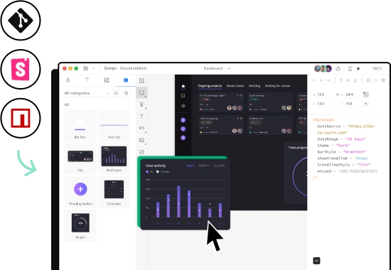
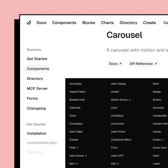
Build UI using real components
Build UI with shadcn/ui React components, without writing code. Work with real structure, variants, states, and interactions, and shape how the interface behaves while designing.
It used to take us two to three months just to do the design. Now, with UXPin Merge, teams can design, test, and deliver products in the same timeframe.


Remove guesswork between
design and development
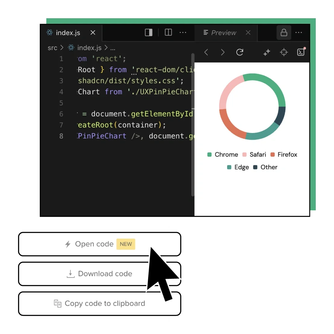
Take the same shadcn/ui components from design to development. Get clean React code that developers can use to build the product faster, without rebuilding UI from scratch.
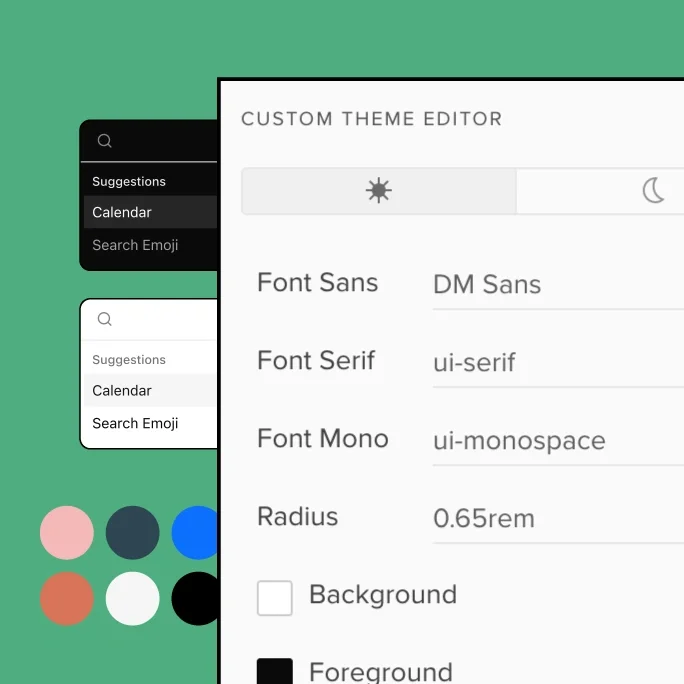
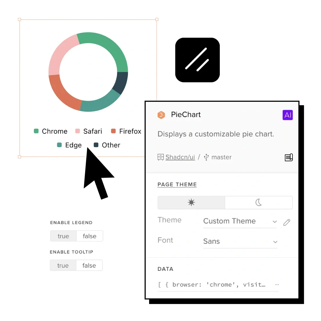
Style it your way
Customize components using Tailwind utility classes. Switch between light and dark mode or define custom themes that match your product’s brand.
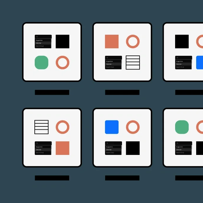
Built to scale
Build and scale design systems using shadcn/ui components you fully own. Reuse patterns across teams while keeping design and code aligned as products grow.
Open and consistent
Design with shared React components built on Radix UI and Tailwind CSS. Keep behavior, accessibility, and structure consistent across products.
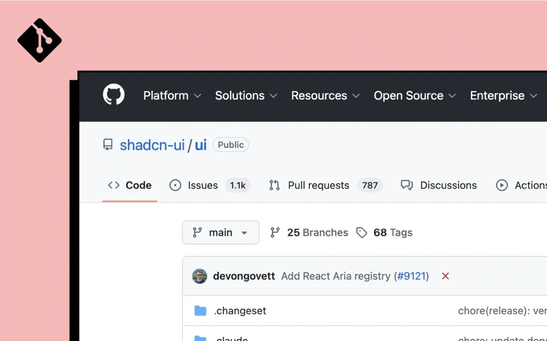
Need more details? Read the documentation.
See the shadcn/ui library documentation in the Git repository. Check for yourself how Merge technology easily adds code components to your design process.
Centralize your
design process
Simplify your design tool stack – try UXPin Merge today and release digital products faster.