Want to create production-ready prototypes faster? Combine Claude Haiku 4.5, Bootstrap, and UXPin Merge to streamline your design-to-development workflow. Here’s how it works:
- Claude Haiku 4.5: Use AI to generate React Bootstrap layouts from text prompts, saving time on manual design work.
- Bootstrap: Leverage its mobile-first, production-ready components for consistent UI design.
- UXPin Merge: Drag and drop real code components into your prototypes for seamless developer handoffs.
Key Benefits:
- Speed up development by up to 8.6x with ready-to-ship prototypes.
- Eliminate the need for developers to recreate designs manually.
- Ensure high-quality, responsive React code from the start.
Quick Setup:
- Activate UXPin Merge (starting at $29/month).
- Get an API key for Claude Haiku 4.5 (Model ID:
claude-haiku-4-5-20251001). - Use Bootstrap components directly in UXPin for easy customization.
This approach simplifies prototyping, reduces errors, and aligns design and development teams. Whether you’re building dashboards, forms, or interactive prototypes, this workflow ensures faster, smoother results.
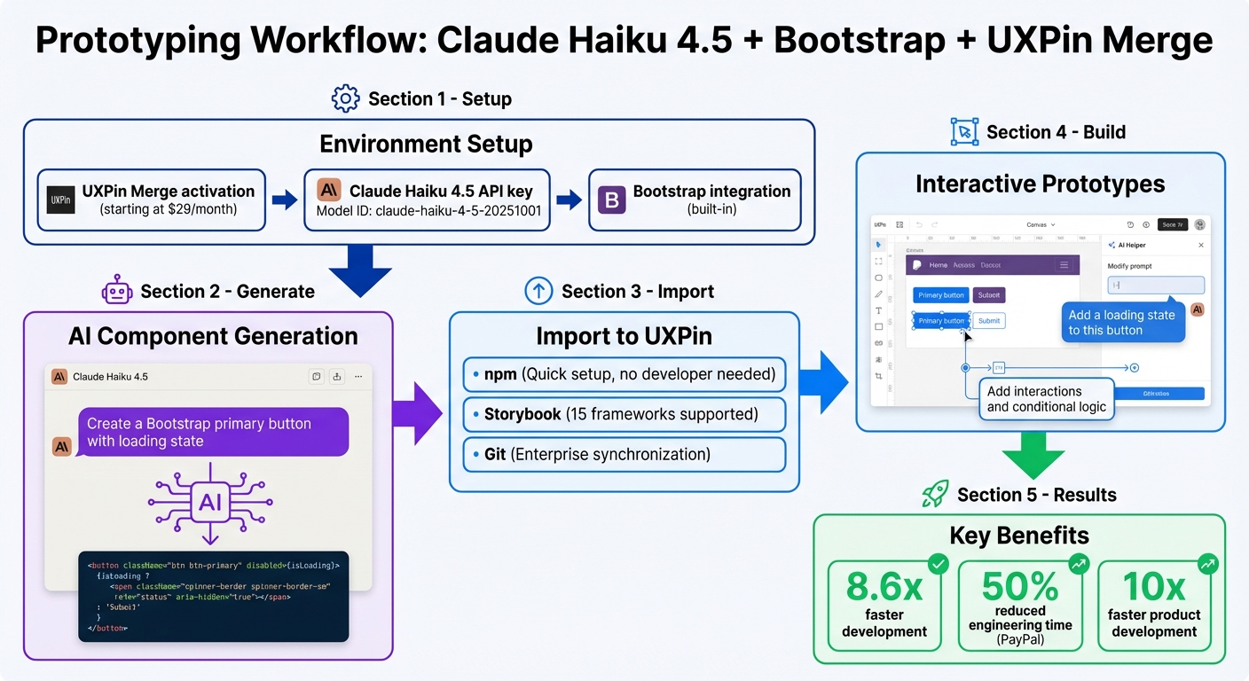
Complete workflow for prototyping with Claude Haiku 4.5, Bootstrap, and UXPin Merge
UXPin Merge Tutorial: Intro (1/5)
sbb-itb-f6354c6
Setting Up Your Environment
To get started, you’ll need to activate UXPin Merge, secure API access for Claude Haiku 4.5, and confirm that Bootstrap’s integration is ready to use. Bootstrap is conveniently built into UXPin Merge and can be accessed directly from the canvas, alongside other popular libraries like MUI, Ant Design, and Tailwind CSS.
Preparing Tools and Accounts
First, make sure your UXPin account supports Merge features. Merge is available across all pricing tiers: Core (starting at $29/month), Growth (starting at $40/month), and Enterprise (custom pricing). With Merge, you’ll gain access to tools like the AI Component Creator and ready-to-use React libraries.
Next, you’ll need an API key to enable AI-powered component creation. Open the UXPin Editor, go to the Quick Tools panel, and select AI Component Creator. From there, navigate to the Settings tab and paste your API key into the appropriate field. Even for Claude models, you’ll need to populate the OpenAI API Key field.
Choose Claude Haiku 4.5 (Model ID: claude-haiku-4-5-20251001) for its fast processing and ability to handle high-volume tasks. This setup enhances your workflow by enabling advanced, AI-driven component generation.
Once your API key is entered and Claude Haiku 4.5 is selected, you’re ready to configure UXPin Merge specifically for Bootstrap.
Configuring UXPin Merge for Bootstrap
With Bootstrap already integrated into UXPin Merge, you can immediately start using its components. The AI Helper is tailored to work with Bootstrap, allowing you to effortlessly adjust styles, layouts, and text content using simple prompts.
To modify a Bootstrap component, click the "Modify with AI" purple icon directly on the canvas. From there, you can make changes without manually tweaking properties. For example, a prompt like "Add a 20px margin-top and change the button variant to primary" will apply those updates instantly. As Donal Tobin shares:
"The AI component creator is a favorite!"
After setting up your API key and selecting Claude Haiku 4.5, include specific Bootstrap-related instructions in your prompts. For example, you might say, "Create a Bootstrap primary button with a loading state" to ensure accurate results. The AI Helper supports four React libraries – MUI, Ant Design, Bootstrap, and Tailwind CSS – so you can easily work within your preferred framework while enjoying the same efficient workflow.
These steps will prepare you to start generating and customizing components seamlessly within your prototypes.
Generating Bootstrap Components with Claude Haiku 4.5
Using your configured Merge environment, you can quickly generate Bootstrap components with Claude Haiku 4.5. This AI-powered tool takes specific text or image inputs and transforms them into functional React code that integrates seamlessly with the UXPin canvas. Known for its speed and efficiency, Claude Haiku 4.5 is ideal for tasks like rapid prototyping, offering a streamlined approach to creating components.
To get the best results, avoid vague instructions. Instead, provide clear and detailed requests. For example, if you’re working on a complex form, break it down into smaller parts. Generate elements like labels, input fields, and validation messages individually. This method not only improves accuracy but also ensures compliance with Bootstrap 5 standards. As Anthropic emphasizes:
"Tell Claude what to do instead of what not to do."
Once you’ve set the foundation, focus on crafting prompts that maximize the AI’s capabilities.
Writing Effective Prompts for Claude Haiku 4.5
For effective results, include specific design details in your prompts. Mention elements like color schemes, typography, and layout preferences. For instance, you could write: "Create an input field with the label ‘Email’ above it. The label should use a 16px bold font, and the input field should have a blue border when focused." Starting with a clear role or directive can help guide the AI’s output.
Another great feature is image-to-code generation. By uploading a high-fidelity mockup, the AI can interpret exact design details, such as typography, colors, and spacing. This ensures the generated component aligns with your design standards. If the initial output isn’t perfect, you can use the "Modify with AI" option to fine-tune it. Simply describe the changes you need – like "increase contrast for accessibility" or "adjust the label’s position" – and the AI Helper will make the updates without requiring manual code edits.
After refining the component, it’s time to test its functionality and design.
Testing and Verifying Components
Once your component is on the UXPin canvas, review its behavior and responsiveness across different screen sizes. Then, validate the React-Bootstrap code in a tool like StackBlitz. This step ensures the code works as intended and adheres to the library’s dependencies and interactions.
As UXPin documentation explains:
"The AI Component Creator’s performance depends on the AI platform’s performance… it’s important to review the results and make any necessary refinements."
If the component isn’t quite right, there’s no need to start over. Try rephrasing your original prompt or adding more details. You can also include self-verification steps in your instructions, such as: "Before finishing, verify your code against Bootstrap 5 usability standards." This iterative process allows you to refine components efficiently, ensuring they’re ready for production.
Importing Components into UXPin Merge
Bring your tested Bootstrap components into UXPin Merge to streamline collaboration between design and development. This integration bridges your AI-generated code with your design process, creating a unified source of truth for both teams.
Integration Options: Git, Storybook, or npm
Select the integration method – npm, Storybook, or Git – that best suits your library and project requirements.
The npm integration is ideal for teams using React Bootstrap or other open-source component libraries. It’s quick to set up and doesn’t need developer involvement. Simply create a new project in the UXPin dashboard, choose "Design with Merge components", and add a new library via npm. Provide the package name and the full path to Bootstrap’s CSS file (e.g., bootstrap/dist/css/bootstrap.min.css) to ensure accurate styling on the UXPin canvas.
For teams already documenting their components in Storybook, this integration offers seamless updates whenever the Storybook source changes. Supporting all Storybook frameworks, it’s a great option for teams managing a documented design system library. Meanwhile, enterprise teams with proprietary libraries can use Git integration for the most comprehensive synchronization with their production repository.
| Integration Method | Ideal For | Advantage |
|---|---|---|
| npm Integration | Open-source libraries (Bootstrap, MUI, Ant Design) | Quick setup without developer assistance |
| Storybook | Teams using Storybook for documentation | Compatible with all frameworks; frequent automatic updates |
| Git Integration | Proprietary enterprise design systems | Deep synchronization with production repositories |
After importing components through your chosen method, use the Merge Component Manager to bring in specific elements like buttons, forms, or navigation bars. This tool allows you to map React props to intuitive designer controls in the Properties Panel, ensuring a smooth design experience.
Customizing Components in UXPin Canvas
Once imported, you can tweak components directly on the UXPin canvas – no coding required. The Properties Panel displays the actual React props from your Bootstrap components, enabling designers to adjust variants, sizes, and states just as developers would in code. For text-based elements like buttons or labels, map the "children" property to a textfield control so designers can edit labels easily.
To maintain clarity, use lowercase for property names to align with React conventions. Group components into categories that reflect your Bootstrap documentation, ensuring designers and developers reference the same structure. This shared organization reduces miscommunication and speeds up project handoffs.
As Erica Rider, UX Architect and Design Leader at PayPal, highlights:
"It used to take us two to three months just to do the design. Now, with UXPin Merge, teams can design, test, and deliver products in the same timeframe. Faster time to market is one of the most significant changes we’ve experienced using Merge."
Building Interactive Prototypes in UXPin
With your Bootstrap components placed on the canvas, you can move directly into crafting interactive, production-ready prototypes. Thanks to UXPin’s code-based approach, every interaction you design aligns perfectly with how developers will implement it – minimizing confusion and speeding up the workflow.
Creating Responsive Prototypes
Begin by dragging Bootstrap components from your library onto the canvas. Use the AI Helper to fine-tune properties instantly. For instance, you can type a natural language prompt like, "Create a dashboard header with a navigation bar and user profile dropdown," and UXPin will assemble the structure using your imported Bootstrap components.
To manage complex layouts, break them into sections – like navigation, sidebar, and content. This keeps everything organized and precise. The AI Helper also simplifies responsive design adjustments. For example, you can use prompts like, "Add 16px padding on mobile and 32px on desktop," to set spacing, alignment, and breakpoints with ease.
If the generated layout isn’t quite right, you can refine it through additional prompts. For example, "Move the search bar to the right and increase padding by 8px." This iterative process allows you to make quick adjustments without manually navigating through property panels, saving time and improving accuracy.
Once your layout is responsive, the next step is to bring it to life with dynamic interactions that simulate production-ready behavior.
Adding Interactions and Conditional Logic
UXPin’s interactions panel makes it simple to add click events, hover effects, and navigation flows – no coding required. Just select a Bootstrap button or form element and define triggers and actions, such as opening a modal on click or navigating to another screen. Since you’re working with real React components, these interactions replicate exactly how they’ll function in development.
You can also use variables and conditional logic to create dynamic prototypes. Build features like a login form that validates credentials, a shopping cart that updates totals in real-time, or a dashboard that filters data based on dropdown selections. These functional prototypes let stakeholders experience realistic interactions and give developers a clear blueprint to follow.
As Allison Barkley, Director of Operations at Baremetrics, explains:
"Being able to jump straight from design to having code ready to going to be a huge time-saver for our team."
UXPin’s AI Component Creator offers flexibility based on your prototype’s needs. For sleek, consistent designs, Claude Haiku 4.5 is ideal, while GPT-4.1 excels with complex layouts that combine logic and visuals. Whichever model you choose, all outputs seamlessly integrate with your production-ready Bootstrap components.
Best Practices for Design-to-Development Workflow
Maintaining Design System Integrity
To avoid design inconsistencies, treat your Bootstrap components as the definitive source for both design and production code. This ensures that everyone is working from the same foundation, reducing confusion and errors.
Regularly use the [uxpin-merge push](https://www.uxpin.com/docs/merge/cli-tool/) command to sync components and keep your design environment up to date. For example, if a developer updates a button style or changes form validation logic in the codebase, these modifications will instantly reflect in UXPin. This approach removes the risks of outdated components causing issues.
You can also use the AI Helper to fine-tune visual styles and layouts, aligning them perfectly with production code. For instance, you could type a prompt like, "Change the primary button color to #0056b3 and increase padding to 12px," to make precise adjustments that match your design system guidelines.
When working with tools like Claude Haiku 4.5, be as specific as possible in your prompts. Include details such as colors, typography, and layout preferences. For example: "Create a Bootstrap input field with a 16px bold label and a blue border when focused." This level of clarity minimizes manual revisions and ensures the components are production-ready.
Scaling for Enterprise Teams
Once your design system achieves consistency, you can expand the workflow to handle the demands of enterprise-scale operations.
Integrate your code repository with UXPin’s CI/CD tools to automatically update design libraries whenever production code changes. This automation keeps everything synchronized without requiring manual updates.
The benefits of this approach are clear. At PayPal, Lead UX Designer Larry Sawyer implemented UXPin Merge and observed a dramatic improvement:
"When I used UXPin Merge, our engineering time was reduced by around 50%. Imagine how much money that saves across an enterprise-level organization with dozens of designers and hundreds of engineers."
Similarly, Microsoft saw impressive results. UX Architect Erica Rider shared how syncing the Fluent design system with UXPin allowed a small team to manage an enormous workload:
"We synced our Microsoft Fluent design system with UXPin’s design editor via Merge technology. It was so efficient that our 3 designers were able to support 60 internal products and over 1000 developers."
To achieve similar outcomes, consider using Git integration to import React components directly from your repositories. Alternatively, npm integration allows designers to independently manage UI packages, offering flexibility. For organizations with more complex setups, the Storybook integration supports up to 15 frameworks, including Vue and Angular, ensuring compatibility across diverse teams.
Conclusion
Claude Haiku 4.5, Bootstrap, and UXPin Merge simplify the journey from design to development. With AI-generated Bootstrap components, you can seamlessly import them into UXPin using Git, Storybook, or npm integration, allowing you to create production-ready prototypes. This process ensures your design and development efforts stay perfectly aligned from start to finish.
Teams leveraging UXPin Merge can speed up product development by as much as 10x, thanks to code-based components acting as a single source of truth. The AI Helper takes it a step further by streamlining iterations – no need to tweak properties manually. Instead, you can use text prompts to adjust spacing, update colors, or restructure layouts. Using Bootstrap components as the foundation for both design and production eliminates version mismatches and cuts down on the manual work that often complicates handoffs. This means your team can focus on solving user experience issues without getting bogged down by unnecessary rework.
Tracking metrics like prototype turnaround time, iteration cycles, and version mismatches can highlight the impact of this approach. You’ll likely see faster workflows and fewer errors, with version mismatches dropping significantly – or even disappearing entirely. These measurable improvements showcase the benefits of combining AI-powered component generation with code-driven prototyping.
The outcome? A quicker, more dependable path from concept to deployment. Designers and developers share a unified foundation, while AI takes care of the repetitive tasks, freeing up time and energy for more critical work.
FAQs
What’s the fastest way to turn a prompt into a Bootstrap React component in UXPin Merge?
The fastest way to create React Bootstrap components is by using Claude Sonnet 4.5 with text prompts. Once generated, these components can be seamlessly integrated into UXPin Merge for interactive prototyping. This method delivers clean, production-ready code, allowing designers to craft prototypes using actual components. It simplifies workflows and minimizes the need for manual coding.
How do I ensure Claude Haiku 4.5 generates valid Bootstrap 5 and responsive code?
To make sure Claude Haiku 4.5 produces valid and responsive Bootstrap 5 code, start by enabling the Bootstrap library within UXPin Merge’s Design Systems panel. Leverage the pre-built Bootstrap components that adhere to Bootstrap 5 standards. You can adjust properties such as variant, size, and disabled to fit your needs. This approach ensures your prototypes are responsive, align with Bootstrap’s grid and component system, and include interactivity for a more realistic experience.
Which Merge integration should I use – npm, Storybook, or Git?
Use Git integration to keep your design system in sync with your version control system, ensuring updates happen automatically. Prefer npm if you want to import and manage React components directly from package libraries without needing a developer’s help. If you already use Storybook, you can integrate interactive components seamlessly from your existing setup. Pick the option that aligns best with your workflow and the tools you’re already using.

