To create faster, more consistent UX designs, combine Claude Opus 4.5, Bootstrap, and UXPin Merge. This workflow bridges the gap between design and development by enabling teams to design with production-ready components. Here’s how each tool contributes:
- Claude Opus 4.5: AI for generating layout ideas and content that aligns with Bootstrap.
- Bootstrap: A framework for responsive, reusable UI components.
- UXPin Merge: Lets you design directly with coded components, reducing handoffs and ensuring alignment with development.
This approach is ideal for enterprise teams struggling with design drift, slow handoffs, or inconsistency. By integrating these tools, you can streamline workflows, cut handoff times by 20–50%, and maintain a unified design system.
Key Steps:
- Set up Claude Opus 4.5 for ideation.
- Install Bootstrap 5 and structure it for reuse.
- Sync Bootstrap components with UXPin Merge.
- Use Claude’s AI to generate layouts and build them in UXPin with real components.
- Test responsiveness and theming to ensure consistency.
This method saves time, reduces rework, and ensures designs are aligned with production code. Start small – try it on a single user flow like a dashboard or form – and expand as you refine the process.
UXPin Merge Tutorial: Intro (1/5)
sbb-itb-f6354c6
Setting Up Your Tools and Environment
To make the most of Claude Opus 4.5, Bootstrap, and UXPin Merge in your design-to-development workflow, it’s crucial to ensure your setup is solid from the start. Before diving into layout creation, you’ll need three core elements: access to Claude Opus 4.5, a cleanly implemented Bootstrap setup, and a fully integrated UXPin Merge connected to your component library. This groundwork is essential for a smooth and efficient process.
Getting Access to Claude Opus 4.5 and Bootstrap
Claude Opus 4.5 can be accessed through Anthropic‘s web app or its API. Designers and product managers typically use the web interface for prompt-driven layout exploration, while developers integrate the API into their tools or CI pipelines using a securely stored API key. If your organization has compliance needs like SOC 2 or HIPAA, make sure to review Anthropic’s data retention and privacy policies before processing sensitive design or user data.
For Bootstrap, install version 5 via npm using npm install bootstrap and wrap it in React components. Bootstrap 5 is well-suited for UXPin Merge integration, thanks to its CSS custom properties and Sass-based theming. Keep your implementation organized in a Git repository, structured by categories like layout, navigation, forms, and data-display components. Centralize your theming by defining colors, spacing, typography, and breakpoints in Sass variables or a design token JSON file. This ensures both Bootstrap and UXPin Merge pull from the same source of truth for consistency.
Configuring UXPin Merge with Bootstrap
UXPin Merge supports React, Vue, and Web Components, making it flexible for various workflows. To integrate Bootstrap, wrap its components using react-bootstrap or custom React wrappers. Once these components are working in a test app, connect the repository to UXPin Merge through the integration panel.
For Bootstrap, the npm integration is the easiest route. Install both react-bootstrap and bootstrap, and include the CSS path (bootstrap/dist/css/bootstrap.min.css) to ensure proper rendering. Use the Merge Component Manager to define props and variants that designers can control. For example, map variant="primary|secondary|danger" on a Button component, allowing designers to adjust styles directly in the Properties Panel without editing code. Start with core components like grid/layout elements, buttons, forms, navigation, modals, and alerts. These cover most user flows and allow your team to hit the ground running. Once integrated, use the checklist below to confirm everything is ready.
Readiness Checklist
Use this checklist to ensure your setup is complete before moving forward with layout generation:
| Area | What to Confirm |
|---|---|
| Claude Opus 4.5 | Web UI and/or API access is configured; internal guidelines established (e.g., no PII/PHI in prompts) |
| Bootstrap Library | Version 5+ installed; custom theme finalized; repo structured and accessible |
| Design Tokens | Colors, spacing, and typography centralized in Sass variables or JSON tokens, referenced in code |
| UXPin Merge | Merge account active, repository connected, initial sync complete, components visible in UXPin |
| Team Roles | Front-end owner assigned to the library; UX lead managing component standards; designers trained |
| Pilot Flow | At least one key user flow identified (e.g., sign-up or dashboard) for testing end-to-end workflows |
Once everything on this list is checked off, your team will have a unified system in place. With Claude Opus 4.5, Bootstrap, and UXPin Merge all aligned, you’re ready to start building with confidence.
Adding Bootstrap Components to UXPin Merge
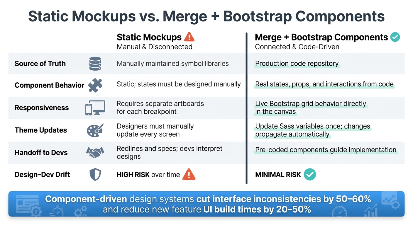
Static Mockups vs. UXPin Merge + Bootstrap: Workflow Comparison
Once you’ve set up your environment and structured your Bootstrap library, the final step is integrating real Bootstrap components into UXPin Merge. This step ensures your team can design using the exact components that will be deployed in production.
Mapping and Validating Bootstrap Components
The first step is to map each Bootstrap component so it aligns with Bootstrap’s class system. For instance, using variant="primary" is much more straightforward and consistent than relying on a boolean like isPrimary. This approach keeps your components aligned with Bootstrap’s documentation.
Make sure your repository is connected, and whitelist the components you want to use in uxpin.config.js. UXPin Merge will automatically detect the props defined in your TypeScript or PropTypes setup. Assign appropriate control types for each prop to streamline the Properties Panel. For example:
- Use dropdowns for enums like
variantorsize. - Use toggles for boolean props like
disabledorisLoading. - Use text inputs for strings like
labelorplaceholder.
Keep the exposed props to a minimum to simplify the design process and make the Properties Panel user-friendly.
Validation is crucial and includes two main checks: responsiveness and theming. Create a test page in UXPin using Bootstrap’s Container, Row, and Col components, and set specific breakpoints. Preview this page at various device widths (e.g., 320 px, 768 px, 1440 px) to verify that the grid behaves as expected. Also, check that theme variables like $primary, $body-font-family, and $border-radius render consistently and match the live application.
Once mapping and validation are complete, you’re ready to sync code updates and ensure your designs stay up-to-date.
Syncing Code Updates to Your Design
With this setup, code updates integrate smoothly. For example, if a developer adds a new prop like density="comfortable" | "compact" to a <Button> component, this change will automatically appear in UXPin after the next Merge sync. Best of all, your existing layouts and settings remain intact.
To maintain reliability, link your Merge sync to your CI/CD pipeline. This ensures UXPin always reflects a passing build from your main or design-system branch. For larger teams, a biweekly release schedule works well. This predictable cadence allows updates to flow into UXPin regularly, with exceptions made for urgent fixes like web accessibility updates or bug resolutions. Share a short changelog via Slack or Teams to highlight any design-impacting changes, such as new variants, deprecated props, or theme adjustments. This prevents designers from being caught off guard during active sprints.
Now, let’s see how this dynamic, code-driven workflow compares to using static mockups.
Static Mockups vs. Merge + Bootstrap Components
The contrast between static mockups and live Bootstrap components in UXPin Merge highlights the efficiency gains your team can achieve.
| Aspect | Static Mockups | Merge + Bootstrap Components |
|---|---|---|
| Source of truth | Manually maintained symbol libraries | Production code repository |
| Component behavior | Static; states must be designed manually | Real states, props, and interactions from code |
| Responsiveness | Requires separate artboards for each breakpoint | Live Bootstrap grid behavior directly in the canvas |
| Theme updates | Designers must manually update every screen | Update Sass variables once; changes propagate automatically |
| Handoff to devs | Redlines and specs; devs interpret designs | Pre-coded components guide implementation |
| Design–dev drift | High risk over time | Minimal risk; design and dev share the same components |
For example, imagine changing a global color palette. With static mockups, this could require hours of manual updates across dozens of screens. In contrast, with Merge and Bootstrap, you update the Sass variable once, and the change reflects across all components in UXPin after the next sync. This approach not only saves time but also ensures consistency throughout the product lifecycle.
Using Claude Opus 4.5 to Build Component-Driven UX
Once your Bootstrap components are synced and validated in UXPin Merge, it’s time to integrate Claude Opus 4.5 into your workflow. Claude acts as a design blueprint tool, turning layout concepts into component hierarchies. These hierarchies are then built in UXPin Merge using production-ready Bootstrap elements. By working directly with these pre-audited components, Claude allows for quick iteration on layouts that align with your system.
Writing Prompts for Bootstrap-Specific Layouts
The quality of Claude’s output relies heavily on how well you craft your prompt. A strong prompt should clearly define key elements like the Bootstrap version, allowed components, target breakpoints, and the core user task. For example:
"Design a Bootstrap 5 product navigation for a SaaS app with 6 top-level links, a user menu dropdown, and a mobile offcanvas collapse pattern using Navbar, Nav, NavDropdown, and NavbarToggle."
Here are more examples of well-structured prompts:
- Dashboard: "Create a Bootstrap 5 admin dashboard for a logistics team using only Navbar, Card, Table, Badge, Modal, and Offcanvas. Include a mobile-first layout, a persistent filter bar, and a detail drawer per row."
- Form: "Generate a Bootstrap 5 client onboarding form using Form, FormGroup, FormLabel, FormControl, FormCheck, and Button. Group fields by task – profile info, billing, notifications – with validation states and one submit action per section."
To keep Claude aligned with your design system, include a directive like: "Do not invent new components or tokens. If something is not possible with the listed components, explain the limitation instead." This ensures the suggestions remain grounded in the components you already have.
Turning Claude’s Output into UXPin Merge Layouts
Think of Claude’s output as a starting blueprint, not the final design. The goal is to extract the layout framework – key UI regions and their nesting – and rebuild it in UXPin Merge using actual Bootstrap components. This process bridges early ideation with production-ready layouts.
Here’s how you can approach this:
- Identify major regions: Break down Claude’s output into core areas like a top navbar, sidebar, or main content section.
- Map regions to Bootstrap components: For instance, a summary area with metrics might translate to a Bootstrap Row with nested Col and Card components.
- Rebuild in UXPin Merge: Use UXPin Merge to insert validated components and adjust their parameters (like size, variants, or states) based on Claude’s recommendations.
- Save reusable patterns: Common structures, like dashboards or multi-step forms, can be saved as templates for consistency across projects.
If Claude suggests something like a "sticky KPI strip", check if it can be implemented using Bootstrap’s sticky utility class with Card components. If it works, great – use it. If not, either adapt it to an approved component or flag it for review as a potential system extension.
Once the layout hierarchy is set, it’s important to understand how constrained outputs differ from raw Claude responses.
Raw Claude Output vs. Merge-Constrained Output
The difference between raw and constrained outputs becomes clear when comparing their impact on production workflows. This distinction is especially critical in enterprise settings where rework can be expensive.
| Dimension | Raw Claude Output | Merge-Constrained Output |
|---|---|---|
| Component Realism | May include invented or custom UI elements | Only uses components already in the system |
| Design-System Compliance | Inconsistent; depends on the prompt | Enforced by the available component set |
| Implementation Ease | Requires interpretation and mapping | Nearly a 1:1 match with production components |
| Risk of Rework | High – developers must reconcile gaps | Low – designers and developers use the same components |
| Handoff Clarity | Ambiguous; specifications need interpretation | Clear – component names and properties are predefined |
| Accessibility Readiness | Variable | Inherited from Bootstrap’s accessible defaults |
Raw Claude outputs are great for brainstorming, while merge-constrained outputs are better suited for production-ready designs. The best teams use Claude for rapid exploration and UXPin Merge to ensure their designs are ready for seamless development.
Improving Collaboration and Deployment with UXPin Merge
Transitioning from a validated design to a finished product often causes delays for enterprise teams. UXPin Merge bridges this gap by ensuring that both designers and developers work from the same set of components, rather than maintaining separate versions.
Designing, Iterating, and Governing with Merge and Forge
Once your environment is established and components are synced, the next step is to streamline collaboration and speed up deployment. Using Merge, you can map layouts with Claude Opus 4.5 and rebuild them directly with code-driven components in UXPin. This allows teams to iterate on actual code-based elements. Stakeholders then review these interfaces, knowing they reflect what can realistically be built, cutting down on the typical back-and-forth during review cycles.
UXPin’s AI assistant, Forge, plays a key role by generating layout suggestions that adhere strictly to your approved design system. It avoids introducing new patterns or components outside your library, ensuring everyone stays aligned without constant manual checks.
To maintain consistency, assign clear ownership of your component library and enforce strict approval rules for new additions. Syncing your Bootstrap library version with your codebase and triggering automatic updates in Merge ensures that designs always match production.
Cutting Handoff and Aligning with Deployment
Real-time updates and unified components make handoff and deployment smoother. Designers can build interfaces directly with Bootstrap components, eliminating unnecessary translation steps. Developers, in turn, can use UXPin’s Dev/Specs mode to inspect component names, properties, and token values, reducing the need for separate spec documents.
For instance, Nordea’s UX team shared that using Merge allowed them to deliver "ready-for-dev" prototypes, which minimized rework and improved collaboration with developers. This approach reduces clarification requests during development, decreases UI mismatches during QA, and accelerates the transition from design approval to implementation.
To keep design and deployment aligned, treat your Merge component library as a core part of the delivery pipeline. Whenever a new Bootstrap version is tagged in your repository, sync it with UXPin so designers always work with the latest components.
Merge vs. Non-Component-Driven Workflows: Lifecycle Impact
Here’s a comparison of traditional workflows versus Merge-based workflows across the product lifecycle:
| Lifecycle Stage | Non-Component-Driven Workflow | Merge-Based Workflow |
|---|---|---|
| Ideation | Freeform sketches; fast but often off-system | Layouts built from Bootstrap components early on |
| Design | Static mockups using visual-only libraries | Interactive prototypes built with production-ready components |
| Stakeholder Review | Reviewers evaluate images; feasibility is unclear | Reviewers interact with live, functional component states |
| Development | Developers rebuild UI from specs and screenshots | Developers use the unified component library |
| QA | UI mismatches are common; components differ from mockups | Fewer discrepancies due to shared design and code sources |
| Release & Maintenance | Design debt builds; manual audits are needed | Library updates sync automatically, ensuring consistency |
Studies show that component-driven design systems can cut interface inconsistencies by 50–60% and reduce the time needed to build new feature UIs by 20–50% in large organizations. This approach keeps every stage – from ideation to release – efficient and aligned.
Conclusion: Key Takeaways for Building UX with Claude Opus 4.5, Bootstrap, and UXPin Merge
This workflow creates a seamless connection between early layout ideation and production-ready design. Claude accelerates layout ideation, Bootstrap provides a shared design language ready for production, and UXPin Merge ensures design and code stay in sync.
Benefits Recap
This combination delivers three major benefits for enterprise teams: speed, consistency, and easier design-to-development handoffs.
- Speed: Reusable design systems can cut new UI build times by 20–50%. Designing directly with components reduces repetitive tasks.
- Consistency: After adopting a design system, 76% of surveyed teams reported better product consistency. Merge strengthens this by making it harder to introduce patterns that fall outside the system.
- Governance: Claude ensures layouts are built using approved components, reducing design inconsistencies. This is especially helpful for teams managing multiple products or regions under one design system.
These advantages make this workflow a strong choice for enterprise projects. Testing it on a smaller scale can help refine the process further.
Next Steps
To validate this workflow, start small. Choose a key flow, such as a sign-up screen or dashboard, and rebuild it using Bootstrap components in UXPin Merge, following Claude’s layout suggestions. This exercise can help identify integration gaps, highlight effective design patterns, and create a clear comparison to share with stakeholders.
Once the pilot is complete, consider expanding gradually. Build a prompt library for Claude that references your specific Bootstrap components and design guidelines. Align with engineering to ensure Merge designs map smoothly to production. Track metrics like cycle times and UI defect rates to measure impact and strengthen the case for scaling up.
For more details on how UXPin Merge can work with your team’s needs, visit uxpin.com/pricing or reach out to their enterprise team at sales@uxpin.com.
FAQs
What’s the fastest way to pilot this workflow on one user flow?
The quickest route to streamlined prototyping is by combining AI-generated components with UXPin Merge. Start by designing a layout using tools like Claude Opus 4.5 or Claude Sonnet 4.5. Once your components are ready, sync them into UXPin Merge for further customization.
From there, take advantage of Preview Mode to test interactions live and see how your design functions in real-time. Then, switch to Spec Mode to review the code, ensure everything is accurate, and share it with developers for feedback. This approach cuts down on manual tasks and accelerates the iteration process.
How do we keep Bootstrap theming and design tokens consistent in UXPin Merge?
To keep your design consistent, start by customizing Bootstrap’s Sass variables with your core design tokens – such as colors, typography, and spacing. Use the className prop to override default classes, and apply your design tokens as CSS custom properties. This approach supports runtime theming, including features like dark mode.
If you’re working with React Bootstrap libraries, make sure to include the Bootstrap CSS path in the Merge Component Manager. To maintain streamlined workflows, document your approved utilities and tokens, and set clear limits on their usage. This ensures everyone stays aligned with your design system.
What should we expose as component props so designers don’t get overwhelmed?
When working with Claude Opus 4.5 and UXPin Merge, it’s important to simplify the design process by exposing only the essential props needed for meaningful customization. Prioritize core elements like colors, spacing, typography, and key behavior states (e.g., default, hover, focus, error). By limiting advanced or overly complex props, you create a cleaner, more streamlined interface. This approach helps designers focus on customizing components efficiently without being bogged down by unnecessary options.