You can go from draft copy to a code-aligned landing page with three tools: GPT-5 Mini for page copy, Bootstrap for the UI, and UXPin Merge for a prototype built from the same components your team ships. Instead of writing copy in one place, mocking up screens in another, and rebuilding everything later, I can keep the page structure, content, and components closer together from day one.
Here’s the short version:
- GPT-5 Mini gives me the first draft for the page sections, headlines, CTAs, and pricing copy.
- Bootstrap gives me the page sections and UI parts, like navbars, cards, buttons, pricing blocks, and forms.
- UXPin Merge lets me prototype with code-backed Bootstrap components, not visual stand-ins.
- UXPin Forge helps me test new layout options after the first version is in place.
- This matters because teams using shared code-backed components can cut handoff time by around 50%.
What I need to do is simple:
- Load the Bootstrap library in UXPin.
- Map the main component props designers will edit.
- Ask GPT-5 Mini for section-by-section landing page copy.
- Build the same layout in Bootstrap and in UXPin Merge.
- Use Forge to test the next version without drifting away from the component library.
In other words: I’m not just making a mockup. I’m setting up a landing page workflow where copy, layout, and shipped code stay much closer in sync.
That’s the core idea behind this process.
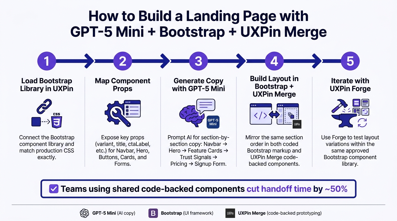
How to Build a Landing Page with GPT-5 Mini, Bootstrap & UXPin Merge
1. Set up Bootstrap components for UXPin Merge
Load the Bootstrap library and styles
Use UXPin’s built-in Bootstrap library to place coded components on the canvas. If you’re working with a custom Bootstrap-based system, connect your React component library, load the same Bootstrap version used in production, and compile brand overrides into a single stylesheet. The goal is simple: match production CSS exactly.
For a landing page draft, start with the built-in Bootstrap library. It’s the fastest way to get moving. Then switch to a custom library after tokens and brand rules are locked in. Once the Bootstrap library is connected, map the props designers will use most.
Component props designers need
For a landing page, expose only the props that change content, variant, and interaction. Keep it tight. Start with navbar, hero, buttons, cards, and forms. These line up with the main funnel stages: awareness, interest, and conversion.
The big win comes from how each component’s props connect to UXPin controls. Designers should be able to update copy, switch variants, and tweak layout without touching JSX. Here’s how the most-used props map into UXPin:
| Component | Props to map | UXPin control type |
|---|---|---|
| Navbar | brand, links, sticky |
Text, text, boolean |
| Hero section | title, subtitle, ctaLabel, imagePosition |
Text, dropdown |
| Button | variant, size, disabled |
Dropdown, dropdown, boolean |
| Card | title, bodyText, imageSource |
Text, text, URL/resource |
| Form | isSubmitting, hasError, successText |
Boolean, boolean, text |
Map variant props like primary, secondary, and outline to dropdown controls. That way, designers can switch Bootstrap styles without guessing class names. Map content props such as title, subtitle, and ctaLabel to text controls so the team can test copy right on the canvas, including U.S. currency and date formats.
For interactive props like onClick on buttons and onSubmit on forms, connect them to UXPin interactions. A Get Started button can move users to another page. A form submission can show success text through successText. It’s a simple setup, but it makes the prototype feel much closer to the finished product during stakeholder reviews, with no backend work needed.
Once the components appear in UXPin’s left panel and the props respond in the Properties Panel, drag a navbar, hero, button, card, and form onto the canvas. Then check that the Bootstrap styling shows up as expected. Resize the viewport and make sure Bootstrap’s grid collapses at 768px and 576px. When that looks right, move on to GPT-5 Mini to build the page structure.
sbb-itb-f6354c6
2. Generate landing page copy and structure with GPT-5 Mini
Prompt for a simple landing page structure
Once you’ve mapped the Bootstrap components, ask GPT-5 Mini for only the copy each section needs. Keep the brief tight. Don’t leave it open-ended.
Ask for section-by-section output in a fixed order: Navbar → Hero → Feature Cards → Trust Signals → Pricing → Signup Form. Also ask for each section as a labeled block with short copy, button labels, and the Bootstrap component it maps to.
Create content for a SaaS landing page for US customers with these sections in order: 1) Navbar 2) Hero with one primary CTA 3) Feature cards 4) Trust signals section 5) Pricing in USD 6) Signup/contact form Return each section as a labeled block with headings. Include: - section name - copy that fits Bootstrap components - button labels - the Bootstrap components it maps to, such as navbar, hero section, cards, rows and columns, form controls, and buttons Use concise headlines (max 8–10 words), scannable copy (1–2 short sentences per section), and avoid metaphors. This setup lines up cleanly with Bootstrap sections, so there’s less cleanup later. Use the trimmed draft as the copy layer when you build the Bootstrap layout in the next step.
Review and adapt the generated content for U.S. readers
GPT-5 Mini’s first draft is a starting point, not the final version. Before you move anything into UXPin, give it a quick pass for tone, conversion clarity, and U.S. formatting. (See our guide on designing for higher conversions for more tips.)
For tone, the hero should explain what the product does and who it’s for in the first 1–2 sentences. CTA labels should be specific. The best ones tell people both the action and what they get.
For U.S. localization, check the draft for common issues:
| Element | What to look for | Correct U.S. format |
|---|---|---|
| Pricing | Missing $ symbol or wrong decimals | $29.00/month, $1,000.00/year |
| Dates | Non-U.S. format in form labels | MM/DD/YYYY |
| Form fields | ZIP Code, State | ZIP Code, State |
| Numbers | Period as thousands separator | 10,000+ customers |
| Spelling | customise, organisation | customize, organization |
Trim the copy so it fits cards, forms, and mobile screens.
Once the copy is trimmed, bring Bootstrap components to UXPin and build the same sections using Merge.
3. Build the landing page in Bootstrap and prototype it in UXPin
Build the page layout with Bootstrap sections
Start with the Bootstrap page structure in this order: Navbar → Hero → Feature Cards → Pricing → Signup Form.
First, load Bootstrap CSS in the <head>. Then place the Bootstrap JS bundle right before </body>. After that, build each section one by one.
Navbar: Use <nav class="navbar navbar-expand-lg navbar-light bg-light"> and include a .navbar-toggler so the menu collapses on mobile. Point the nav links to section anchors like #features and #pricing.
Hero: Put the headline, subheadline, and CTA inside col-12 col-md-6. The main CTA can say Get started for $29.00/month and use .btn.btn-primary.btn-lg.
Feature cards: Use a .row with three .col-12.col-sm-6.col-md-4 columns. Inside each one, place a .card with .card-body, h5.card-title, and p.card-text.
Pricing: Use col-12 col-md-4 cards for each plan. Each card should show the plan name, the price in $XX.00/month format, and a .btn.btn-primary.w-100 CTA. If one plan is the pick you want people to notice first, mark it with Bootstrap’s .badge component.
Signup form: Use .mb-3, .form-label, and .form-control for each field. Keep labels in U.S. terms like Work email, ZIP Code, and State. If you use a date placeholder, format it as MM/DD/YYYY.
When you move into Merge, keep the same section order and the same labels. That way, the coded page and the prototype line up cleanly.
Recreate the same layout with Merge components in UXPin
Next, mirror that same Bootstrap layout in UXPin with code-backed components.
Open UXPin and add your synced Bootstrap library through Merge. Drag the Navbar component onto the canvas first. Then set the nav labels and link targets in the properties panel so they match the Bootstrap markup.
Add the Hero component after that. Set its props – headline, subheadline, ctaLabel, and secondaryCtaLabel – with the same U.S.-localized copy used in code. For the main CTA, use Get started for $29.00/month so the prototype stays aligned with the build.
Then place three FeatureCard components in a row and fill in each title and body in the panel. Add the PricingTier component and set price={29}, currencySymbol="$", and billingPeriod="month" to match the Bootstrap pricing section. Finish with the SignupForm, and turn on the fields from code: full name, work email, and company size.
Keep the props and labels the same as the Bootstrap version. Then wire up the CTA clicks. Link Get started for $29.00/month to #pricing and Book a demo to #contact. That lets people click through the prototype much like they would on the live page.
Static mockups vs. Merge prototypes: a direct comparison
The day-to-day difference between a static mockup and a Merge prototype goes beyond how the screen looks. It changes the handoff itself. With a static mockup, a developer gets an image and then has to rebuild each part by hand. With a Merge prototype, the component is already production-ready.
| Static mockups | UXPin Merge prototypes | |
|---|---|---|
| Handoff effort | High – requires specs and asset exports | Low – developers use the same code components |
| Rebuild risk | High – developers recreate visuals manually | Low – design and code stay in sync |
| Behavior consistency | Visual only; interactions are described, not demonstrated | Components behave the same way they do in production |
Once the prototype matches the build, use Forge to iterate faster on copy, layout, and edge cases.
4. Use UXPin Forge to speed up iteration
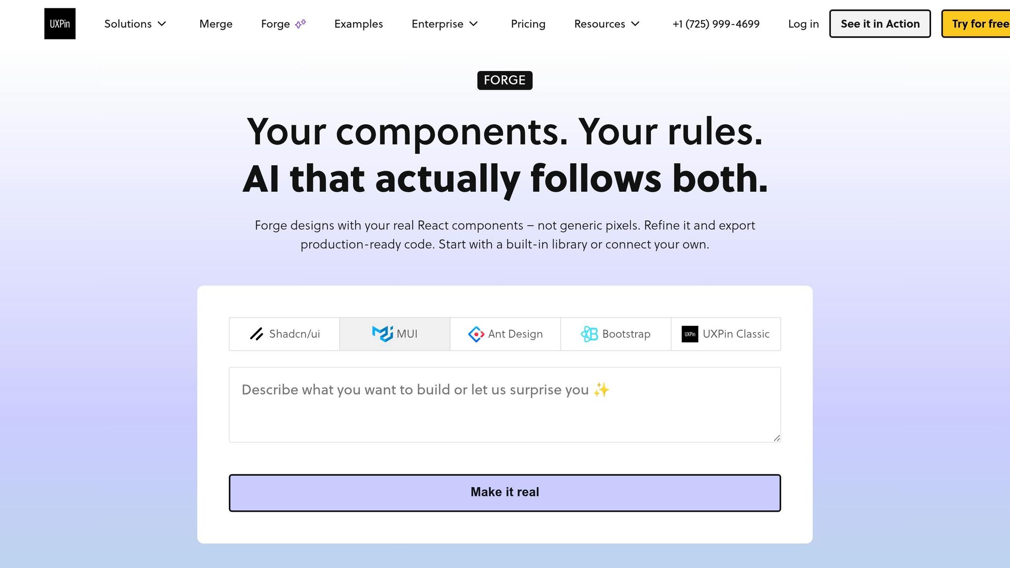
Where Forge fits after GPT-5 Mini and Merge
Once the prototype matches the component set, Forge is the fastest way to work through the next version. After GPT-5 Mini drafts the copy and Merge adds the Bootstrap components, Forge lets teams keep iterating in the same canvas.
Forge creates layout variations using the same approved Bootstrap components, so changes stay inside the design system. That means each version stays aligned with the Bootstrap library already used in Merge. Say you want to try a different CTA position in the hero section. Forge can generate that version without breaking system consistency or turning into a one-off mockup that someone has to rebuild later.
Forge can also scan a live URL and recreate a similar layout with your component library. That speeds up redesign work while keeping the system intact.
Conclusion: from AI draft to deployable landing page
Together, GPT-5 Mini drafts the page, Bootstrap builds it, Merge turns it into a prototype, and Forge speeds up the next round of changes. For product teams, that means fewer rebuilds, faster reviews, and a shorter path from first draft to a deployable page. You also get landing pages out the door faster, with fewer handoffs and a cleaner path from AI draft to deployable build.
Build A Landing Page using Bootstrap 5 | Full Step by Step Tutorial
FAQs
Do I need coding skills to use UXPin Merge with Bootstrap?
No. UXPin comes with a built-in Bootstrap library, so you can drag and drop production-ready components right onto the canvas. From there, you use the visual editor to set properties, variants, and states instead of writing HTML or CSS by hand.
If your team uses custom or branded component libraries, engineers usually take care of the first setup. After that, designers and product managers can build prototypes without manual coding.
How do I keep Bootstrap components in UXPin matched to production?
Connect your custom component library to UXPin with Git or npm integration. That gives UXPin a direct link to your repository, so changes in production code show up in the design environment too.
If you use the built-in Bootstrap library, UXPin maps design tokens such as spacing, typography, and breakpoints on its own. With custom setups, it helps to assign a design system owner. That person can keep props, naming conventions, and sync rules in line so the system doesn’t drift.
What should I review before using GPT-5 Mini copy on a live landing page?
Review GPT-5 Mini copy against your brand voice so the tone stays consistent and sharp.
Also check U.S. formatting:
- $29/month
- Dates in mm/dd/yyyy or Month Day, Year
- Commas for thousands
- U.S. English spelling
If the copy feels generic, passive, or a little flat, refine it with follow-up prompts. The goal is to keep it focused on the reader, tied to clear benefits, and aligned with your conversion goals.

