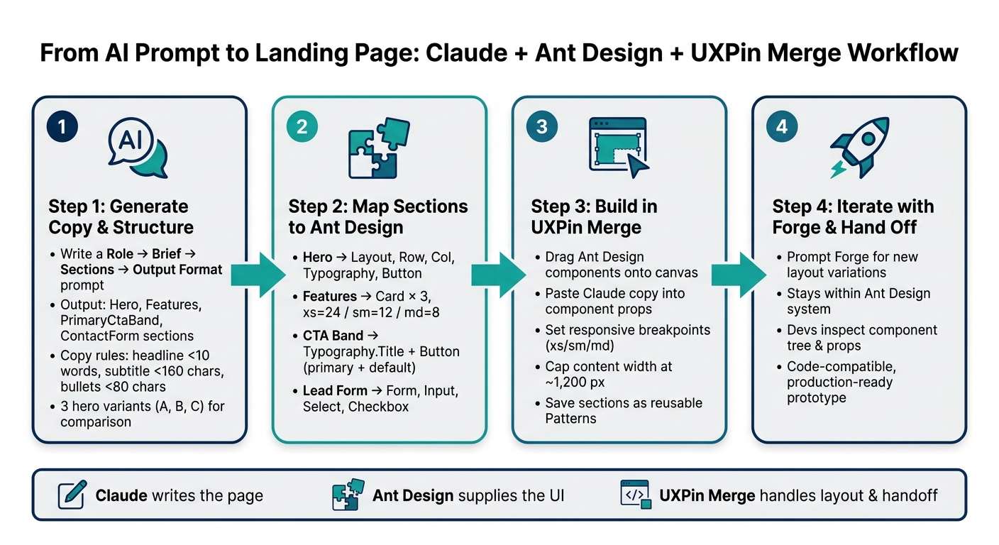
You can go from prompt to prototype with one simple flow: use Claude Haiku 4.5 for page copy and section structure, Ant Design for React UI parts, and UXPin Merge to build the page with the same code-backed components your dev team uses.
I’d sum it up like this: Claude writes the page, Ant Design supplies the UI, and UXPin Merge puts both on a shared canvas. That cuts mismatch between design and code and gives teams a clearer design handoff path.
Here’s the full idea in plain English:
- Claude Haiku 4.5 drafts the landing page sections and short UI copy
- Ant Design gives you ready-made React parts like
Button,Card,Form,Input, andSelect - UXPin Merge lets me place those coded parts on a design canvas
- The page includes 4 sections:
- hero
- features grid
- CTA band
- lead form
- The form collects:
- First Name
- Last Name
- Work Email
- Job Title
- Company Name
- Team Size
- marketing consent
- The example target is a B2B marketing analytics platform
- The main conversion goal is Book a live demo
A few details stand out. The guide keeps copy short enough for UI use, uses responsive Ant Design grid settings like xs={24}, sm={12}, and md={8} or md={12}, and recommends a content width around 1,200 px. It also uses U.S. formatting like $249 per month, 1,200 campaigns, and 3.5x ROI.
What I like most is the job split. One tool writes. One tool supplies components. One tool handles layout and handoff. That makes the workflow easier to follow and easier to repeat.
If you want a short version, it’s this:
- Start with a labeled prompt in Claude
- Map each section to Ant Design components
- Build the page in UXPin Merge
- Use Forge for more layout versions
- Hand off a prototype tied to the same component system devs inspect
In other words: this article is a step-by-step way to build a landing page that stays close to production from the first prompt.
From AI Prompt to Landing Page: Claude + Ant Design + UXPin Merge Workflow
UXPin Merge AI: Smarter UI Generation That Follows Your Design System
sbb-itb-f6354c6
Step 1: Generate landing page structure and copy with Claude Haiku 4.5
Claude Haiku 4.5 does best when you give it a short, labeled brief that leads to UI-ready output. Think short text fields that can drop straight into Ant Design props. Then, in Step 2, you’ll map each section to Ant Design components.
Write a prompt for sections, audience, and conversion goal
Start by setting three inputs: product, audience, and one conversion goal. In this walkthrough, the product is a B2B marketing analytics platform that helps U.S. marketing teams track real-time campaign ROI across channels. The audience is marketing managers and directors at midmarket tech companies with 50–500 employees. The conversion goal is a single action: Book a live demo.
Put those inputs into a labeled design brief at the top of your prompt. Then tell Claude which sections to generate and the order to use. The prompt pattern that tends to work best is Role → Brief → Sections → Output Format:
Act as a UX copy assistant helping design a B2B SaaS landing page implemented with Ant Design components inside UXPin Merge. Product: a marketing analytics platform for U.S. marketing teams. Audience: U.S.-based marketing managers at midmarket tech companies (50–500 employees). Primary CTA: Book a live demo. Format prices as $249 per month. Use commas for thousands and periods for decimals (e.g., 1,200 campaigns, 3.5x ROI). Output a structured JSON-style output with these sections: Hero, Features, PrimaryCtaBand, ContactForm. For each section, include only short, UI-ready text fields – title, subtitle, bullets, buttonLabel, field labels and types. No long paragraphs. Avoid any code syntax that might break JSON.
After Claude returns the structure, tighten the copy before you turn it into components.
Refine headlines, microcopy, and form fields
The first pass gives you a strong skeleton. The second pass is where the copy gets tight enough to use. Take just the hero block from Claude’s output and run a follow-up prompt with strict length limits: headline under 10 words, subtitle under 160 characters, and each benefit bullet under 80 characters. Those limits help keep the copy compact inside Ant Design Typography.
Ask Claude for 3 alternative hero variants labeled A, B, and C in the same structured format. That way, you get actual options to compare instead of one draft you’re stuck tweaking.
For the form section, your second-pass prompt should clearly ask for U.S.-standard field labels:
- Work Email
- First Name
- Last Name
- Job Title
- Company Name
- a
Selectfield for Team Size - a
Checkboxfor marketing consent
These field names and types map straight to Ant Design Form.Item, Input, Select, and Checkbox components.
Next, map the approved sections to Ant Design layout and form components to finalize your prototype.
Step 2: Map Claude’s output to Ant Design components
Before you open UXPin Merge, map each part of the page to essential design system components from Ant Design. That gives you a clean build plan and cuts down on rework later.
Use this table as the reference point:
| Landing page section | Ant Design components | Key props and notes |
|---|---|---|
| Hero | Layout, Layout.Content, Row, Col, Space, Typography.Title, Typography.Text, Button |
xs={24} / md={12} on each Col; Button type="primary" size="large" for "Request demo" |
| Features grid | Layout.Content, Row, Col, Card, Typography.Title, Typography.Text, Space |
xs={24} / sm={12} / md={8} for a 3-column grid; gutter={{ xs: 8, sm: 16, md: 24 }} on Row |
| Primary CTA band | Layout.Content, Row, Col, Space, Typography.Title, Button |
Centered single Col; Button type="primary" for the main action, type="default" for a secondary action |
| Lead form | Form, Form.Item, Input, Select, Checkbox, Button |
layout="vertical"; match each Form.Item name to the backend field key |
Build the sections in that order. It keeps the page structure clear and makes implementation much less messy.
Convert hero, features, and CTA sections into layout components
For the hero, use one Row with two Col blocks: the left side for text, the right side for the product visual. Set both columns to xs={24} and md={12} so the layout stacks on mobile and splits evenly on larger screens. Inside the text column, use Space direction="vertical" to stack the headline, subtitle, and buttons without fiddling with one-off spacing.
The features area should use three Card components inside a single Row. Set each Col to xs={24}, sm={12}, and md={8} so the layout shifts from one column to two, then three. Add gutter={{ xs: 8, sm: 16, md: 24 }} on the Row to keep spacing even across breakpoints. Each Card should include a Typography.Title at level 4 for the feature name and Typography.Text for the supporting copy Claude produced.
For the CTA band, place a centered Col inside the section and add a Typography.Title plus a primary Button labeled "Request demo." If the copy includes a second action, such as "Get pricing," add a Button type="default" next to it.
Once those layout sections are mapped, move to the lead form.
Build the lead form with Ant Design form inputs
Set the Form to layout="vertical". Each Form.Item name should match the backend field key exactly. For example, use name="workEmail" if that’s the field your backend expects. That way, developers don’t have to remap fields during handoff.
A few form details matter here:
- Add required and email validation rules to the email field.
- For the Team Size
Select, use these U.S.-friendly ranges:1–1011–5051–200201–1,0001,000+
- For the consent checkbox, use
Form.ItemwithvaluePropName="checked"and a customvalidatorthat confirms the value istruebefore submission.
The submit button should read "Request demo."
With those sections mapped to Ant Design, you’re ready to assemble them in UXPin Merge. This workflow allows you to design UI with coded components much faster than traditional methods.
Step 3: Assemble the page in UXPin Merge using Ant Design components
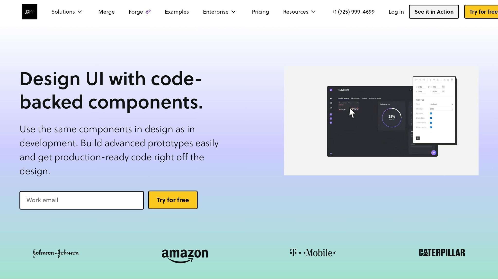
Open UXPin Merge and build the landing page right on the canvas with Ant Design components. This is the point where Claude’s copy turns into a working Ant Design prototype. Work section by section, and keep the component setup matched to Claude’s output.
Set up the page structure in the Merge canvas
Drag a Layout onto the canvas and use Content for the landing page sections. Add the sections in this order:
- hero
- features
- CTA band
- lead form
Add copy, set props, and adjust for responsive layouts
Paste Claude’s copy into the right component props: Typography.Title for headlines, Typography.Text for supporting copy, and Button labels for CTAs.
Set the hero to xs={24} and md={12}. Set the feature cards to xs={24} and md={8}. Use Typography.Title levels and strong to create a clear hierarchy. Cap Content at about 1,200 px so the page stays easy to read.
Once the layout feels stable, keep that same component setup for fast variations later. It’s a simple way to make updates without rebuilding the whole page each time.
Save finished sections as Patterns for reuse. That keeps page assembly fast and cuts out the hassle of rebuilding shared sections from scratch.
Check the code-backed output for design-dev alignment
Developers can inspect the exact component tree and props. Preview each breakpoint, fix any spacing or column-span issues in the props panel, and use those updates to get the prototype ready for design handoff.
After the layout passes breakpoint checks, move to the next iteration pass.
Step 4: Speed up iteration with UXPin Forge and prepare for handoff
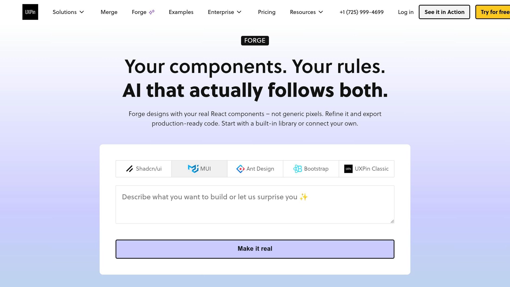
After you build the first Ant Design layout in UXPin Merge, UXPin Forge helps you move faster without rebuilding what’s already done. Forge is UXPin’s built-in AI assistant. It creates and edits layouts using only approved design system components, so the versions it generates stay code-compatible and on-system.
Use Forge to build Ant Design layouts from prompts
Once the layout is in place and the copy is ready, use Forge to spin up new versions without leaving the same Ant Design system. From this point on, Forge handles the visual layout work. Prompt Forge directly inside UXPin with the structured section outline Claude produced earlier.
A good Forge prompt is specific. For example:
"Using our Ant Design library, build a responsive landing page with a left-aligned hero, a three-column feature grid, a CTA band, and a right-sided signup form capturing name, email, company size, and job title. Stack to a single column below 768 px."
That kind of prompt gives Forge a clear lane to follow, which makes the output much easier to use.
After Forge generates the first layout, drop Claude’s copy into the matching props – Typography.Title for headlines, Typography.Text for supporting copy, and Button labels for CTAs. Then adjust breakpoints and column spans on the canvas. Developers can inspect the component tree and props directly.
At this stage, the goal is simple: move through iterations faster while keeping the prototype lined up with production components. That gives you a shorter path from approved copy to a developer-ready landing page.
Conclusion: From AI prompt to a functional landing page
This workflow keeps content, components, and handoff aligned.
FAQs
How do I connect Claude’s output to Ant Design components?
Treat Claude’s output as a structural brief, not a visual design.
Ask for a structured outline that maps each section to Ant Design components like Layout, Row, Col, Typography, Card, and Form.
Then turn that output into a simple component list and use it as a checklist in UXPin Merge. Drag in the matching Ant Design components and set their props in the Properties Panel so they match the AI-generated brief.
What makes UXPin Merge better for design-dev handoff?
UXPin Merge makes design-dev handoff smoother by letting designers use the same production-ready React components that developers already work with. That keeps both sides in sync and cuts down on the usual back-and-forth.
Because these prototypes are code-backed instead of static mockups, developers can inspect props, variants, and responsive behavior right away. In plain English, they’re not guessing how something should work from a flat screen. That means less friction during handoff, less rework, and a faster path to deployment.
How should I validate the lead form before handoff?
Test the full submission flow in Preview Mode and make sure both error and success states behave the way they should.
Check that Form, Form.Item, Input, Select, and Checkbox use the right Ant Design props and line up with production validation rules. That means field rules, error messages, required states, default values, disabled states, and any edge cases should match what users will see in the live product.
Also confirm:
- the submit action fires correctly
- the form stays usable across breakpoints
- any issues are logged in UXPin comments
- any loading-state needs are noted in UXPin comments
If something feels off, call it out plainly in the comments so the next person doesn’t have to guess what went wrong.
Related Blog Posts
- How to prototype using Claude Haiku 4.5 + Ant Design – Use UXPin Merge!
- How to build UI using Claude Sonnet 4.5 + Ant Design – Use UXPin Merge!
- How to build a landing page using Claude Sonnet 4.5 + Ant Design – Use UXPin Merge!
- How to build a landing page using Claude Haiku 4.5 + MUI – Use UXPin Merge!