How Hick’s Law Applies To UX Design

Hick’s law basically states that the time it takes to make a decision increases as the number of alternatives increase.

Origins of Hick’s Law

It is named after American and British psychologists Ray Hyman and William Edmund Hick. In the 1950s, they sought to study the effect of the number of stimuli present on a person’s reaction time to an individual stimulus. 

Their findings suggested that users given more options take longer to choose which to interact with. 

Hick’s Law & Web Design

This law found broad application in user experience design, because not only did it reduce users’ confusion, but also increased conversion rates of call-to-action UI elements.

It basically boils down to scaling down the number of options available to streamline decision-making and reduce user response time. It’s become one of the strongest user experience and design principles we have. 

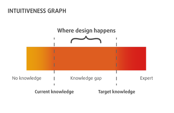
Does Hick’s law enforce reduction at all cost?

Imagine a credit card form that would allow payments by one type of card only or an online t-shirt store that lets you buy only one size. :) That seems not to be the case here.

A very similar problem of choice paralysis was described in a study called: “When Choice is Demotivating”. In a famous “jam experiment” the researchers set up a display featuring a line of exotic, high-quality jams, customers who came by could taste samples, and they were given a coupon for a dollar off if they bought a jar. In one condition of the study, 6 varieties of the jam were available for tasting. In another, 24 varieties were available. What did they find?

Of the 242 customers who passed the extensive selection display of jams, 60% (145) actually stopped at the booth. In contrast, of the 260 customers who passed the limited-selection
display of jams, only 40% (104) stopped.

However, that doesn’t tell the whole story.

“Is the initial attractiveness of extensive choice also reflected in subsequent purchasing behavior? Our findings suggest not: Nearly 30% (31) of the consumers in the limited-choice condition subsequently purchased a jar of Wilkin & Sons jam; in contrast, only 3% (4) of the consumers in the extensive-choice condition” (Source)

So how to avoid the choice paralysis and Hick’s law adapt to contemporary web design needs?

Adapting Choice Paralysis & Hick’s Law To Modern Design Needs (with Examples)

We took some of the best work from the UX Patterns gallery to illustrate some ideas to answer that question. Click the wireframes to upload them completely free to your UXPin account and start tinkering right away. If you’re new to UXPin, it’s a good way to start a free trial, click the wireframe you like to sing up for free.

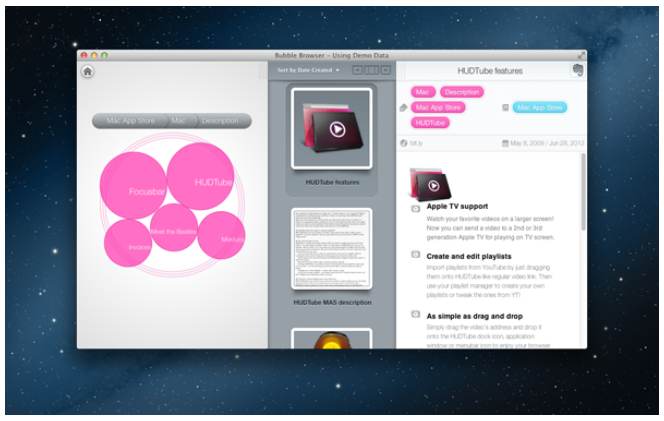
Dropdown menu from Dishizzle

How to apply Hick’s law to a drop-down menu design where you’ve got to expose several content groups? Well, here’s an idea from Dishizzle – good categorization and corresponding visual code.

Click to upload the wireframe to UXPin or sign up for free

Header from Typecast

This one is quite obvious – the signup button stands out quite clearly and the only other alternative within the nearest area is the “Find out more” link, which visually has inferior visibility. It’s a good idea to resist the temptation to fit everything-that-is-important in attention drawing hot spot. :)

Click to upload the wireframe to UXPin or sign up for free

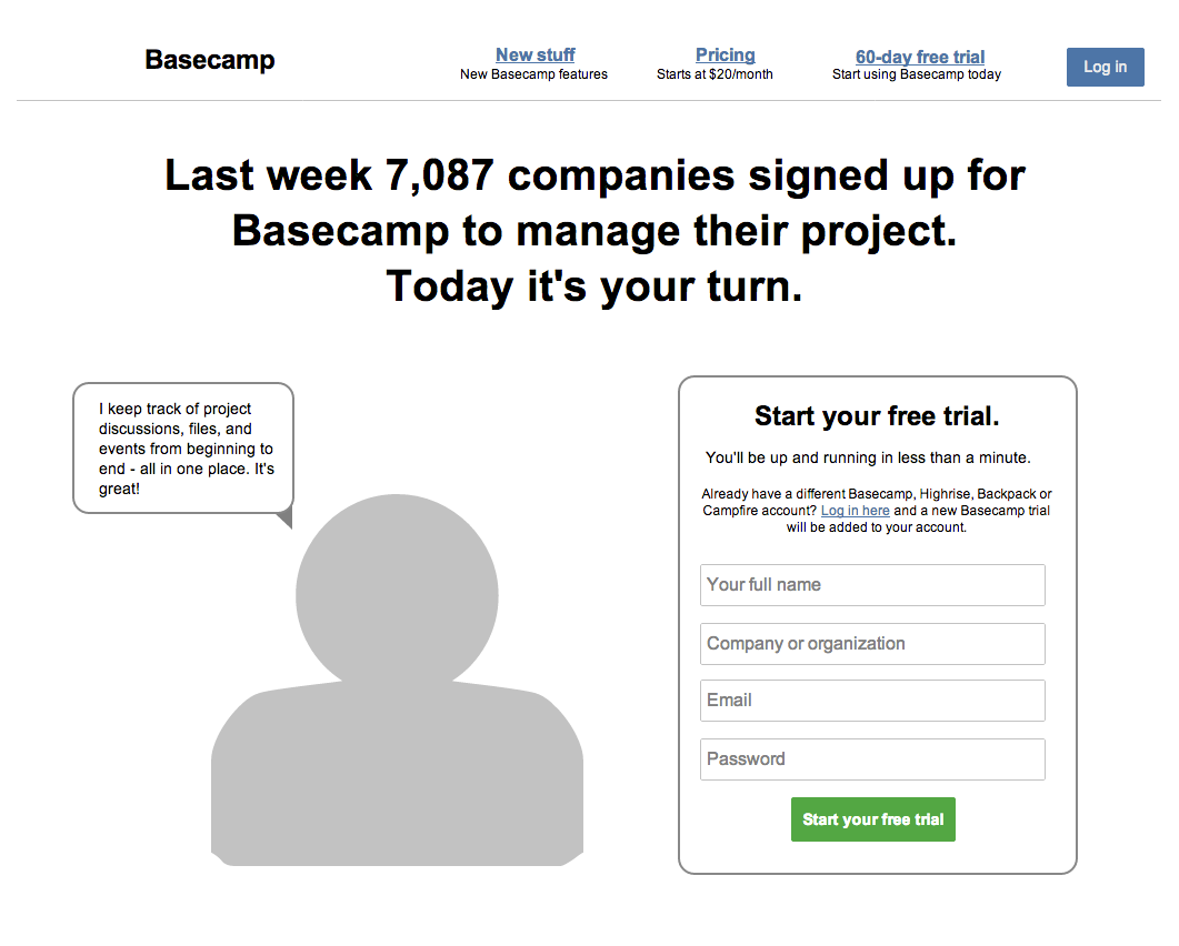
If you want a yet clearer example of this technique, check out the next wireframe:

Sign up from Basecamp

Upload this wireframe to UXPin

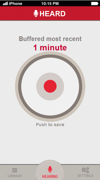
Main screen from Heard

Heard is a type of app where time really matters. Thanks to the visual “hegemony” of the record button there is really just one thing to do here.
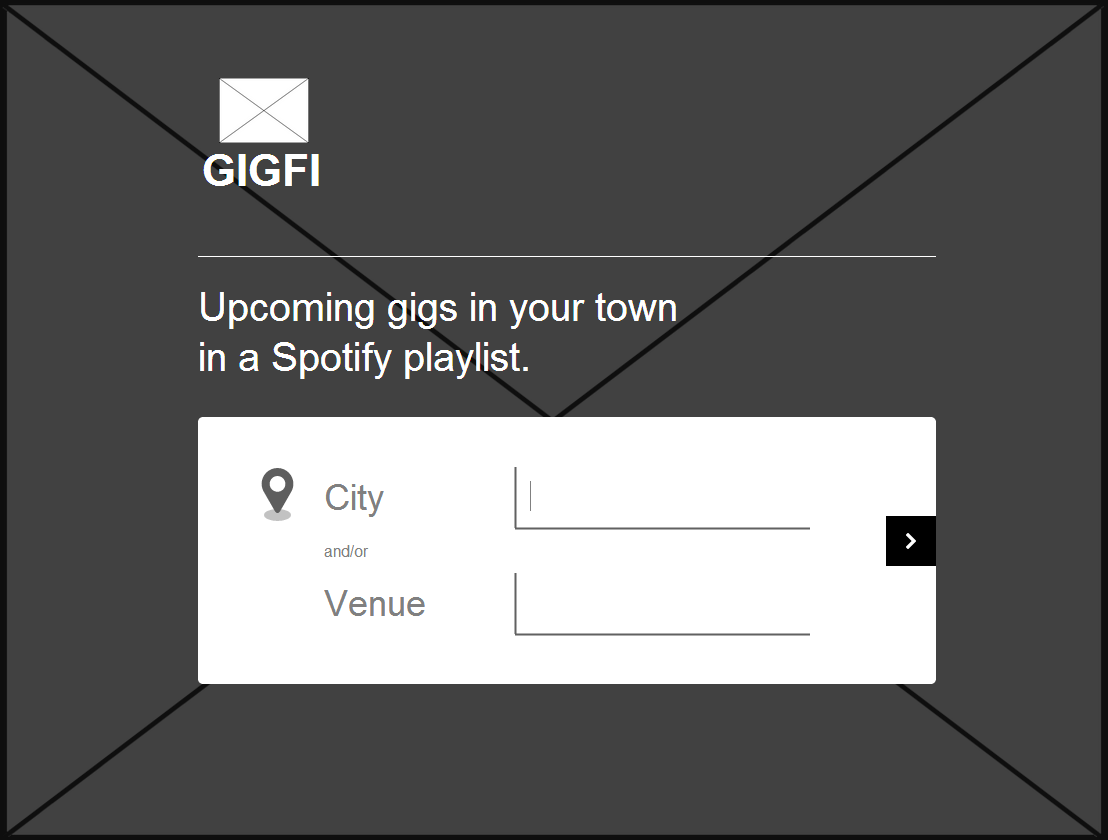
UXPin - responsive breakpoints tutorial

Search from Gigfi

No tags, no categories, just a search bar. There’s nothing more frustrating than setting up an “advanced” search that eventually goes wrong (and when you go back and discover all that carefully customized search is gone – that’s a true “Hulk moment”). If you want your customers to try the app and discover its functionality themselves, then you should let them do it. :) Gigfi bet on simplicity and curiosity that drives even the most daring decisions in people’s lives. See if you this would work your service, here’s the wireframe:

Click to upload the wireframe to UXPin or sign up for free

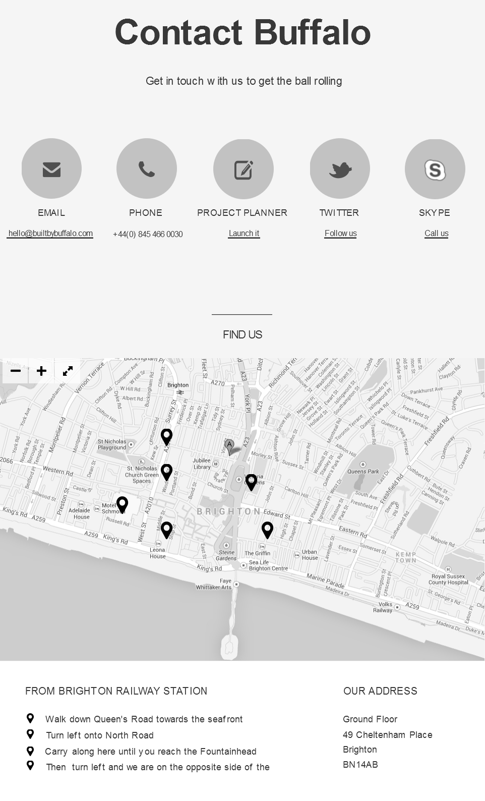
Contact Page from Buffalo

Another way to incorporate Hick’s law to your web design is segmentation. You will make your 40ish elements more clear if you put it into groups, just how Buffalo divided its contact page:

Click to upload the wireframe to UXPin or sign up for free

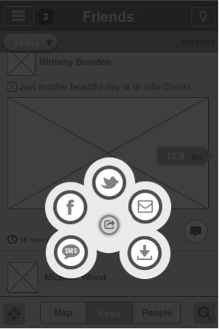
Multishare button from Ban.jo

Another technique of applying Hick’s law to web design – moving out of the context or layering. This wireframe simulates the lightbox effect that sets everything that’s not a part of the multi sharing button to background, so you don’t have any unnecessary alternatives.

Click to upload the wireframe to UXPin or sign up for free

Apply Hick’s Law To Your Own Designs

As interesting a concept as it is, Hick’s Law is difficult to use in design practice. 

Whether you’re designing a homepage, menu items, a shopping cart, payment process or something else, it’s difficult to nail down a UX or interface design that captures this concept perfectly. 

…But you can try. If you’re interested in getting started, check out our ebook on UX design for beginners for some other tips. 

Funniest Web Designs of the 90s

“Really, those sites aren’t the ugliest, crappiest websites of the 90s”, we wrote In a recent post about progress in design where we compared the design of popular websites the time they launched and their present looks. And we really ment it; we didn’t pick up the crappiest, funniest ones. Then we liked the concept of really collecting them – just to back up the thesis;)

Because, if you think those were funny, you’re going to enjoy this gallery:)

Continue reading Funniest Web Designs of the 90s

5 Flat Design Myths Busted.

Five myths of flat design
Photo credits

I would love to see Morgan Freeman mysteriously emerge from the shadows now and tell us how many years it would take to see all flat designs done around the web. It looks like we’re on the hype of flat design trend and as one looks at all this variety of different sites, one asks: so is this site flat or not. How can we tell? Let’s look at some flat design assumptions before the myth becomes the truth.

Continue reading 5 Flat Design Myths Busted.

Learn about Lean with LUXr

Build measure learn - the lean startup philosophy
By Yingying Zhang

Yet another great night learning about Lean Startups.

For those of you who are not familiar with “Lean Startups” – it’s a philosophy for companies, especially startups. Startups can shorten their product development cycles by adopting a combination of business-hypothesis-driven experimentation, iterative product releases, to build products or services to meet the needs of early customers. This way, they can sidestep the need for large amounts of initial project funding and expensive product launches. (Source: Wikipedia)

We learned how to make it work with Janice from LUXr. She rocks! Here are my takeaways from her talk:

Continue reading Learn about Lean with LUXr

Iridies and User Experience Blossom in Spring.

User Experience blossoms in spring
Photo Credit: Chris Willis

This spring we’ve been quite busy with supporting some cool UX conferences and workshops. Our KUDOS to you friends for supporting the whole UX community and delivering such great value and to all the people who attended, showing the strenght in user experience!

Thank you:

If our numbers are right the total amount of attendees in these conferences is circa 3000. So hey 3000 UX enthusiasts, a big thanks to you too! :)

See you next spring!

If you’d like us to back up your conference or workshops, just send us a line a hello@uxpin.com.

Google Glass – Gimmick or Revolution? Infographic.

I’ve tried Glass. We were sitting together with friends in a pub in San Mateo (CA) and we’ve played with Glass capabilities. My opinion: it’s still more of a nerd gizmo than a massively popular, world-changing, device. But there is hope. There is great hope in the concept of wearable computers and Google was first to introduce a meaningful device with a chance for the creation of a platform (like iPhone, iTunes, and Appstore).

So here’s an offer: let’s give Glass a chance.

First of all, UXPin is the only design environment that lets you design your own Google Glass App prototype. Go play with it. It’s fun to think about your app for a wearable computer.

And finally, something that we’ve been working on lately – info about Google Glass summed up in an Infographic. We all really hope you’ll like it. Whenever somebody asks you “so what is this Glass buzz all about?” just show him this infographic.

Google Glass Infographic

Designing An Online Store? It’s all about the side doors.

By Christine Pillsbury

Please use side entrance sign

Photo Credit

In the analog space, a store’s “homepage” is the equivalent to the big, fancy mall entrances enticing shoppers to come in for a visit. Artfully displaying the season’s latest styles, most beautiful wares and of course sales and special offers. In the online space, there are many more entrances to your store – the side doors. The fact is your site’s homepage is likely not a shopper’s initial entry point. And even when it is, it’s definitely not their final destination.

If all of this is sounding a bit like overstating the obvious – good. But, then why is it that 90% of design processes, schedules, scopes, and client expectations are geared toward designing the homepage in the first round of design? Basically, it’s a relic of the web 1.0 era. It worked very well when we designed sites from the top down, but it doesn’t work anymore.

We have to stop thinking about where things live in a logical hierarchy and start studying how and why people got to where they are. Online shopping is more organic now than it has ever been. A products’ seeds are spread all over the web on Google, Facebook, YouTube, Twitter, Banners, Reddit, 3rd Party review sites and more. And customers, happy or not, are planting those seeds more than the brands themselves.

As designers, we have to arm ourselves with a more holistic view of shopper needs and behaviors. This means redefining the entire process, not just the design process – it has to be incorporated into everything from discovery to development. Some UX shops are already ahead of the curve. Other agencies, with a legacy in marketing, still need to adjust.

With that in mind, I’m sharing a work-in-progress design approach that I’ve had success with. And for the record, I am not saying that it’s the end-all-be-all, just something I’ve seen produces measurable results. It’s based on a simple notion that is well accepted, yet still not widely adopted in the agency world: Don’t start designing the IA and UI, rather begin by walking in the shoes of the people coming to your site, take on their POV and reconstruct their experiences from the outside in – like a detective.

So… How Do You Find And Make The Most Of All Those Side Doors?

Start Informed

This article isn’t about taking a deep dive into the research needed to start any major conversion-oriented redesign. But I do think it’s worth providing a reminder of the insights needed before you start problem-solving against your own assumptions and intelligent guesses. Again, the name of the game is user empathy.

Whatever your process, it should be informed by:

  • Competitive and Comparative Analysis
  • Site Analytics, but be careful these don’t lead to band-aids and don’t limit completely rethinking solutions
  • Business and Functional Requirements
  • Media Plans
  • Stakeholder Interviews, including Customer Care
  • And most importantly, insights directly from Real Prospects and Customers like interviews, quantitative and qualitative surveys.

All this upfront discovery work will result in the artifacts you need to begin, for example, Personas, Content Audits, Functional Specifications, KPI’s… and ultimately, an actionable Creative Brief.

Next, Map Your Site’s Ecosystem

Shoppers don’t live in a vacuum, and neither does your site. In fact, by the time a person gets to your .com they’re pretty darn close to making a buy decision one way or another. Chances are high they’ve Google’d your service, done their comparisons on 3rd party sites, watched an unboxing on YouTube, talked to a friend about you or even checked out the product at a retail location.

So, your first step to designing any online shopping experience is to identify all the roads that lead to it. These maps can be as high-level or as detailed as you deem needed, like weighting them with quant/qual data.

Below is a simple example of mapping the offsite and onsite traffic to a product detail page.

Product Page Ecosystem

Now, Design The UX Before The UI

At this point, you should have everything you need to create the high-level flows that will inform your UI concepts. They’re called User Journeys, or Task Models*. In the simplest terms, a User Journey is the collection of content and activities that a user experiences on their way to accomplishing a goal. There are all different approaches to creating these artifacts, but the whole point is to create a model of a real user’s state of mind and key interactions from consideration to post purchase – identifying pain points and opportunities along the way (if you’re not that familiar with what a user journey is check out this great article.

I start by focusing on a single core task, like Buy A New Phone and draw it out on a whiteboard. On the right side, I’ll jot down the ultimate action like Add To Cart, then on the left side, the points of origin like a Google Search, a Banner Ad or a Friend’s Social Post.

Your creative brief should include a list of key emotional questions a user must answer before they feel confident enough to pull the trigger. As you design your flows, these are the user-mindsets you need to satisfy along the way.

For example, if the store is for a No-Contract Mobile client, the research might tell you prospects are asking:

  • Do I really need all these features?
  • Is this the best price?
  • How’s the coverage?
  • Is this a popular, “in” phone?
  • What’s if I don’t end up liking it?

Now on the left, pick a point of origin and start constructing the convincing storyyou need to tell the consumer to make the sale. Jotting down the likely user questions (mindsets) and providing answers (in the form of content and tools) that connect the dots along the way. I use the word story loosely; of course what you’re creating is a non-linear interactive experience chuck full of great ideas for content and functionality.

Below is an example customer journey and concept board (Note: I’ve redacted out actual concept descriptions and client names).

Product Page User Journey

Basically, you’ll go through this exercise as many times as needed and start to realize there’s a lot of overlap in user needs at specific junctures. The site’s architecture and page designs will start to emerge, as tasks will naturally start to group. But before you start sketching the UI, pull back and come up for some perspective. This isn’t just simply a mapping process; it’s a conceptual one. Brainstorm features, curate your thinking, remove non-essentials, and try to flatten the experience – simplify whatever you can. Why? Because you want to design and streamline the paths to purchase, not just provide every possible combination for each of your site’s primary functions; sell, support, etc. The ultimate goal is to make each journey feel like a believable, natural, story – but the ideal story, of a real person who starts out knowing very little about your client’s offering and has now confidently made a purchase. A story created based on research, focused on user empathy and molded by your instincts and ideas.

By the time you get to this point you’ll have half designed the site in your head. In some ways this is exactly the point; a more informed, concerted way to figuring out what needs to be on any given page – and more importantly, what doesn’t. You’ll have a clear understanding of where all the side doors are and how to nudge shoppers to a conversion on their own terms. And finally, as you begin to design the UI you can be solely focused on designing the optimal relationships between page elements versus figuring out what’s suppose to be there.

Happy sketching!

Author:
Christine is a CD/UXD at Beam Interactive Marketing & Experience Design in Boston, MA. www.beamland.com. There, she currently leads multiple creative teams on a variety of digital engagements for Yahoo!, Virgin Mobile USA, Boost Mobile USA, Fidelity and SaltMoney.org.

Previously, she led creative teams at Mullen, Ogilvy and US Interactive. Over the past 16 years she has won dozens of industry awards such as the One Show, Hatch and London Internationals for numerous fortune 500 brands.

Christine holds an MFA in Design and Technology from the Dynamic Media Institute at MassArt. Her published thesis “Interactive Narrative: An Alternative Approach” has become part of the MFA program’s foundational curriculum. She has guest lectured on information architecture and interactive design at Boston University, MassArt and The New England Institute of Art.

UXPin invites to guestblogging

UI Walkthroughs: yes or no?

By Cesare Rocchi

Walkthroughs - still needed?

Photo Credit

The short answer, the one we all use, is: it depends. But the smart guy doesn’t stop there and asks: it depends on what? Here is my answer to that.

Introduction

I have built an app, should I put in a walkthrough? Probably many of you had to answer these questions. In my experience the sooner you address it (even at design phase) the better because it will inform other choices you’ll make along the path to shipping. Like many other debates (e.g. skeuo vs flat) it’s easy to fall in theoretical discussions and semantics. Here, I promise, I’ll stick to the pragmatic side of things, taking inspiration from other products, not necessarily software products. So, it depends on what?

Walkthough as a kind of manual

Shipping an application with a guided walkthrough is like selling a product with a manual. Think of the last time you have checked a manual bundled with a product. My answer is “around 10 years ago”. There is a reason for that: as a user, I am an explorer, and I will explain that later. Even Apple, known to be pretty minimal when it comes to manuals, ships the iDevices with a little booklet. I see it as a sort of “placeholder”, something to avoid the complaint: “why there is no manual?” You see where we are going: if you don’t provide instructions people will ask for them if you do – people won’t look at them. So the manual for products like TVs, fridges or cars has become an object, ignored by default, but with the function to reassure customers: if I need it, it’s there.

Things are a bit different when we talk about software. Those of you over thirty might remember the big manuals bundled with Microsoft Office, but we are talking about ages ago. In 2008 the introduction of mobile applications as we know them today was disruptive in many ways: the SDK, the distribution system and also the manuals. Has any of the apps bundled in iOS a walkthrough? No. Apple provides a support website where you can find all the manuals. This is a big switch with respect to bundled-with-huge-manuals desktop apps we were used to: the manual is online, check it if you need it and nobody shoves in your face a walkthrough when you start an application for the first time. When I started developing and doing research on mobile applications (it’s was 2003) there was a term that implicitly expressed the lack of a manual: “wake up and use”. The rationale behind this expression is: “the application is so intuitive that there is no need for a walkthrough”. Bullshit. I am afraid I have used the adjective “intuitive” in previous writings (even academic papers) but now I think it is too generic and pointless. Not to mention that people are so different at many levels (cognitive, social, cultural) that a universally intuitive UI is like a unicorn. So you don’t want your walkthrough to be considered as the manual of the fridge. What are the options?

Standing on the giant’s shoulders

You can build on previous knowledge or well-known patterns. There’s a treasure out there, use it. Let’s put aside walkthroughs for a second and talk a bit about icons of visual cues. For example, the “sandwich” icon, adopted by the Facebook app and many others, is so widespread and adopted in a mobile application that you can safely assume almost everybody would know the meaning of that and would expect a panel with sections to open up when you tap it.

Is it intuitive? No. It might stand for a pile of paper, a cake, a sandwich, and many more meanings. But so many applications use it that it has just become a sort of convention, much like the floppy disk icon was (and probably still is) a symbol to convey the “save” meaning. So if you build an application inspired to the UX patterns and icons of famous and well-known applications it is very likely you don’t need a walkthrough. Just be aware it is not about intuitiveness, it is just “standing on the giant’s shoulders”. People are used to it much like they are used to hold a fork because they have learned it from someone else. Intuitive encompasses way more wizardry. Something intuitive does not require conscious reasoning, you just use it as if you had always known how to use it, though in software intuitive is usually synonymous of easy to use. For example, the switch component in iOS is not intuitive, though people use it as if it were intuitive, because it resembles a real-world switch and they already know how it works. Paraphrasing: some components in iOS are “standing on real world’s shoulders”, that is exploiting a metaphor.

If the UX of your application builds on top of well-known patterns and visual cues, it is likely you do not need a walkthrough. But don’t take my word for it, if you want to be sure, test it.

The power of testing

This is the leitmotiv of any good UX designer: test it. You are not building an app for you, you are building that for people. Then why don’t you let people use it and collect some feedback? If you are an indie developer you can ask a few friends of yours to use it. Just don’t tell them anything, otherwise, you blow the test off. Think-aloud techniques are good to spot macro issues, e.g. something does not look “tappable”. If you have a budget you can even try A/B testing, showing two of a more alternative version of your UI and measuring which one is the most “successful”. In both cases you collect data, evidence to inform your design choices. Any opinion on UX out there is questionable, so – if you can afford it – I really encourage you to validate decisions with tests. To test something you need at least a beta version, with no data available. Instead of building something “in the dark” you can create something based on two common-sense properties: the type of customers and the nature of your app.

Types of Customers

As I have mentioned before, customers can be very different by culture, society, and personal traits. A broad distinction to start with is the following: explorers and by-the-book guys.

Who is the user?Photo Credit 1, 2

The Explorer is the guy that opens the box of the TV and does not even touch the manual. You can expect this guy to complain if forced to view a walkthrough. Your only escape, in this case, is to offer the possibility to skip the walkthrough at any time.

The by-the-book guy is the one that follows the manual slavishly. In this case, a walkthrough is needed, or a one-star review will pop soon.
These are not two mutually exclusive sets but the extremes of a spectrum. Just think where the majority of your customers are placed along the spectrum. You might have no idea, and that’s fine, but if you do try to exploit this information.

Nature of the app

Types of customers is a subjective trait but there is also a more objective side of things. Is your application disruptive? Are you “standing on the giants’ shoulders”? When the Clear app was released there was nothing like that and customers, used to buttons, would have felt lost. That’s why a walkthrough was needed. Sure, they could have run tests, come up with something more inspired to the real world and hope people to get it. But I think the essence of the app was also to be different, to show something new and that generated good traction. So, if you build something so disruptive that is inspired to neither the real world (like the switch component) nor to well-known applications (like the sandwich icon/panel of the Facebook app) you’ll probably need some walkthrough.

You have two options here: instructions-along-the-way, like flipboard, or instructions-at-first, using static screenshots and labels to explain. This is very specific to your application and it’s hard to provide general rules about that. One tricky thing to explain is gestures.

If buttons are a hack then gestures are… hidden!

There is a famous piece by Josh Clark advocating the usage of gestures instead of buttons. If you show me a globe on an iPad I will be tempted to spin it and if it does not I’ll think it’s a bug. This is due to the “affordance” of the globe as we know it in the real world: it is meant to be explored by spinning it. But what about direct manipulation of an items’ list in iOS? Is the swipe-to-delete action intuitive? Absolutely not. Come see my father using that. If I hadn’t told him, he would have never discovered the archive/delete option in the Mail application. Why? Because the affordance of an item in a list does not tell me it is meant to be swiped. This means that either I discover it somehow (accidentally or somebody teaches me) or I’ll never get it because there is no hint. Nowadays swipe-to-delete is probably so common on iOS that you could avoid to explain it, but that really depends on your target. When it comes to gestures, either your metaphor is very adherent to reality (as in the globe example) or you’ll need to provide some clues to the customer: you can do it along the way or provide all the instructions at the beginning. The point is: you are building a “realm” which is potentially new and unfamiliar to the user and you want to avoid him to get lost.

Author:
Cesare Rocchi is a speaker, writer, UX designer and developer specializing in web and mobile applications. He began working on interactive applications while he was a researcher in the academia. He runs Studio Magnolia, an interactive studio that creates compelling web and mobile applications. He blogs at upbeat.it. You can find him on Twitter or app.net. When off duty he enjoys snowboard and beach tennis. Now he is busy working on Neater.

UXPin invites to guestblogging

Priority Matrix: The value of a unique UX

By Pablo Diaz-Gutierrez

Priority matrix - plan differently

President Dwight D. Eisenhower once said

“What is important is seldom urgent, and what is urgent is seldom important.”

It seems obvious if you think about it. And yet, in this age of information overflow, I bet you are also guilty of task management by email: A new message from a customer, your boss or a coworker often makes you turn your priorities on their head. That little red number telling you how many unread messages you have is so hard to ignore. It’s just human nature, we are wired to pay attention to things that change unexpectedly. We don’t even realize that we are trapped in multi-tasking and the illusion of work.

This problem is so common that several authors have built successful careers on helping people deal with it. Many of them draw, with credit for it or not, from the so-called Eisenhower Matrix. The goal of this method (described in his diaries) is to classify everything you have to do into a 2×2 matrix, where critical (important) things go on the top half, and immediate (urgent) things go on the left side. This way, everything we have to do falls into one of four categories:

  • Critical AND Immediate: Do this now, it’s an emergency
  • Critical: Spend most of your time and effort on these tasks
  • Immediate (but not critical): If you can delegate this to someone else, do so
  • Everything else: Stuff that falls here doesn’t deserve your time

Priority Matrix - four quadrants

At Appfluence, we develop a suite of tools called Priority Matrix. This post describes the design decisions we made early in the development process when we were still trying to figure things out. It used to be that developers working on a new tool would have to start from the bottom up, developing low-level UI elements that, when put together, would bring their products to life. Today, modern development tools and powerful frameworks have come a long way. Creating a full, polished product is now easier and faster than it ever was. But this convenience came at the cost of suffocating nearly all originality in user interfaces. When presented with the task of designing the Priority Matrix, we decided to do the right thing and deliver a pleasant, unique experience that serves our users well.

One way to think about design choices is in terms of a spectrum of possibilities that ranges from hastily putting off-the-shelf components together, all the way to developing complete UI elements from scratch. The former has been done time and time again, and the results are invariably unsurprising. Software outsourcing houses churn examples by the dozen, and they don’t make a blip on anyone’s radar because they’re more of the same. The latter, on the other hand, requires a lot more effort, dedication, and frustration until you get it right, if you ever do. But if you succeed, the result is a unique, well-fitting UX that your users will hopefully love. We went that way, and after iterating several times, we settled on a design that made us happy.

The first and most obvious decision to make was how to implement the four quadrants. Our original constraints were the following:

  1. Each version had to feel native to the platform, to differentiate from quick ports
  2. The UI had to be touch-friendly since our first release was for the iPad
  3. The quadrants had to be resizable by the user to focus on one section, or else we would waste a lot of screen real estate

Given the task to design a 2×2 matrix, the quick, first approach would be to show some buttons to maximize each quadrant, to reassign items across quadrants, and to change projects. We did this as a proof of concept, and it felt clunky. As it didn’t fit our requirements, we moved on. The next iteration would allow the user to drag the edges between each quadrant in order to resize them as needed, horizontally or vertically. This was an improvement over the first attempt, but it still didn’t feel native on the iPad: It was like a Windows app ported to a tablet interface. Also, in order to be usable at all, the edges had to be pretty wide, in order to allow the user to drag correctly. This would also have made us waste a lot of space, which we couldn’t afford on a smartphone or tablet version.

After much sketching, head-scratching and contemplation, one of us (I can’t remember exactly who) proposed having a central button that users could drag to resize the four quadrants at once. That was just right. Even though this was a non-standard UI element, users were able to identify the functionality at first sight (the icon helps with that). Because it’s just one button, we could easily afford to give it sufficient space to be easy to drag. And best of all, it is just fun to use. Even this long after we first released the app (it came out on day 1 of the iPad era), we still turn heads when we demo this particular feature. In retrospect, we wouldn’t do it all the time, but the effort we put into carefully designing from scratch paid off in scores.

Priority matrix screenshot

Priority matrix screenshot 2

The resizable quadrants are the signature element of the Priority Matrix interface. But the same careful, iterative design process was used to come up with other interactive elements. For example, items can be rearranged (re-prioritized) by holding a finger on the item and dragging it from one quadrant to another. We did this because we felt that the default iOS table reordering gestures were a bit clunky when working with multiple tables side by side. In addition, the iPad version of the app exploits the device’s multi-touch capability beyond the standard pinch and swipe operations. When dragging an item with one finger, a second finger can be used to change projects, reassigning the item to a different context. Little things like these makeup complete user experience. It pays off to step back and think through every now and then.

The design approach we propose here is not for everyone, every time. It is time-consuming, demanding and uncertain. However, as we said before when it works, the results speak for themselves. As mobile, tablet and web development frameworks evolve, it will become increasingly clear which UI and UX conventions stick and which ones are phased out. Until then, I recommend that you set clear goals and take a chance to explore the possibilities that your platform offers. Just don’t be a copycat.

Author:
Pablo Diaz-Gutierrez is a co-founder at Appfluence. They make Priority Matrix, a simple and effective task management software tool for busy people. Pablo is interested in all things productivity, and he would love helping you go home on time to enjoy the simple pleasures in life.

Hold on to reality: restrain your creativity and your feedback. Part 3.

By Dominik Strzałkowski, UI designer at Macoscope

Bubble Browser - entirely new approach for your Evernote data

FIRST PART OF THIS ARTICLE
SECOND PART OF THIS ARTICLE

How to introduce innovative solutions?

Tip 7: Introduce innovative solutions only in an environment the users know.

Bubble Browser Intuitivenes Graph

Most of our solutions related to the user experience are based on the guidelines developed by Jared Spool. Jared Spool demonstrates how a designer should think in order to create a useful, intuitive product. The main issue that Spool emphasizes is that it is not the design that is supposed to be intuitive – it is the users who act intuitively when using the software. The design has to be thought out in such a way as to help in this matter, and, if the need arises, to inconspicuously train users.

The user’s intuitive activities are an individual issue and, according to Spool, are closely related to two issues:

  1. What people already know when they start using the program; in other words, their entry knowledge;
  2. Previous similar experiences and how do they impact their perception of the application.

Taking into account the fact that the perception of most users is normally limited to what they are already acquainted with, we, as designers, have to predict which elements the users will recognize, and which they will have to be taught.

Jared Spool discerns two types of user knowledge: current knowledge, that is the knowledge a user already has, and target knowledge, the knowledge one needs to use a given program or application at full capacity. The space between them (the knowledge gap) is to be covered by a well-thought-out and intuitive product. Assessing the current knowledge of users, that is recognizing and analyzing their previous experience, can greatly help in the determining of the required target knowledge.

The purpose of this analysis is to minimize the amount of new knowledge that the user has to obtain in order to use the application. Obviously, an ideal situation would be one, in which this comes naturally, and one’s previous knowledge would be employed when using the application. So all the new elements of Bubble Browser 2 had to meet two basic goals: improve the prototype and make use of the elements and environment that the user is already accustomed to. Users can’t start from scratch, and we had to help them navigate through the application with their current knowledge. One of such elements that makes use of this is, for example, the omnifield, a text-based query box at the top of the screen similar to that in which users type in website addresses or submit queries in Internet browsers. We made the assumption that users will quickly understand the principle of the omnifield by analogy to similar solutions. An additional element that supports this connotation is the use of the term “browser” in the program’s name itself.

Bubble Browser omnifield Screenshot
Fig. Omnifield Screenshot

We considered three elements of the UI as relatively well-known and facilitating the use of our app:

  1. The omnifield for browsing, an element known from internet browsers.
  2. Thumbnail previews of note content.
  3. Note content presented in a linear way common in browsers, word processors, and Evernote itself.
Bubble Browser bubble screenshot
Fig. Bubble screeenshot

The use of accessible elements in an environment that users were acquainted with allowed our innovative use of bubbles to browse data to be a straightforward means of conveying information and facilitating navigation for those, who haven’t used Bubble Browser previously. In this way, even more so than in version 1.0, we created an accessible environment for learning how to use the application efficiently and intuitively.

Evaluation

Tip 8: Analyze application reception and its assumptions.

On the 21st of March, the newest version of Bubble Browser was made available in the Mac App Store. Of course, mistakes were made, both in the application itself as well as in the work process. But we handled them promptly with a frank and direct attitude that allowed us to complete work without significant delays. We believe that the system of extensive limitations we imposed allowed us to develop an efficient way of delivering a product with a limited number of people on the design team without any holdups and without overinvesting.

As we care about feedback and how people evaluate our software, we would like to hear from you. Take our app for a spin and let us know what you think. We would like to verify whether our assumptions work in practice and whether the aesthetic and functional minimalism allows for intuitive use of the software.

END OF THE THIRD (LAST) PART

FIRST PART OF THIS ARTICLE
SECOND PART OF THIS ARTICLE

Hold on to reality: restrain your creativity and your feedback. Part 2.

By Dominik Strzałkowski, UI designer at Macoscope

Bubble Browser - inspire yourself visually

BEFORE YOU DIVE IN, MAKE SURE TO READ THE FIRST PART OF THIS ARTICLE ON RESTRAINING CREATIVITY

Tip 5: Limit creativity, but make the work process more flexible.

It’s very important for us to keep the work process flexible and to allow for the fast change of priorities. Project management is a primary issue, but, for efficiency’s sake, the work process cannot be rigid and linear.

In order to maintain the flow, flexibility and nonlinear quality of the work process we used Trello, an Internet-based tool for project management. Trello allowed us to objectively keep track of our work progress, the number of various concepts and the flow of information between developers and designers. As a program that originated from the Kanban method (a scheduling system for production), Trello ideally supported our idea of limiting creativity and making the work process more flexible. It also could be used as a visual aid for the GTD (Getting Things Done) methodology.

Furthermore, as followers of the Manifesto of Agile Software Development, we tried to employ its four principles (the fourth point was not a focal concern in this case, as there was no direct client):

  1. Individuals and interactions over processes and tools;
  2. Working software over comprehensive documentation;
  3. Customer collaboration over contract negotiation;
  4. Responding to change over following a plan (in this case Evernote was our indirect “client” and, in practice, the supplier of data).

When designing Bubble Browser 2 the following points were most important for our tasks:

  1. Analyzing user feedback and prioritizing it according to the difficulty level, time consumption and innovativeness (meaning a solution that the users have not considered) of the proposed changes;
  2. Determining the bare minimum of changes that would render the application more efficient, so as to not revolutionize its concept;
  3. Deciding on flexible project management tools;
  4. Distribution of responsibilities amongst the design team, and designating one person to keep track of the creative constrictions and to manage the flow of the project’s progress.

Tip 6: Don’t employ every suggestion you get when designing an application

After receiving information on the needs of our users we could revise the assumptions of our project and proceed to the main work phase for version 2.0.

The feedback we got showed us what features were expected, but we decided to minimize the number of changes and improvements, and not to give in to the pressure of creating an app that will unquestioningly address all user needs. Listening to user opinions naturally is important, and it gives you the chance to broaden your perspective, but it nonetheless is imperative to distinguish between high-priority needs and those that can wait. We considered those most important that allowed us to streamline the application, but without drastically altering its concept.

END OF PART TWO

In the last part, you will learn:
Tip 7: Introduce innovative solutions only in an environment the users know.
Tip 8: Analyze application reception and its assumptions.

GO TO THE THIRD PART OF THIS ARTICLE

Hold on to Reality: Restrain your Creativity and your Feedback. Part 1.

By Dominik Strzałkowski
User interface designer at Macoscope

Design of Bubble Browser

Design Process of the Bubble Browser – foreword

“This blog is all about design and we want to show you people who are changing this game. Macoscope team created completely new way of browsing your Evernote notes. They take out the text-based, boring, architecture of the Evernote and replaced it with visual search – the Bubble Browser. I’ve heard that Evernote founders were impressed. Let’s hear their story!” – Marcin Treder

Macoscope is a Polish company founded by people fascinated with creating applications for Apple products: iPad, iPhone, and Mac. We’re working on an interdisciplinary team of developers, engineers, and designers and benefit from the unique experience and potential of each team member. We enjoy our job and gladly share experience acquired through the years, so in this three-part article below we’d like to show you how we design our apps. We’re open to dialog and sharing our knowledge. Our team will gladly listen to your opinion.

Limit yourself

Tip 1: Limit your possibilities

Based on our experience with our newest project, Bubble Browser, a visual browser for Evernote notes, we wanted to present our approach to implementing innovative solutions in applications. The assumptions we held throughout the development process allowed us, a group of five, to create a stable, and in our opinion, conceptually revolutionary, product in a little over six months.

What advice can we give you to help you efficiently deliver a program to the market that features an innovative solution? If you want to be creative and complete an application within a given timeframe, you have to establish clear and strict limitations on every level: analytical, functional and, most of all, creative.

Tip 2: Watch out for excessive creativity

Many software designs share a problem we don’t like to admit: the impossibility of their completion. We can only make guesses based on our experience, and that of our colleagues, how many promising concepts were scrapped during various stages of development, testing and functional verification. It is not uncommon to hear bitter conversations amongst application designers in which they complain about failing to deliver their products to the market because of this. No one records the statistical data on unfinished projects, but, being a part of the application designer community, we know that it is a common problem.

It’s obvious that technology offers us virtually unlimited creative possibilities. Everybody knows this and everybody gives in to its creative potential. Tools that are used in application development (we chiefly use OmniGraffle, Slicey, Skala, Trello; occasionally Basecamp; and, of course, Adobe CS) are increasingly intuitive and relatively simple to use. We have – and have always had – many talented software engineers, developers, and designers (and, contrary to the theory of “the age of creativity”, this hasn’t changed in recent years – we’ve always been surrounded by talented individuals).

Tip 3: Don’t give in to the terror of innovation and the allure of technology

Used as a buzzword to describe any nonstandard idea, constantly emphasized, imprecise and unclear, the word “innovation” tempts and increases the feeling of partaking in something special – ultimately, we’re creating contemporary technology, and the need for innovation is the basis of all our good decisions. However, it is also the basis for many of our mistakes.

Why is it that, despite a favorable work environment, we (as the software designer and developer community) do not finish so many projects or cease working on them half-way through? How can we fight the terror of innovation and creativity that slows us down? What can we do in order not to allow our desire to create a “total application” to change our design into a multi-headed monster that will eat us up along with our budget, emotionally burn out our coworkers, and, finally, will force investors to change their line of business and return to “safer” and more traditional solutions, which have worked in the past?

Quickly create a prototype and get feedback from actual users

The origins of Bubble Browser

Bubble Browser is an application that was created for the purpose of Evernote’s international Dev Cup 2012 competition. Naturally, we wanted to win, but we knew from the beginning that our primary goal should be providing a working prototype as soon as possible in order to get feedback from our users – even if we risked releasing a partially unfinished product.

Evernote Bubble Browser

Bubble Browser 1.0.

Tip 4: Limit the number of innovative features to a minimum

Nothing is more frustrating and damaging to a team as a period of time-consuming work that yields no visible results. We knew from practice that in order not to burn ourselves out when perfecting a product for a longer period we should minimize the number of solutions we wanted to include from the start.

Although we had many ideas for additional features, we decided to limit ourselves only to one main purpose of the application: browsing notes. Bubble Browser was always supposed to be a browser – nothing more, nothing less. As we had time restrictions and did not want to get lost in creative concepts we decided only to introduce one innovative element unknown to users previously, which is bubble browsing.

Six weeks after we started working on the app, we had a fully-functional, though still underdeveloped (both creative- and design-wise) prototype. Version 1.0 was accepted by Apple and included in the Mac App Store, and within three months it circulated the globe and was tested by hundreds of users.

Actual users provided us with feedback that allowed us to impose the precise limitations we desired. Thanks to our decisive work process and the fact that we purposefully left the software’s functional side and design incomplete, we managed to skip the time-consuming phase of testing the application’s functionality.

On February 20th, 2013, Evernote published a shortlist of the best Dev Cup 2012 projects. We are proud to have been featured on that list. This also convinced us that the project is worth perfecting.

END OF PART ONE

In the next parts we will show you more tips based on our experience working on Bubble Browser:

Tip 5: Limit creativity, but make the work process more flexible.
Tip 6: Don’t employ every suggestion you get when designing an application
Tip 7: Introduce innovative solutions only in an environment the users know.
Tip 8: Analyze application reception and its assumptions.

READ THE SECOND PART OF THIS ARTICLE

Check the infographic about Bubble Browser 2.

What UX Designers Can Teach Marketers About Visual Storytelling

By Danny Groner

Fashion portrait by Evgeniya Porechenskaya

UX designers work hard to make the pages brighter and easier to navigate for everyone. But one thing that some companies may lose if they overlook the importance of their design team is the expertise that their UX team has in actually selling products or services. In short, they put on more than a pretty face.

Executives should learn to welcome the design team into discussions about campaigns, advertisements, and messaging, as the UX team can contribute thoughtful suggestions about how typical people react. They’re the ones at a company most directly in touch with the research and information that guides a team courting new business or keeping existing clients happy. Here are a few thoughts on how businesspeople and other marketers can take advantage of UX design principles.

One of the core principles of UX design is crafting a natural flow for users to discover their desired results by following a clear and simple path of interaction. Marketers would be wise to follow suit. Designers know that the best way to court and keep people is by telling a compelling and addictive story. Why not try to do the same with your marketing materials? Start with your desired user outcome (i.e. a form signup, login success, or some other interaction) and work your way back. How can you get someone to engage with the process long enough that they’ll stick around to hear your pitch, or to register to hear more about your company?

The first rule is that familiarity breeds comfort. When people see someone or something they recognize they’ll feel calmer and less skeptical. This especially holds true with people – we instinctively react with greater familiarity and comfort when there is a person involved – we’re also much better at information retention when a person is involved in the transmitting of the information. In visual storytelling, if the same person appears throughout your communication, it’s a much more consistent way to reinforce your messaging.

Start telling a more human story with your pitches. Shutterstock now offers a “Search by model” feature that makes it easy.

Shutterstock same model feature

Here are five ways this feature will get your marketing team thinking more like designers:

1. Powerpoint presentations.

As you turn research and data into slides, you might consider brightening them up with some graphics. Having the same model appear on each slide, posing in different ways and calling attention to the relevant information, is a great way to keep people focused. Visual aids come in handy, but adding a familiar assistant will go that much further.

2. Travel brochures.

When booking tickets and making itineraries for our vacation getaways, it’s useful for us to see someone in the pictures enjoying the sun, nightlife, or other perks. We imagine ourselves in that spot, and it becomes an emotional experience from the get go; we grow to crave that time away even more. A smiling model appearing in different locations and hot spots will act as a personalized travel agent walking potential customers through the amenities on hand.

3. Educational worksheets.

If you’ve ever attended a daylong workshop or continuing ed course, it’s a reminder that sitting through classroom time can still be a drag, even as adults. Course instructors can borrow a lesson from elementary school teachers in this way and spice up their worksheets with a Mavis Beacon-like presence, courtesy of a stock model in the margins. It’ll help reinforce the material for more visually-oriented students and keep things interesting.

4. Article series.

Website editors occasionally report on the same subject at some length, and using a model to illustrate each article in the series is an effective way to demonstrate that they are meant to be tied, or read, together. For instance, if you were covering the ways that different social media platforms influence our decision-making, you could have the model at the top of each article demonstrate different emotions related to the various platforms.

5. Product how-to guides.

When unveiling a new product or feature, it’s often best to do so with an assistant to outline, explain, and showcase it at work. The narrative you hope to develop in the introduction is greatly enhanced – and this is particularly true online – by an assistant who appears on screen to show off the ins and outs of the system. Even if the terrain is new to them, if the graphics are compelling enough, people will flock to the next page in hopes of learning more.

Author:
Danny Groner is the outreach manager at Shutterstock.

Four “Go-Mobile” Traps

Four go-mobile traps

Photo Credit

By Yingying Zhang

I had a wonderful night at UX Eye meetup. Mike Macegave us an excellent talk “The Four Mobile Traps” – Lots of great stuff and I was taking notes like crazy! I thought it would be great if I share my notes and thoughts with you, so that more people can avoid these traps:) I’m sure nobody doubts the power of mobile devices and how they are changing our world: people pull out phones and tap tap tap whenever they get a chance my friend deals with emails on his phone most of time some people seriously consider replacing laptops with tablets.

Lots of companies are going for mobile solutions these days. This could be a very exciting journey, especially for big companies. It’s not easy — going mobile means (1) users may reconsider their commitments; (2) current rules of good product designs may change – strong things in web platform tend to be weak. But it’s time for change, see a presentation by Marc Benioff, CEO of Salesforce.com, talks about their product future. Seriously go mobile? Here comes the four traps.

1. The Legacy

Company leaders usually underestimate this challenge, thinking “porting” web app into mobile would do it. This won’t work in most cases since mobile apps can be vastly different from the web. Simply porting an app from web to mobile may result in awkward usage flows too many or too few mobile features, or even worse, broken features.

The solution? Rethink mobile. Don’t port.

  • Learn the mobile paradigm: build a mobile team and follow best practice; if you don’t have enough resources, at least you need a dedicated mobile product manager.
  • Separate what you do from how you do it: think Microsoft. Microsoft has been trying to make the mobile interface look like Windows (for example, WinCE) and failing for so many years. Finally, they rethought designs and Windows Phone came out, but the greater market was already snatched by iOs and Android.
  • Break down your app: do not make your mobile app like a gigantic monster — just think, do you want to use it if you are a user?
  • Focus on your mainstream users (the 80%) first: you need to understand what average problems for your major users. You may be very excited to learn about how your top 20% users love to use your products and innovative advice they provide, but remember to solve the core problems first, do not try to get a home-run to satisfy your 20% users.

2. Smartphone Fear

Increasing smartphone users does not equal to increasing tolerance for privacy issues. For example, quite a few users have fear about auto-sharing to their social networks (by the way, I’m the kind of person who checks my social network posting immediately after I share).

The solution?

  • Do it right
  • Use trademarks for transactions
  • Display opt-in and opt-out options
  • Give users absolute social clarity

3. Confusion

Designs that lack thoughtfulness may get people confused in many ways:

  • Unreadable: text too small; the interfaces have low contrast and users can not read the mobile content under the sun or in battery saving mode.
  • Unusable elements: for example, this horizontal scroll is too small for fingers.
  • Unusable elements - too small buttons

  • Cryptic buttons, icons, text: when there’s no standard, your icons are just pretty pictures, make them meaningful
  • Unresponsive: users can get confused when there’s no response to their actions — they may think “Why there’s no reaction? Did I do something wrong” and start press actionable areas on screens repeatedly
  • Lack of help
  • Lack of intuitive success path: you know this when a user says “what can I do from here?”
  • Design over usability: this means although your interface is pretty, it’s not easy to use.

The solution?

  • Remember functionality is the highest form of beauty, make it easy-to-use first.
  • Avoid confusing UI, such as multi-level menus in a small screen
  • Make it responsive, or acknowledge users that something is going on
  • Offer help to users, make it context sensitive

4. Boredom

Users pay less attention to content details on smartphones, therefore, it’s important to get users hooked to your app fast.

The solution?

When you do user testing, do not just test usability, also pay attention to user emotional engagement. Gather both quantitative and qualitative data, such as conversion/bounce rate.

As a summary for how to avoid these traps, check out Mike’s 10-point plan to avoid these mobile traps :)

Time to go mobile and do it right!

Author’s Bio:
Yingying is an enthusiastic UXer living in the San Francisco Bay Area of United States. She loves the web, mobile or any object that possesses great user experience. Sometimes she develops her own for fun, too. Yingying loves food, books, Karate and exploring the world. To know more about Yingying, visit her website: http://yingyingz.com

Designing Form Validation – The Right Way

Form Validation Design

Small Task of Great Importance

Form validation design is as tricky as a hyperactive squirrel. It’s a tiny thing that can steal your lunch (both a squirrel and dodgy form validation). No matter how boring it is for us designers – we need to follow certain rules to make the form validation our strength rather than weakness.

And believe me or not I needed to see results of A/B tests years ago to really buy the concept of spending lots (relatively) of time on the design of form validation.

As a convinced follower of the idea of the importance of form validation, I welcomed the opportunity to share my experience in the great Design Modo!

“A couple of years ago I saw Twitter’s form validation for the first time and I was absolutely amazed. User Interface nerds among you probably know what I’m talking about. At the time we were almost jumping with excitement.

The discrete charm of well-designed form validation in Twitter’s forms was absolutely seductive. Informative error messages popped out right when I’d made an error, immediately eliminating irritation. “Inline validation” helped me understand what was going on right away. I could feel that this simple form was trying to have an actual conversation with me. That was a revelation! In the end, I didn’t have to wait for a reload of the whole page to check if the form was filled in with the right data.
This experience completely changed my approach to the design of forms. It helped me understand that form validations are meant to have conversations with users and guide them through the difficult times of errors and uncertainty.”

Read the whole article on how to design a form validation.