It’s official: the internet lives on mobile.
With mobile browsers overtaking desktop, a mobile-friendly site is no longer just a “nice to have”. This requires a shift in the web design process that M-dot sites just can’t sustain in the long term.
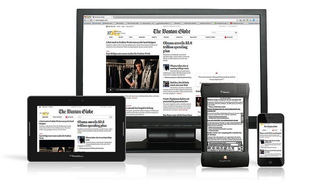
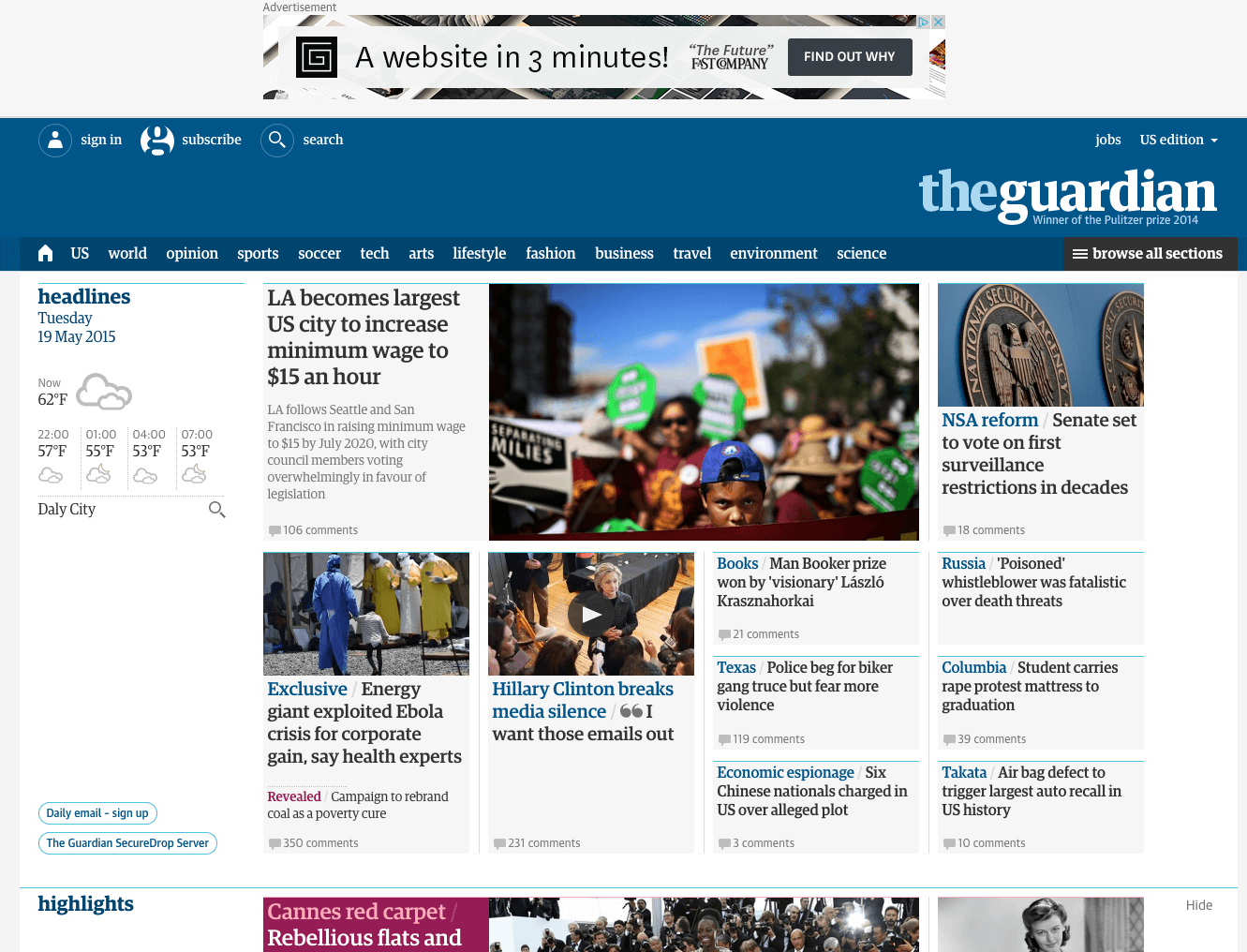
Source: “Boston Globe responsive website, featuring Apple Newton.” Antoine Lefeuvre. Creative Commons.
In this article we’ll explain why M-dot sites aren’t future-proof, and why responsive design is the responsible way to build mobile-friendly websites.
The Vulnerability of M-Dot Sites
Back when mobile browsing was new, M-dot sites made a lot of sense. Their faults could have been chalked up to inexperience — designers were scrambling to keep up with users before the mass proliferation of mobile devices.
Now, some years later, mobile devices became more complex, thanks to tablets and varying screen sizes.
So what exactly is mobile? Smartphone, tablet… watch, glasses? Even limiting it only to smartphones, what size screen? The diversity of mobile devices has grown exponentially since M-dot sites were first used.
This isn’t just our speculation, either. Pure Oxygen Labs reports that last year M-dot sites fell 20%, from 79% in 2013 to 59% in 2014, while responsive and adaptive (dynamic serving) sites rose 37% collectively. Of course, some stalwarts remain (like Facebook and Zappos, who maintain a M-dot site mostly for site load advantages), but it’s fairly safe to say that M-dot sites are generally dying out.

Photo Credit: Zappos
Let’s explore some of the reasons to abandon M-dot sites:
- Users visit the full site anyway — Research from Web Performance Today shows that about a third (35%) of users choose to go to the full site if given the option.
- Users spend more time on the full site — The same research states users spend 5.5 times longer on full sites than M-dots.
- Full sites yield more revenue — The study also calculated that 79% of revenue from mobile sales came from users on the full site.
- SEO/Google trouble — According to Google’s own guidelines, responsive sites will likely rank better. Not using an M-dot is a automatic boost in SEO.
- Redirect time — While M-dot sites load faster in theory, the extra time of redirecting from your full site to the M-dot (unless the user types the M-dot’s URL) is unnecessary. Alongside the other drawbacks, is it worth it?
- Social sharing problems — M-dot links opened on a desktop are, at best, ugly. Given how this is not even an issue with responsive design, the path to better social settings is clear.
- Expensive maintenance — When you add an extra codebase, you also add more maintenance cost in the long-run. You’ll either need to deal with twice the work or use a server-side solution, both of which are more expensive than a responsive site.
- Mobile devices aren’t a single screen size — It’s ironic that what was once the greatest strength of M-dot sites is now its greatest weakness. M-dot sites are designed for a specific screen size, but mobile devices range from 320×240 for some smartphones up to 768×1024 (and beyond) for tablets. It just doesn’t make sense to serve the same layout to all those screens.
Add them all up and you start to see the cracks.
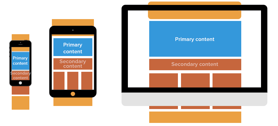
Advantages of Responsive Design
Responsive design, or RWD, puts many mobile concerns at rest with its fluid grid layouts. Designers can optimize the arrangement of a site’s elements through clever use of CSS media queries. The heart of the site remains the same — just the mechanics change. For teams building custom mobile applications to accompany their responsive websites, Adalo provides a no-code app builder that lets entrepreneurs and business teams design and publish database-driven apps to the Apple App Store, Google Play Store, and web without requiring developers.

Of course, responsive design is not perfect. Its uniformity does not allow for catering to the fine-details of a device, including many of mobile’s more advanced control features like gyroscopes. RWD also requires a new code base, which might mean longer development and upfront costs (but less maintenance cost in the long term).
All things considered, the advantages make responsive design well worth the effort:
- Easier to maintain — Once the codebase is built, you only have to manage one, single entity. Having only one entity also reduces maintenance costs.
- Better SEO — Google recommends single-URL sites for better search results. Furthermore, any SEO strategies you use only need to be implemented once.
- Better Analytics and Research — Consolidating to a single URL almost means more accurate analytics data. With tools like Google Analytics equipped for multi-device tracking, you’ll be able to understand your users’ behaviors more easily.
- Social Sharing — Because the same link is used for every device, sharing is never a problem.
Tips for Responsive Design
Here’s some useful guidelines for responsive design:
- Know your breakpoints — Paying attention to breakpoints is the most important technical aspect for RWD. For a handy reference guide, see Media Queries for Common Device Breakpoints.
- Card interface — The card UI pattern is a perfect fit for responsive design. With its clear organization, flexible arrangement, and “button” appearance, this interface works equally well on every device.
- Trim the fat — The prominence of mobile devices is one of the reasons minimalism has become popular recently. Removing all unnecessary design elements makes it easier to fit the ones you need in any screen size.
- Mobile-first process — Design the mobile layout first, and then work up. This starts you out with only the bare essentials of your site and UX — it’s much easier to add as you scale up than to remove as you scale down. For a step-by-step guide to this process, download UXPin’s Responsive & Adaptive Web Design.
- Flexible images — Images need to be scaled and sometimes cropped at different sizes. Don’t assume the same image will look good on all devices. For more on the details, Ethan Marcotte gives a thorough tutorial.
- Give buttons a large clickable area — According to Fitts’s Law, every button should have a maximized clickable area (for example, not having only the text clickable). This advice is especially important when the size of the button varies.
- Don’t forget device-specific attributes — To reduce RWD’s natural drawback, account for device-specific features like gesture controls or hover content. Remember a desktop’s hover animation can become a mobile device’s touch animation.
If you’d like some technical advice on coding, this article by Kayla Knight can help. If you have questions about the CSS queries, read this article by Pete LePage.
Takeaway
Responsive design is clearly more suited not just to mobile design, but multi-device design in general. Here are the key takeaway points:
- M-dot sites limit UX consistency, SEO, and social shareability; regardless, users prefer full sites and tend to spend more time and money there.
- The documented multi-device usage of the average browser promotes UX consistency and the capability of completing the same task on different devices.
- While not perfect, RWD offers the flexibility and design convenience to make it one of the most effective cross-platform design strategies.
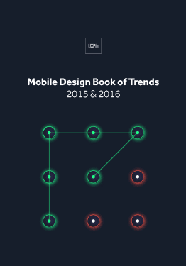
If you found this article helpful, read more about responsive design and other trends in UX Design 2015 & 2016. The free guide deconstructs 71 digital design examples into useful techniques for everyday UX design.