Creating accessible React components can be challenging, but AI tools are making it easier. Tools like UXPin, React Aria, Cursor AI, HopeAI, AI SDK, and Bolt streamline accessibility in design and development. They help developers meet WCAG standards, implement ARIA roles, and ensure keyboard and screen reader compatibility. These tools save time, reduce errors, and integrate seamlessly with React workflows.
Key Highlights:
- UXPin: Combines design and development with accessibility checks, ARIA support, and screen reader compatibility. Pricing starts at $6/month.
- React Aria: Focuses on WCAG compliance with hooks for state, focus, and keyboard navigation.
- Cursor AI: AI-powered code editor that suggests accessibility improvements in real time.
- HopeAI: Generates reusable React components with built-in testing and documentation.
- AI SDK: Simplifies accessible conversational AI with pre-built React components.
- Bolt: Automates accessibility improvements in React code with AI suggestions.
These tools are transforming accessibility workflows, making it easier for developers to build applications that are user-friendly for everyone.
A11y Agent – Understanding accessibility fixes in React Code
1. UXPin
UXPin is a design and prototyping platform that connects design and development, with accessibility at its core. Unlike many traditional tools, UXPin lets teams create code-backed prototypes using real React component libraries, ensuring accessibility is part of the design from the start – not an afterthought.
Accessibility Features
UXPin’s focus on accessibility begins with its React component libraries, which include WCAG-compliant options like Material-UI (MUI), Ant Design, and Tailwind UI. These libraries come equipped with essential accessibility features such as ARIA roles, keyboard navigation support, and screen reader compatibility.
This setup allows teams to evaluate prototypes for accessibility early on, testing interactions and navigation before moving into development.
AI-Driven Capabilities
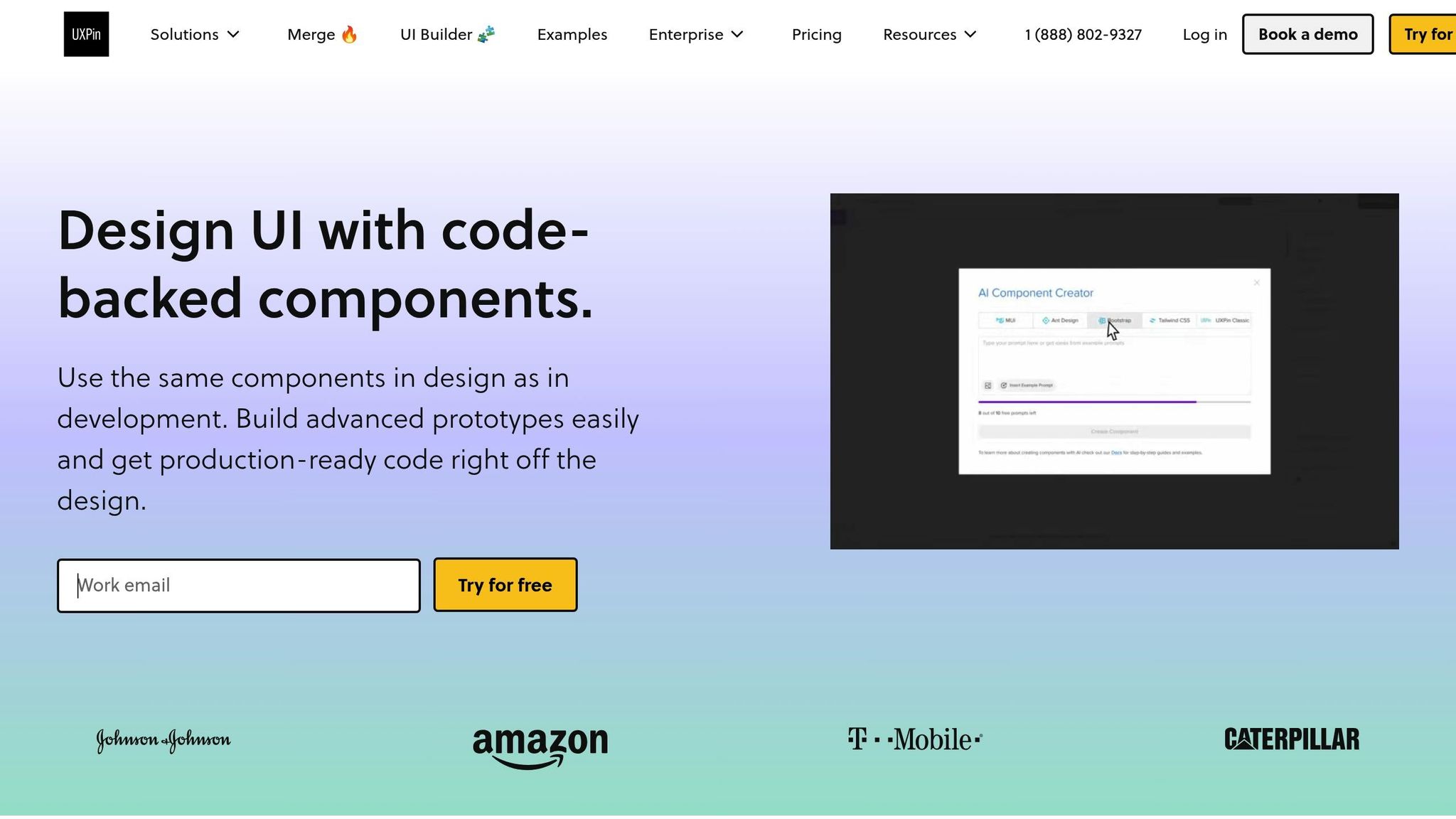
UXPin’s AI Component Creator, available in the Merge AI plan, generates React components based on design specifications while adhering to accessibility best practices. The AI ensures semantic HTML structure and recommends ARIA attributes and roles during the creation process.
Additionally, UXPin’s AI tools provide design suggestions to maintain consistency across component libraries. When new components are added, the AI proposes accessibility-friendly patterns based on existing ones, helping teams uphold accessibility standards throughout their design system. These AI-driven features integrate smoothly with development workflows for streamlined testing.
Integration with React Ecosystem
UXPin simplifies the handoff between design and development with its deep integrations. For example, the platform’s Storybook integration (available in Company and Enterprise plans) allows teams to import existing component libraries, complete with built-in accessibility features, directly into UXPin. This makes it possible to test accessibility at the prototype stage using the exact components intended for production.
The npm integration further enhances this workflow by syncing custom React component libraries with UXPin. Any accessibility updates made to components are automatically reflected in the design tool, creating a feedback loop that keeps accessibility improvements flowing seamlessly between design and development.
Prototyping and Development Made Accessible
UXPin’s code-backed prototyping ensures that prototypes behave just like the final application – accessibility features included. This means screen reader users can interact with UXPin prototypes using their assistive technology, enabling practical accessibility testing before development begins.
Advanced prototyping tools like conditional logic and interaction settings allow designers to simulate accessibility scenarios, such as managing focus within modal dialogs or enabling keyboard navigation across complex interfaces. By addressing potential accessibility issues during the design phase, teams can avoid costly fixes later on.
With pricing starting at $6/month for the Essentials plan and going up to $39/month for the Merge AI plan (which includes the AI Component Creator), UXPin offers solutions for a range of budgets. For organizations with stricter compliance needs, the Enterprise plan includes additional security and accessibility compliance features.
2. React Aria
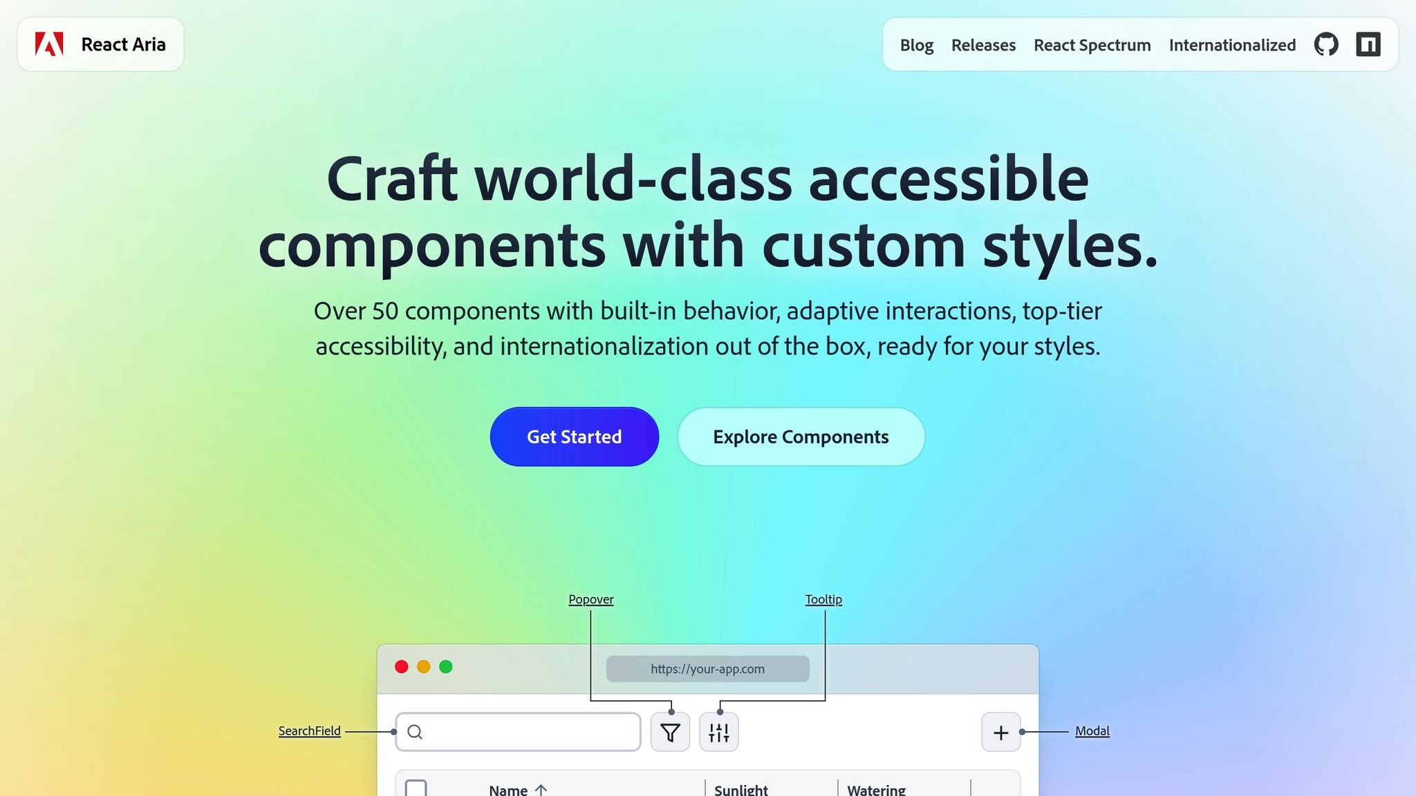
React Aria is a headless library of React components and hooks designed to create accessible user interfaces. It gives developers complete control over the design while ensuring compliance with WCAG standards. By focusing on accessibility without dictating styles, React Aria is perfect for developers who value functionality and behavior over predefined aesthetics.
Accessibility Features
React Aria simplifies the implementation of accessibility by automating WAI-ARIA features through behavior hooks. These hooks handle state management, focus control, keyboard interactions, and screen reader compatibility. The library supports advanced tasks like accessible drag-and-drop functionality, keyboard-based multi-selection in data tables, and built-in form validation with error messaging. Each component is optimized for seamless interaction across mouse, touch, keyboard, and screen readers.
Integration with React Ecosystem
React Aria integrates smoothly with any design framework, whether you prefer CSS modules, styled-components, Tailwind CSS, or traditional CSS. The library offers three levels of integration to suit different development needs:
- High-level components: Ideal for rapid development with built-in DOM structures.
- Customizable patterns: Use React contexts to tailor components to your design requirements.
- Low-level hooks: Provide complete control over component behavior for fully custom implementations.
The library’s architecture separates state management, behavior logic, and rendering. This modular approach allows teams to reuse accessibility logic across projects, even when visual designs vary significantly. It’s a flexible solution that ensures accessibility remains consistent across different design systems.
Ease of Prototyping and Development
React Aria supports internationalization in over 30 languages, offering built-in formatting for dates, numbers, and text direction. This makes it a natural fit for global applications, simplifying the process of creating accessible interfaces from the start. The library’s behavior hooks manage complex tasks like state transitions, keyboard events, and focus handling, saving development time and reducing the risk of accessibility issues.
For teams working on intricate data interfaces, React Aria provides specialized tools, such as table column resizing, sortable headers, and accessible data grid navigation. These features eliminate the need for extensive custom development, allowing developers to focus on building robust application logic.
3. Cursor AI
After diving into UXPin and React Aria, let’s shift gears and look at Cursor AI, a tool specifically designed to make accessibility in coding more seamless.
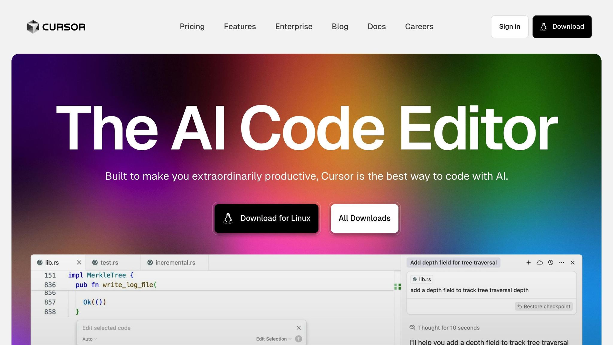
Cursor AI is an AI-driven code editor built on the foundation of Visual Studio Code. Its primary goal? To assist developers in crafting accessible React components. By analyzing your code in real time, it uses artificial intelligence to offer smart suggestions that enhance accessibility throughout the development process.
With natural language prompts, Cursor AI can generate React code that aligns with accessibility best practices. It takes care of important details like adding proper ARIA attributes, managing focus, and integrating effortlessly with frameworks such as Next.js and Create React App. This ensures that accessibility stays front and center across all your projects.
What makes Cursor AI even more helpful is its ability to provide contextual feedback and update multiple files simultaneously. This not only ensures consistency in accessibility but also minimizes the need for tedious manual reviews, making development smoother and faster.
4. HopeAI
HopeAI steps away from the usual code editor experience, offering a fresh perspective on React development with its focus on a composable architecture. This AI-powered assistant is designed to simplify the process of generating, building, testing, and releasing reusable React components, making component creation more efficient.
AI-Driven Capabilities
HopeAI uses artificial intelligence to craft components that emphasize reusability and maintain consistency throughout your codebase. One standout feature is its ability to automatically generate detailed documentation for every component it creates, saving developers valuable time.
What truly makes HopeAI unique is its structured approach to component creation. Each component suggestion comes with built-in automated testing, which helps catch common coding errors early. This not only reduces the need for manual testing but also ensures components align with accessible design principles, enhancing the overall quality of the code.
Integration with React Ecosystem
HopeAI works seamlessly with the Bit Platform, creating a smooth workflow for developing and distributing components. This integration allows teams to share and reuse components across projects, maintaining consistent functionality and design. By focusing on eliminating code duplication and following modern development practices, HopeAI makes managing large React applications far more efficient.
Simplifying Prototyping and Development
One of HopeAI’s most practical features is its ability to provide instant component previews alongside the generated code. Developers can see how components perform in various contexts without having to jump between tools or environments.
On top of that, the platform automatically produces detailed documentation for each component. This significantly cuts down on the time spent writing documentation manually, leaving developers free to concentrate on building new features and improving their projects.
5. AI SDK
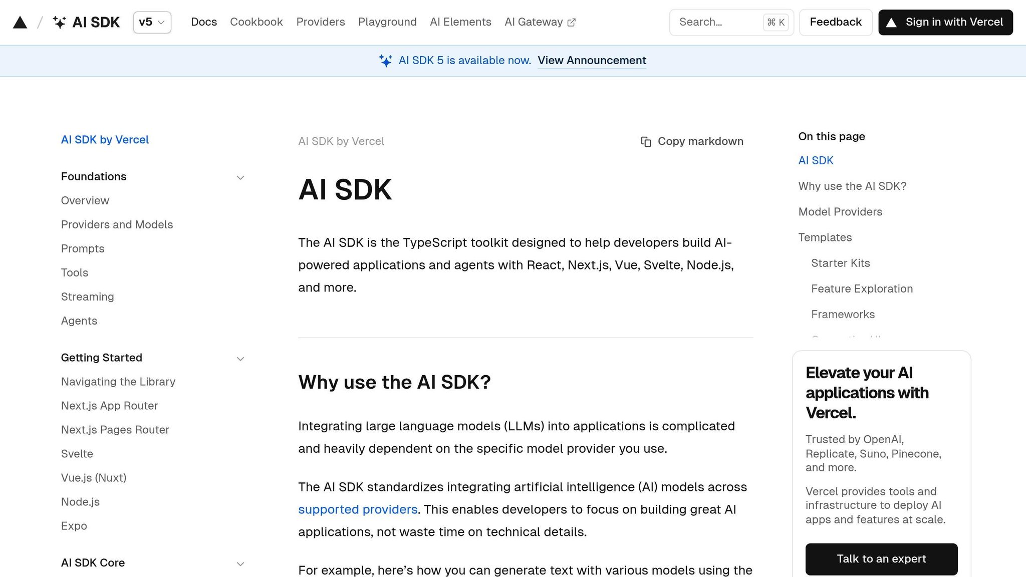
AI SDK simplifies the creation of conversational AI interfaces with a focus on accessibility. This toolkit equips developers with ready-to-use components designed to make chat experiences inclusive and user-friendly. From initial design to final deployment, accessibility remains a core principle.
Accessibility Features
AI SDK’s "Accessibility First" design philosophy ensures that every component is interactive, easy to use, and accessible. Key features include:
- Full keyboard navigation for seamless interaction.
- Proper ARIA attributes to enhance screen reader compatibility.
- High-contrast typography for better readability.
- Strong focus management to improve user experience.
One standout example is the Response component, which renders Markdown generated by large language models. This component is explicitly "Built with accessibility in mind for all users". These accessibility features are fully integrated into modern React workflows.
Integration with React Ecosystem
AI SDK offers a robust set of React components tailored for AI chat interfaces. It uses modern React patterns to provide flexible and composable solutions for various applications. Key highlights include:
- Built-in TypeScript support for enhanced development workflows.
- Integration of the
Responsecomponent via the@ai-sdk/reactuseChat hook. - Theme support for light and dark modes, enabling components to align with different design systems and user preferences.
With these features, AI SDK streamlines the development of accessible and adaptable conversational AI experiences.
sbb-itb-f6354c6
6. Bolt
Bolt takes AI-assisted accessibility in React development to the next level. This tool is designed to create accessible React components by combining modern web standards with established best practices.
AI-Powered Features
Bolt uses AI to understand what developers aim to achieve, generating React components that align with accessibility standards. These include ARIA labels, semantic HTML, and keyboard navigation. It also analyzes existing code to suggest accessibility improvements, making the process less time-consuming.
Seamless React Integration
Bolt fits right into the React ecosystem. It works with popular workflows, supports modern features like hooks and the context API, and generates TypeScript type definitions to ensure consistency. Plus, it’s compatible with frameworks like Next.js, Gatsby, and Create React App, making it highly versatile.
Faster Prototyping and Development
With Bolt, developers can speed up prototyping by turning design sketches or brief descriptions into functional, accessible components. Its user-friendly interface gives developers full control over styling, logic, and behavior, ensuring seamless integration with existing design systems.
Tool Comparison Table
Overview: UXPin simplifies the process of creating design-to-code prototypes while ensuring accessibility for React components.
| Tool | Primary Focus | Key Accessibility Features | Pricing | Best For |
|---|---|---|---|---|
| UXPin | Design-to-code prototyping | Built-in accessibility checks, ARIA support, screen reader compatibility | $6–$119/editor/month | Teams focused on seamless design-development collaboration |
UXPin offers an easy-to-use platform that bridges the gap between design and development, making workflows more efficient. It integrates smoothly with widely-used development tools, helping teams uphold accessibility standards. Pricing starts at $6 per editor per month for smaller teams and goes up to $119 per editor per month for larger organizations that require advanced features like extended version history and team management. This summary emphasizes UXPin’s capabilities, setting the stage for the final insights in the article.
Conclusion
AI tools are transforming the way developers tackle accessibility in React component development. These tools provide automated documentation, instant visual feedback on design accessibility, and AI-driven methods to evaluate theming and color choices. This ensures that designs align with visual accessibility standards right from the start. They also seamlessly integrate brand guidelines with accessibility standards, while still allowing room for creative flexibility. Additionally, features like accessible color systems are specifically designed to support inclusivity.
Platforms like UXPin highlight how these advancements are shaping the industry. By merging design with accessibility, UXPin simplifies workflows, ensures compliance, and delivers cost-effective solutions that make advanced accessibility tools accessible to teams of any size. Through automation, real-time feedback, and intelligent constraints, AI is making accessible development both efficient and intuitive.
FAQs
How do AI tools like UXPin help ensure React components meet WCAG accessibility standards?
AI tools such as UXPin make it easier to ensure React components align with WCAG accessibility standards by embedding automated accessibility checks into the design and prototyping workflow. These capabilities include features like contrast checkers to verify color contrast ratios, real-time testing for keyboard navigation, and support for ARIA attributes and screen reader functionality.
By catching and resolving accessibility issues early in the development process, UXPin helps teams stay WCAG-compliant while promoting a more inclusive user experience right from the beginning.
What are the advantages of using AI tools to ensure accessibility when designing React components?
How AI Tools Enhance Accessibility in React Component Design
AI tools bring a lot to the table when it comes to building accessible React components right from the design stage. They help pinpoint and fix accessibility issues early on, ensuring your application is more inclusive from the get-go. By automatically checking things like semantic HTML, ARIA attributes, and focus management, these tools reduce the chances of mistakes slipping through the cracks.
Beyond error-checking, AI tools also take care of repetitive tasks, speeding up workflows and giving developers more time to focus on creating a seamless user experience. The outcome? A more efficient design-to-development process and React applications that are easier for everyone to use.
How can AI tools like Cursor AI and Bolt enhance accessibility in React workflows, and are they easy to integrate?
Using AI Tools to Boost Accessibility in React Workflows
AI tools like Cursor AI and Bolt AI can play a significant role in making React applications more accessible. Take Cursor AI, for instance – it evaluates React components and offers suggestions to enhance accessibility. This includes improving keyboard navigation, adding proper ARIA attributes, and ensuring fallback options are in place. These features are crucial for building interfaces that everyone can use.
On the other hand, Bolt AI speeds up the creation of accessible React components by turning text prompts into functional components, all while following accessibility best practices. By automating critical tasks and fine-tuning accessibility features, these tools make it easier to design React components that are more inclusive and user-friendly.

