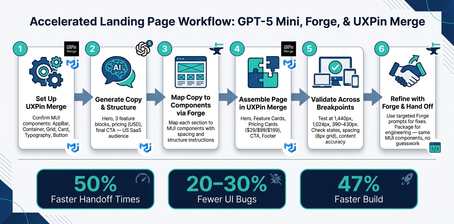
You can go from draft to handoff with fewer rebuilds if you start with code-backed MUI parts instead of static mockups.
I’d sum up the process like this: use GPT-5 Mini to write the page copy and set the section order, use Forge to turn that plan into a layout prompt, and use UXPin Merge with MUI to build the page from the same React parts your developers use.
That means you’re building a landing page with:
- a hero
- feature cards
- pricing cards
- a final CTA
- a footer
The big point is simple: design and code stay closer from the start. The article also points to numbers behind that idea, including 50% faster handoff times, 20–30% fewer UI bugs, and a 47% faster build for a simple form page when teams use a design system tied to code.
Here’s the workflow in plain English:
- Check UXPin Merge setup and make sure MUI parts like
AppBar,Container,Grid,Card,Typography, andButtonare available. - Ask GPT-5 Mini for landing page copy for a U.S. SaaS audience, including pricing in USD and dates like June 27, 2026.
- Send that copy to Forge with a clear prompt that maps each section to MUI parts.
- Build the layout in UXPin Merge using real React-backed parts for the hero, features, pricing, CTA, and footer.
- Review states and breakpoints at 1,440 px, 1,024 px, and 390–430 px.
- Refine inside the same system so handoff stays clean.
In short: if you want a landing page prototype that looks close to what ships, this is a direct way to do it.
How to Build a Landing Page with GPT-5 Mini, Forge & UXPin Merge
UXPin Merge Tutorial: Exploring MUI Library (3/5)
sbb-itb-f6354c6
Set up UXPin Merge and confirm your MUI component library
Before you place anything on the canvas, make sure your setup is in good shape.
Check prerequisites in UXPin
You need an active UXPin account with Merge enabled. Also check that the MUI library is available in your project. Once that’s in place, you can move to GPT-5 Mini to map out the landing page structure.
Confirm MUI components are available in the editor
Inside the editor, check that the MUI components are loaded before you start laying out the page. Open the left component panel and look for AppBar, Container, Grid, Card, Typography, and Button.
Then do a quick sanity check: drag a Button onto the canvas and open the properties panel. You should see options for variants, colors, and sizes. If those settings show up as expected, your MUI library is live and rendering as code-backed components.
Lock in library governance at the start
For enterprise teams, this step doubles as a governance check. UXPin Merge connects straight to your approved component library and design tokens, which means designers are working from the same source of truth. That helps keep the prototype in line with the approved system. After the MUI library is live, use GPT-5 Mini to draft the page copy and section order.
Plan the landing page structure with GPT-5 Mini and Forge
Once your MUI library is confirmed and available in UXPin, use GPT-5 Mini to draft the copy, set the section order, and shape the page hierarchy. Then drop that draft into a Forge prompt so the copy maps straight to components.
Generate section copy and hierarchy for a US audience
For a US SaaS landing page, use this prompt:
"You are writing copy for a US SaaS product landing page. Product: ‘LaunchFlow’ – an AI-powered landing page builder for US marketing teams. Target audience: US-based digital marketers at mid-sized companies who need to launch campaigns faster and improve conversion rates. Goal: Get visitors to start a 14-day free trial. Tone: Clear, straightforward, and benefit-focused. Output:
- A hero section with:
- One main headline (max 12 words, focused on outcomes).
- One subheadline (1–2 sentences explaining how LaunchFlow helps).
- One primary CTA label (e.g., ‘Start your free trial’).
- Three feature blocks. For each feature:
- A short title.
- A 1–2 sentence description focused on benefits, not features.
- A pricing section with three plans showing USD prices:
- Starter: $29/month
- Growth: $99/month
- Scale: $199/month For each plan: a one-line positioning statement and 3 bullet points.
- A final CTA section:
- One closing headline.
- One supporting line reinforcing urgency and value.
- One primary CTA label.
Use en-US spelling, US date formats (e.g., June 27, 2026), and numbers with a period as the decimal separator."
This gives you the copy and hierarchy in a form you can move straight into Forge.
Turn the draft into a layout prompt for Forge
Paste the copy into a Forge prompt and map each content block to a MUI component. Be specific about component names, layout structure, and spacing. A prompt like this tends to work well:
"Create a responsive landing page using our MUI library. Use a single-column layout with a max width of 1,200 px. Sections, in order:
- Hero section:
- Full-width
AppBarwith logo placeholder and navigation links (‘Features,’ ‘Pricing,’ ‘Resources’).- Below, use a
ContainerandGridto place text on the left (hero headline, subheadline, primaryButtonfor ‘Start free trial’) and an illustration placeholder on the right.
- Features section:
- Use a
Containerwith aGridof threeCardcomponents.- Each card should display a feature title and description from the provided copy.
- Pricing section:
- Use a
Containerwith aGridof three pricingCardcomponents, aligned center.- Each card includes the plan name (Starter, Growth, Scale), USD price (e.g., $29/month, $99/month), bullets, and a primary CTA
Button.
- Final CTA:
- Use a full-width
Boxwith a contrasting background color.- Center a closing headline, supporting line, and a single prominent CTA
Button.Apply spacing consistent with our MUI theme (default typography and spacing scale), and ensure mobile responsiveness."
The goal here is simple: tell Forge exactly what goes where, so you spend less time cleaning up the first pass.
Review the first pass before editing components
After Forge generates the layout, do a quick structure check before you touch individual components. Start with the hero. It should sit above the fold, and the headline, subheadline, and CTA should be easy to read without scrolling.
Then look at the hierarchy across the page. The hero headline should be the largest text on the page. From there, the subheadline and body copy should step down in a clear way. In the features and pricing sections, make sure card headings and bullet points explain the value fast.
It also helps to keep navigation tight. Too many links can pull attention away from the trial CTA. If anything feels off, like a section in the wrong place, uneven spacing, or a CTA that fades into the background, fix the page structure first.
Once the structure looks right, move into component assembly in UXPin Merge.
Assemble the landing page sections with MUI components in UXPin Merge
Once the structure is approved, build the page in UXPin Merge with the mapped MUI components. Because each component is backed by real React code, what you place on the canvas stays in step with what developers will ship.
Build the hero and navigation area
Start with AppBar and Toolbar. Add the logo placeholder and primary navigation links to the top bar, and keep the layout simple while you dial in hierarchy and spacing.
Under the nav, drop in a responsive Container and set up a two-column Grid. Put the hero headline in the left column with Typography variant="h1", then add supporting copy with variant="subtitle1" and a primary Button for the main call to action. Use the right column for an image or product mockup placeholder. Set alignItems="center" so the hero content sits centered vertically.
Edit the Typography props right in the UXPin panel. Paste in the headline copy GPT-5 Mini generated, then check that the font size and weight match your MUI theme. The headline should be the most prominent text on the page.
Then carry that same setup into the feature cards and pricing grid.
Add features and pricing with cards and grids
For the features section, place a Container below the hero and nest a Grid inside it with three Card components in a responsive layout. Set each Grid item to xs={12} and md={4} so the cards stack on mobile and line up in one row on desktop. Inside each Card, use CardContent for a Typography heading and a short description from your GPT-5 Mini copy. Keep each card at the same height with height: "100%" so uneven copy doesn’t throw off the row.
Because these are real MUI components, the layout stays aligned with code from day one.
The pricing section uses the same grid pattern. Build three cards with the plan names, USD prices, and bullet points from the GPT-5 Mini output:
- Starter at $29/month
- Growth at $99/month
- Scale at $199/month
To call out the recommended plan, place a small Chip above the card header. Inside each card, include the positioning statement and three benefit bullets from the generated copy. Wrap up each card with a primary Button in CardActions.
Finish the page with a CTA and footer
After the main content is set, finish with a clear closing CTA and a simple footer.
For the final CTA section, use a full-width Box with a contrasting background from your MUI theme so it stands out from the sections above. Inside that Box, center a Container and stack a closing Typography headline, a supporting line, and one Button with variant="contained" and size="large". Add generous vertical padding so the section feels like a clear stopping point.
For the footer, use a Box with a neutral gray background, a Container inside, and a simple row of text links – Privacy Policy, Terms of Service, and Contact. Set flexDirection="row" and justifyContent="space-between" to spread the brand mark and links across the row.
Validate, iterate, and hand off the prototype
The page is built. Now comes the part that saves headaches later: check how it behaves before stakeholders see it.
Check interactions, responsiveness, and content accuracy
Open Preview mode and test every interactive element. Click through every state on your Button, CardActionArea, and navigation links – default, hover, active, focus, and disabled where it applies. Make sure those states behave the same way in both the hero and pricing sections. Then walk the full path from entry to CTA. If a click leads nowhere, that’s a handoff problem waiting to happen.
For responsiveness, review the layout at three breakpoints: 1,440 px for desktop, 1,024 px for tablet, and 390–430 px for mobile, including iPhone 14/15 and common Android devices. At each size, check a few things closely:
- The hero headline stays easy to read and doesn’t wrap in an awkward way
- The pricing cards stay readable with no horizontal scroll
- The CTA button remains visible on the first screen on mobile
Also check spacing. Values should use multiples of 8 px so the vertical rhythm stays steady across sections.
Content accuracy is the last pass before you bring in stakeholders. Confirm that all pricing uses the dollar sign, such as $29/month; dates follow U.S. format, such as June 27, 2026; and that you use one conversion term the same way throughout the page. Review the hero, subcopy, feature bullets, pricing tiers, and footer against the GPT-5 Mini draft and the approved product copy.
Design errors contribute to 68% of rework costs in product development. Catching state, responsiveness, and content issues in the prototype stage – before a single line of implementation code is written – is where this workflow pays off most.
Refine the layout with Forge while staying in the system
If review turns up issues, use Forge for focused fixes instead of rebuilding by hand. The trick is simple: write prompts that stay inside your approved MUI components.
For spacing, select the section and prompt: "Tighten hero spacing by one spacing step, keeping all components MUI and preserving current alignment."
For card emphasis, try: "Using only properties available on existing MUI Card variants, visually emphasize the recommended pricing tier using elevation and contrast."
For CTA copy, prompt: "Rewrite this hero CTA for US B2B SaaS buyers to be direct and under 25 characters long."
If Forge suggests a value that clashes with your design tokens, keep the component structure and change that one value by hand so it fits the approved token. Then document the final setup. The point is to adjust, not rebuild. Move fast, but keep everything inside the same Merge library engineering will use.
Conclusion: A repeatable workflow for faster design-to-development delivery
Once the prototype clears review, package it for engineering handoff.
GPT-5 Mini creates structured content and page hierarchy for a U.S. audience. Forge and UXPin Merge turn that content into a prototype built with real MUI components. Then the validation and handoff step makes sure engineering gets a prototype built from the same component system they’ll use in production, with no guesswork around spacing, states, or copy.
FAQs
Do I need coding skills to build this landing page?
No. With UXPin Merge, you can drag and drop pre-built, code-backed MUI components onto the canvas and set them up in a visual sidebar instead of writing code.
You manage the layout and interactions through the interface, and you can use AI Helper to make changes with simple text commands. Clear, descriptive prompts matter more than coding skills.
How does UXPin Merge keep MUI designs aligned with development?
UXPin Merge helps keep MUI design work lined up with development because it uses live, code-backed React components instead of static mockups.
When you sync your MUI library through Git, npm, or Storybook, designers work with the same components and props developers use. If colors or variants change, those updates show up in the actual React props. That means designs stay in step with production code, and prototypes look and behave much closer to the final application.
What should I test before handing off the prototype?
Before handoff, review the prototype for three must-check items: brand voice, tone consistency, and U.S. formatting.
The copy should sound like the brand from top to bottom. If one section feels polished and sharp but another feels stiff or generic, fix it. That kind of mismatch stands out fast.
Also check the details that are easy to miss:
- Prices should use the dollar sign, like $29
- Dates should follow the U.S. month-first style, like 04/15/2026
- Spelling should use U.S. English conventions
Then run one last responsiveness check across all breakpoints to make sure the layout, spacing, and copy hold up on every screen size.

