Rapid Prototyping Process and Fidelity – A 5-Minute Guide
Rapid prototyping accelerates the prototype phase, so design teams can push final designs to engineering teams faster. As Facebook Mark Zuckerberg once said, “Move fast and break things!”
Striving for perfection can cost precious time, putting product teams a step behind the competition. Rapid prototyping ensures that design teams only focus on a design’s key features and flows to get the project to market quickly.
Key takeaways:
- Rapid prototyping is a methodology of creating a workable prototype of a product fast, considering key features and screens that are absolutely necessary for the next stages of product development
- The process of rapid prototyping involves creating a prototype, testing it with users, and iterating it as fast as possible, so the design is ready for development as fast as possible.
- A rapid prototype allows stakeholders to quickly see how the product will look like and what its user experience will be like before committing resources to building it.
- Rapid prototyping is efficient, fast, accessible and focused on making a product that users will enjoy.
UXPin’s advanced prototyping features enable design teams to build products faster. Use React components in prototyping and build production-ready prototypes 10x faster. Discover UXPin Merge.

What is Rapid Prototyping?
Rapid prototyping is the process of creating high-fidelity prototypes to test user flows and validate ideas fast. The goal of rapid prototyping is speed. Designers focus solely on optimizing the user experience to prevent getting sidetracked by “nice-to-have” features and aesthetics.
The quicker teams get a product to market, the faster it can generate revenue to fund growth and product improvements.
Rapid Prototyping vs Traditional Prototyping
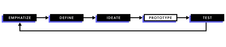
In comparison to rapid prototyping, the traditional prototyping process follows five well-defined stages:
- Sketching – Brainstorm by drawing quick and rough sketches on paper.
- Wireframing – Start laying out the skeletal framework with boxes and rough shapes.
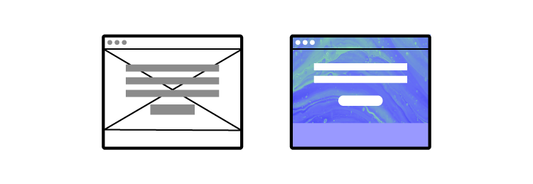
- Mockups – Inject detail into wireframes with colors, typographies, photos, and other visual design elements.
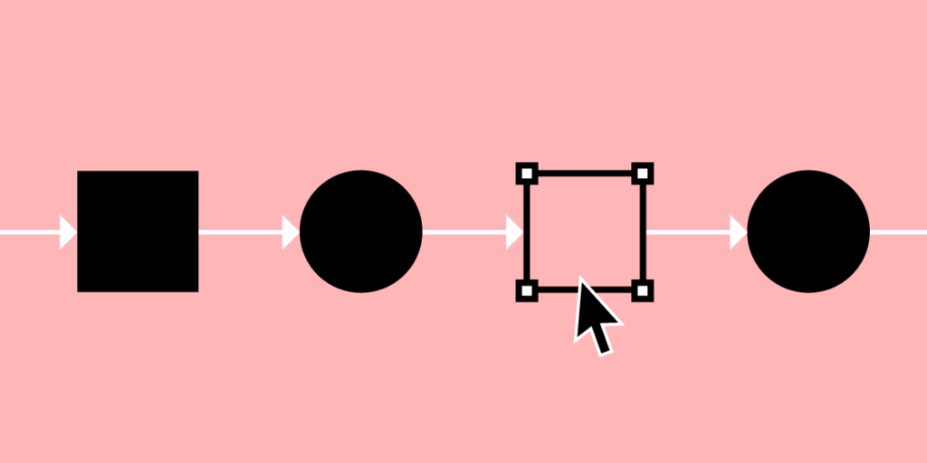
- Prototyping – Add interactivity to mockups by stitching screens together for basic prototypes or adding animations/interactions for advanced prototypes.
- Development handoff – The engineering team receive a prototype in order to turn it into the final product.
But with the popularization of new ideas such as Lean UX and rapid prototyping, plus the school of thought that wants to get into coding as quickly as possible, this traditional sequential method is becoming outdated.
Benefits of Rapid Prototyping
To recap, let’s look at the four primary benefits of rapid prototyping:
- Saves money – getting products to market faster through rapid prototyping reduces labor costs while enabling products to generate revenue quicker.
- Saves time – rapid prototyping catches user pain points during testing eliminating the chance of errors reaching development where changes cost significantly more time and money.
- User-focused – with limited time, teams must focus on optimizing the user experience and not get distracted by nice-to-have features.
- Accessible – rapid prototyping creates an environment where non-designers can build and test prototypes. This process saves time by eliminating the necessity for product teams to explain ideas to UX designers, who then present designs back to product teams—often over several iterations.
The Rapid Prototyping Process
Rapid prototyping is less of a separate process and more a filter for efficiency. In rapid prototyping, you revise quickly based on feedback and shift swiftly to high-fidelity prototyping to get as quality feedback as you can.
The key to rapid prototyping is setting clear objectives and KPIs, so teams only focus on the tasks required to meet those goals.
The following steps apply to rapid prototyping and testing phases—assuming that you have already completed the early stages of the design process.
Step 0 – Interactive Wireframes
Where rapid prototyping focuses on the final stages of the design process, interactive wireframes bring speed and efficiency to early-stage design.
With interactive wireframes, UX teams have a massive head start as they move into designing mockups and high-fidelity prototypes.
Download our free e-book on interactive wireframes and learn how this early-stage design strategy can help optimize the rapid prototyping process.
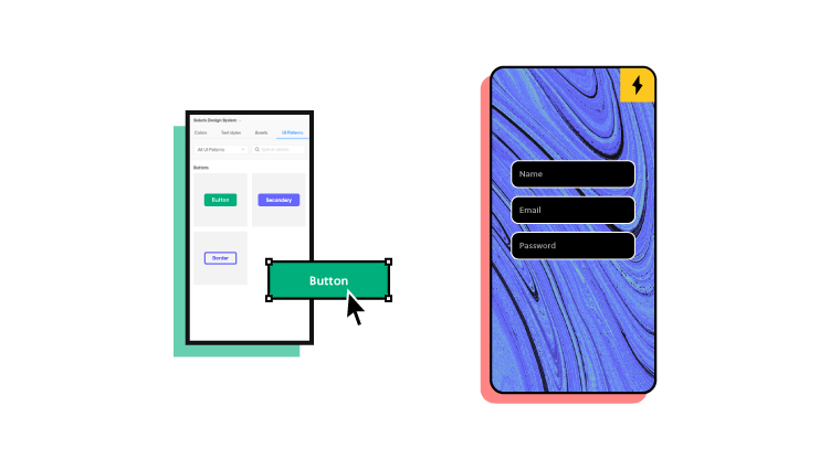
Step 1 – Create a Design System
A design system helps designers maintain speed and consistency—essential elements for effective rapid prototyping. Design systems also streamline onboarding new designers or even allow non-designers to build products (like PayPal does with our Merge technology).
UXPin lets you create a design system from scratch or use popular systems like Google’s Material Design, Bootstrap, or iOS. Additionally, you can use ready-to-use interactive UI patterns to build reusable components fast!
Step 2 – Create Your Mockups
Once your design system is complete, creating mockups is as easy as drag-and-drop.
If you prefer to design in Sketch, UXPin’s Sketch import makes it easy for designers to upload mockups to begin prototyping and testing.
Step 3 – Creating Interactions – The UXPin Way
With your mockups complete, it’s time to connect user flows and add interactions.
Keep your interactions simple to start. You can even create guidelines for interactions in your design system, so team members just copy and paste. Not only will simple interactions save time, but they also maintain uniformity, keeping the final product clean and consistent. Designers can always come back to refining interactions at a later stage.
Remember, the goal is to only focus on the interactions that matter for users to complete a flow! UX designers must build prototypes that look and feel like the final product to get accurate feedback from testing.
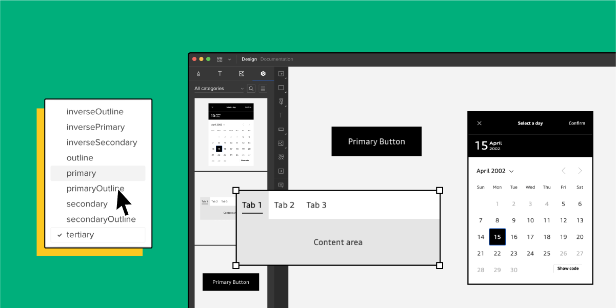
With UXPin, you can create components, variables, add states, and use real data to make your high-fidelity prototypes look and behave exactly like the final product.
- Components save you time by allowing you to create reusable elements—for example, a button, icon, or card. The Master Component defines the component’s properties, while the Instance Component mirrors the content from its master. Any changes to the Master copies to all Instance Components, allowing designers to make changes to an entire flow by editing a single element.
- Variables allow you to store user inputs and take actions based on the provided data inside the prototype. UX teams can provide a personalized experience during usability testing and demonstrations to stakeholders—a powerful UXPin feature to enhance rapid prototyping.
- Another powerful UXPin feature is the ability to create element and component states—for example, default, hover, active, and disabled. Additionally, you can set up triggers to activate or switch between states, like a drop-down or navigation menu.
- UXPin Merge lets designers take high-fidelity prototypes to a level no other design tool can! As you design with components that were coded, UXPin Merge enables prototypes to look and function exactly like the final product—more on UXPin Merge later in this article!

Step 3 – Test, Tweak, Repeat
Once high-fidelity prototypes are complete, it’s time for testing. With UXPin, you can test prototypes in the browser or download UXPin Mirror (iOS & Android) for testing on mobile devices—you can even lock prototypes in UXPin with password protection to prevent unauthorized access.
UX teams can collect feedback from stakeholders and usability studies to tweak designs before returning to the testing phase to validate the changes.
UX designers might make minor changes during testing to get instant feedback and accelerate the rapid prototyping process.
How UXPin Merge Accelerates Rapid Prototyping
Traditional design tools render vector or raster graphics. While these graphics might look like the final product, they have limited functionality which doesn’t provide meaningful feedback from testing and stakeholders.
Prototypes created this way require the user to “imagine” that they have entered data or activated an element’s state—like adding a product to their cart or playing a video.
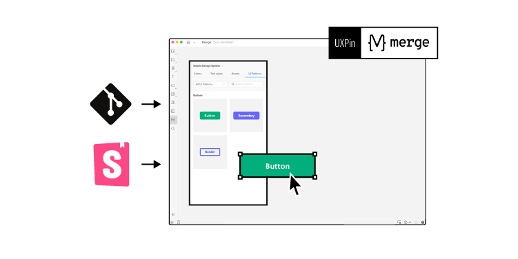
UXPin is a code-based design tool. When a designer draws something on the canvas, UXPin renders HTML/CSS/JS code. As UXPin is code-based, we went one step further and introduced Merge technology that integrates with Git or Storybook, and brings all the components your devs coded for the design system into UXPin library so that you can reuse them! The result? You can prototype with ready and fully interactive UI elements without designing from scratch.
Test participants and stakeholders no longer have to “imagine” what will happen when they interact with a UXPin prototype because it looks and functions like the final product! Using actual data from JSON, Google Sheets, or CSV, designers can also simulate an authentic product experience and make quick changes to test multiple scenarios.
Not only does UXPin Merge accelerate rapid prototyping with an authentic user experience and meaningful feedback, but it also makes the transition from designing to engineering and on to the final product significantly quicker.
PayPal’s DesignOps 2.0 – A UXPin Merge Success Story
UXPin Merge forms the core of PayPal’s DesignOps 2.0—where product team members (not designers) use rapid prototyping to build interfaces for PayPal’s internal tools.
Essentially, UXPin Merge provides PayPal’s product team with a no-code drag-and-drop tool to build user interfaces and test high-fidelity prototypes with React components. Additionally, PayPal’s product managers import real information from JSON, Google Sheets, or CSV—giving prototypes final product functionality.
Instead of taking part in the prototyping and testing process, PayPal’s UX designers (of which there are only three to 3,000 developers!) act as mentors to product teams, providing guidance and support when necessary.
With code components, PayPal’s engineers can develop the product team’s prototypes significantly faster than using a vector or raster-based design tool.
If PayPal can achieve efficient rapid prototyping with just three UX designers, imagine what UXPin Merge could do for your design process. Discover UXPin Merge.