You can go from brief to clickable landing page in hours, not days, if you split the work the right way. I’d use GPT-5 Mini for copy, Ant Design for UI parts, and UXPin Merge to turn both into a live prototype that matches what engineers already use.
Here’s the short version:
- I start with one clear brief: audience, goal, offer, tone, and output fields
- I ask GPT-5 Mini for JSON-only copy for the hero, features, pricing, CTA band, and signup form
- I build the page in UXPin Merge with live Ant Design React components
- I map each JSON field to component props, so I can swap copy without rebuilding the layout
- I check the prototype at 375 px, 768 px, and 1,440 px
- I test form states like hover, focus, disabled, and validation before handoff
That matters because landing page work often gets stuck in three places: copy drafts take too long, layouts drift from the design system, and developers rebuild static mockups from scratch. This workflow cuts that friction by keeping copy, layout, and UI parts tied to the same structure.
A few parts stand out:
- GPT-5 Mini writes section copy and gives multiple versions
- Ant Design supplies page layout, cards, buttons, stats, and form fields
- UXPin Merge renders those parts as a working prototype inside the canvas
By the end, you have one page with:
- a hero with headline, subhead, and CTA
- a feature grid built from cards
- a pricing area with tiers like $49.00/month and $499.00/year
- a CTA strip
- a signup form with fields such as business email, company size, role, and demo time
What I like most is the structure. If the model returns clean fields like hero_title, primary_cta_label, features[], or price_usd, I can plug them straight into saved section patterns. Then I can test three headline angles, update pricing copy, or change form text without touching the layout.
The result is simple: less back-and-forth, fewer review loops, and a handoff that stays close to production code.
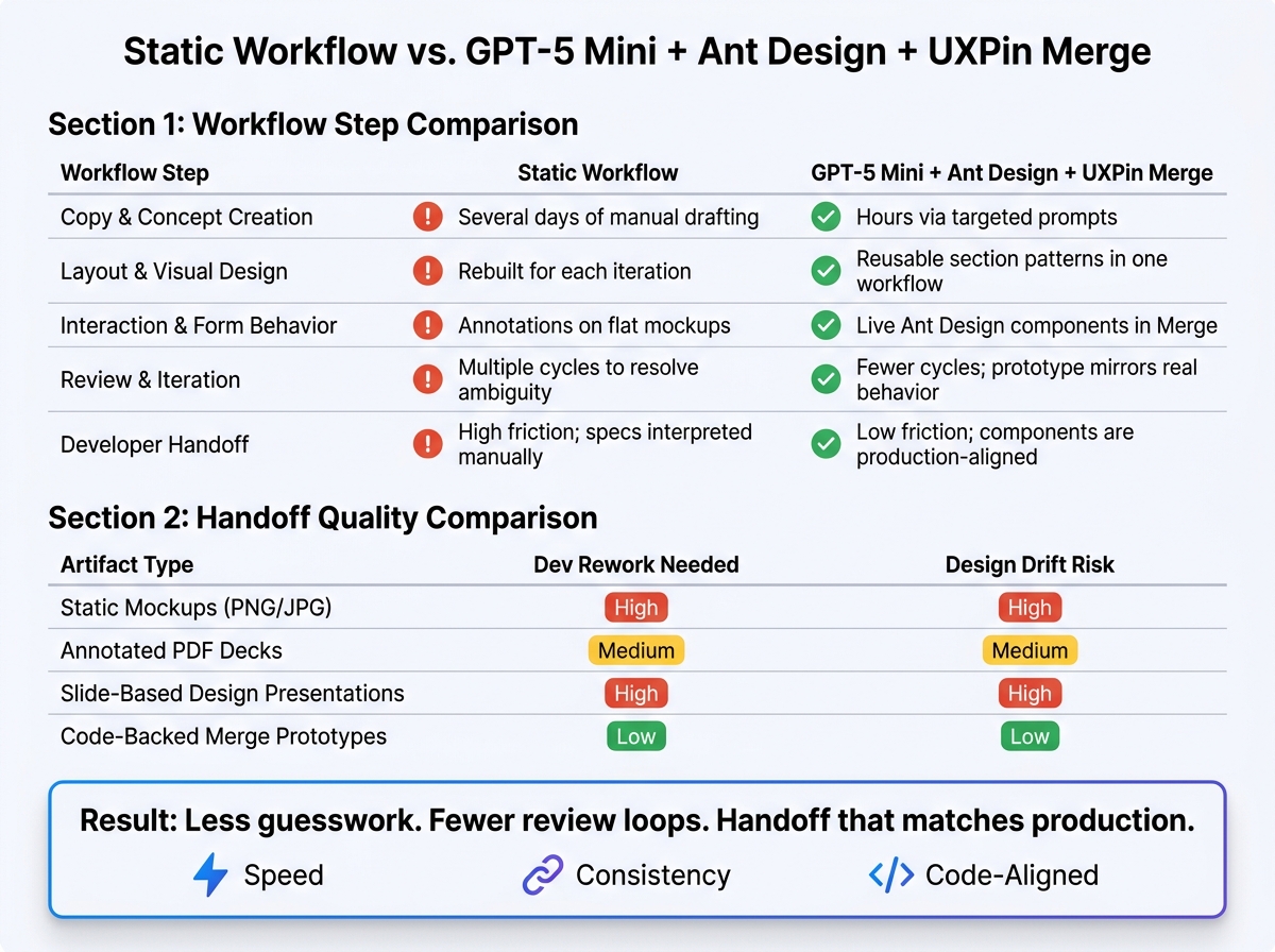
Static Workflow vs. GPT-5 Mini + Ant Design + UXPin Merge: Speed & Handoff Quality
UXPin Merge AI: Smarter UI Generation That Follows Your Design System
sbb-itb-f6354c6
2. Generate landing page copy and structure with GPT-5 Mini
Start with a short brief: the page goal, the audience, and the offer. Reuse that same brief in every prompt so GPT-5 Mini stays consistent across the hero, features, pricing, CTA, and form copy. It also helps to define the exact fields you want for each section – hero_title, hero_subtitle, primary_cta_label, secondary_cta_label, and supporting_bullet_points[]. That way, the field names line up cleanly with Ant Design component props inside UXPin Merge.
Be explicit about tone too. Use something like: "Professional, confident, concise, and suitable for senior product and design leaders. Business-casual. Use en-US spelling." Adding one or two sample headlines you like gives the model a clear target, which helps keep the voice steady from one section to the next.
Once that brief is set, generate all section copy in one structured pass.
Prompt for hero, features, pricing, and form content
Use one structured prompt that covers all five sections at once. Here’s a production-ready example you can use as-is:
"You are helping design a SaaS landing page for UXPin Merge. Audience: US-based product designers and front-end engineers at mid-to-large B2B software companies. Goal: drive sign-ups for a 14-day free trial. Tone: professional, confident, concise; en-US spelling; US currency formatting. Output a single JSON object with these keys:
hero– title, subtitle, primary_cta_label, secondary_cta_label, supporting_bullet_points[]
features– array of 4–6 items, each with title and description
pricing– array of 3 tiers (Starter, Growth, Enterprise), each with tier_name, price_usd as a number like49, billing_period, display_price as a US-formatted string (e.g., ‘$49/month’), short_description, feature_list[], cta_label, and best_for
cta_band– cta_headline, cta_supporting_copy, cta_button_label
form– form_title, form_subtitle, form_fields[] where each field has field_label, field_name, placeholder, input_type, required, validation_message, and a global privacy_noteReturn valid JSON only."
This setup gives you copy that drops straight into reusable section patterns, so you don’t have to rewrite content for each component.
For pricing, keep price_usd separate from display_price. It keeps the raw data clean for analytics or A/B tests. You can also mark the middle tier as "Most Popular" and set "cta_label": "Contact sales" for the Enterprise tier instead of showing a numeric price.
For the form, add this line to the prompt:
"Provide a privacy_note for US enterprise users stating that data will only be used to contact them about UXPin Merge and will not be sold, with a link placeholder (‘View our Privacy Policy’)."
That gives you ready-to-use copy for Ant Design Form.Item components, including error text such as "Please enter a valid work email."
Ask for structured variations you can reuse
One-off AI output is tough to reuse. A better move is to ask for variations as arrays. Add this instruction to your prompt:
"For
hero_title,hero_subtitle, andprimary_cta_label, return 3 versions each as an array of objects with fields:tone(‘enterprise’, ‘conversational’, ‘technical’) andtext. ‘Enterprise’ should be outcome-focused and confident. ‘Conversational’ should be slightly warmer while staying professional. ‘Technical’ should reference specifics like ‘component libraries’, ‘design tokens’, and ‘code-backed prototypes’."
You should also ask the model to tag each headline by character length: short (≤40 characters), medium (40–80), and long (80–120). Short options fit compact hero layouts. Longer ones work better in detailed overview sections.
Because each variation comes back as its own object with a tone or id field, a designer can bind a toggle in UXPin to switch between options without rebuilding the layout. That makes copy testing much easier, and the structure stays the same.
Use these arrays as source data when you bind copy to Ant Design props in UXPin Merge. Next, place these structured fields into UXPin Merge and bind them to Ant Design components.
3. Build the page in UXPin Merge with Ant Design components
Once your structured JSON is ready from GPT-5 Mini, the next move is putting it into an actual page layout, not a static mockup. In UXPin Merge, Ant Design components render as live React components. That means each prop you set on the canvas lines up with implementation.
The point here is simple: turn structured AI output into reusable section patterns, not into a bunch of one-off edits inside the canvas. After the layout is in place, you can bind GPT-5 Mini’s structured fields to those components.
Set up the page layout with Ant Design primitives
Start with Layout, then add Header, Content, and Footer. Build the page as Layout > Header > Content > Footer.
Inside Header, use a Row with two Col elements:
- One for the logo
- One for the main navigation or CTA button
Set responsive breakpoints like xs, md, and lg right on the Col props so the base layout adjusts cleanly on smaller screens.
The Content area is where each landing page section lives. Build each section as its own Row, and use Col blocks to control the column split. A standard hero section, for example, can use a two-column desktop layout with md={12} for each column, then collapse into a single column on mobile with xs={24}.
Inside those columns, use:
Typography.Titlefor the headlineTypography.Paragraphfor supporting copyButtonwithtype="primary"andsize="large"for CTAs
For the feature section, a Row of Card components is a clean fit. Each Card maps to one feature item from your GPT-5 Mini output. The title field maps to the card title, and children holds the description.
For the form section, use Ant Design’s Form as the container, with Form.Item wrapping each Input. Because UXPin Merge renders the real Form component, you can preview validation states, required-field errors, and layout options like vertical or inline forms right in the canvas. No hand-coding needed.
Set up reusable section patterns in Merge
Once you’ve assembled each section once, save it as a pattern in UXPin. A pricing block pattern, for instance, can wrap Card, Typography, Tag, and Button with exposed props such as planName, priceInUSD, billingInterval, featureList[], and ctaLabel.
Save the pattern once, then let teams reuse it by swapping only the content fields.
Name patterns clearly, like "3-Tier Pricing Table," "Standard SaaS Hero v1," and "4-Column Feature Grid." Store them in a shared UXPin library so marketing, product, and regional teams all pull from the same source.
When Ant Design ships an update, or your team changes a design token, updating the underlying Merge component pushes that change across every prototype using it.
Next, map the JSON fields from GPT-5 Mini to these reusable props so copy can change without changing the layout.
4. Connect GPT-5 Mini output to reusable landing page sections
Once your section patterns are saved in UXPin, you can bind GPT-5 Mini JSON fields straight to component props. Each JSON field should connect to a saved Merge prop.
Map AI output fields to component props
In a hero section, headline maps to Typography.Title, subheadline maps to Typography.Paragraph, and primaryCtaLabel becomes the text inside your main Button. If GPT-5 Mini returns secondaryCtaLabel or supportingText, map those values to a secondary button or a small Typography.Text element under the CTA area.
Feature arrays work the same way. Each object in the features[] array, with title, description, and sometimes icon, fills one Card or list item in your feature grid. For pricing, fields such as planName, price, billingPeriod, description, features, highlighted, and ctaLabel map straight to the plan card props you set up in Section 3. That means you can swap copy in seconds without touching the layout.
Use this same field-to-prop pattern across hero, feature, and pricing sections. Once those props are bound, the prototype is ready for review, interaction checks, and handoff with Merge.
Swap copy fast while keeping system consistency
You can use the same setup to test speed, compliance, or cost copy without changing the layout. For example, test three hero versions:
- One focused on speed
- One focused on enterprise compliance
- One focused on cost savings
Each version uses the same Ant Design component hierarchy: the same button styles, the same grid breakpoints, and the same card dimensions. The only thing you replace is the GPT-5 Mini output fields. The content changes, but the component structure stays ready for review and handoff.
5. Review the prototype and measure workflow gains
Validate layout, interactions, and system alignment
Open preview mode and check the prototype at 375 px, 768 px, and 1,440 px. In UXPin preview, review the GPT-5 Mini copy inside Ant Design components at each width. Look closely at heading wraps, stacked feature cards, and U.S.-formatted pricing.
Then test the interactive states in preview:
- Hover
- Focus
- Disabled
- Validation
For the form, test required-field validation, email validation, and invalid ZIP validation. If anything feels off, fix it before handoff.
Every time the copy changes, run validation again. A small text edit can shift spacing, wrapping, and form behavior, so it’s worth checking each pass.
Once the prototype clears those checks, move on to the workflow comparison.
Compare workflow speed and handoff quality
These comparisons show why using the same layout, copy, and components helps teams move from prompt to handoff with less back-and-forth.
Table 1: Workflow step comparison
| Workflow step | Static workflow | GPT-5 Mini + Ant Design + UXPin Merge |
|---|---|---|
| Copy & concept creation | Several days of manual drafting | Hours via targeted prompts |
| Layout & visual design | Rebuilt for each iteration | Reusable section patterns in one workflow |
| Interaction & form behavior | Annotations on flat mockups | Live Ant Design components in Merge |
| Review & iteration | Multiple cycles to resolve ambiguity | Fewer cycles; prototype mirrors real behavior |
| Developer handoff | High friction; specs interpreted manually | Low friction; components are production-aligned |
Table 2: Handoff quality comparison
| Artifact type | Dev rework needed | Design drift risk |
|---|---|---|
| Static mockups (PNG/JPG) | High | High |
| Annotated PDF decks | Medium | Medium |
| Slide-based design presentations | High | High |
| Code-backed Merge prototypes | Low | Low |
That’s the core value here: less guesswork, fewer review loops, and a handoff that lines up much more closely with what gets built.
Conclusion: What this workflow helps enterprise teams do
GPT-5 Mini speeds up copy and section ideation. Ant Design keeps the UI aligned with production. UXPin Merge turns that work into a code-backed prototype.
For enterprise teams, that means faster reviews, cleaner handoff, and less rebuild work.
FAQs
Do I need coding skills to use this workflow?
No. Ant Design is built into UXPin Merge, so you can drag and drop production-ready components like buttons, forms, and grids right onto the canvas. No coding. No importing code either.
The AI assistant helps keep things aligned on the technical side, while you stay in control of the layout and component properties in the visual editor. When the prototype is ready, developers can pull production-ready code from it.
How do I connect GPT-5 Mini JSON to Ant Design components in UXPin Merge?
You don’t need to map JSON data by hand in UXPin Merge. The connection is built in and runs automatically.
In your project, open the AI Component Creator and add your OpenAI API key in Settings. Once you’re connected, the AI lines up with the active Ant Design library and generates components from the production-ready antd npm package. If you use Ant Design component names in your prompts, the output tends to stay more consistent.
What should I test before handing off the landing page?
Before handoff, make sure the prototype lines up with brand, content, and technical standards. Review the copy for brand voice and tone, and tighten any generic phrasing so it sounds on-brand.
Also check U.S. localization, including $ and standard date formats, then test responsiveness and interactivity in Preview mode. Use Spec Mode to share token-based values, CSS properties, and interaction logic.

