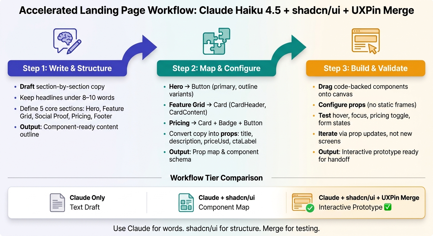
You can go from blank page to testable landing page in a few hours if you split the work into 3 parts: plan the copy in Claude, map each section to shadcn/ui components, and build it in UXPin Merge with props instead of static frames.
I’d sum up the workflow like this: Claude writes the page structure, shadcn/ui gives the UI parts, and UXPin Merge turns those parts into a working prototype. In this case, the page uses 5 core sections: hero, feature grid, social proof, pricing, and footer.
Here’s the short version:
- Start in Claude Haiku 4.5 to draft section-by-section copy
- Keep copy tight: short headlines, short body text, one action per section
- Map content to components like
Button,Card,Badge, andAccordion - Turn copy into props such as
title,description,priceUsd, andctaLabel - Build in UXPin Merge using code-backed shadcn/ui components
- Review states and flows like hover, focus, pricing toggle, and form behavior
- Iterate by editing props, not by remaking screens
A few details matter more than people think. The article keeps formats consistent with U.S. standards like July 28, 2026, $29/month, and 1,000. It also pushes teams to keep handoff clean by using the same section names, component names, and prop labels from draft to prototype.
Build a Landing Page with Claude + shadcn/ui + UXPin Merge: 3-Step Workflow
Build Landing Pages 10x Faster With These Shadcn Component Libraries
sbb-itb-f6354c6
Quick comparison
| Workflow | Best use | Main limit | Output |
|---|---|---|---|
| Claude only | Copy ideas and page outline | Layout and UI must still be rebuilt by hand | Text draft |
| Claude + shadcn/ui | Copy plus component planning | Still needs a prototype layer | Component map |
| Claude + shadcn/ui + UXPin Merge | Building and testing the page before handoff | Needs setup first | Interactive prototype |
What stood out to me most is the shift from “designing screens” to configuring blocks. That can cut rework, trim handoff confusion, and make review cycles easier – especially when multiple teams need to approve pricing, CTA text, and section order.
If you want a simple rule to follow, it’s this: use Claude for words, use shadcn/ui for structure, and use Merge for testing.
1. Plan the landing page in Claude Haiku 4.5

Start with Claude Haiku 4.5 before you touch a single component. The goal here is simple: build a clear section-by-section outline that maps straight to shadcn/ui blocks.
Prompt for named sections and conversion-focused copy
Use a section-based brief. Tell Claude the product category, target audience, main conversion goal, and the exact sections you want on the page. Here’s a practical prompt:
You are writing a landing page for a US B2B SaaS product. Output a hero, three value props, four feature cards, two testimonials, a pricing summary in USD, and a footer CTA. Keep headlines under 8 words and body copy under 40 words per section.
This makes each part easy to turn into components. Be specific about U.S. formatting too: USD pricing, American spelling, and MM/DD/YYYY dates.
For the hero, ask Claude to cover three things in one block: what the product does, who it’s for, and why it matters. A solid output looks like this:
"Headline: Ship better landing pages faster. Subheadline: Generate, refine, and validate production-aligned page concepts. CTA: Start free trial."
If your page is built to drive trial sign-ups, use Start free trial instead of softer labels like Get started or Learn more.
Once the copy is short and action-driven, turn it into sections you can plug into components. This workflow allows you to design UI with coded components for faster prototyping.
Refine the draft to match shadcn/ui patterns
Think of Claude’s first draft as raw material for component mapping. Then use a follow-up prompt to tighten it up:
Rewrite this page as reusable sections. Keep headlines under 10 words, body copy to 1–2 sentences, and each section focused on one action.
Label each section by purpose next to the copy. For example, Hero: drive signups, Feature grid: explain product benefits, Testimonials: reduce purchase anxiety. That keeps the page tied to both hierarchy and conversion intent.
What should the final output include? A component-ready outline with named sections, short copy, CTA text, and a section-to-component map, such as:
- Hero → Button
- Value props → Card grid
- FAQs → Accordion
- Testimonials → Card or quote layout
From there, you’re ready to map each section to a specific shadcn/ui component.
2. Map Claude output to shadcn/ui components
Map Claude’s outline to shadcn/ui components.
Match each section to specific components
Each named section from Claude maps straight to one or more shadcn/ui components. For a typical B2B SaaS landing page, it usually looks like this:
| Section | shadcn/ui Components | Key Props |
|---|---|---|
| Hero | h1, p, Button |
headline, subheadline, primaryCtaLabel, secondaryCtaLabel |
| Feature grid | Card (CardHeader, CardContent) |
title, description, icon, badge |
| Social Proof | Card, h2, p |
quote, name, role, company, avatarUrl |
| Pricing | Card, Badge, Button |
planName, priceUsd, billingFrequency, featureBullets, badgeLabel |
Stick to one USD format across the page, like $29/month. The Badge component is a good fit for labels such as Most popular on a pricing card.
This prop map is the blueprint for the Merge build.
Convert content into props, variants, and reusable blocks
Once the mapping is in place, turn Claude’s raw copy into discrete props. Say Claude outputs Unlimited projects - Create and manage unlimited design projects with code-backed components. That splits into title: "Unlimited projects" and description: "Create and manage unlimited design projects with code-backed components."
Do the same for buttons. Assign a variant right away. Hero CTAs often use primary, while secondary actions may use outline or ghost.
Repeatable sections should become reusable blocks. Feature cards and testimonials follow the same pattern with different data. So instead of rebuilding the same layout again and again, you can use:
- a
FeatureGridthat takes an array of feature objects - a
TestimonialsSectionthat takes an array of testimonials
That setup makes edits much easier. If you want to change copy or add a pricing tier later, you update one object in the array instead of rebuilding the section by hand.
Idea-only workflow vs. code-backed component workflow
Here’s what changes when you move from a Claude-only setup to a Claude + shadcn/ui + UXPin Merge workflow:
| Claude-only | Claude + shadcn/ui + UXPin Merge | |
|---|---|---|
| Speed of iteration | Fast for ideas, slow to rebuild layouts | Fast at the prop level once blocks are set up |
| Production alignment | Often diverges from real design system constraints | Stays aligned – only real components and supported variants are used |
| Handoff clarity | Static docs engineers must interpret | Interactive prototype with real components and a clear prop map |
| Setup effort | Minimal – just prompting | Requires upfront schema and Merge configuration, but scales well |
Use this prop map in UXPin Merge to assemble the page from real shadcn/ui components.
Next, assemble the same blocks in UXPin Merge using real shadcn/ui components.
3. Build the landing page in UXPin Merge with shadcn/ui
With the prop map done, jump into UXPin Merge and build the page with real shadcn/ui components.
Set up Merge and use built-in code components
In Merge, shadcn/ui components show up in the left panel by component type – Button, Card, Badge, Dialog, Tabs, Input. Drag them onto the canvas as code-backed components with live props, variants, and states.
If your team uses a custom React component library, connect it through UXPin’s Git-based workflow so repo updates refresh existing prototypes.
Pro tip: Use JSDoc tags like
@uxpinpropnameand@uxpinignorepropto control how props appear in UXPin. You can rename long prop names, hide internal-only fields, and add descriptions so designers know what each prop does.
Once the component library is in place, turn each Claude section into a layout you can work with.
Assemble sections and configure component props
Stick with the same section names and props Claude generated. That keeps things clean and cuts extra work.
Start with the hero. Drag a container onto the canvas, set 64 px top padding and 24 px spacing between the headline and body text, then drop in a Heading component for the H1. Paste Claude’s headline straight into the text prop. Add a Text component for the subheadline, then place two Button components: set the primary CTA to the primary variant and the secondary CTA to the outline variant.
Then repeat that same prop-based setup across the rest of the page. For the feature grid, place three Cards in a three-column desktop grid. Each card gets a title prop and a description prop. For testimonials, set quote, name, role, and company props on each card. For pricing, use Badge for labels like Most popular and format prices as $29/month. In the footer, use a column layout for links, legal text, and contact info.
Because these are code components, hover states, focus outlines, and disabled styles are already there. You don’t need separate frames for every state. In preview, the button hover color changes, the focus ring appears during keyboard navigation, and you can set up behaviors like switching between monthly and annual pricing cards.
Static mockups vs. Merge prototypes
The gap between a static design file and a Merge prototype becomes clear during handoff. One is mostly a picture. The other behaves much closer to the shipped product.
| Static mockups | Merge prototypes (shadcn/ui) | |
|---|---|---|
| Handoff fidelity | Low – developers interpret visual specs and rebuild layouts in code | High – the same components and props can be used in design and production |
| Rework risk | High – unclear interactions and edge cases surface late | Low – realistic states can be tested before implementation starts |
| Inspection quality | Manual redlining and measurements | Direct inspection of component props, variants, and responsive behavior |
| Implementation speed | Longer – layouts are recreated from scratch | Shorter – teams can reuse the same component configuration from the prototype |
With the prototype assembled, the next job is to review copy, layout hierarchy, and interaction quality.
4. Validate, iterate, and prepare for handoff
Review copy, layout hierarchy, and interaction quality
Once the sections are assembled in Merge, shift from build mode to validation mode.
At this stage, bring marketing, product, engineering, and sales into the same review and use the Merge prototype as the shared reference point.
Marketing reviews the value proposition, CTAs, and USD pricing. Product and UX review section order and typographic hierarchy. Engineering checks whether components and props match the codebase.
This is where the prototype starts earning its keep. Instead of talking about the page in the abstract, stakeholders can test hover states, focus states, billing toggles, form validation, navigation, and scroll behavior right there in the session. Catching a misaligned CTA or a fuzzy pricing label in a short review costs a lot less than fixing it after launch.
Record every decision in a shared doc or ticketing system. Use the same section names and props from the build. Note which prop changed and why. Log each update with the component, prop, and reason.
Iterate with Claude and update the same component structure
After the changes are logged, send only those edits back into Claude.
Keep the prompt tight and copy-only:
"Use the existing hero, subheading, ButtonGroup, and Badge components. Change text and section order only."
That keeps Claude’s output aligned with the same component structure already used in the Merge prototype.
From there, make changes as prop updates, not new screens. Swap the title text, adjust ctaPrimaryLabel, and reorder sections in the canvas. Update props and section order only. Don’t spin up new screens.
That loop makes testing much easier. Teams can run multiple copy versions fast, compare a value-focused angle with a risk-reduction angle, and do it without rebuilding the page from scratch.
Conclusion: What teams gain from this workflow
Once the structure is checked and the copy is tightened, the workflow becomes repeatable.
Claude defines the content. shadcn/ui supplies the component system. Merge turns both into a testable prototype. The result is a faster path from planning to copywriting, cutting the process from days to hours, keeping each section aligned with the design system, and giving engineering a clear view of the components, props, and variants needed at handoff.
For teams managing multiple landing pages or running frequent messaging tests, that consistency adds up over time.
FAQs
Do I need coding skills to use this workflow?
No, you don’t need coding skills or React knowledge to use this workflow. In UXPin Merge, you build your landing page by dragging and dropping production-ready shadcn/ui components onto the canvas.
There’s no need to write code. You just use the properties panel to change variants, states, and content with simple controls like dropdowns, checkboxes, and text fields. And because these components are code-backed, your changes match how they behave in production.
How do I turn Claude’s copy into reusable component props?
Ask Claude to return the copy in a structured JSON format. Then map each JSON field straight to your component’s React props, making sure keys like hero_headline or primary_cta_label line up with the props exposed in your UXPin Merge library.
You can also ask Claude to include a component whitelist and a short rationale for each element. That way, the output is ready to paste into the UXPin Properties Panel and stays in sync with the codebase.
What should I validate before handing off the landing page?
Before handoff, make sure the landing page’s copy, structure, and code are ready for production. Run one last localization pass for U.S. standards, including $1,299.00, MM/DD/YYYY, imperial units, and American English spelling.
Also review accessibility, responsive behavior at 375px, 768px, 1,024px, and 1,440px, component states in Experimental Mode, and confirm that component props and design tokens line up with your shadcn/ui setup.
Related Blog Posts
- How to build a landing page using Claude Opus 4.5 + shadcn/ui – Use UXPin Merge!
- How to build a landing page using Claude Opus 4.5 + Custom Design Systems – Use UXPin Merge!
- How to build a landing page using Claude Sonnet 4.5 + Bootstrap – Use UXPin Merge!
- How to build a landing page using Claude Haiku 4.5 + MUI – Use UXPin Merge!