App Design Mockup — How to Create it Fast?
App design mockups play a crucial role in the design process by visualizing a mobile app’s user interface and allowing designers to refine aesthetics and collaborate with stakeholders. By enabling design refinement, facilitating feedback, and enhancing usability evaluation, mockups contribute significantly to the app’s overall success and help create a seamless user experience.
This comprehensive article covers various aspects of app design mockups, from their essential elements and best practices to leveraging open-source design systems for faster mockup creation.
Create high-quality mockups and prototypes leveraging the power of code-to-design in the UX design process with UXPin Merge. Visit our Merge page for more details and how to request access.

What is an App Mockup?
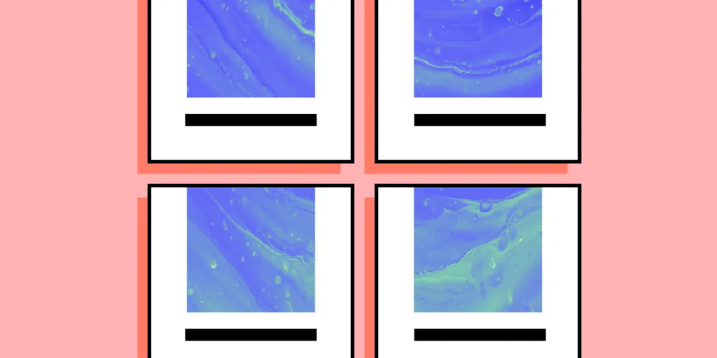
An app mockup is a visual representation of a mobile UI that showcases its layout, UI elements, and overall aesthetics. Unlike wireframes, which focus on structure and functionality, mockups incorporate more UI detail, including colors, typography, and images. Designers use these mockups to refine the app’s aesthetics before moving to high-fidelity prototyping and usability testing.
Purpose and benefits of creating mobile app mockups
- Visual communication: Mockups help designers and stakeholders visually understand the app’s design, ensuring everyone is on the same page regarding its appearance and functionality.
- Design refinement: Creating mockups enables designers to experiment with different design elements, iterating and improving the app’s aesthetics before prototyping and, later, the design handoff.
- Feedback and collaboration: Mockups facilitate discussions and feedback among team members and stakeholders, allowing for better collaboration and design decisions.
- Usability evaluation: Although not typically interactive, mockups can provide insights into the app’s usability, identifying potential issues early in the design process.
- Efficient development: By resolving design-related questions during the mockup and prototyping stage, designers can save engineering time and resources, reducing the need for costly revisions later.
How do mockups fit into the overall design process?
Mockups are integral to the mobile app design process, bridging the gap between wireframes and interactive designs (prototypes). They typically follow the wireframing stage, where the design team maps the app’s structure and functionality.
Once the wireframes are approved, designers create mockups to add visual detail, exploring the app’s aesthetics and UI design elements. After finalizing the mockup, the design team moves into the prototyping phase, adding interactivity and testing the app’s usability.
This structured approach ensures a smooth transition between each stage of the design process, allowing for iterative improvements and effective collaboration throughout the design process.
Essential Elements of App Design Mockups
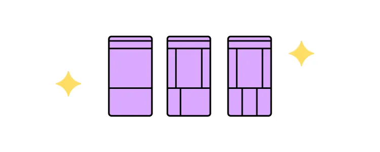
- Interface layout and structure: Establish a clear, intuitive design that effectively organizes content and UI elements. Prioritize usability and maintain a consistent structure throughout the app to ensure a seamless user experience.
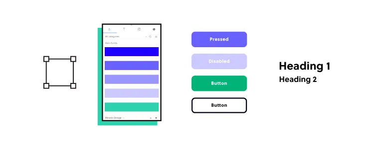
- Typography and font choices: Select legible and accessible fonts that align with your brand identity. Consider readability across various mobile devices and screen sizes, and maintain consistency in font usage to create a cohesive visual experience.
- Color scheme and branding: Choose a color palette that complements your brand identity and enhances the app’s aesthetics. Use colors to create contrast, draw attention to key elements, and improve usability by adhering to accessibility guidelines.
- Imagery and icons: Incorporate high-quality images and icons to support your app’s content and enhance its visual appeal. Opt for a consistent visual style and optimize graphic elements for various screen resolutions.
- Interactive elements and navigation: Design clear and intuitive navigation elements, such as buttons, menus, and tabs, to guide users through flows and tasks. Ensure that interactive components are easily identifiable, responsive, and consistent throughout the app to promote a smooth user experience.
Best Practices for Creating App Design Mockups

Start with low-fidelity wireframes
It’s standard practice to create low-fidelity wireframes before mockups. These wireframes let you focus on the app’s layout fast. This approach enables you to identify and address issues with the app’s structure and information flow early in the design process, ensuring a solid foundation for the mockup and prototyping stages.
Maintain consistency with design guidelines and principles
To create visually appealing and functional mockups, follow established design guidelines and principles that involve consistency, hierarchy, and alignment. These best practices will result in a cohesive and professional app design that meets user expectations and promotes a positive product experience.
Prioritize user experience and usability
User experience and usability guides the mockup design process. Consider load times, accessibility, and device compatibility to ensure your app caters to diverse users.
Collaborate and gather feedback
Actively seek feedback and input from team members and stakeholders during the mockup process. Collaboration encourages diverse perspectives, leading to innovative solutions and more refined designs. Use mockups as a communication tool to facilitate discussions and address concerns before moving on to the prototyping stage.
UXPin’s Comments feature makes collaboration and feedback effortless–even for collaborators who don’t have a UXPin account. Team members can tag each other, assign comments and mark them as resolved upon completion.
Iterate and refine your mockups
Continuously iterate and improve your mockups based on feedback and testing. Refining your designs throughout the process ensures you address issues and deliver a polished, high-quality app. Embrace the iterative nature of design to create a final product that meets user needs and stands out in the competitive app marketplace.
Leveraging Open-Source Design Systems for Faster Mockups
What are open-source design systems?
Open-source design systems (component libraries) are comprehensive collections of reusable UI components, patterns, templates, and guidelines that help designers create consistent and cohesive app mockups more efficiently. By leveraging these design systems, designers can streamline their workflow, maintain a consistent visual language, and focus on refining app-specific features and user experiences.
Benefits of using open-source UI libraries for app mockup design
- Time savings: Using pre-built components from a design system can significantly reduce the time spent creating mockups from scratch. For example, drag and drop a navigation drawer onto the canvas instead of designing one from scratch. If your app relies on third-party data sources, you might also consider solutions like DreamFactory, which provides governed API access to any data source, allowing you to prototype with real backend connectivity without lengthy integration work.
- Consistency: Design systems promote visual and functional consistency across the app. For example, applying the same color scheme and typography throughout the app ensures a cohesive user experience.
- Scalability: Components in design systems are built for scalability, making it easier to adapt your app for future changes. For example, designers can combine existing elements to create new patterns and components, thus maintaining consistency while scaling quickly.
- Collaboration: Design systems facilitate better cooperation among designers and developers by creating a single source of truth. For example, shared design assets and guidelines can streamline team communication and handoff.
Popular open-source design systems to consider
- MUI: Modeled off Google’s Material Design, MUI offers a versatile design system with comprehensive guidelines for creating visually appealing and functional cross-platform apps.
- Fluent Design System: An open-source, cross-platform design system developed by Microsoft with components and patterns for Web, Windows, Android, and iOS.
- Ant Design: Ant Design focuses on enterprise-level app design, providing a comprehensive set of high-quality components and patterns for desktop and mobile applications.
Turning Your App Design Mockups into Interactive Prototypes

What is an interactive prototype?
An interactive prototype is a dynamic version of an app mockup that simulates the app’s user interface (UI) and functionality, allowing users to interact with and navigate through the app as if it were a fully developed product.
Unlike static mockups, interactive prototypes include animations, transitions, and clickable elements that accurately represent the app’s user experience. Designers use these prototypes to conduct usability testing, gather user feedback, and refine the app’s design and functionality before moving into the development phase.
The benefits of interactive prototyping
- Usability testing: Interactive prototypes enable designers to test the app’s usability and functionality, revealing potential issues before development begins.
- Realistic user experience: Interactive prototypes accurately represent the final app, allowing stakeholders and users to experience realistic flows and interactions.
- Improved collaboration: Interactive prototypes facilitate better communication and collaboration between designers, developers, and stakeholders, ensuring everyone understands the app’s intended functionality.
- Faster iteration: Designers can quickly iterate on interactive prototypes, making adjustments based on user feedback and usability testing to refine the app’s design and functionality.
Tips for transitioning from mockups to interactive prototypes
- Identify key interactions: Before creating a prototype, determine the essential user interactions and app flows you want to test and validate.
- Use code-to-design prototyping tools: Leverage specialized interactive prototyping tools to transform your mockups into interactive prototypes efficiently.
- Animate transitions: Incorporate animations and transitions to enhance the app’s user experience and provide a more realistic representation of the final product.
- Conduct user testing: Engage with real users to test your prototype, gather feedback, and identify areas for improvement.
- Iterate and refine: Continuously iterate on your prototype, incorporating user feedback and usability test results to refine the app’s design and functionality before development begins.
Designing App Mockups and Interactive Prototypes With UXPin Merge
UXPin Merge is a code-based technology that allows designers to use fully interactive code components in the product design process without technical skills or writing a single line of code!
With Merge, designers can go from sketching to wireframing, mockups, and interactive prototyping effortlessly–and in a fraction of the time than traditional UI kits and image-based design tools.
Another significant Merge benefit is that it creates a single source of truth between design and development. Designers use visual elements for the design process, while engineers use the code behind them, both pulled from the same repository.
Designers can preview Merge prototypes in the browser or the UXPin Mirror app for native applications–perfect for cross-platform testing. UXPin provides designers with canvases for popular mobile devices, including iPhones, iPad, wearables, and Android.
Merge allows you to import any open-source component library or your product’s design system into UXPin:
- Git Integration: direct syncing to React-only design systems hosted in a repository.
- Storybook Integration: Connect any Storybook to UXPin, including React, Vue, Angular, and Ember libraries.
Enhance your mockup and interactive prototyping process with the world’s most advanced design tool. Visit our Merge page for more details and how to request access.


