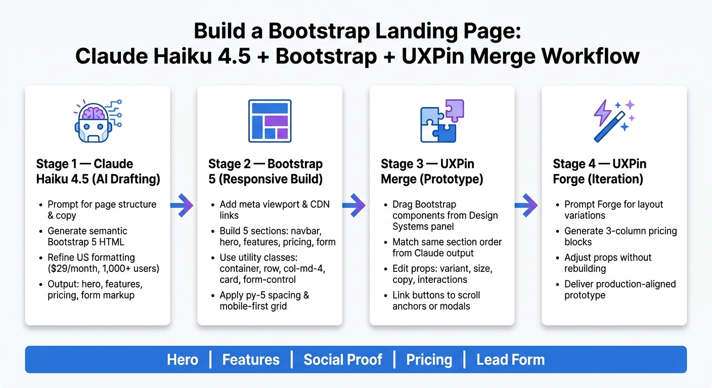
If I want a Bootstrap landing page done with less back-and-forth, this is the core process: I use Claude Haiku 4.5 for page copy and HTML drafts, Bootstrap 5 for the page structure, and UXPin Merge to rebuild the same page with code-based components. The result is a workflow that covers 5 main sections – hero, features, social proof, pricing, and lead form – while keeping copy, layout, and prototype closer together.
Here’s the short version:
- I prompt Claude to draft the page outline and section copy
- I ask it for semantic Bootstrap 5 HTML
- I build the page with Bootstrap classes like
container,row,col-md-4,card, andform-control - I move the same structure into UXPin Merge
- I use Forge to test layout variations like 3-column pricing blocks
- I still do manual checks for accessibility, labels, contrast, and QA
A few concrete details stand out right away:
- Pricing uses U.S. format: $29/month, $79/month, $249/month
- Form fields include name, email, and company
- Feature copy should stay around 20–25 words
- Outcome-driven bullets can mention numbers like 10+ hours saved per week or 15% higher conversion rates
- The page should use U.S. formatting like July 30, 2026 and 1,000+ users
What this article shows is simple: I can use AI for the first draft, Bootstrap for the front-end structure, and UXPin for a prototype that matches the shipped component library more closely than a static mockup.
| Part | What I use it for |
|---|---|
| Claude Haiku 4.5 | Copy, page outline, Bootstrap-ready markup |
| Bootstrap 5 | Grid, cards, buttons, pricing, forms |
| UXPin Merge | Prototype with code-based Bootstrap components |
| UXPin Forge | New section and layout variations |
If I’m building landing pages for a U.S. SaaS product team, this setup helps me move from idea to coded structure to interactive prototype without splitting the work into separate tracks.
How to Build a Bootstrap Landing Page with Claude Haiku 4.5 & UXPin Merge
Is This the Fastest Way to Build a SaaS Landing Page? (Claude AI)
sbb-itb-f6354c6
1. Plan the landing page in Claude Haiku 4.5
Use Claude Haiku 4.5 to map out the structure, write the copy, and draft Bootstrap-ready markup before you touch design. Think of Claude’s output as the working source file for both the Bootstrap build and the Merge prototype.
Prompt Claude for page structure and section copy
Start with a prompt that gives Claude a clear role, audience, goal, and tone. For a US SaaS landing page, use something like this:
You are a senior US-based UX writer and conversion copywriter. Create a [landing page outline](https://www.uxpin.com/studio/blog/landing-pages-guide/) for a B2B SaaS analytics platform targeting US small and mid-sized businesses. Include sections for: navbar, hero headline and subheadline, key features, social proof, pricing tiers, and a lead capture form. Optimize for demo requests and free trial sign-ups. Then prompt each section on its own. That usually gives you tighter copy and a cleaner page flow. For pricing, ask Claude to write three tiers:
- Starter at $29/month
- Growth at $79/month
- Enterprise at $249/month
Add a short benefit line for each one. For features, ask for five bullets aimed at US product managers. Each bullet should focus on outcomes, like saving 10+ hours per week or increasing conversion rates by 15%.
Once the structure looks good, have Claude turn it into Bootstrap 5 sections.
Refine the output for US formatting and content hierarchy
Next, clean up the draft. Tighten the headlines, remove filler, and standardize US formatting. The hero headline should state the value in one sentence. Feature bullets should stay under 20–25 words so they’re easy to scan on mobile. CTAs should be short and direct: Start Free Trial, Request Demo, View Pricing.
Check that pricing, numbers, and dates follow US style, like $40/month, 1,000+ users, and July 30, 2026. You can ask Claude to handle this pass too:
"Shorten all headlines and feature descriptions to be more scannable on a landing page, keeping US formatting like $40/month and 1,000+ users. Maintain a clear hierarchy from hero to features to pricing to form."
That extra pass can make the page feel much cleaner. It’s a small step, but it saves editing time later.
Ask Claude for Bootstrap-compatible section markup
After the copy is in good shape, ask Claude for semantic Bootstrap 5 HTML using containers, rows, columns, cards, and forms. For the hero, this prompt works well:
Generate semantic Bootstrap 5 HTML for a responsive hero section inside a <section> tag. Include a navbar at the top, a centered hero with a headline, subheadline, primary CTA button (btn btn-primary), and secondary CTA (btn btn-outline-secondary). Use a container, row, and col-12 col-md-6 layout. Assume American English copy and US SaaS pricing context. Do the same for the other parts of the page:
- A features grid with
col-md-4cards - A pricing section with three
cardcomponents andbtn btn-primary - A lead capture form with
form-controlinputs and<label>elements linked withforandid
Also ask Claude to use semantic elements like <header>, <main>, <section>, <nav>, and <footer> where they fit, instead of relying on generic <div> blocks. For navigation, include descriptive aria-label attributes, and keep button text short.
Use that output as the blueprint for the responsive Bootstrap page in the next section.
2. Turn Claude’s output into a responsive Bootstrap landing page
Once you have Claude’s markup, the next move is simple: turn it into a page that actually works.
Start in the <head>. Add <meta charset="utf-8"> and <meta name="viewport" content="width=device-width, initial-scale=1">, link Bootstrap 5 CSS from a CDN, and load the Bootstrap JS bundle right before </body>. Also set lang="en-US" on the <html> element so the page lines up with U.S. localization settings.
Build the hero, features, pricing, and form sections
Take Claude’s navbar markup and place it inside <nav class="navbar navbar-expand-lg navbar-light bg-white border-bottom">, with a .container nested inside. For the hero section, use a .container with a .row.align-items-center.py-5. Put the headline and subheading in .col-12.col-md-6.text-center.text-md-start. Then place an image or product screenshot in .col-12.col-md-6.text-center, using .img-fluid and clear alt text. The main CTA should use .btn.btn-primary.btn-lg.mt-3.
For features, wrap Claude’s bullet list in <section class="py-5 bg-light">. Turn each feature into a .col-12.col-md-4 card inside a .row.g-4. Use .card.h-100.shadow-sm, add .fw-semibold to the feature title, and apply .text-muted to the description.
Pricing follows the same pattern, which keeps the page tidy and easy to scan. Build three .col-12.col-md-4 cards inside a .row.g-4, with .card.h-100.shadow-sm and .card-body.d-flex.flex-column inside each one. Show the tiers in U.S. format: Starter at $29/month, Growth at $79/month, and Enterprise at $249/month. Highlight the middle plan with .border-primary and a .badge.bg-primary label. Under each price, list plan benefits in a .list-unstyled.text-start.small list.
For the form section, center the layout with .row.justify-content-center and a .col-12.col-md-6 column. Use <form class="p-4 border rounded-3 bg-light">, make sure each <label> connects to its input with matching for and id values, and use .btn.btn-primary.w-100.mt-2 for a full-width submit button.
That gives you a complete Bootstrap page that’s ready for Merge.
Use Bootstrap spacing and alignment utilities instead of custom CSS
This is where Bootstrap saves time. Instead of writing custom CSS for every gap and alignment tweak, lean on utility classes.
Use py-5 or py-4 on sections to keep vertical spacing consistent. Inside each section, apply mb-3, mb-4, or mb-5 to headings and content blocks so the layout doesn’t feel cramped. For alignment, text-center works well on section headings, while text-center text-md-start is a good fit for hero copy. That way, content stays centered on phones and shifts left on desktop screens.
Longer text can get hard to read on large displays, so wrap those blocks in .col-lg-8.mx-auto. And when a button sits inside a narrow column, add .w-100 to make it stretch across the space. On mobile, that gives users a large tap target instead of a tiny button floating in the middle.
Bootstrap’s grid and utility classes are mobile-first, so you can handle layout changes without writing custom media queries.
Comparison table: manual Bootstrap build vs. Claude-assisted Bootstrap build
The table below shows how the workflow changes in practice.
| Task | Manual Bootstrap build | Claude-assisted build | Time impact |
|---|---|---|---|
| Outline page structure | Read docs and sketch sections by hand | Prompt Claude for a starter outline | Faster first draft |
| Write hero HTML markup | Hand-code the navbar, columns, and CTA layout | Generate semantic markup and refine it | Less boilerplate |
| Draft feature card content | Write copy and card markup separately | Generate copy and card structure together | Fewer manual passes |
| Create pricing cards | Build each card and price layout individually | Prompt for a full set of card markup in US pricing format | Faster setup |
| Structure signup form | Write labels, inputs, and button from scratch | Generate an accessible form scaffold | Less setup |
| Accessibility and QA | Manual check | Manual review | Similar effort |
Claude speeds up the draft stage, but accessibility checks, color contrast checks, and final QA still need human review no matter how the markup was produced. A good way to think about it: Claude gives you the frame, but you still need to inspect the house.
Treat Claude’s output as a strong first draft. Clean up class names so they match standard Bootstrap patterns, then run the HTML through a validator before moving it into UXPin Merge using the npm integration.
Once the HTML is validated, use the same Bootstrap structure in UXPin Merge.
3. Recreate the landing page in UXPin Merge with real Bootstrap components
After you validate the Bootstrap HTML, rebuild the page in UXPin Merge with code-backed Bootstrap components.
Use the Bootstrap library from the Design Systems panel
Bootstrap is available in UXPin’s Design Systems panel. That means you can drag components straight onto the canvas instead of rebuilding them from scratch.
Browse groups like navigation, layout, forms, and content. Then assemble the page with the same Bootstrap pieces Claude generated. The goal is simple: keep the design in step with the code your developers will use.
Stick to the same section order Claude laid out. Add a Navbar for the top bar. Build the hero with Container, Row, and Col. Place Card components in the features and pricing rows. Use Form and Input components for the lead capture area. This keeps the prototype tied to the same Bootstrap structure that will show up in production.
Once the structure is in Merge, you can fine-tune copy, props, and interactions without tearing the layout apart.
Edit props, content, and interactions in Merge
Each component shows its props in the properties panel, including options like variant and size. Set the hero CTA button to variant: primary and size: lg. Use outline-secondary for secondary actions.
Paste Claude’s hero, feature, pricing, and form copy into the matching Bootstrap components. Format pricing in U.S. style, like $29/month. Update form placeholders to match U.S. formats too.
Interactions work the same way. Set the "Get started" button to scroll to the pricing section or open a signup modal. Show invalid states with Bootstrap’s is-invalid styling and error text. Set Navbar links to anchor-scroll to each section. Because the prototype uses the same component system, these behaviors map cleanly to front-end work.
Comparison table: vector-based mockups vs. Merge Bootstrap components
| Dimension | Vector-based mockups | Merge Bootstrap components |
|---|---|---|
| Consistency with production code | Approximate – spacing and variants can drift | Exact – same class names, props, and breakpoints |
| Handoff effort | High – developers recreate layouts from artboards | Low – developers confirm or adjust props |
| Responsive design best practices | Static artboards per breakpoint | Inherent – Bootstrap grid handles stacking |
| Iteration speed | Slow – redraw shapes for each change | Fast – update props and copy across all instances |
| Component reuse | Manual duplication | Built in – reuse across pages and experiments |
With the landing page in Merge, the next speed boost comes from generating and adjusting variations in Forge.
4. Speed up iteration with UXPin Forge and finish with a production-aligned prototype
Use Forge to generate and adjust Bootstrap-based layouts
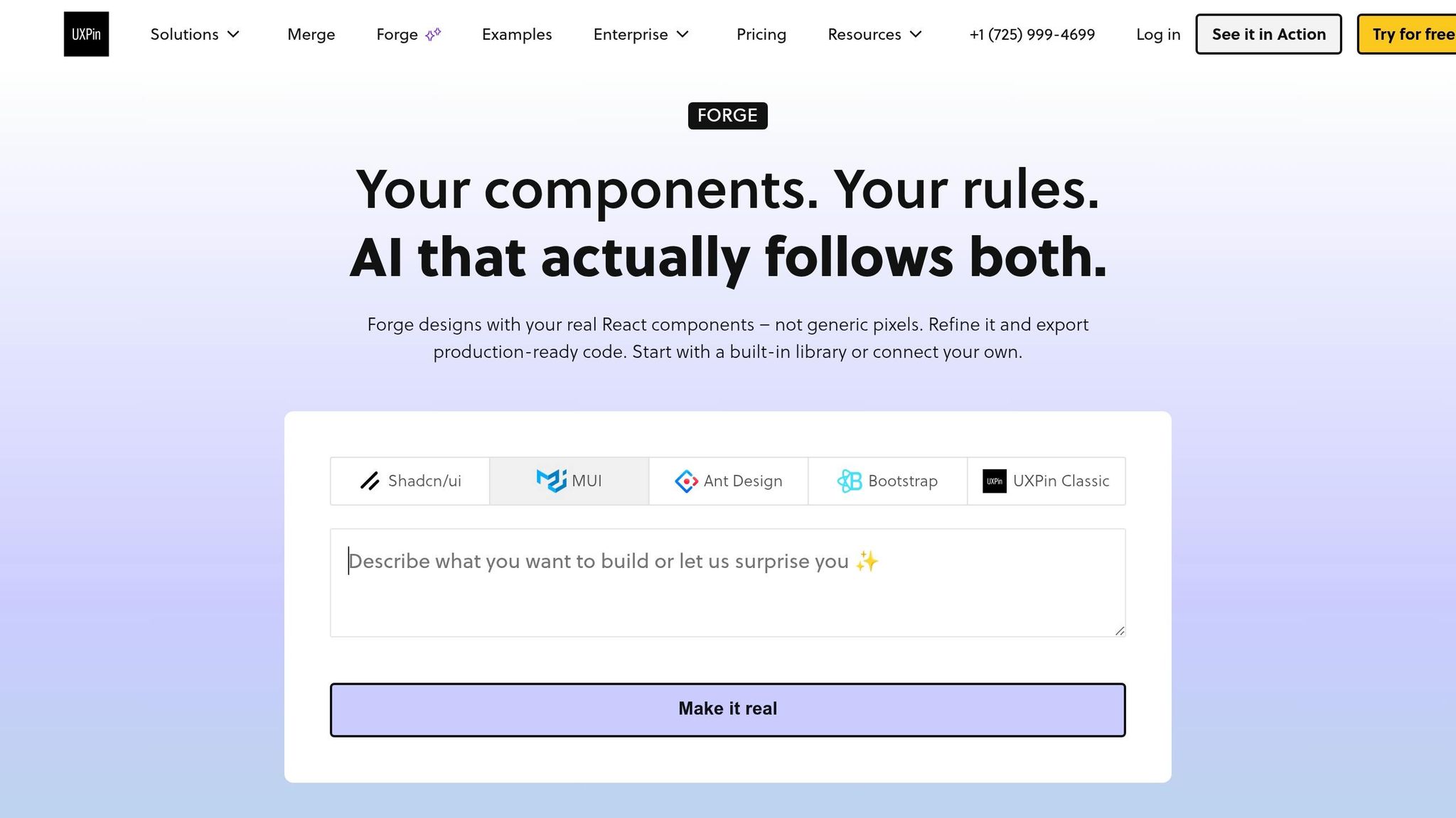
Once your landing page is built in Merge, UXPin Forge lets you iterate on sections fast without rebuilding layouts by hand. Forge is built right into UXPin, so you can prompt it from inside the canvas. That means the structure stays flexible, and you can test new versions without tearing the page apart.
Forge can generate UI components and layouts from prompts, images, URLs, or JSX. If you want pricing blocks or new section options, you can prompt it against the page structure you already have:
"Create a three-column pricing layout for the existing landing page sections using Bootstrap Container, Row, and Col with Card components. Format pricing as $29/month, $79/month, and $249/month."
Forge returns a Bootstrap-based layout that you can tweak right away. You can adjust props, swap in new copy, or change variant values without leaving the flow.
The table below shows where Forge saves time while giving you more control.
Comparison table: Claude plus Bootstrap alone vs. Claude plus Bootstrap plus Merge plus Forge
| Dimension | Claude + Bootstrap alone | Claude + Bootstrap + Merge + Forge |
|---|---|---|
| Ideation speed | Fast for copy and markup drafts | Fast for copy, markup, and section variations |
| Design fidelity | Code in a text editor, with no visual canvas | Visual canvas with real Bootstrap components |
| Production alignment | High if developers follow Claude’s output | Tighter – same components and structure stay in UXPin |
| Interactive fidelity | Static HTML preview | Interactive prototype built from real components |
| Iteration cycle | Edit code, refresh browser, repeat | Update props in Merge and refine layouts with Forge |
| Component control | Depends on manual implementation | Built in through Bootstrap component library |
That combination is what turns a static prototype into a reusable landing-page workflow.
Conclusion: the fastest path to a reusable landing page
The workflow comes down to four linked parts. Claude drafts the copy and markup. Bootstrap gives you the responsive structure. Merge and Forge keep the prototype tied to production components.
For U.S. product teams managing multiple landing pages, this stack cuts handoff cycles across every section – hero, features, pricing, and form. So instead of giving developers an artboard to interpret, you give them a prototype built from the same Bootstrap components used in code.
FAQs
How much HTML should I clean up after Claude generates it?
Clean it up so the code fits your design system and works as a reusable component.
Before you import anything, strip out inline styles, hard-coded colors, extra custom CSS classes, and ARIA attributes that native HTML already handles on its own.
Then tighten the content so it fits the component’s limits, line up the feature set with your library, and catch missing imports or prop issues by testing the build. Finish by polishing the copy for U.S. English and locking in the final component hierarchy.
Do I need coding skills to rebuild the page in UXPin Merge?
No. You don’t need coding skills or knowledge of HTML, CSS, or React to rebuild the page in UXPin Merge.
UXPin Merge comes with a built-in, code-backed Bootstrap library. So you can drag and drop production-ready components onto the canvas, then use the properties panel to change variants, states, and content.
A little knowledge of the Bootstrap grid can help. But it’s not required.
How do I keep the Bootstrap page and Merge prototype in sync?
Connect your design environment to your production codebase with Git or npm integration. That creates a live link between the two, so changes to your code components show up in UXPin Merge.
Use the same section names and component props that exist in your production code. If something is off, fix it in the component library or the codebase itself instead of overriding it on the UXPin canvas.
Related Blog Posts
- How to build a landing page using GPT-5 Mini + Bootstrap – Use UXPin Merge!
- How to build a landing page using Claude Opus 4.5 + Bootstrap – Use UXPin Merge!
- How to build a landing page using Claude Sonnet 4.5 + Bootstrap – Use UXPin Merge!
- How to build a landing page using Claude Haiku 4.5 + MUI – Use UXPin Merge!