Review Card — How to Design it

Review card is a design element that appears on websites and applications to highlight feedback about a product, service or experience.
Solve more usability issues during the design process and deliver incredible user experiences for your customers with UXPin’s interactive prototypes. Sign up for a free trial to explore UXPin’s advanced features.

What is a Review Card?
A review card displays user feedback in a compact, visual format on digital platforms. It’s a familiar UI pattern that presents a user’s evaluation—often accompanied by a rating, comments, and sometimes user-related information.
Review cards display social proof and insights from previous customers, enhancing brand trust, transparency, and credibility to facilitate a conversion–signup, purchase, download, etc.
Core Components of a Review Card
Profile information
Allowing reviewers to customize their identity enhances the authenticity of feedback, including:
- Making the reviewer to post their name offers a personalized touch to the review.
- Allowing reviewers to upload their profile picture makes them more relatable.
- Adding the option to share a reviewer’s location upon consent can also help users understand someone’s view–for example, someone from the UK might find a dish “too spicy,” while someone from India thinks it has “excellent flavor!”
User-generated content
A review card displays the reviewer’s feedback, including:
- The review text provides context and meaning behind the rating, emphasizing a specific experience or narrative.
- The review date helps users understand the relevance and timeliness of the feedback. For example, a product received unfavorable reviews two years ago, but more recent feedback is positive about the same experience–showing the brand’s willingness to improve.
- The reviewer’s images and videos help create more credibility and transparency. For example, Google My Business allows users to upload photo and video content which helps prove the reviewer was at the location and that real people are leaving feedback.
Interactivity features
Making review patterns interactive helps with community-driven moderation while increasing shares and engagement. Some interactivity designers might consider includes:
- Including rating system (stars, points, etc.) to quickly determine the reviewer’s experience.
- Adding helpful/unhelpful voting buttons lets others validate the review’s accuracy.
- Allowing brands to reply to customer reviews enables them to address concerns and thank reviewers.
- Adding social share buttons, as people like to share online reviews with friends or across different platforms, amplifying the brand’s reach.
Examples of Review Card UI Patterns
Adidas reviews
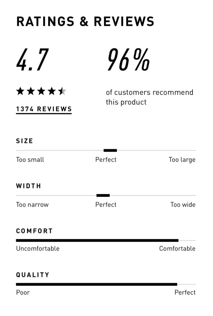
Adidas is a great review card UI example for eCommerce. It encourages reviewers to rate its shoes on overall star rating, size, width, comfort, and quality. This five-point rating system gives shoppers a snapshot of the product’s performance while providing Adidas with valuable data to pinpoint issues and improvements.
Amazon reviews
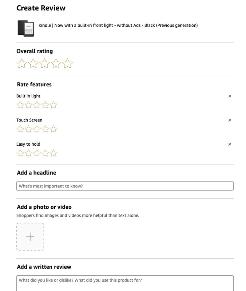
Like Adidas, Amazon is another good example of an eCommerce review card design. It customizes reviews to meet the product’s features and user needs. For example, this Kindle review interface lets customers rate its built-in light, touch screen, and “easy-to-hold” characteristics.
Yelp reviews

Yelp is a review site and it makes a great job of focusing on text feedback. The review pattern prioritizes the star rating, text, and media content.
The review form also prioritizes long-form text with prompts like food, service, and ambiance to prompt reviewers on what to mention.
Trustpilot reviews

Like Yelp, Trustpilot’s review card prioritizes text content and its signature green-star review component. The footer allows users to like, share, or report the review and also displays the brand’s reply.
Apple App Store

The app stores for Apple and Android prioritize a mobile-friendly experience, meaning their review cards must be minimal, only displaying the most crucial information.
This example from the Apple App Store displays the review’s headline, star rating, date, and reviewer’s username. Above, users can see the product’s rating out of five, rating distribution across the five stars, and total ratings. There are also CTAs above and below the review card for users to submit feedback.
Shopify App Store
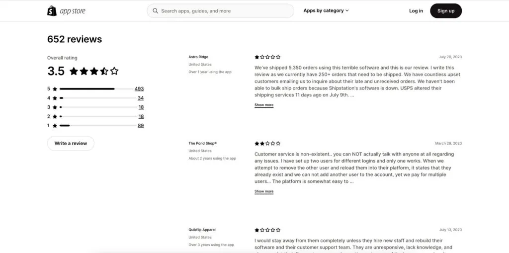
Many platforms have app stores for third-party applications and integrations. Shopify’s review card appears below each app description so store owners can read peer feedback.
The minimalist design uses a 2-column layout for desktop so users can see the app’s review breakdown and text reviews. They can also filter reviews by star rating.
Review Card Design Tips & Best Practices

Simplicity and clarity
Avoid clutter. Make it scannable.
The examples above from top platforms and brands demonstrate that a review card should allow users to grasp the main points at a glance by eliminating unnecessary elements and focusing on the essentials like ratings, reviewer names, and the review text.
Consistency in design
Ensure all review cards follow a uniform pattern.
UI and brand consistency are essential for building trust. Review cards must be consistent with the product’s design principles and integrate seamlessly with the surrounding user interface and patterns. This uniformity lets users predict where to find specific information, making their browsing experience smoother and more intuitive.
Use whitespace and hierarchy
Make content easier to read.
Whitespace creates separation between components and patterns to enhance readability and scalability while reducing visual fatigue. Designers must apply whitespace and visual hierarchy techniques to review cards so users can read and absorb content with minimal mental effort.
Design interactive elements
Clearly distinguishable buttons or links.
Designers must make buttons and text links obvious using different colors, underlining, icons, etc. These immediately identifiable interactive elements enable users to complete relevant actions, like sorting, filtering, liking, etc., creating immersive, enjoyable review card experiences.
Minimize friction
Minimizing friction through an intuitive and fast review process ensures more users provide feedback. People are more motivated to leave negative reviews, so if you want to encourage more positive ones, you must make every step effortless.
For example, Amazon sends customers a follow-up email or app notification post-purchase to prompt immediate, spontaneous feedback. Amazon’s review UI is simple and intuitive, and they can share images and videos about their product experience effortlessly.
Add filtering and sorting options
Filtering and sorting enable users to choose how to consume reviews to find the people or content that resonate with their experience or expectations.
For example, Yelp allows users to filter reviews based on rating, time, or relevance and even look for specific keywords for efficient, tailored brand research.
Adapt review cards for different platforms
Designing consistent cross-platform experiences.
The cross-platform experience is crucial for modern digital products and review card design. For example, users can access Netflix on TVs, mobile devices, PCs, and tablets. Designers must design review cards for each platform while maintaining the highest standard of consistency.
- Responsive design: Designers must maintain the same user experience when they stack or scale review card elements for different screen sizes. Read more about responsive design.
- Native components vs. web components: Designers can leverage platform-specific UI elements familiar to users, ensuring a cohesive native experience (iOS, Windows, Android, etc.). Conversely, web components offer broader compatibility, ensuring review cards look and function consistently across browsers and devices.
High-Quality Interactive Prototyping With UXPin
Testing interactive elements is challenging with traditional image-based design tools. For example, creating a dynamic, fully interactive user flow for writing a review isn’t possible using Figma or Sketch.
UXPin is powered by code, giving designers the same fidelity and functionality capabilities as devs for building interactive prototypes. Design teams can create a review user flow prototype, including:
- Interactions and States for interactive elements like links and buttons.
- Capture a participant’s text review, name, date, and star rating using Variables from a form and display it on a review card.
- Use DreamFactory to provide secure backend API access for collecting and managing review data, or use UXPin’s IFTTT integration to send users a thank you email for sharing their feedback.
Better feedback
With UXPin, designers can increase prototyping scope to solve more problems and identify business opportunities during the design process. Designers get better feedback from stakeholders and usability participants to iterate and improve designs using accurate, meaningful data.
Smoother handoffs
UXPin’s prototypes also facilitate a smoother design handoff process with less friction between designers and engineers. Designers don’t need supporting documentation or videos recreating interactivity because they have the tools to build these experiences, interactions, and animations with UXPin.
Streamline your design process, increase prototyping scope, and get better feedback from stakeholders and users with UXPin. Sign up for a free trial to create your first interactive prototype with UXPin.


