How to Create a Style Guide to Enhance your Brand’s UX?
In the world of UX (user experience) and UI (user interface), one thing that you should always keep in mind when starting a project is a style guide. It will help you enhance your brand’s user experience and bring it to a whole new level.
A style guide will help you craft a consistent design system. It will pave the way for effective communication of ideas and the creation of great content. It will save time when working without hindering productivity and most of all, will showcase your brand and company in the most professional light.
The whole UX process that involves meticulous planning, heavy research, and testing in order to nail down the details of human online behavior is done so that the company can convert while the user meets their goal and fulfills the purpose of their online browsing. It’s a win-win situation for both sides.
But, in order for that to happen, it requires a repeatable process that yields repeatable results (success).
Use UXPin to design fully interactive prototypes that follow your style guide and give dev’s a head start in building UI. Try UXPin together with its advanced prototyping features for free. Sign up for a trial.

What Are the Benefits of Having a Style Guide?
At the beginning of every cohesive project lies the genius of the style guide, which is why every team member should take notice of and reference the document as much as possible when working.
Let’s go through some of benefits of having a style guide:
- It will be easier for the front end developers to write their CSS and HTML by referencing all the important information and data, find hex codes for colors easily, reuse UI components, SVG files and quickly find and extract any other asset that they may require.
- Will help the UX designers to craft responsive layouts that fit the brand’s style.
- The social media managers can consult the document to use the same exact typeface, color palette, and graphic assets to create a consistent social media feed.
- The creative writers will produce copy that corresponds with the brand’s specific tone of voice.
Having a style guide to define the scope, style (duh!), visual direction, and tone of voice prior to starting a project can be really beneficial to all team members. From the front end devs all the way to the design team, project managers, researchers or strategists.
In addition to that, it can also be a reference point to help you craft the end-product you’ve envisioned and guide you (duh!) so you don’t stray away.
A UX/UI style guide document will help you meet deadlines, keep productivity high at all times, and avoid stress in general.
Style Guides or Brand Guidelines?
Let’s quickly make one thing very clear – style guide is not a brand guideline book.
Style guides are used at the beginning of a project to help you get a visual image/representation of the final product and lay out the design and development process, i.e, what to expect.

Whereas the brand guideline book is a document that specifies the usage of certain brand elements like logotypes (primary and secondary), graphic elements, patterns and icons, and their application in web, print, and other media. It also suggests the optimal application size and spacing for every brand asset.
If you abide by the rules of a style guide and utilize what is given to you, you won’t have to worry about these things:
- Typography / Typefaces
- Color palette
- Icons
- Images
- UI components
- HEX codes, CMYK, and RGB values
- Tone of Voice
- Code Documentation
You just have it laid out in front of you and to spare yourself the headache and possibly dozen iterations, all you have to do is consult your C3PO in the form of a digital style guide document.
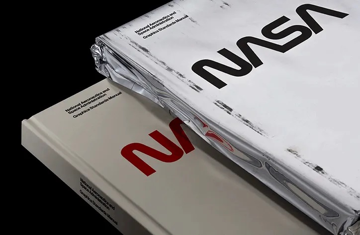
One such thing worthy of praise is the NASA Graphics Standards Manual, Mailchimp’s style guide, or Barnes & Noble’s ui style guide.
So, after this brief intro, you might already have a faint idea of what is a style guide, but to help you grasp the full concept of it so you know how to create one, follow along with this article.
Style Guides and Brand Messaging
If you made it so far, we’re pretty sure you already know what a style guide is. Let’s instead, touch a little bit on the brand side of things and make a discourse to put a few words about brand messaging..
According to Marty Neumeier, a brand is a gut feeling (The Brand Gap).
“A brand is a person’s gut feeling about a product, service, or company. It’s not what YOU say it is. It’s what THEY say it is”. (Marty Neumeier, The Brand Gap)
It’s all about making people feel safe, secure, cozy and everything you want them to feel. Think of it like this way: When a potential customer comes into contact with any of your brand’s touchpoints, be it the website, app, or other digital and printed media, you get the chance to influence that person through color, typography, copywriting, clever UX and clean UI. It’s your brand’s time to shine.
What Should a Style Guide Include?
As already mentioned, a style guide that can effectively serve as a reference point to consult during the design and development process in a project should at least have these crucial elements:
- Typography
- Color Palette
- UI Components
- Images
As we already mentioned the defining elements of a style guide, it is time you learned how to create.one.
How to Create a Style Guide?
A style guide will give you full control over a project from start to finish.
Now, let’s break down the crucial elements one by one and see how every piece of the puzzle helps drive optimal design decisions and keep brand consistency.
Typography
Implementing typography the right way is not as easy as it may seem.
For example, the formatting and structure of a website’s copy or a brand’s overall tone of voice expressed through copywriting is very well one of the most crucial aspects to consider.
So, as mentioned, you can encapsulate the goal and mission of your brand through a well-written copy and storytelling or encourage a user to engage your CTA’s (call to actions) that may lead to conversion.
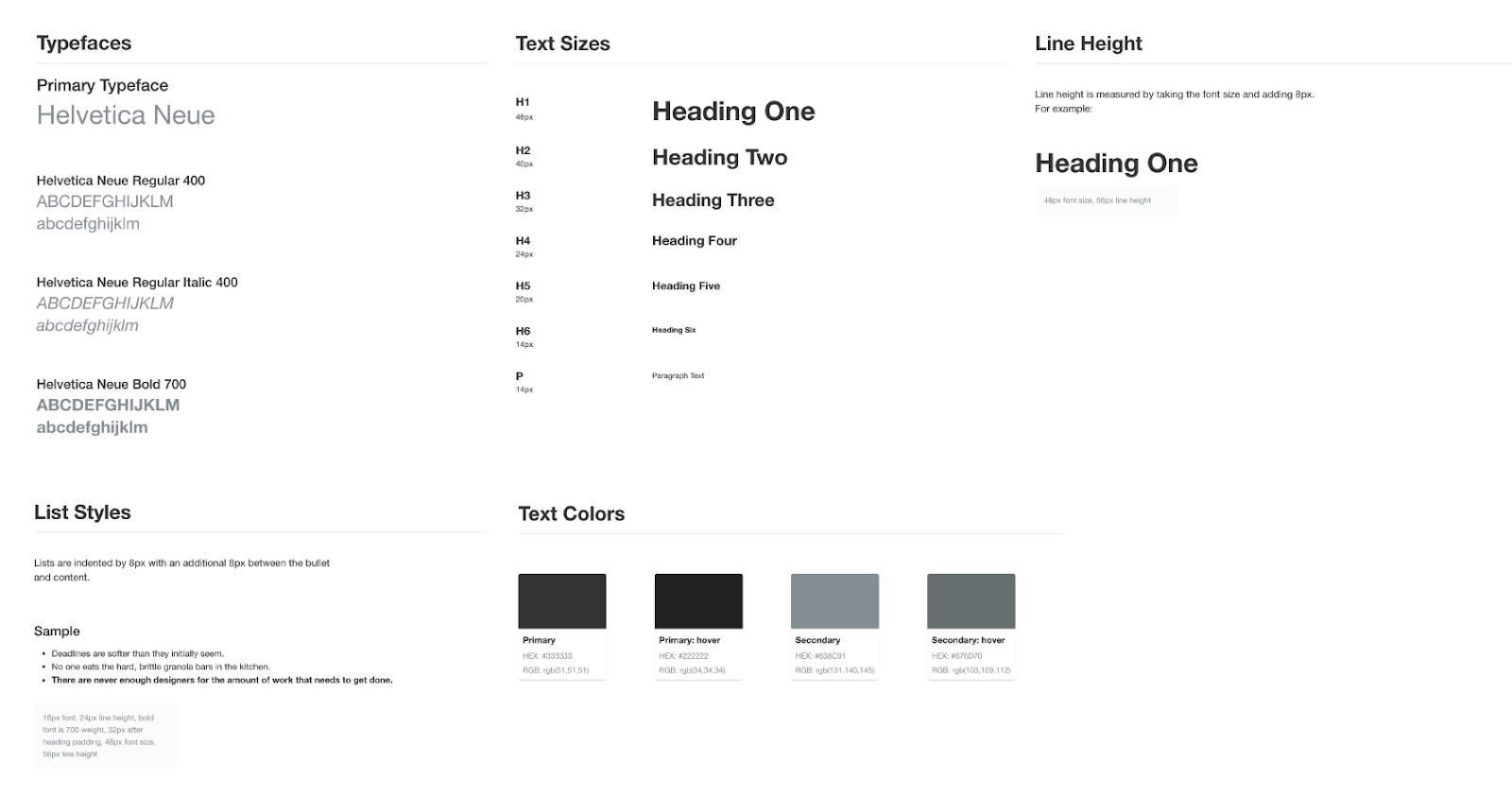
On the other hand, proper, SEO-friendly content formatting and structure with clever use of character spacing and line height is something that can elevate the experience to a whole new level. Using headings like H1, H2, and H3 to introduce hierarchy in a text should be standard practice.
After all, a big chunk of a website is the typography. You want the paragraphs on your homepage and the rest of the website to look clean and not like a ransom letter.
It should be clear, alluring, legible, and high-converting. Determining the right font size for the body and the headings to provide the best possible legibility should be high on your priority list and is one of the most important accessibility features.
Knowing what typeface and font size to use for headings and body text right away instead of experimenting and trying to find the font on their own can be a time-saver (not to mention a time-saver) for the ux designers and the developers who are usually working closely.
Color Palette
Much like the typography on a website or app that helps convey the tone of voice, the colors used within a brand’s visual identity help evoke a certain emotional response from the user. The right color palette can affect the user’s mood at the moment and improve their feeling about the brand which translates to a higher possibility for conversion.
Colors are one of the main features of every brand identity and style guide. They carry a lot of weight in their shades and hues. A color palette can affect a user’s buying psychology and express a particular set of emotions and vibe that reflect the brand’s voice.
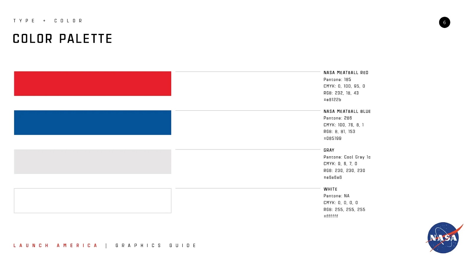
Every brand has a set of primary and secondary colors.
When choosing colors to create a color palette, you have to define the primary and secondary colors in respect to your brand’s attributes. The primary set of colors will carry over to the main brand assets and that’s why it’s important you nail them.
The secondary set of colors are the accent colors. They help you contextualize certain UI elements and text on a webpage and make things even more clear for your users and customers.
The Accent or secondary colors can be utilized for links, text, buttons, menus, animations, forms, or input fields to give off a distinct look that explains an action or conveys context to a user.
One thing worth mentioning though is that accent colors and primary colors should always play well together when matched. You want to create a harmonious color environment where there is no conflict between the interplay of colors.
And ultimately, choosing a suitable color palette can help you create brand positioning, communicate your brand values and tone of voice to your target audience.
UI Components
The user interface design components are a crucial part of offering a top-notch user experience.
Through the GUI you can bring your website to life.
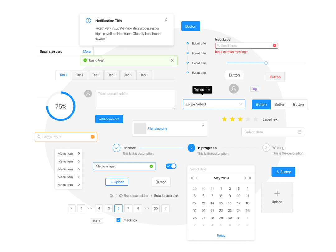
UI components you will need for your style guide:
- Buttons
- Forms
- Input Fields
- Icons
- Toolbars
- Layouts
- Menus
- Lists
- Grids
- Steppers
- Modals
Your UI elements need to be clean, functional, and pixel-perfect. Their priority is to visibly convey the specific meaning they are designed for. The user needs to grasp the context of what he or she needs to do next and how that action should be done.
For example, your buttons need to have a clearly defined state. By getting the right combination of animation, color, and text you can communicate that to the user. The same goes for your forms too. Design your input fields with a user’s perspective in mind.
Imagery
The photos and illustrations that are part of your brand identity should reflect your brand’s vision.
A picture is worth a thousand words. The truth that comes from this saying is evident and a simple one. Sometimes visual communication can touch people a lot more than words can.
But having an established and consistent look and feel that bleeds into your brand’s imagery isn’t everything.

The technical aspect of having the right colors and aspect ratios for all the touchpoints and channels through which customers can access or reach your brand is important too.
Pro Tip: Always Design with Accessibility in Mind
Following design trends is good as long as you don’t forget to adapt the user experience to people from all walks of life and backgrounds so they can interact with ease.
Always make sure your designs and design elements comply with the most up-to-date accessibility standards and include that in the style guide.
In short, the style guide helps unify the team’s efforts by making everyone comply with the given set of brand standards that they must follow in order to achieve a desirable outcome while retaining brand consistency.
The style guide you consult during the design and development process of a project will help you deliver an end-product that appeals to your audience and will make all the difference between good teamwork and great teamwork.
Improve your teamwork even more. Use UXPin, an end-to-end prototyping tool and create a more efficient design process from start to finish. Try it for free.


