What Is a Mockup? Definition, Examples & How to Create UI Mockups (2026)
UI mockups are a critical milestone in the design process. They are where ideas first come to life with real color, typography, and content — bridging the gap between abstract wireframes and interactive prototypes.
Key takeaways:
- A UI mockup is a high-fidelity, static visual representation of how a product’s interface will look.
- Mockups sit between wireframes (low-fidelity structure) and prototypes (interactive, testable experiences) in the design workflow.
- They answer critical visual questions — layout, color, hierarchy, typography — and give stakeholders a realistic preview before any code is written.
- Modern tools like UXPin let designers build mockups with real code-backed components, then transition seamlessly to interactive prototyping.

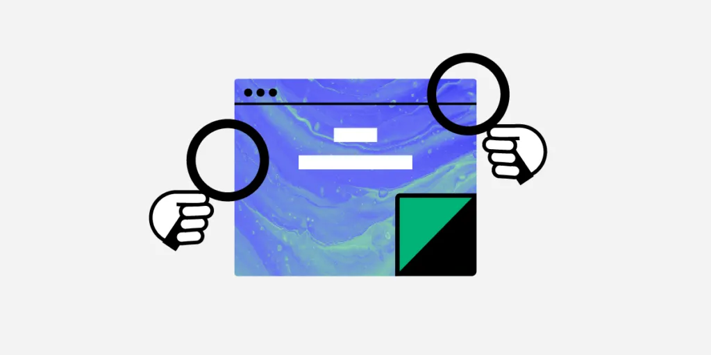
What Is a UI Mockup?
A UI mockup is a high-fidelity, static visual representation of a digital product’s interface. It shows the final layout, color palette, typography, icons, imagery, and content hierarchy — essentially a pixel-accurate preview of how the product will look — but without interactive functionality.
Think of a mockup as a detailed architectural rendering. You can see exactly what the building will look like, but you can’t walk through the door yet. That step comes in prototyping.
What Are Mockups For?
Mockups serve several purposes in the design thinking process:
- Visual validation: They answer questions about color, layout, and hierarchy that wireframes leave unanswered.
- Stakeholder alignment: Unlike low-fidelity wireframes, mockups require little context — stakeholders can see exactly what the product will look like and give meaningful feedback.
- Revealing hidden problems: A color that looks fine in a style guide may fail contrast checks in context. A layout that seemed logical as a wireframe may feel cramped with real content.
- Developer reference: Engineers use mockups to understand sizing, spacing, colors, and typography. With UXPin’s Spec Mode, developers can inspect every detail directly.
- Starting point for prototyping: Once the visual layer is locked, designers add interactions to transition from mockup to high-fidelity prototype.
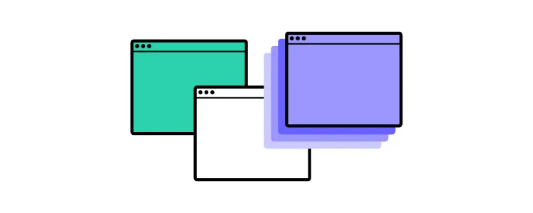
Wireframe vs. Mockup vs. Prototype
Understanding the progression helps you use each artifact at the right time:
| Artifact | Fidelity | Focus | Interactive? |
|---|---|---|---|
| Wireframe | Low | Structure, layout, content hierarchy | No |
| Mockup | High | Visual appearance — color, typography, imagery | No |
| Prototype | High | Behavior — clicks, transitions, state changes | Yes |
The typical flow is wireframe → mockup → prototype, though experienced teams using established design systems sometimes skip directly from brief to mockup or even to prototype.
When to Use UI Mockups
Create mockups after you have resolved structural decisions during wireframing — screen count, layouts, CTAs, navigation, and information architecture. With those pieces in place, generating mockups and moving to high-fidelity prototyping becomes faster and more focused.
Teams using UXPin with a component library or design system can often skip the separate wireframing step entirely, since code-backed components already carry real visual styling.
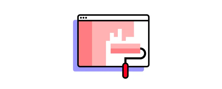
Anatomy of a UI Mockup
Content Layout
A mockup replaces wireframe placeholders with actual content — real (or representative) images, UI components, and text. The content drives the layout pattern (F-pattern, Z-pattern, card grid), as designers decide how to prioritize and arrange elements within the screen’s constraints.
Color & Contrast
Color defines branding, content grouping, hierarchy, and emotional tone. Contrast is essential for legibility and accessibility. UXPin’s built-in accessibility features include color-blindness simulation and WCAG contrast checking — no external tools needed.
Typography
Mockups are the first opportunity to see typography choices in context — font size, weight, line height, and spacing interacting with real content and surrounding elements. Pay special attention to readability at actual rendering sizes, not just in a style guide.
Spacing & White Space
Spacing improves legibility, defines visual hierarchy, and draws attention to key elements. Strategic white space around a CTA or hero image makes it stand out without adding visual noise.
3 Types of Mockup Tools
1. Graphic Design Software
Some designers use tools like Photoshop or Illustrator for mockups. The drawback: these are not prototyping tools, so you must recreate everything in a separate application to add interactivity. This extra step introduces errors and wastes time.
2. UX Design Tools
Specialized tools like UXPin are purpose-built for the wireframe-to-mockup-to-prototype workflow. Drag components from a design library or your design system, arrange them into mockups, and add interactions — all without switching tools.
With UXPin Merge, mockup components are real, production-grade code. An MUI Button in your mockup is the same MUI Button your developers ship. This eliminates visual drift between design and production.
3. Code-Based Mockups
Technically proficient designers sometimes build mockups directly in HTML/CSS/JS. This guarantees no surprises at handoff, but building and iterating in code is slow compared to using a visual tool.
UXPin bridges this gap: designers work visually, but the underlying components are code. You get the speed of a design tool with the fidelity of coded mockups. Libraries like MUI, shadcn/ui, and Bootstrap are available out of the box.
AI-Generated Mockups with UXPin Forge
In 2026, the fastest way to create a UI mockup is often to describe it. UXPin Forge generates high-fidelity mockup layouts from multiple input methods:
- Text prompt: “Dashboard with a sidebar navigation, KPI cards, a line chart, and a data table using our design system.”
- Image upload: Upload a sketch, screenshot, or whiteboard photo and Forge converts it into a component-based layout.
- URL-to-UI: Point Forge at an existing page and it rebuilds the layout using your component library.
Because Forge generates from your actual production components — not generic shapes — the output is already on-brand and exports as clean JSX. AI handles the initial 80% of layout work; designers refine the remaining 20% with UXPin’s professional tools.
Forge also supports conversational iteration: instead of regenerating from scratch, you can say “Move the filters above the table” or “Replace the pie chart with a bar chart,” and Forge modifies the design in place. This makes the mockup creation process feel more like directing a skilled assistant than wrestling with a blank canvas.
From Mockup to Production Code
The traditional mockup-to-code handoff is where most design work loses fidelity. Developers interpret static images, make assumptions about spacing and behavior, and rebuild everything from scratch. This gap is where visual inconsistencies are born.
UXPin Merge eliminates this gap entirely. When your mockup is built from production React components, the handoff is not an interpretation — it’s a direct transfer:
- Developers inspect real code: Every component in the mockup has actual props, states, and styling that engineers can inspect in Spec Mode.
- JSX export: The layout can be exported as production-ready JSX, ready to integrate into the codebase.
- No visual drift: Because the mockup uses the same components as production, what designers see is exactly what ships.
Enterprise teams using Merge report up to 50% reduction in engineering time for UI implementation — because engineers stop rebuilding what designers already assembled.
Best Practices for Creating UI Mockups
- Start mobile-first. Mobile-first design forces content prioritization. Scaling down from desktop often leads to compromises on small screens.
- Avoid switching tools. Use an end-to-end design tool like UXPin for wireframing, mockups, and prototyping. Switching apps introduces errors and breaks context.
- Use a component library. A UI kit or design system lets you build, test, and iterate mockups much faster than designing from scratch.
- Don’t reinvent the wheel. Industry-standard UI and UX patterns reduce the learning curve for users. Apply familiar patterns and customize only where your product requires it.
- Adopt a minimalist approach. Every element should earn its place. Remove anything that doesn’t support the user’s primary task.
- Leverage design-tool features. UXPin’s Components feature lets you save and reuse elements, while Auto-Layout automatically resizes and rearranges content as you edit.
- Name files and layers properly. A consistent naming convention keeps projects organized and makes documentation, handovers, and onboarding smoother.
3 Tips for Collaborating with Developers on Mockups
- Use Atomic Design methodology. Explain UI from smallest atoms to larger molecules, organisms, and page templates. This helps developers visualize the component hierarchy and build reusable code.
- Annotate interactions clearly. Static mockups don’t show behavior, so annotate animations, transitions, and state changes. Better yet, link to a UXPin prototype where developers can experience the interactions firsthand.
- Use code-backed components. When mockups are built with UXPin Merge, developers can inspect the actual component code, copy production-ready JSX, and skip the manual recreation step entirely. This can reduce engineering time by up to 50%.
Ready to build mockups that transition seamlessly to production code? Start a free UXPin trial and experience the difference code-backed design makes.
Frequently Asked Questions About UI Mockups
What is a UI mockup?
A UI mockup is a high-fidelity, static visual representation of a digital product’s interface. It shows the final layout, color palette, typography, icons, and content hierarchy — a pixel-accurate preview — but without interactive functionality.
What is the difference between a wireframe, a mockup, and a prototype?
A wireframe is a low-fidelity skeleton showing layout and structure. A mockup adds visual detail — colors, typography, images — but remains static. A prototype adds interactivity — clickable buttons, transitions, and real behavior. The progression is wireframe → mockup → prototype.
When should I create a mockup?
Mockups typically follow the wireframing phase, once layout, navigation, and information architecture have been decided. They are created before prototyping to lock in visual decisions and gather stakeholder feedback.
What tools are used to create UI mockups in 2026?
Common approaches include graphic design software (Photoshop), dedicated UX design tools (UXPin, Figma, Sketch), and code (HTML/CSS). UXPin is unique because designers can build mockups with real, code-backed components and transition directly to interactive prototyping.
Can AI generate UI mockups?
Yes. UXPin Forge generates high-fidelity mockup layouts from a text prompt, image upload, or URL — using your production component library. AI handles the initial layout, and designers refine the details with professional tools.
How do I hand off mockups to developers effectively?
Use a design tool with developer handoff features like UXPin’s Spec Mode. When mockups are built with code-backed components via UXPin Merge, developers can copy production-ready JSX directly — no manual recreation needed.


