Design with Fluent UI Components: Free React Library for Prototyping (2026)
Microsoft’s Fluent UI is one of the most widely adopted React component libraries for enterprise applications — and it’s available as a fully interactive, drag-and-drop library inside UXPin. Designers can prototype with the same production-grade components that developers ship, then hand off clean, copyable code.
This guide covers what Fluent UI is, why enterprise teams choose it, and exactly how to start prototyping with Fluent UI components in UXPin — including with UXPin Forge, which can generate complete interfaces from a text prompt using real Fluent UI components.
What Is Fluent UI?
Fluent UI is an open-source React component library developed and maintained by Microsoft. It powers the interfaces of Microsoft 365, Teams, Azure Portal, and other Microsoft products — and it’s available for any team to use.
Key characteristics of Fluent UI:
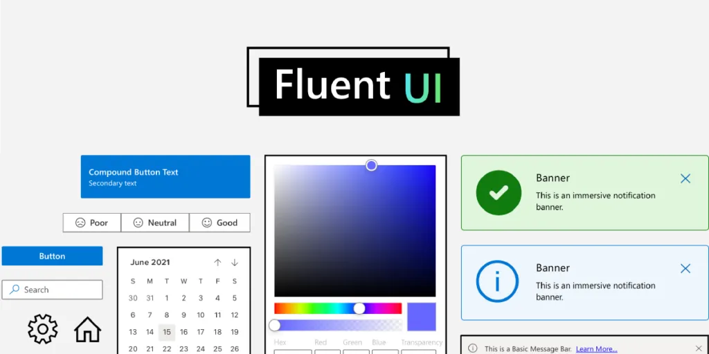
- Enterprise-grade components — Pivot tables, data grids, command bars, date pickers, charts, and 70+ other components built for complex business applications.
- Accessibility first — Every component ships with WCAG-compliant keyboard navigation, screen reader support, and high-contrast mode.
- Cross-platform — Components work across desktop, tablet, and mobile, and across operating systems (Windows, macOS, iOS, Android).
- Customisable theming — Override colours, typography, spacing, and border radius to match your brand while retaining Fluent’s interaction patterns.
- Well-documented — Extensive documentation, Storybook examples, and an active GitHub community.
If your team builds enterprise dashboards, admin panels, internal tools, or any product in the Microsoft ecosystem, Fluent UI is a natural choice.
Why Use Fluent UI in UXPin?
Most design tools treat Fluent UI as a static UI kit — a collection of rectangles that look like buttons but don’t behave like them. UXPin is different. Through Merge technology, UXPin brings the actual React components onto the design canvas. That changes the entire prototyping workflow.
Design Faster With Drag-and-Drop Components
Build prototypes by dragging fully functional Fluent UI components from the library panel onto your canvas. No need to recreate buttons, dropdowns, or tables from scratch. Assemble screens, test with users, and iterate — all in a fraction of the time it takes with image-based tools.
Build Interactive Interfaces Without Code
Fluent UI components in UXPin are fully interactive out of the box. A DatePicker opens a calendar. A Dropdown expands with real options. A Toggle switches states. You can set up component properties — variants, sizes, disabled states — just as a developer would set props in React. The result is a prototype that behaves like the final product.
Streamline Design-to-Development Handoff
When you share a UXPin prototype with your engineering team, developers can inspect any component in Spec Mode and copy the ready-to-use code. Because these are the same components engineers import into their codebase, there’s no interpretation gap. What designers build is what developers ship.
Enterprise teams using UXPin Merge report up to 50% reduction in engineering time thanks to this single-source-of-truth approach.
Generate Fluent UI Interfaces With AI
UXPin Forge takes this even further. Describe the screen you need — “a user management dashboard with a data table, search bar, and filter sidebar” — and Forge generates an interactive prototype using real Fluent UI components. You can also upload a screenshot or paste a URL, and Forge will recreate the layout with production components.
Because Forge is constrained to your connected component library, every generated element is a real, buildable component — not a generic placeholder. After generation, use UXPin’s professional design tools to refine the last 20%.
Fluent UI Components Available in UXPin
The Fluent UI library in UXPin includes 70+ interactive components. Here’s a selection of the most-used ones:
| Category | Components |
|---|---|
| Inputs | Button, Checkbox, ComboBox, DatePicker, Dropdown, RadioGroup, SearchBox, Slider, SpinButton, TextField, TimePicker, Toggle |
| Data Display | DetailsList (data grid), Table, Avatar, Badge, Card, Label, Tag, Tooltip |
| Navigation | Breadcrumb, CommandBar, Nav, Pivot (tabs), Link |
| Feedback | Dialog, MessageBar, ProgressIndicator, Spinner, Toast |
| Layout | Divider, Stack, Accordion, Panel, ScrollablePane |
| Data Visualisation | Charts (bar, line, pie, donut), Sparkline, HeatMap |
| Pickers | ColorPicker, PeoplePicker, SwatchColorPicker, Calendar |
Each component supports property configuration on the canvas — change variants, sizes, labels, and states without writing code.
How to Start Using Fluent UI in UXPin
Getting started takes less than five minutes:
- Sign up for a free trial — Fluent UI is available immediately during the 14-day trial period.
- Create a new prototype from the UXPin Dashboard.
- Open the Design System Libraries panel in the left sidebar and select Fluent UI.
- Drag and drop components onto your canvas. Configure properties in the right panel — set labels, variants, disabled states, and more.
- Preview your prototype to see full interactivity — dropdowns expand, toggles switch, calendars open.
- Share with developers — they can open Spec Mode to inspect dimensions, spacing, and copy component code.
Fluent UI vs. Other Component Libraries in UXPin
UXPin supports multiple production component libraries. Here’s how Fluent UI compares:
| Library | Best For | Components |
|---|---|---|
| Fluent UI | Enterprise apps, Microsoft ecosystem, data-heavy tools | 70+ |
| MUI (Material UI) | Consumer-facing apps, Material Design | 60+ |
| shadcn/ui | Modern, minimal apps, Tailwind CSS-based | 40+ |
| Bootstrap | Marketing sites, general-purpose web apps | 50+ |
| Ant Design | Enterprise apps, Chinese market, data-intensive | 60+ |
You can also bring your own custom React component library into UXPin using the Merge Git integration or Merge CLI tool.
Who Should Use Fluent UI?
- Enterprise product teams building internal tools, admin panels, and dashboards.
- Teams in the Microsoft ecosystem who want visual consistency with Office 365, Teams, and Azure.
- Designers working with React developers who want a shared component language between design and code.
- Accessibility-focused teams — Fluent UI’s built-in a11y support reduces the work needed to meet WCAG standards.
Start Prototyping With Fluent UI
UXPin is the only design tool where AI generation, professional design capabilities, and production code output all operate from the same source of truth — your actual component library. With Fluent UI in UXPin, you get:
- Interactive prototypes with real component behaviour — no faking it.
- AI-powered generation with Forge — describe what you need and get a working prototype in seconds.
- Production-ready handoff — developers copy real code, not redline documents.
- Design system consistency — every prototype is built from the same components your engineers use.
Start your free 14-day trial and prototype with Fluent UI components today.
Frequently Asked Questions
What is Fluent UI?
Fluent UI is Microsoft’s open-source React component library for building accessible, enterprise-grade web applications. It provides pre-built components like buttons, tables, charts, and date pickers that follow Microsoft’s design language and work across devices and platforms.
Is the Fluent UI library in UXPin free?
Fluent UI components are available during UXPin’s 14-day free trial. The library includes 70+ fully interactive components that you can drag and drop onto the canvas, configure properties, and preview in real time.
Can I copy Fluent UI code from UXPin?
Yes. UXPin’s Spec Mode lets developers inspect any Fluent UI component and copy its code. Because the components are real React code, the output maps directly to what engineers use in production.
How does Fluent UI differ from Material UI (MUI)?
Fluent UI follows Microsoft’s design language and is optimised for enterprise and productivity applications, with components like pivot tables and command bars. MUI follows Google’s Material Design and is more common in consumer-facing apps. UXPin supports both libraries.
Can I use Fluent UI with UXPin Forge?
Yes. UXPin Forge can generate interfaces using components from any library connected via Merge, including Fluent UI. Describe what you need in a text prompt, upload a screenshot, or paste a URL, and Forge builds an interactive prototype with real Fluent UI components.
What types of applications is Fluent UI best suited for?
Fluent UI excels in enterprise and productivity applications — dashboards, admin panels, data-heavy tools, and any product that integrates with the Microsoft ecosystem. Its built-in accessibility, responsive design, and complex components like data grids make it ideal for business software.


