Want to streamline your UX design process? Combine Claude Sonnet 4.5, Bootstrap, and UXPin Merge to create faster, production-ready prototypes. This workflow bridges the gap between design and development, cutting down on revisions and ensuring alignment with final products.
Key Takeaways:
- Claude Sonnet 4.5: AI-powered tool for generating UX ideas, layouts, and interface copy aligned with Bootstrap.
- Bootstrap: Provides pre-built, responsive UI components for consistent designs.
- UXPin Merge: Lets designers use real, code-based components for interactive prototypes.
Why This Matters:
- Designers and developers work from the same component library, reducing miscommunication.
- Prototypes are built with production-ready code, saving time and effort.
- Ideal for SaaS dashboards, internal tools, and customer-facing portals.
This guide shows you how to:
- Set up Claude Sonnet 4.5 to produce Bootstrap-compliant outputs.
- Write effective prompts for AI to generate accurate layouts.
- Use UXPin Merge to create interactive prototypes with real components.
Ready to simplify your design-to-development workflow? Let’s dive in.
UXPin Merge Tutorial: Intro (1/5)
sbb-itb-f6354c6
Setting Up Claude Sonnet 4.5 and Bootstrap for UX Design
To get the most out of Claude Sonnet 4.5 for UX design, it’s crucial to establish a clear framework. Without it, the model might produce generic markup that doesn’t align with your design system. The aim is to create a consistent prompting structure so all outputs are compliant with Bootstrap and ready for integration into UXPin Merge. This ensures the components generated are immediately usable.
How to Configure Claude Sonnet 4.5 for UX Workflows
Start by drafting a team-wide system message that defines Claude’s role and boundaries. For example:
"You are a senior UX engineer working with Bootstrap 5 and UXPin Merge. Always use Bootstrap utility classes, follow mobile-first responsive patterns, and apply WCAG 2.1 AA accessibility standards."
This message acts as a foundation, keeping Claude focused on producing outputs that adhere to your design standards.
Next, develop a shared Bootstrap vocabulary. This is a quick-reference guide listing your approved Bootstrap components (e.g., navbar, card, modal, toast), spacing scales, color tokens, and their mapping to UXPin Merge props. Include 3–5 example snippets, such as a standard form layout or a card design. These examples help Claude understand the exact structure and classes to replicate.
To maintain organization across your team, set up a clear file structure for AI-generated assets. Use folders like /ai-specs, /ai-prototypes, and /ai-snippets to keep everything accessible for designers and developers. Before incorporating any AI output into UXPin Merge, review it carefully for design accuracy, semantic HTML, and accessibility compliance.
Writing UX-Focused Prompts for AI
Vague prompts, like “create a responsive landing page”, lead to vague results. A well-crafted prompt should include four key elements: context, goal, constraints, and output format. Adding a self-check instruction ensures Claude reviews its output for common errors before submission.
Here’s an example of a detailed prompt for a pricing section:
"You are helping design a responsive pricing section using Bootstrap 5 and UXPin Merge components. Generate HTML for a mobile-first layout with three plans using Bootstrap grid and cards. Use
container,row, andcol-12 col-md-4– no fixed pixel widths. Include pricing in USD (e.g., $49/month). Headings must follow a logical hierarchy; includearia-labels for interactive icons; ensure color combinations meet WCAG AA. Return only<main>...</main>HTML, no explanations, no<html>or<body>tags, Bootstrap classes only, no custom CSS. Before returning the code, verify: responsive grid, ARIA attributes, and US-appropriate copy."
Building Reusable Prompt Templates
Once you’ve nailed down your prompt structure, take it a step further by creating reusable templates. These templates can help ensure consistent results for common tasks like layouts, forms, navigation, and component variations. Each template should include fixed sections for constraints and output formatting, with placeholders for variable details like page type or field lists.
Store these templates in a version-controlled repository under a folder like /ai-prompts/bootstrap-ux/. Use clear file names, such as layout-dashboard.md or form-authentication.md, and include a version header inside each file (e.g., "Version 1.2 – aligned with Bootstrap 5.3 and UXPin Merge"). After each project, document any issues or adjustments needed for specific templates. This feedback loop will help refine your prompts into highly reliable tools for future projects.
Integrating Bootstrap Components with UXPin Merge
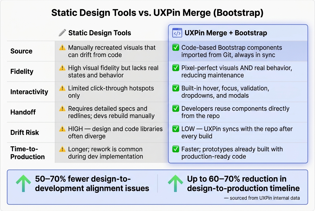
Static Design Tools vs. UXPin Merge with Bootstrap: Key Differences
Once your prompts and templates are ready, the next step is importing Bootstrap components into UXPin Merge. This ensures your designs are built with production-ready code instead of static mockups.
How to Connect a Bootstrap Component Library
UXPin includes native Bootstrap integration, so you can start using Bootstrap components right away. However, if your team works with a custom Bootstrap library, you’ll need to connect it through Git.
To link a custom Bootstrap library, you’ll need a React component library, a Git repository, and an active UXPin Enterprise plan with Git integration. Many teams in the US prefer GitHub paired with React-Bootstrap for its seamless CI/CD workflow.
Here’s how the connection process works: First, prepare your library by exporting components like <Button>, <Navbar>, and <Card> and ensuring Bootstrap CSS is imported centrally. Create a protected design-system branch. Next, in UXPin Merge settings, add a Git integration, point it to your repository and branch, and configure the build command (e.g., npm install && npm run build). Once the build completes successfully, organize components into categories like Forms, Navigation, and Feedback for easier access.
One common mistake is forgetting to bundle all dependencies – if Bootstrap’s CSS or your custom theme file is missing, components will appear unstyled in UXPin. Additionally, avoid exposing raw className strings as props. Instead, use constrained enums so designers can select options from dropdowns rather than typing class names manually.
Once your library is integrated, you can start using these components directly in the design canvas.
Designing with Bootstrap Components in UXPin
With your library connected, you can create interactive prototypes that reflect real-world behavior. Simply drag components like Navbar, Card, or Modal from the component panel and adjust their behavior using the Properties panel – no coding required.
For example, imagine building a SaaS analytics dashboard. You could add a Navbar with a brand logo and user menu, place metric Cards using the Bootstrap grid to display key SaaS stats, and include Tabs for sections like "Overview", "Customers", and "Billing." These components will render with accurate spacing, typography, and interactive features like hover effects, dropdowns, and modals – all functioning straight out of the box.
You can also fine-tune responsive behavior by setting column widths (sm, md, or lg) directly in the Properties panel. Preview your design at common US screen sizes – 1440px for desktop, 1024px for tablets, and 390px for mobile – to ensure the layout adapts well across devices. You can even configure US-specific details like $49.00 pricing, ZIP code fields, and state dropdowns using component properties, keeping your prototypes realistic from the start.
Static Design Tools vs. UXPin Merge: A Side-by-Side Comparison
To see the impact of this approach, compare it to traditional design workflows. This side-by-side breakdown highlights how UXPin Merge, paired with Bootstrap, streamlines the design-to-development process.
| Aspect | Static Design Tools | UXPin Merge (Bootstrap) |
|---|---|---|
| Source | Manually recreated visuals that can drift from code | Code-based Bootstrap components imported from Git, always in sync |
| Fidelity | High visual fidelity but lacks real states and behavior | Both pixel-perfect visuals and real behavior, reducing maintenance work |
| Interactivity | Limited to click-through hotspots; advanced interactions require extra effort | Built-in hover, focus, validation, dropdowns, and modals |
| Handoff | Requires detailed specs and redlines; devs rebuild components manually | Developers reuse components directly from the repo, minimizing specs |
| Drift Risk | High; design and code libraries often diverge | Low; UXPin syncs with the repo after every build |
| Time-to-Production | Longer; rework is common when devs implement the UI | Faster; prototypes are already built with production-ready code |
According to UXPin’s internal data, teams using Merge experience 50–70% fewer design-to-development alignment issues and reduce the design-to-production timeline by up to 60–70%. The reason is simple: when designers and developers work from the same component source, there’s no room for miscommunication or errors.
Generating Bootstrap UX Patterns with Claude Sonnet 4.5
With your Bootstrap components now integrated via UXPin Merge, you can use Claude Sonnet 4.5 to create reusable UX patterns. Claude provides a structural draft that you can refine into production-ready designs.
Step-by-Step: AI-Assisted UX Creation
The quality of Claude’s output depends heavily on the clarity of your prompt. A well-crafted prompt can produce markup that’s almost ready for enterprise use.
Building on earlier prompt techniques, here’s a structure tailored for US enterprise workflows:
Role: "Act as a senior UX engineer building enterprise web apps with Bootstrap 5 and WCAG 2.1 AA compliance."
Context: "This is an internal expense approval dashboard for a US-based company."
Goal: "Generate responsive HTML using Bootstrap 5 for an internal expense approval dashboard with a sidebar navigation, summary cards showing USD totals, a sortable expense table (columns: date, merchant, category, amount), and an approval modal."
Constraints: "Use Bootstrap 5 classes only – no inline styles, no custom CSS, no external JS."
Localization: "Use MM/DD/YYYY for dates, 12-hour time with AM/PM, and USD currency formatted as $1,250.50."
Accessibility: "Addaria-labelon all buttons and links,aria-expandedon toggles,aria-describedbyon form fields, and ensure tab order."
Output format: "Return HTML only. Wrap each screen in comments like<!-- Expense list page -->."
Claude generates markup using standard Bootstrap patterns, giving you a semantically correct starting point in minutes rather than hours.
Once you have the initial markup, refine it to fit your design system before importing it into UXPin Merge.
Refining AI Outputs for UXPin Merge
Claude’s raw output is a draft that needs adjustments to align with your design system. Here’s a six-step process for refining it:
- Strip non-standard code: Remove inline styles, hard-coded hex colors, or any non-Bootstrap classes. Stick to semantic HTML and Bootstrap utility classes for seamless integration with Merge components.
- Break it into components: Divide the markup into smaller, reusable pieces that match your design system, following component-driven prototyping principles. For example, separate it into
ExpenseSummaryCards,ExpenseTable,ApprovalModal, andSidebarNav. - Apply your design tokens: Replace generic Bootstrap defaults with classes linked to your design tokens. If
.btn-primaryand.text-primaryalready use your brand colors, no extra work is needed. - Fix naming conventions: Standardize IDs, data attributes, and component names to match your team’s coding guidelines, ensuring maintainability.
- Validate accessibility: Check for keyboard focusability, proper focus trapping in modals, and WCAG 2.1 AA color contrast compliance. Replace vague link text like "Click here" with more descriptive labels.
- Map to Merge components: Bind each refined HTML structure to the corresponding React/Bootstrap component in UXPin Merge. This allows designers to work with live, code-backed elements rather than static mockups.
This process transforms an AI-generated draft into reusable, Merge-ready components. By iterating 2–3 times with targeted feedback, you can refine the UX logic to the point where it requires minimal adjustments in Merge.
Raw AI Output vs. UXPin Merge Prototype: A Comparison
Here’s a side-by-side comparison showing the transformation from raw AI-generated markup to a fully refined UXPin Merge prototype:
| Aspect | Raw AI Bootstrap Output | UXPin Merge Prototype (Refined) |
|---|---|---|
| Visual consistency | Generic Bootstrap defaults; spacing and typography may not match your design system | Token-bound classes ensure consistent spacing, colors, and typography |
| Accessibility | ARIA attributes may be incomplete or missing; focus order can be illogical | Fully validated ARIA labels, logical tab order, and WCAG 2.1 AA color contrast |
| US localization | Dates and currency may default to ISO or non-US formats if not explicitly prompted | MM/DD/YYYY dates, 12-hour AM/PM time, and USD formatting applied consistently |
| Interactivity | Static HTML; modals and dropdowns require manual JS wiring | Functional Bootstrap behaviors like hover states, modals, and validation included |
| Reusability | Monolithic HTML block; hard to reuse across screens | Componentized markup with props, ready for drag-and-drop use in prototypes |
| Production readiness | Requires significant developer rework before deployment | Built on production-ready code; developers can reuse components directly |
While Claude efficiently generates the structural foundation, UXPin Merge refines these drafts into polished, reusable components that developers can implement with ease. This combination speeds up the transition from concept to production-ready design.
Building a Component-Driven UX Workflow with UXPin Merge and Forge
With AI-powered layouts and reusable components in place, this workflow takes team collaboration and efficiency to the next level. When Bootstrap patterns are ready for Merge, a systematic approach eliminates unnecessary rework for both designers and developers.
Using Forge to Generate Layouts
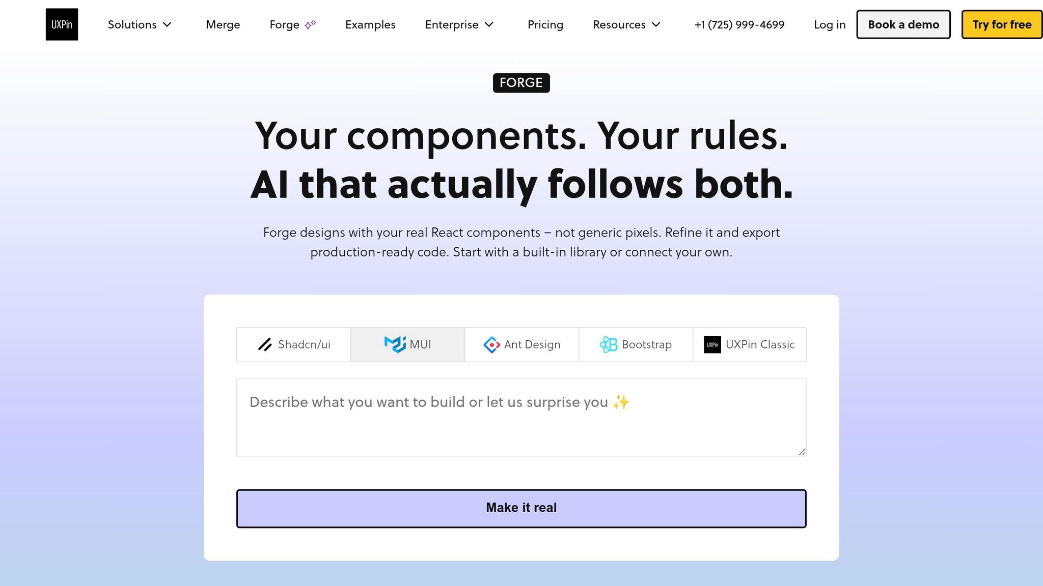
Forge, UXPin’s built-in AI assistant, works directly within your design system. Here’s how it operates: you describe a screen – like "a responsive account settings page with tabs for Profile, Security, and Billing, form fields, and a save confirmation state" – and Forge generates a layout. Importantly, it only uses Bootstrap components from your pre-approved Merge library. No off-brand elements or invented patterns sneak in.
The process is simple. Choose your Bootstrap-based Merge library, write a prompt specifying details like a 12-column grid, component density, and type, and Forge will create a layout. From there, you can tweak variants, refine text, and wire interactions – all within UXPin. Because Forge is integrated into UXPin, there’s no need for an extra AI subscription or importing external code.
UXPin notes that using Merge can cut the time to create a high-fidelity prototype by 70–90% compared to redrawing UI in static tools. Designers work with prebuilt components instead of starting from scratch.
After generating layouts, the next step is converting Bootstrap patterns into reusable components.
Turning Bootstrap Patterns into Reusable Components
Take common Bootstrap UI patterns – like confirmation modals, CRUD tables, or multi-step forms – and transform them into reusable Merge components with defined properties. Designers and developers agree on a standard pattern (e.g., a "danger" confirmation modal with primary and secondary actions). Developers then wrap the Bootstrap elements into a single component with configurable props like title, bodyText, primaryActionLabel, and variant. Once added to the Merge library, designers can adjust these components using UI controls instead of code. This ensures features like sorting, server-side pagination, row selection, and accessibility are implemented once and applied consistently wherever the component is used.
UXPin case studies show that teams using Merge experience significantly less front-end rework. One study even reported "almost zero" UI discrepancies between design and implementation after adopting Merge components.
How Teams Collaborate Using UXPin Merge
Reusable components form the backbone of a synchronized design and development process. With Merge, collaboration depends on a shared library, clear ownership, and a lightweight governance model. A core design system team manages the Bootstrap-based Merge library, approves new components, and oversees deprecations. Feature teams use project-specific UXPin workspaces, leveraging Forge to draft layouts before refining them with approved components.
Treat component updates like software releases: version them, document changes, and flag deprecated components with migration guidance. Merge prototypes allow cross-functional teams to review interactive designs that mimic the final product. This minimizes misalignment and reduces late-stage rework.
Here’s how roles can be structured for clarity:
| Role | Responsibility |
|---|---|
| Design system team | Manages the Merge library, approves new components, and handles versioning |
| Feature designers | Use approved components and propose new patterns through UXPin prototypes |
| Engineers | Build and publish components to Merge, ensuring technical feasibility |
| Product managers | Validate prototypes against requirements and provide sign-off before development |
This approach keeps design specs, component behaviors, and production code aligned, ensuring smooth collaboration across teams.
Conclusion: Scaling UX with AI and Code-Driven Design
This workflow shifts the way UX is crafted, moving away from static screens to a unified, code-powered approach. Here’s how it works: Claude Sonnet 4.5 generates structured layouts, Bootstrap ensures component consistency, and UXPin Merge turns ideas into interactive prototypes built from the exact components engineers use for production.
Studies indicate that AI-assisted design can cut early-stage ideation time by 20–50%, speed up prototyping, and reduce handoff cycles. The result? Less rework and quicker stakeholder approvals – clear advantages that pave the way for broader adoption.
To scale your design process effectively, focus on three core elements: reusable prompt templates, a centrally managed Merge library, and a well-defined component ownership model. Collaboration is key – design system teams, feature designers, engineers, and product managers must work together with clear governance to make this system practical and efficient.
For enterprise teams in the U.S., it’s essential to track metrics like the time it takes to move from an idea to a testable prototype, the rate of design-to-development rework, and component reuse across teams. These indicators reveal whether your workflow is genuinely speeding things up or unintentionally adding complexity.
FAQs
What should I include in a team-wide system message for Claude Sonnet 4.5?
In a UXPin Merge workflow, it’s crucial to set up a system message that ensures adherence to both design and technical standards. Here’s how you can achieve that:
- Use Approved React Bootstrap Components: Stick exclusively to the components provided by React Bootstrap. This ensures uniformity across the design system and avoids introducing inconsistencies.
- Align with Design Tokens: All outputs should reflect the predefined design tokens for elements like spacing, colors, and typography. This keeps the design consistent and predictable.
- Follow Accessibility Guidelines: Ensure outputs comply with accessibility standards, such as proper contrast ratios, ARIA roles, and keyboard navigation.
- Write Clean, Production-Ready JSX: The JSX should be optimized for production, with no unnecessary code or inline styles. Maintain clarity and simplicity in the structure.
- Leverage Bootstrap 5 Utility Classes: Use the utility classes provided by Bootstrap 5 to handle spacing, alignment, and other layout adjustments. This avoids the need for custom CSS.
- Responsive Grid Solutions: Ensure designs are fully responsive by utilizing Bootstrap’s grid system and breakpoints. This guarantees a seamless experience across all devices.
- Avoid External CSS: To maintain consistency, do not include any external CSS. Rely solely on the approved components and utility classes for styling.
By enforcing these rules, you can maintain a cohesive design system while ensuring technical precision.
Do I need a custom Bootstrap React library in Git to use UXPin Merge?
No, you don’t need a custom Bootstrap library in Git if you’re working with the standard version of Bootstrap. That’s because Bootstrap is already integrated into UXPin, and you can find its preloaded components in the Design Systems panel. However, if your organization uses a modified version of Bootstrap, then a custom library becomes necessary. In that case, you can either connect it through Git integration or import it using npm.
How do I turn Claude’s HTML into reusable Merge components?
To turn Claude’s code into reusable components in UXPin Merge, start by ensuring the code is tested and organized as React components. If you’re working with custom libraries, use the Merge Component Manager to bring them in via npm. Here’s how:
- Click Add Library and select Import React Components.
- Enter the package names, such as
react-bootstraporbootstrap, and include the CSS path (e.g.,bootstrap/dist/css/bootstrap.min.css).
Once imported, define props and variants for your components. This allows for easy customization directly in the Properties Panel, making the components more flexible and user-friendly.