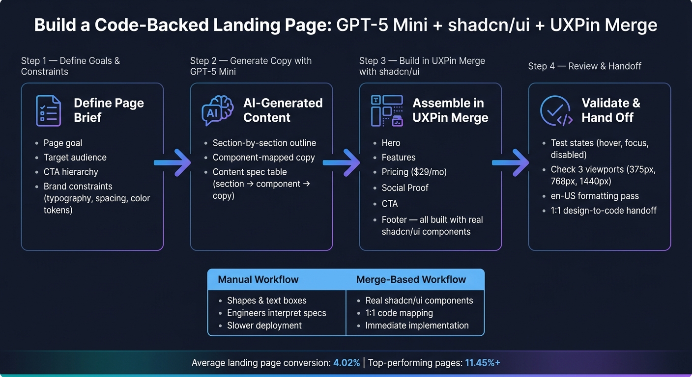
If you want a landing page done with less back-and-forth, this process is simple: I use GPT-5 Mini to draft the page plan and copy, then I place that content into shadcn/ui components inside UXPin Merge. The result is a code-backed prototype with the main sections already mapped: hero, features, social proof, pricing, CTA, and footer.
Here’s the core idea in plain English: landing pages often convert at around 4.02%, and top pages can pass 11.45%. So the main parts – headline, hero image, primary CTA, and form – need to come together fast and cleanly. This workflow helps me do that by keeping copy, layout, and components tied to the same plan.
What I get from this setup:
- A one-page brief with the goal, audience, CTA, and design rules
- GPT-5 Mini output shaped around component-ready sections
- A content spec that maps each line of text to a UI part
- A landing page built with shadcn/ui in UXPin Merge
- A final review for states, responsive behavior, and en-US formatting
The page setup in this guide includes:
- Hero
- Feature section
- Social proof
- Pricing with a starting plan at $29/month
- CTA
- Footer
I also keep the build aligned with U.S. formatting, such as June 28, 2026, 1,000.50, and USD pricing. Below, I’ll walk through the workflow in a short, clear way without repeating the full article.
How to Build a Landing Page with GPT-5 Mini + shadcn/ui in UXPin Merge
Simplest way to build Modern Landing Page (Next.js 15, Shadcn, TypeScript)
sbb-itb-f6354c6
1. Define the page goal, content structure, and design constraints
Before you open GPT-5 Mini or touch a single component in UXPin Merge, write a one-page brief. Keep it focused on four questions: What is the goal? Who is it for? What should visitors do next? What constraints apply?
That brief gives you a shared map. It keeps GPT-5 Mini and UXPin Merge pointed in the same direction, so the output lines up cleanly with shadcn/ui components in UXPin Merge.
Once the brief is ready, use GPT-5 Mini to turn it into section ideas and copy you can actually build with.
Set the conversion goal and section list
Start with one goal in one sentence. For this guide, the goal is: "Drive signups for a guided GPT-5 Mini + shadcn/ui + UXPin Merge workflow that helps teams build code-backed landing page prototypes faster."
Use that sentence to shape the sections GPT-5 Mini should write and the components UXPin Merge should put together.
Then map the user journey into a clear section order as part of your website prototyping process. Use this sequence: hero, value proposition, feature cards, social proof, pricing, and footer.
There’s a simple reason for that order. Visitors need to understand what the workflow does before they trust it. And they need enough proof before they move toward pricing or signup.
The main CTA for this page is "Start Free Trial." Put it in the hero as the primary button, repeat it in the pricing section, and include it in a sticky header.
Secondary CTAs like "View Docs" and "Explore Components" can sit near related content, but they should stay secondary to the main conversion path. Set that hierarchy now, and GPT-5 Mini is much less likely to spit out generic filler that wanders off course.
Next, turn the brief into a prompt that maps each section to a shadcn/ui component.
Document brand and system constraints
Constraints make GPT-5 Mini’s output build-ready. Write them down as a short checklist before you draft any prompts.
For this build, the constraints are:
- Typography: Inter, weights 400/500/600, with a clear heading hierarchy (H1 → H2 → body)
- Spacing: 8 px base grid for section padding, gaps, and component margins
- Color tokens: Mapped to shadcn/ui theme variables –
primary,accent,background,foreground– with no arbitrary hex values - Buttons: One primary button per view; secondary and ghost variants for supporting actions
- Cards: Consistent border radius, subtle shadow, and a standard layout for feature cards and testimonials
Add a short localization checklist to the brief, and reference it in every GPT-5 Mini prompt. Use US English spelling such as "customize", "color", and "behavior"; USD currency; imperial units; and °F where relevant.
Include those rules in every prompt so GPT-5 Mini stays aligned with the locale and the component system.
The next step is to feed these goals and constraints into GPT-5 Mini for a section-by-section outline.
2. Use GPT-5 Mini to generate copy, section ideas, and layout direction
Once your brief and constraints are set, GPT-5 Mini should turn that input into structured content you can place straight into UXPin Merge. The best way to think about it: not as a general writer, but as a component-aware content planner.
Prompt for a section-by-section outline that maps to components
Generic prompts usually lead to copy you can’t use. A better move is to tell GPT-5 Mini exactly which sections to include, which fields to fill out in each one, and which shadcn/ui components the copy should fit.
Here’s a reusable prompt structure you can adjust for this build:
"You are helping me design a SaaS landing page in UXPin Merge using shadcn/ui components. The product helps product designers and UX teams build code-backed landing page prototypes faster using GPT-5 Mini and shadcn/ui. Primary conversion goal: get visitors to start a free trial.
Create a section-by-section outline covering: hero, feature grid, social proof, testimonials, pricing, CTA, and footer. For each section, provide: 1) two headline options (max 70 characters each), 2) supporting body copy (max 140 characters per paragraph), 3) CTA label text where relevant, 4) bullets or stats for cards and badges, and 5) a ‘Component mapping’ line specifying which shadcn/ui components to use – for example, ‘3 cards in a grid with Heading, Text, and Button.’
Localize all copy for US readers: USD currency (e.g.,
$29/mo), US date formats (e.g.,June 28, 2026), commas for thousands (e.g.,10,000 teams), imperial units and Fahrenheit where relevant, American spelling, and neutral, inclusive language."
That Component mapping line is what makes the outline build-ready. It pushes GPT-5 Mini to write each block for a clear shadcn/ui slot instead of handing you loose marketing copy.
Refine the copy into a build-ready content spec
After GPT-5 Mini gives you the first outline, run three tight passes before opening UXPin Merge.
Start with the structural check. Make sure every required section is there and that each one includes all the fields you asked for. If the pricing block is missing CTA labels, prompt:
"Add a primary CTA label to each pricing plan and confirm each plan includes 4–6 feature bullets."
Next comes the component-fit pass. Review each section and see whether the copy fits the component it’s meant for. Hero headlines should stay under 60 characters. Card body text should stay at 1–2 sentences. FAQ answers should top out at 2–4 sentences. If the copy runs long, prompt GPT-5 Mini with:
"Shorten all headlines to under 60 characters and compress card body text so it fits a shadcn/ui card without overflow."
Then move to the content spec. This is where you turn the refined output into a plain mapping of every line of copy to a specific component. For the hero section, it looks like this:
| Section | Component | Content key | Final text |
|---|---|---|---|
hero |
Heading |
hero_title |
"Align design and dev in days, not months" |
hero |
Text |
hero_subtitle |
"Build code-backed prototypes with real shadcn/ui components – no rebuilds, no drift." |
hero |
Button |
hero_primary_cta |
"Start Free Trial" |
hero |
OutlineButton |
hero_secondary_cta |
"Explore Components" |
hero |
Badge |
hero_social_proof |
"Trusted by product teams" |
hero |
Text |
hero_footnote |
"No credit card required. Cancel anytime." |
You can also have GPT-5 Mini make this table for you directly:
"Transform the refined outline into a content spec listing each piece of text with section name, shadcn/ui component type, a content key, and the final copy."
Use that spec directly in UXPin Merge to build the page with real components.
3. Build the page in UXPin Merge with shadcn/ui components
Use the content spec from Step 2 to build the page in Merge. The goal here is simple: turn that spec into an interactive prototype made with real shadcn/ui components so developers can inspect everything during handoff.
Set up UXPin Merge and use the shadcn/ui library
UXPin already includes the built-in shadcn/ui library, so you don’t need to import anything.
If your team works from a custom shadcn-based library, Enterprise also supports custom Library AI integration, Git integration, and onboarding.
Assemble each landing page section with real components
Add each section from the content spec to the canvas with shadcn/ui components. Here’s the basic component match-up:
- Hero: Use a large headline, supporting text, a primary
Button, and a secondaryButtonfor the alternate action. Add aBadgeabove the headline for social proof, then a short line of text below the buttons for support. - Features: Use a three-column grid of
Cardcomponents. Each card can include an icon, a short headline, and one or two sentences of supporting text. Keep the copy short so it sits well inside the component. - Pricing: Use three side-by-side
Cardcomponents. Each one should include a plan name, aBadgefor the featured plan, pricing in U.S. dollars, a short feature list, and aButtonCTA. Use component variants and properties to mark the highlighted plan as featured. - Social proof: Add two or three testimonial
Cardcomponents withAvatarelements for customer photos, names, and roles. Place a short testimonial blurb inside each card. - Footer: Use a multi-column layout with links and legal copy at the bottom. Keep it light: a brief tagline, navigation links, and a copyright line are enough for the prototype.
Use the properties panel to switch states like hover, focus, and disabled so the prototype behaves more like the live component. That makes handoff cleaner because developers can inspect the component props directly.
Use Forge to speed up layout decisions inside UXPin
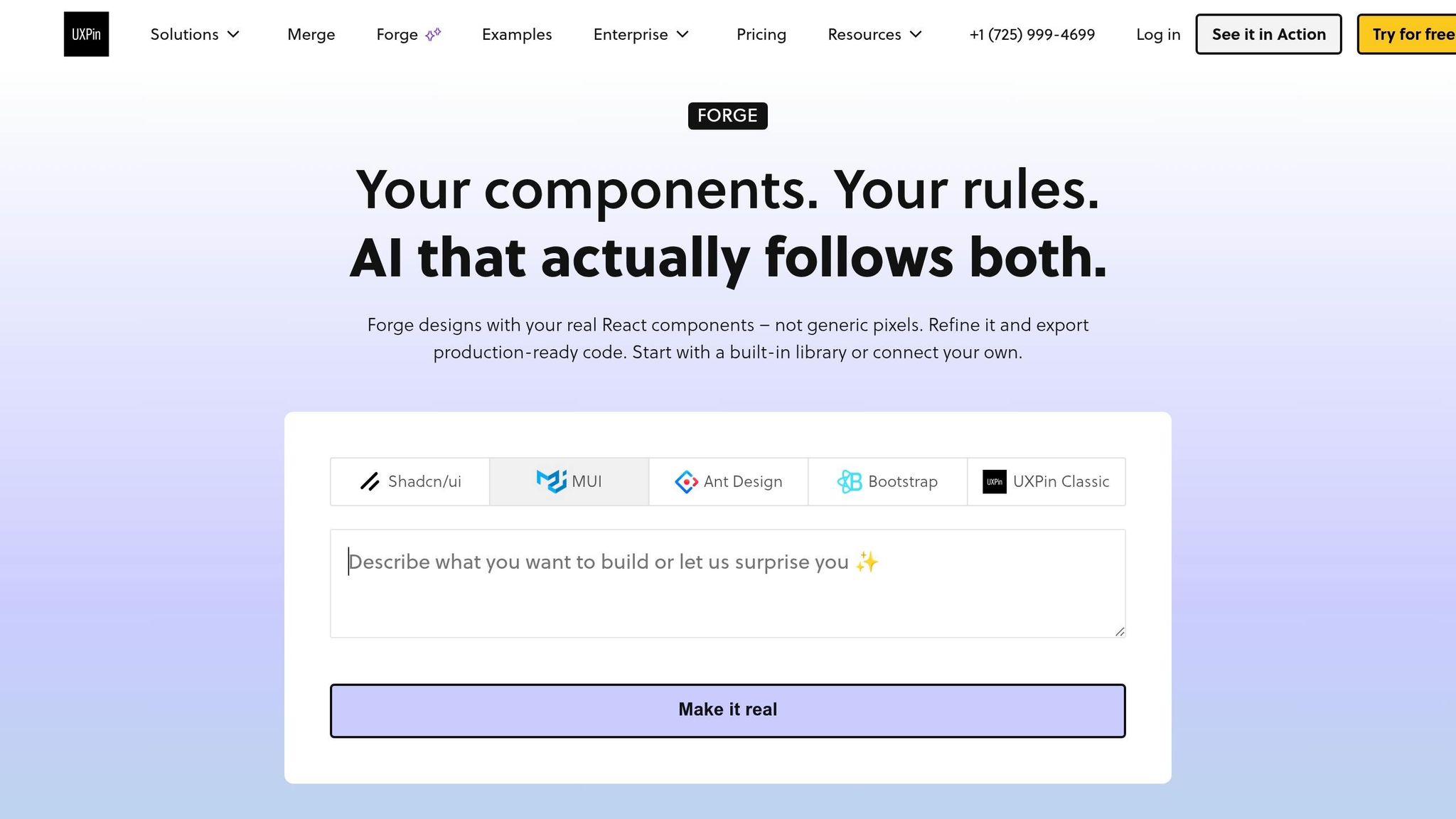
Once your main sections are on the canvas, Forge – UXPin’s built-in AI assistant – can help you try layout variations without rebuilding the page from scratch.
A simple workflow is to ask Forge for alternate arrangements after you place the hero and features sections. For example, you might test a two-column hero against a centered one, or swap a card-based features section for icon-and-text rows. Forge can place these alternate layouts on the canvas using the same shadcn/ui components, which makes it easier to compare spacing, hierarchy, and composition side by side.
After the layout is set, review responsiveness, states, and handoff details. Next, review responsiveness, states, and handoff readiness.
4. Review interactions, assess workflow gains, and prepare handoff
Check responsiveness, states, and en-US copy and formats
With the prototype in place, do one last pass before handoff. In Preview, test the primary and secondary CTAs, pricing toggle, forms, and navigation. Use the same section list, copy, and component props from the build step as your review checklist. That keeps the review tight and makes it easier to spot anything that drifted.
Check that each element moves through its states the right way: hover, focus, active, disabled, loading, and, when needed, error and success. Just as important, make sure those state changes don’t throw off the layout around them.
Then resize the canvas across three viewports: mobile (375–414 px), tablet (768–1024 px), and desktop (1440 px+). Code-backed components tend to surface responsive issues at the component level instead of turning into one-off pixel patches, which makes fixes faster.
Run one last en-US pass for currency, dates, commas, American spelling, and imperial units. A quick check with GPT-5 Mini can catch formatting inconsistencies before handoff.
Code-aligned handoff: Manual vs. Merge-based workflows
After validation, compare the two workflows to show why the Merge-based version cuts handoff friction.
| Manual | Merge-based | |
|---|---|---|
| Workflow steps | Shapes, text boxes, and styles documented separately | Real components assembled with built-in tokens and states |
| Design–dev alignment | Engineers interpret and translate specs | 1:1 mapping between prototype components and code components |
| Component reuse | UI elements approximated or recreated per page | Shared, reusable shadcn/ui components used throughout |
| Speed to deployment | Manual workflows require engineers to interpret and translate specs | Dev can implement immediately because the prototype uses the same components as production |
That code-aligned setup is what makes handoff move faster.
Conclusion: From AI prompt to a code-backed landing page
The end result is a code-backed prototype built from AI-generated structure and real shadcn/ui components. Every section uses approved components, every interaction reflects real props, and every handoff artifact matches the codebase. So you get less design drift, fewer rebuilds, and faster release cycles – not just for one landing page, but for every page that follows the same pattern.
FAQs
How detailed should my brief be before prompting GPT-5 Mini?
Provide a clear brief so the output lines up with what you want.
A good brief should include:
- a short product description
- the main conversion goal
- the target audience
- the tech stack
- the exact shadcn/ui component names you want used
It also helps to spell out design limits. For example:
- spacing rules
- font limits
- layout preferences
- color usage
- breakpoint notes
For localization, state U.S. conventions up front, such as:
- $ for currency
- U.S. English spelling
- MM/DD/YYYY for dates
- U.S. number formatting
If you want output that plugs into your design system with less back-and-forth, use structured JSON or XML tags to map content, fields, and UI sections.
Can I use my own shadcn-based component library in UXPin Merge?
Yes. UXPin Merge comes with a pre-integrated shadcn/ui library out of the box.
But if your team has its own shadcn-based setup, you can connect that too with the UXPin Merge CLI.
You can sync custom components through Git, npm, or Storybook. So if you use team-specific tokens, overrides, or custom components, you’re not stuck with the default setup.
In that case, clone the provided shadcn-merge boilerplate. It includes files like uxpin.config.js and tailwind.config.js, which help make sure those styles and component settings show up correctly in the editor.
What should I review before handing off the landing page?
Before handoff, review the AI-generated content for brand voice, tone, and U.S. localization. That includes details like currency formatting – for example, $29 – and local date formats. Also make sure you’re using the latest shadcn CLI package.
Then test the experience across device previews and canvas sizes. Use UXPin’s accessibility checker to check contrast, ARIA, and focus states, and confirm that interactions and conditional logic behave the way they should.

