Website Prototyping: The Hands-on Guide
A perfect website isn’t made in one smooth creation and launch effort. Seamless and fully functional sites are the result of careful prototyping. Prototypes allow early imperfections to be weeded out of websites and offer opportunities to maximize the effectiveness of your site.
A business’s website is, oftentimes, the first impression made on investors and customers. Understanding how to perfect your website through prototyping is crucial for early success, which is why this article covers website prototyping in depth.
Create a website prototype that you can actually test with users. Build an interactive prototype in UXPin and design a UI that brings the whole team together. Try UXPin for free.

What is a website prototype?
A website prototype is an early version of a site that serves as a starting point. The ability to prototype creates room for exploration, refinement, and perfection in an effective way. One of its best aspects is that it creates a space for development prior to publishing a website.
A prototype can start out in a low-fidelity format and contain a simple outline of the site’s form and function. This outline can evolve into a high-fidelity prototype with all of the details and interactive design intended for the final product.
The flexibility of website prototyping benefits all parties. Designers and developers have a space to perfect their products, while stakeholders can get a realistic idea of the interface early on. Even clients benefit from the flawless user interface that prototyping helps develop.
Benefits of website prototypes
Let’s highlight the most notable impacts website prototyping offers, so you can visualize how your business will benefit.
Visualization
Visually appealing platforms are best created through a visually informed process, like prototyping. A powerful system allows multiple iterations, as the early image of a site develops into something fully functional.
The ability to visualize each step of a site’s development in real time gives everyone involved a chance to be included and inspired. Designers and developers have the option to constantly tweak and interact with their work to find the perfect fit for a site. The ability to actively assess the direction of a project also benefits stakeholders who may not fully understand a team’s progress and goal without interactive visuals.
Early feedback
Nothing is more time-consuming and fruitless than completing a project only to find that, at some point, things are headed in the wrong direction and need to be redone. Prototyping is an effective strategy for avoiding these late-development pitfalls.
When teams are able to interact with their design during all stages of construction, feedback is easily generated and implemented. With the ability to test and reorient the direction of a platform at any time, it is far less likely that the end product will miss its goals at completion.
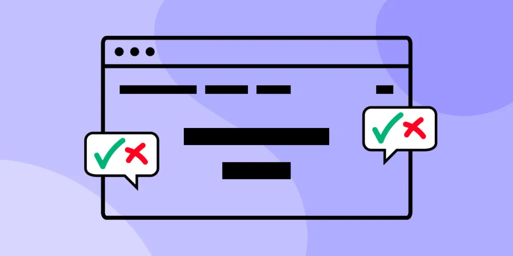
User experience testing
The final product is all about its users, so why not integrate user input as early into the design process as possible?
Prior to a product’s completion, the user interface and user design can be tested on real users with a prototype. This allows for a fully interactive experience, so users can test and provide feedback on all functions of a website.
Risk reduction
Website design can be riddled with hidden pitfalls that only become blatantly apparent when the site is published. User interface issues like confusing navigation and inconsistent design styles can diminish your website’s impact.
Interactive prototyping helps mitigate these risks by bringing issues with website form or function into plain view prior to publishing. What would have been a costly complication, is little more than a slight tweak with a prototype.
You can even reduce risks beyond functionality by using a prototype to ensure the product aligns with the visions of stakeholders. An alignment with company goals is much easier to assess when the site can be easily reviewed during its creation by anyone in the company.
Clear communication
A cohesive and smoothly functioning platform is the result of a well-connected team. While there are plenty of ways to foster general teamwork, communication on a singular product is best accomplished with a shared source of information.
A prototype is the perfect central point of information for a website design team to communicate through. Contributions from all members can be seen and interacted with in this format, allowing all members to be on the same page and discuss various points of improvement.
Efficient iteration
Editing a fully published website is a very complex process that can be avoided with the right tools. The ability to repeatedly create new iterations of a project with ease helps build the best product you can.
An effective and efficient process for creating new iterations of a project encourages teams to make more edits prior to publishing and pursue more creative concepts. As a result, final sites are more likely to run smoothly and stand out from cookie-cutter competitors’ sites.
User-centered design
User research can only go so far. This form of user integration may work for concept creation, but as platforms are developed, more specific user input is needed. Prototypes offer an opportunity to explore user interactions in a way that is unique to your website.
By granting test users access to interact with and review a prototype of a site, teams gain a better understanding of what improvements can be made. Issues that may have otherwise been missed by a busy design team can be highlighted by users, and this information can inspire impactful improvements.
Defining the scope
Defining and maintaining scope is an important part of any project, and websites are no exception. With multiple individuals involved in the creation of a website, a loose scope can result in projects taking up more time and resources for developments that are not necessary.
Prototypes act like an outline, allowing teams to define the scope of their work early on. Specifying what features are needed creates a foundation for focus, where any additions that fall outside of the project’s scope can be easily caught and redirected.
Stakeholder approval
Stakeholders may not have an in-depth understanding of website design, making it difficult to describe a product and receive approval. Prototypes provide an accurate visual reference that makes projects easy for stakeholders to perceive and approve.
Cost savings
The later mistakes are caught, the larger and more costly they tend to be. Early resolution of design errors or flaws in a prototype can prevent mistakes from growing into a financial burden in the final version of a site.
Design exploration
Exploration tends to be most inviting and effective when it is easy and without risk. Prototypes provide designers with a risk-free space to indulge in creative whims and the best prototyping systems allow easy access to a variety of design tools.
This form of exploration opens up opportunities for new design styles that might help your website stand out and impress its audience.
How to create a website prototype
If website prototyping sounds like it would benefit your business, that’s great! Here are a few important things to consider before getting started to maximize your prototype’s potential.
Run preliminary work
Well-executed ideas tend to have one thing in common, research. Understanding how, why, and for whom you plan to design a website should come before all else. Take time to identify your target audience with some preliminary user research studies. Understanding what users want and marrying those concepts with what your website is meant to do can set up a successful foundation.
While you can’t expect to have every answer at such an early phase, it is worth trying to answer every core question you can think of regarding your future website. For example:
- What is the purpose of your site?
- How would you categorize your website; as a blog, a sales platform, or something else?
- Who is your intended audience?
- How will your audience interact with your website?
- What features will your site need to succeed?
- How will your website be similar to others in its category?
- How will it be different?
The more preliminary work you do, the easier and more precise the following design steps will be. For more information on preliminary work, explore the product development guide.
Sketch out your first visuals
With all of your key elements and goals in mind, it’s time to create the precursor to your prototype. This original outline is often referred to as a wireframe and its goal is to outline your website’s key features.
This rough draft should detail things like the site’s information architecture, interactive elements, and basic design ideas. Details and precision are not the main goals during this phase, so wireframes can be generated with mockup tools or hand-drawn sketches. A little paper prototyping know-how can go a long way in this stage.
Create a prototype with UXPin
Now it’s time for the main event; a prototype that is flexible, interactive, and capable of representing a completed product. Your wireframe initiates this process, by directing focus towards the key aspects of your design. Meanwhile, the prototype allows for the addition of new details.
The traditional prototyping process can be lengthy and complex, but advancements in technology have simplified prototyping. UXPin is one such tool, designed specifically to improve the efficiency and effectiveness of prototyping in website design.
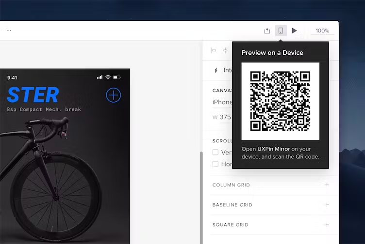
UXPin prototypes are designed for simplified previewing so your team can check for imperfections and get feedback with ease. Previews can be tested in multiple browsers or even viewed on mobile devices to ensure they meet your standards in all formats. With UXPin Mirror, you can even see the difference your updates make in real time on mobile devices.
A library of advanced features ensures that your UXPin prototype will accurately encapsulate every detail you intend to have in a completed website. Create various states for interactive components, design a drop-down menu that supports smooth navigation, or organize with tab menus, navigational drawers, and many other options.
The opportunities for customization in the prototyping phase don’t stop here. Variables can be added to personalize user experiences and expressions can be used to compute a variety of values, like those in a virtual shopping cart. You can even generate conditional interactions to have your site respond differently based on users’ interactions.
UXPin’s professionally designed prototyping tool allows you to create all of the complex functions necessary for a professional website, through a simplified system that does not require you to learn how to code.
Validate your concept and refine your website prototype
Once you have generated a prototype that fits your goals, it’s time to test. An interactive and fully functioning prototype can be used to test how well users are able to navigate your website. Record how long it takes users to discover and use specific features, identify challenges, and observe how your design is received.
With a flexible prototype, revisions can be easily implemented based on user response and then those revisions can be retested to refine your website into its final form.
A Practical Example of a Website Prototype in UXPin
When designing for users, you need to know their end goals and actions along the way. The two are called content and user flows, respectively, and together they form the heart of any great website.
But how do we go from an information outline to interactive design? In this post, we’ll discuss how to turn a set of content into a prototype, rapidly.
Step 1: Assemble a content inventory
What are we designing? Many designers start from the outside and work their way in, crafting the containers and framework before examining the information that users spend more time with.
When you start designing from the inside out, you design with the user in mind. What they need to see immediately will gain prominence over what you want them to notice second. Navigation bars deserve less attention than the call to action, for example.
As importantly, a content-first approach is also naturally a mobile-first approach. Mobile devices have more limitations, screen size, and bandwidth to name a few, and so designing within these parameters force you to prioritize content ruthlessly.
A content inventory is an organized list, spreadsheet, or equivalent document containing all the elements relevant to the end-user. A good inventory acts as a hierarchy of information divided into sections.
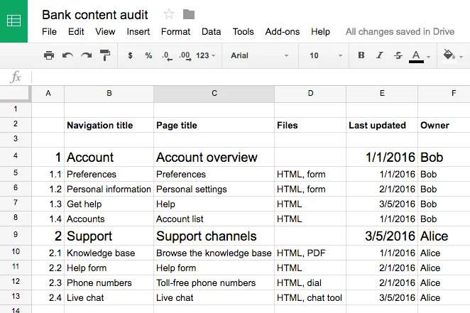
Your completed content inventory lays out all the possibilities for your user flows.
Step 2: Plan the core flow with informed decisions
A complex project like a banking website will require many flows, such as:
- Changing a password
- Viewing investment options
- Reviewing 401k
- Ordering checks
- Opening a new account, or closing an old one
- Transferring funds to or from a different bank
- Paying the credit card balance
Each flow requires a user to weave through multiple content pages. For the sake of this tutorial, we’ll focus just on the credit card payment process, one of the most crucial flows. When you prototype, focus first on the riskiest or most fundamental user flows.
Let’s write it out this user flow:
- The user lands on the homepage.
- The user completes their login information and redirects to their dashboard.
- The user clicks into their credit card balance.
- The user chooses an account from which to pay the balance. Then submits the request and confirms their balance is paid off.
That sounds like a lot of steps, but there are only three decisions involved: deciding whether or not to pay, choosing an account from which to do so, and choosing to confirm the transaction. Each step must be clear and effortless in our prototype.
Step 3: Build the prototype
In this case, we’ll build a user flow that lets people pay off their credit card balance at a fictional bank.
Given real content, our goal is to build a mid-fi. Unlike lo-fi prototypes, which act like boxy wireframes, or hi-fis, which show branding in place, mid-fis demonstrate the flow of decisions users take to accomplish a task.
If you’re limited on iterations, mid-fi prototypes are the perfect choice since you don’t waste time on visual design but still provide enough detail for user testing.
In a mid-fi, functional prototype, you’ll want to show:
- Correct layout of UI elements (navigation, primary content, etc.)
- Basic colors
- Basic interactions (no advanced animations or states yet)
- Correct typography
- Images in the correct dimensions
Here’s how we’d make it work for our bank website.
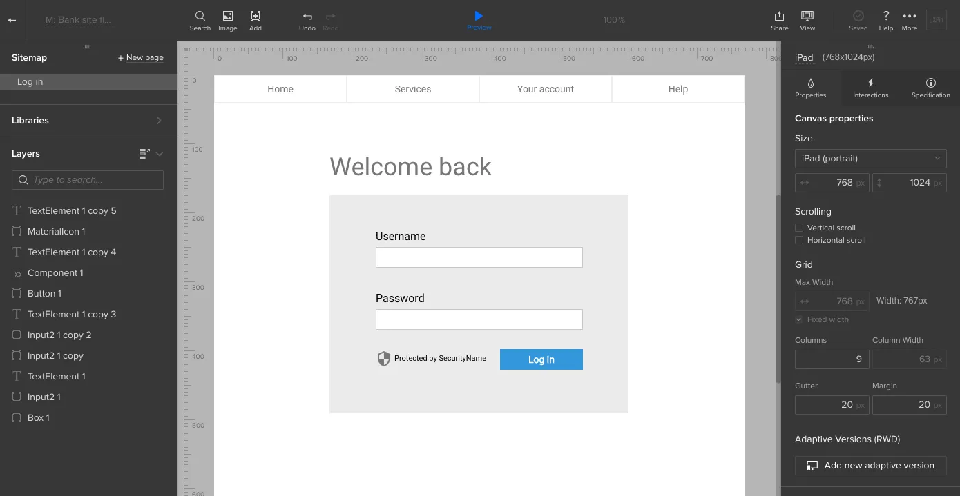
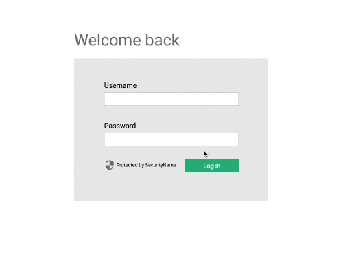
Login page
Logging in is easy: a simple form on the bank’s home page lets users securely enter their account. But we don’t neglect this obligatory step because it’s the user’s first interaction with the bank and its brand. Everything from the color scheme to the microcopy must fit with the friendly-yet-professional tone.
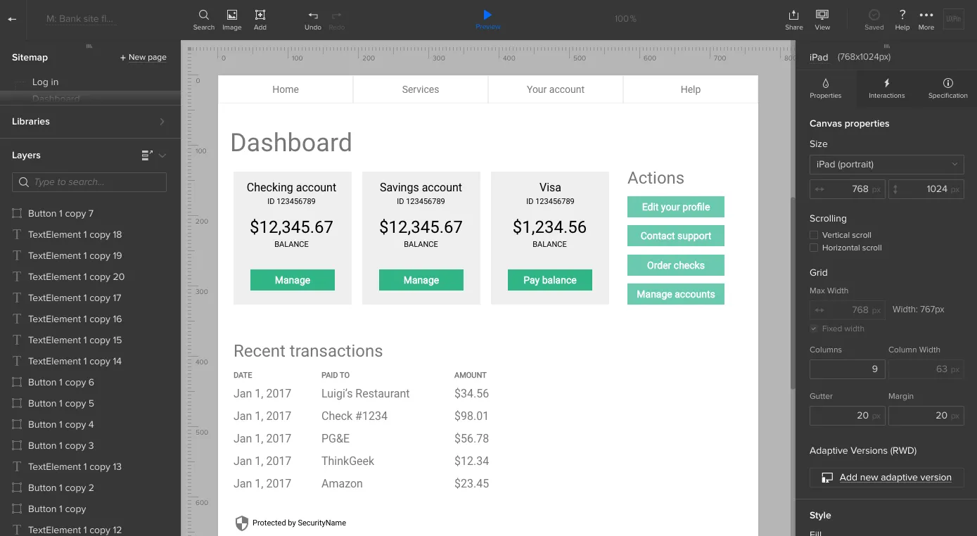
Account overview
Upon entering their username and password, they see a dashboard that includes their account information. The purpose of this screen is to give the person an overview of their accounts. There are no ads, no upsells, and secondary information is pushed to one side. It’s all about their money.
To help them decide if it’s time to pay, we’ll include their credit card balance on this screen.
Payment process
According to the user flow, we know that the person’s next move is to choose to pay the card balance. That’s an easy click — and presents a second decision. At this point, he or she must choose the account to withdraw money from.
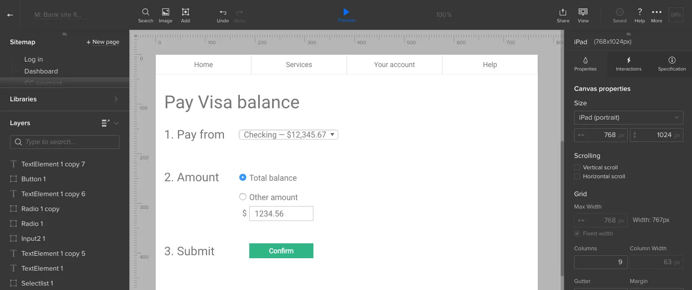
Decisions take time and cognitive power, so we should make choosing an account dead simple. Each account is listed with as little information as necessary (the account name and balance).
Next, the person reaches their third decision: whether or not to commit the transaction. At this point, all they need to know is what the transaction’s about. That means we can eliminate the previous decision’s options.
A new screen, or even a simple modal window, will present the information they need to make that decision. Specifically, the account name, the amount to pay, and the approve and disapprove buttons.
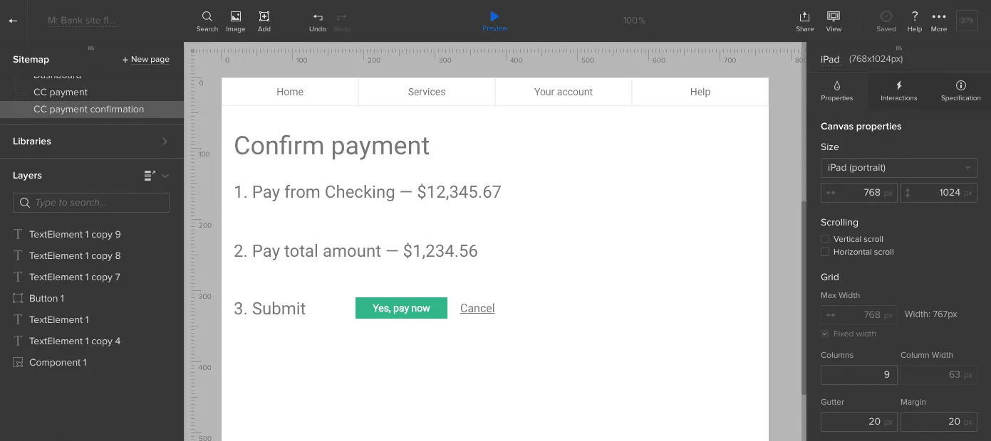
Success! Clicking the right button confirms that the balance is now cleared.
Getting close to reality makes it work
Notice that each screen in this design uses both realistic colors, typography, and layout — in addition to real microcopy. It’s not fully polished, but enough to start testing.
At this point, we just need to add some basic interactions so people can click through the screens. Once that’s finished, it’s time to collect feedback, iterate as needed, and then test with our users.
To complete your prototype, just repeat all the above steps with each user flow.
Build your own prototype in UXPin
People visit an interactive website to accomplish a task, not use a widget or admire its graphics. That makes the flow along with real content as important as developing a prototype’s UI.
Content-centric design helps find their way along that path. If you’d like to try what you learned in this guide, go ahead and start your free trial in UXPin.


